Okay, so this post will basically be a rant about my experience working on a design system for almost 2 years now. I've failed to come up with a solution to this struggle, so I feel like I'll just write it out of myself and see if people out there are fighting the same thing and if they managed to solve it in any way.
The struggle cycle
The thing is I'm talking about is basically an endless cycle involving UX and engineering and it goes like this:
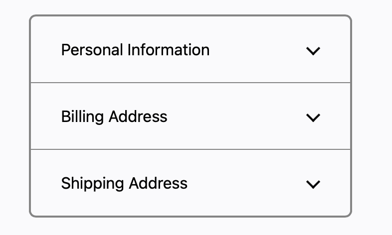
You work with a UX designer on the design system team and you come up with a design for a component, let's say an
Accordionwhere there's text on the left side and a chevron on the right, something like this:

You go into your cave and implement this design with whatever fancy and cool stack your team is using for your design system. You come up with the best API ever, you feel very proud, UX approves your implemented component and you release it, you go to sleep.
Next day you wake up, have some breakfast, brew that perfect coffee and open slack and you see the following message: The
Accordionis not working, how can I place the chevron to be on the right side of the text? After you survived your heart attack, you start to wonder, why on earth would they want a chevron on the left side? That's not at all how theAccordionis designed, so you ask the developer. The answer is that they got handed a design in let's say Figma, and they saw that there was anAccordionwith a chevron on the left side, so they imported yourAccordioncomponent and searched for a way to place the chevron on the left side, but it was nowhere to be found. Of course it was nowhere to be found, since it wasn't a requirement, but now you're in a place where you are right because you implemented what the design was, the developer is right, because they just want to implement a design the were handed, so where did it all go wrong?
Understanding where it goes wrong.
Well, here's where it all goes wrong. In design tools like Figma, it's just too easy to customise a component. You pull the component in, you notice something you want to change, right-click, Detach and boom, you're free to do whatever you want to the design. You shift that chevron to the left-side (which by the way might be a valid change), you hand it off to your developer and onto the next one. Without proper organisation wide education on how to use the design system and a very disciplined approach from UX designers, this is bound to happen in every org. And by the time you, the developer on the design system team, catch this error, it's all too late. UX already spent a ton of time coming up with the design, they (understandably) feel attached to it, the developer on the product team also spent a bunch of time implementing that design and now you're faced with the following task.
The questions you have to deal with
You have to tell them that the Accordion is not supposed to be used like this, you have to involve your UX designer and you have to find the answer to a bunch of very tricky questions, usually in a short amount of time.
- Does this change make sense in the context of the system?
- Do you want to allow
Accordions with chevrons on the left side company wide? - Should you add some escape hatch so that this team can move forward with their feature and hack the chevron to the left side?
- If you add that, how do you make sure that it's not abused in other places and that your product(s) have a consistent UI?
- Do you tell them that they have to stop the feature work and redesign it and live with the chevron on the right side? Does your team even have the political power to say something like that?
It's a big can of warms that get opened repeatedly, ultimately, because UX tools are not good at enforcing the constraints of the system on designers. If you faced this problem in the past, please leave a comment, I'm very interested in how other organisations solve this problem.


Top comments (1)
Great post, thanks for sharing!