
Imagine you're an experienced web developer 👨💻 and someone asks you to center a text inside a box. "Not like I didn't do that a 1 Mio times in my life" you say and continue. Rule after rule is being added by you to the css file, and finally you look at the result. Something is off, the text isn't just a little bit too low. In fact, the text in the button is also too low, it was never really centered. You apply, just like a pro would do, EVERY css rule that has "align" in the name and set it to "center" aaaand doesn't work,
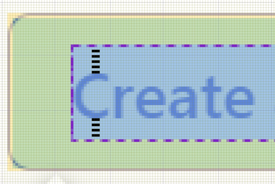
That wouldn't happen to you? Well, go ahead, logout and check the Log in and Create account button from dev.to. Did you notice that the space above is larger than the one below? It is off by a pixel.
Here you can count them 😉:
Now I don't dare to say that it was by accident in the case of dev.to, and I will go ahead, saying it is by design like that. But why could that be the case on other websites?
Well, the cause of the issue is vertical metric (or rather its poor values), which as the name implies, is there to vertically align the font. If that metric is off, your alignment will be trash. "Only unknown, cheap fonts are affected" I hear you say, to which I can only answer: No!
Just to give you an example: One of them is Open Sans, which according to Google Fonts is used by 130,000,000 websites and the second most used font from Google Fonts... which means 130,000,000 Websites have wrong text alignment 😅
Cheers
Edit #1:
The vertical offset is most likely intentionally by the creator(s) for most fonts. However, I think it would be better if all of them would be centered by default and manually offset by software, e.g. using css-rules.
Edit #2:
Above I said that all 130,000,000 websites are affected by it, but that would only be the case if all of them actually tried to vertically center at least one piece of text using that font.

Top comments (6)
Actually this font alignment might be by design. Some time ago I read an article about Youtube's logo alignment. Unfortunately I cannot find it right now, but I found another quick article about optical center.
thesignchef.com/article/how-to-a-d...
Here you can see, how this button would look perfectly centered mathematically, for comparison
Yes, it actually might be by design. But I doubt that it is always better to have it lower or higher. The article you shared also says that mathematically centered text or logos look a little bit low. That would mean that we should align them higher, not lower?
This is why I think all fonts should be centered mathematically and later offset by css-rules etc.
The question is, which one would happen more often:
Because as a developer, I wouldn't be happy if designer told me to offset every single text. I know I can make a few rules to cover most cases, but why would I, if I can use font that doesn't need that?
Even mathematically-centered becomes "interesting", when decenders come into play. Though I do agree that ultimately such adjustments should be up to type setting, not type design.
Not 130,000,000, at least attributable to Open Sans. Only those web sites that try to vertically centre at least one piece of text using that font. But the reality is there's no single strategy for getting this right in all circumstances. There's always a trade-off between competing requirements and so it really isn't the fault of a particular choice of font metrics.
If you want to know more about how CSS might deal with this issue in the future, take a look at the proposals for the text-edge and leading-trim properties.
That's correct. However I think all fonts should be 'centered' by default and later offset by e.g. css-rules. That would make it easy to simply change fonts, without changing the alignment.
I'm looking forward to text-edge and leading-trim