
This post is part of a series on the development of a reverse polish notation calculator web-app using Rust/Wasm, Vue, and TypeScript. You can read more and follow along with development at the GitHub Repo.
Let's add some buttons. For this iteration, I want to have a UI that can display the state I created in Luka 01, 10 number buttons, and a button for each arithmetic function.
It doesn't need to start off too pretty, here is the layout I made in Figma on the bus while listening to The Killers:
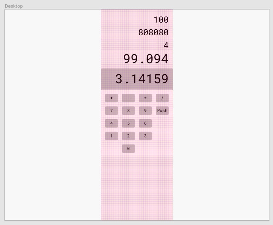
I can group the buttons into three types: the number buttons (0 through 9) append to the right side of the string that is presented in the "display", the function buttons each call the operate function on the Rust side with the string of the button's label, and the push button which will call the push function on the Rust side. I'm going to eventually want each of these to be a different color which will help a user visually parse what they can do, but for now, they can all take the same CSS and I'll differentiate the colors by applying classes.
There is a lot of code I ripped out of the default Vue template -- more than would be worth noting here. I also added a reference to the main.css file that I am using to style the whole application.
The base App.vue implements a CalculatorBase.vue component which will hold all of the components that make up the calculator. I created a component called ButtonOperation.vue and put a button on it.
Voila! We're almost done!
I gave the button the following styling:
:root {
    --teal-dark: #319795;
    --teal-light: #38b2ac;
    --shadow: 0 4px 6px -1px rgba(0, 0, 0, .1), 0 2px 4px -1px rgba(0, 0, 0, .06);
}

html {
    font-size: 16px;
}

button {
    text-align: center;
    font-weight: 700;
    border-color: transparent;
    border-radius: 0.25rem;
    flex-shrink: 0;
    justify-content: center;
    cursor: pointer;
    color: #fff;
    background-color: var(--teal-light);
    padding: 0.5rem 1rem;
    margin: 1rem;
    box-shadow: var(--shadow);
    transition: background-color 80ms linear;
}

button:hover {
    background-color: var(--teal-dark);
}

button:active {
    background-color: var(--teal-light);
}
And now the button is teal. When hovered, it will turn a darker shade of teal over the course of 80ms. When clicked, it will immediately jump to the light teal again.

Wrap Up
I wanted to do more today, but for now I have a teal button deployed. Go to https://lukarpn.z14.web.core.windows.net if you want to enjoy clicking on it.
Starting Commit: f37109bf4b7b3d22ef0b54785f9104f453d3c8c4
Ending Commit: d712b197986e3279dc76c22baeb31fbeabad0b4c

Top comments (0)