While at university, I joined Shazam as part time web developer. I stayed at Shazam for 5 enjoyable years. This post is about one hackday project I worked on. The project involves plotting one billion Shazam recognitions onto a blank canvas, and then observing the result.
This post also touches upon the process I used to create the visuals.
What is a ‘Shazam recognition’
Think of a Shazam recognition like this. You open up Shazam, the mobile app, and have it ‘listen’ for a piece of music that’s playing in the background. A recognition is the successful identification of the song.
Location data
A user may opt-in to sharing their location data with Shazam. Shazam then makes some of the anonymised location data (latitude and longitude) available to employees, depending on their use case.
Having anonymised location data to visualise was a cool experience. It taught me a lot about processing large datasets, visualisations which tell a story, and visualisations which look pretty but don’t do anything else.
The visualisation
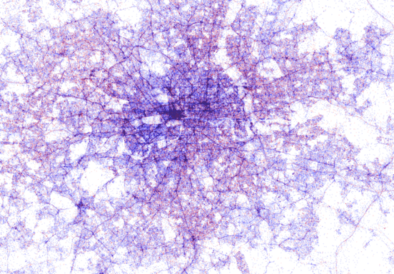
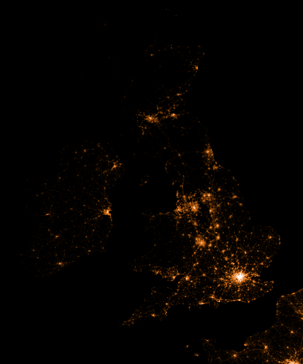
One thing you need to know, all visualisations follow this idea: One dot represents one successful recognition. Dots are plotted onto a geographical coordinate system. This is not the same as taking a Google Map and then plotting location markers over it.
Chicago, London, New York, Full
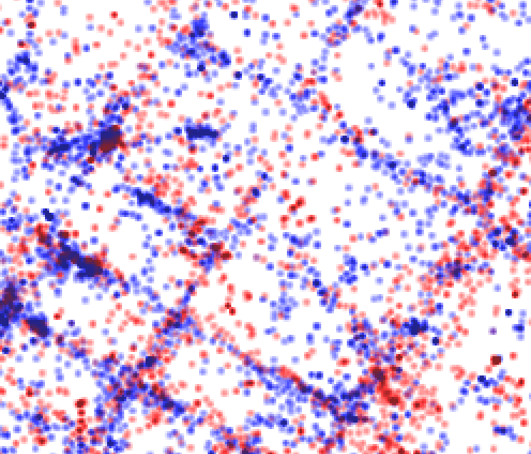
Zoomed into New York
I have used colour to differentiate between Android and iOS. Can you guess which is which? Hint: Look at the major cities. Which device type do you think is prevalent there?
- Android: Red
- iOS: Blue
If you look closely the the dot maps, you can notice clear definitions for the roads. This can be explained by passengers who are Shazam’ing music playing from car speakers.
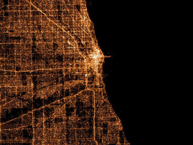
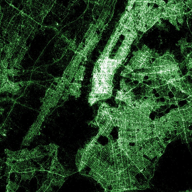
I also made maps with alternative colour schemes.
Chicago, Los Angeles, New York, United Kingdom
Interactive Maps
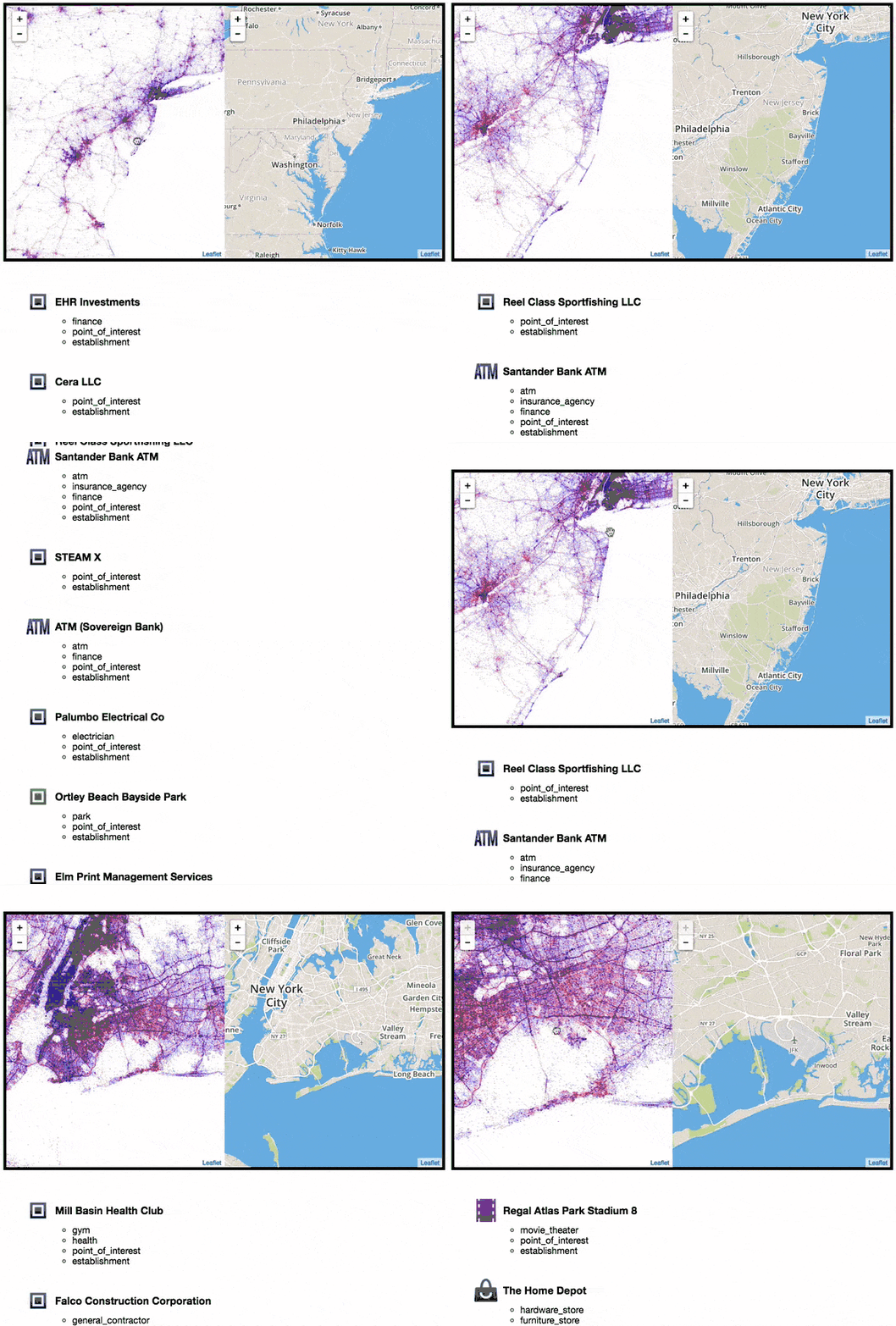
I thought it would be fun to visualise the map interactively. In the same way you would drag/zoom on a Google Map, what if you could also drag/zoom a Shazam map? This element of interactivity is what encourages people to use, explore and learn from the maps. Rather than just being something static that you never revisit.
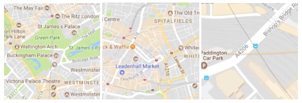
To do this, I needed to generate millions of map ‘tiles’. For example, here are some tiles of London, taken from Google Maps.
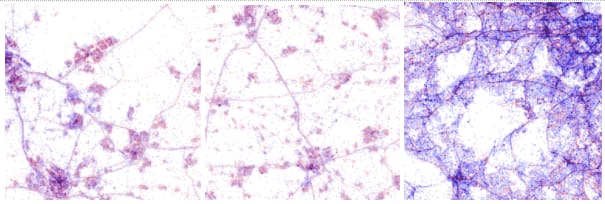
Each tile is a separate image. Take note of the different zoom levels. As you might guess, when you drag and zoom on a Google Map, it presents many different images to you, the images are referred to as map tiles.
Here are the tiles of the Shazam Map.
In total, I created over 40GB worth of tile data. This is because of the zoom level I had specified. A high zoom level means those viewing the map are able to zoom into a greater level.
Upon reviewing the visualisations with colleagues, we kept wondering: What “place” was in the location of large clusters. For example, was it a music venue where people would frequently be using Shazam?
To help answer this question, I had an idea: What if I used a location service to determine what places are currently present. To do this, I used the Google Maps Places API. Every time you scroll to a new location, I query Google Maps API to ask the question: What places are within this location?
When using this feature, we began to realise that clusters of dots would typically be the result of: cafes, night clubs, shopping centers, convenience stores and others.
I also synced a Mapbox map (similar to Google Maps) so as you drag and zoom into the Shazam map, the other ‘regular’ map would move around also. This allows you to quickly identify what geographic location you are currently looking at
The code
Like with everything I do, I’m only benefiting from hard work done by others in our community. All credit goes to Eric Fischer for their excellent work on datamaps. If you follow the instructions on that Github repository, you’ll be able to make your own visualisations. You’ll need a dataset consisting of longitude and latitude points, you might find something on Github, for example, awesome-public-datasets.
If you end up trying it out: here are a few notes I made for myself which you might find useful.
First, you need a big long list of latitudes and longitudes. However to even get hold of that data, you might have to do extra work. In my case, I got it from an internal Shazam API. I used a Node module called fast-csv to parse data. Using streams in this fashion makes parsing large data (gigabytes worth) simple to do.
csv.fromStream(stream,{headers : true}).on('data', handleRecord);
The handleRecord function does this:
function handleRecord(record) {
   const location = tag.location.latitude + ',' + tag.location.longitude;
   console.log(location);
}
The output looks something like:
lat,lon

-22.1028,166.1833

29.8075,-95.4113

51.2168,-0.8045

27.3007,-82.5221

20.5743,-100.3793

-36.0451,146.9267

26.7554,-81.4237
At this point, you can begin to plug it into data maps (there are detailed instructions within the project documentation).
Following the documentation long enough, I arrived at a point where I could create the final image. To create a datamap of London, specify the bounding box as location coordinates that you wish to capture:
./render -A -- output 14 51.641353 -0.447693 51.333508 0.260925 > london.png
Because I created the same static maps so often (when experimenting with colour for example), I decided to script the whole process. Being a web developer, I did this all in Node.js, however a simple Bash script would have been fine. First, I made an object containing all the maps I wanted to render.
Data structure to render all maps
Then it was a case of constructing the command you saw earlier, but for each location entry in that JSON block you see in the image above.
Presenting
At Shazam, there were multiple hack days. Then after a few months, was a demo day. You presented your hack day work on the demo day. Showing folks this particular project was well received.
To those developers creating command-line applications or going on code refactoring adventures during hack days, consider that a demo day audience may prefer more visual demos, rather than technical (this has been my experience). One way around this is: blog about what you’ve done and share the resources after, skipping a live demo entirely. Or even better, figure out how to distill technical concepts to a non-technical audience, introduce more visuals, and continue to give your demo to a live audience. It’s harder, but more rewarding.
High resolution images of the data maps
Note: You can zoom into these images with the Google Photos interface
- World — Notice which countries/cities have high iOS usage
- United Kingdom — Notice the cities
- Toronto
- San Francisco
- Paris
Conclusion
I’m grateful to Shazam for encouraging us to learn new skills and technologies. Also thanks to Eric Fischer for developing the datamaps project in the first place! If you have access to location data, consider the many interesting ways of visualising it. You could also try using Tweets from the Twitter API, just make sure they have location data attached to them.
Want to see more like this?
Follow me on Twitter: @umaar and let me know! I try & tweet out lots of web development resources.
Please like and share if you enjoyed reading my article and leave a comment with your experiences in data visualisation.








Top comments (2)
Great article!
When should one go with this approach instead of using runtime visualization tools like kepler.gl/
Thank you! That's a good question. I would say it depends on the amount of data you have to visualise, and the level of interactivity you need.
For Kepler, if you check out their demos, you'll notice that it's in the hundreds of thousands, and on my machine I start to get lag at that point. For my visualisation, I needed to handle over 1 billion rows! That's where something statically generated would have been the only option for me - which is why I used datamaps
That being said, if you need lots of interactivity, such as clickable markers, you'll probably have to go with a runtime visualization tool.
If you don't need lots of interactivity, have lots of data points, and want to make a performant visualisation, then something statically generated might be better. Otherwise, tools like Kepler seem great and certainly make life a lot easier!