
Motivation
Being able to build a solid component system that can be seamlessly reused in many projects is absolutely crucial for modern web-development. Precisely for this reason, I would love to walk you through the process of construction of several components that are ready for the challenges of today's dynamic Web landscape. 🚀
We will be building not only beautiful, but also highly-dynamic components that have different states for different scenarios. Which in turn will allow us to seamlessly build dynamic web applications. 🚀
Remark
This article is particularly aimed at beginners and those who want to familiarize themselves with Typescript, React, styled components and how to glue it all together. However, even seasoned developers might learn a trick or two, so stay tuned! 🚀
Content
Today we will start our journey from a relatively simple button. component, will build it using Typescript and styled-components.
Syllabus of today's article
We will learn a few cool tricks about:
⭐ Isomorphic components in React
⭐ How to use Typescript with React and styled-components effectively
⭐ Using custom props with styled-components
Sneak Peak
Here's how our button will look at the end.

I've also built a component sandbox where you can just play around with all the components.
Feel free to visit my components sandbox and look at the
final results of our today's work.
🚀🚀🚀 Enough words, let’s build the button 🚀🚀🚀
Let’s firstly plan what we want to achieve and program purely on interfaces! So let’s start from the Button’s interface (what kind of props it will receive):
In the simplest approximation, it will look like :
interface ButtonProps {
 isLoading?: boolean;
 isCompleted?: boolean;
 disabled?: boolean;
 children: ReactNode;
}
Where, the isLoading flag will be indicating whether we are fetching something or carrying out some operation - basically the loading variant of the button.
isCompleted flag - indicates whether some operation (async or not) is successfully completed.
Disabled - indicates whether the button is disabled, and finally children prop indicates what will be wrapped and displayed in the button, be it some text or icon.
💡 Let’s think about what we can also add to the interface! The button will be receiving some onClick actions, and we will definitely need to keep this in mind and add this to the interface.
interface ButtonProps {
 isLoading?: boolean;
 isCompleted?: boolean;
 disabled?: boolean;
 children: ReactNode;

 onClick: () => void; // 💡 added onClick support
}
This kind of works, but, and this is a big BUT - this is super inconvenient and mechanical.
Let’s imagine that we would want to add more and more standard button props (aria labels for example), so we would end up constantly reflecting this in the interface.
We can do way better
💡 Not only can we do this automatically, but we can also preserve all the Typescript type safety and code-hinting by simply extending already existing standard interfaces.
So, let’s continue our interface programming.
interface ButtonProps extends React.ComponentPropsWithoutRef<'button'> {
 isLoading?: boolean;
 isCompleted?: boolean;
 disabled?: boolean;
 children: ReactNode;
}
💡 Notice how our interface extends React.ComponentPropsWithoutRef with the ‘button’ generic.
This simply means that our button will be able to get onClick and all standard native button props - automatically. Which is cool!
Alternatives to this approach
Actually there are several ways to perform this trick with type extension. You can also end up doing something like this (also valid):
interface Props extends ButtonHTMLAttributes<HTMLButtonElement> {
 isLoading?: boolean;
 isCompleted?: boolean;
 disabled?: boolean;
 children: ReactNode;
}
Or even like this
const Button: React.FunctionComponent<
 React.DetailedHTMLProps<
   React.ButtonHTMLAttributes<HTMLButtonElement>,
   HTMLButtonElement
 > & { 💡💡💡 OUR CUSTOM PROPS GO HERE💡💡💡 }
> = ({ title, children, style, ...rest }) => {
 return <button {...rest}>{title ?? children}</button>};
🚀 The same spiel!
Approach that we will employ 👷
Although there are many ways of achieving this task, we will use the first variant when we extend React.ComponentPropsWithoutRef and here is why.
By doing so we can achieve the nifty 💡 flexibility 💡 of our component.
Let’s imagine the case when we have an external link <a></a> to some resource and it should be styled like this button component, but it should have all the native link props.
We also don't want to lose any type safety.
The first reflex is to build a separate link component and just borrow some button styles or class. But, we've got...
Polymorphic Components in React
With built-in polymorphism in React we can employ a way better strategy!
We can use nifty ‘as’ prop to render our component however we want, be it a link or our standard button!
❗ However, with Typescript this can be quite painful, since we have some limiting type rigor.
Let’s again program on interfaces a little, and see how this problem can be solved!
I’ve already written one article on dynamic typing in Typescript (in the context of api calls).
💡 Here we will follow exactly the same approach - we will use generics!
Here’s the solution:
type ButtonProps<T extends ElementType> = {
 renderAs?: T;
 isLoading?: boolean;
 isCompleted?: boolean;
 disabled?: boolean;
 children: ReactNode;
} & ComponentPropsWithoutRef<T>; // 💡&💡 means that we simply add some type or interface to our props
Let’s understand it.
1️⃣ We pass generic to the props which extends ElementType (ButtonProps<T extends ElementType>). Element Type is a nifty React utility type - which essentially means that we will be using any valid HTML element or React Component (if we will specify invalid HTML element, an error will be thrown).
2️⃣ Next we pass this generic to the props and specify in renderAs?: T that the button will be rendered “as” this generic.
3️⃣ Finally we add & ComponentPropsWithoutRef to get all native HTML element props right out of the box.
To make this super clear, if we will specify renderAs = ‘button’ we will automatically get all standard button props, whereas if ‘a’ will be specified, we will get link props (such as href). Cool!
🚀🚀 We have our interface and now we are ready to proceed and prepare the scaffold for the button. 🚀🚀
Scaffold
Let's create two files.
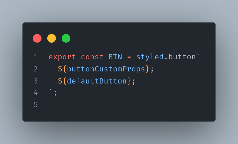
UltimateButton.styles.tsx for the styles.
import styled from 'styled-components';
export const BTN = styled.button``;
```
UltimateButton.tsx for the component.
```typescript
import React, { ComponentPropsWithoutRef, ElementType, ReactNode } from 'react';
import * as Styled from './UltimateButton.styles';
type ButtonProps<T extends ElementType> = {
renderAs?: T;
isLoading?: boolean;
isCompleted?: boolean;
disabled?: boolean;
children: ReactNode;
} & ComponentPropsWithoutRef<T>;
// 💡 In generic the HTML type of component will be specified. And by default it is button
const UltimateButton = <T extends ElementType = 'button'>({
renderAs,
isLoading,
isCompleted,
children,
...rest
}: ButtonProps<T>): JSX.Element => {
return (
   <Styled.BTN
     as={renderAs}
isLoading={isLoading}
isCompleted={isCompleted}
{...rest}
>
{children}
</Styled.BTN>
);
};
export default UltimateButton;
```
Since we already thought in great detail over the Button’s interface. I think everything should be very self-explanatory.
❗ Please note, in the Button’s generic `<T extends ElementType = 'button'>` we specify the default value of ‘button’. So, if generic will not be specified, this will be our default. ❗
###Testing the Scaffold###
Let’s test our button in the wild. We will render it as `button` and as `link`, and as a button with href prop(this case should error out).
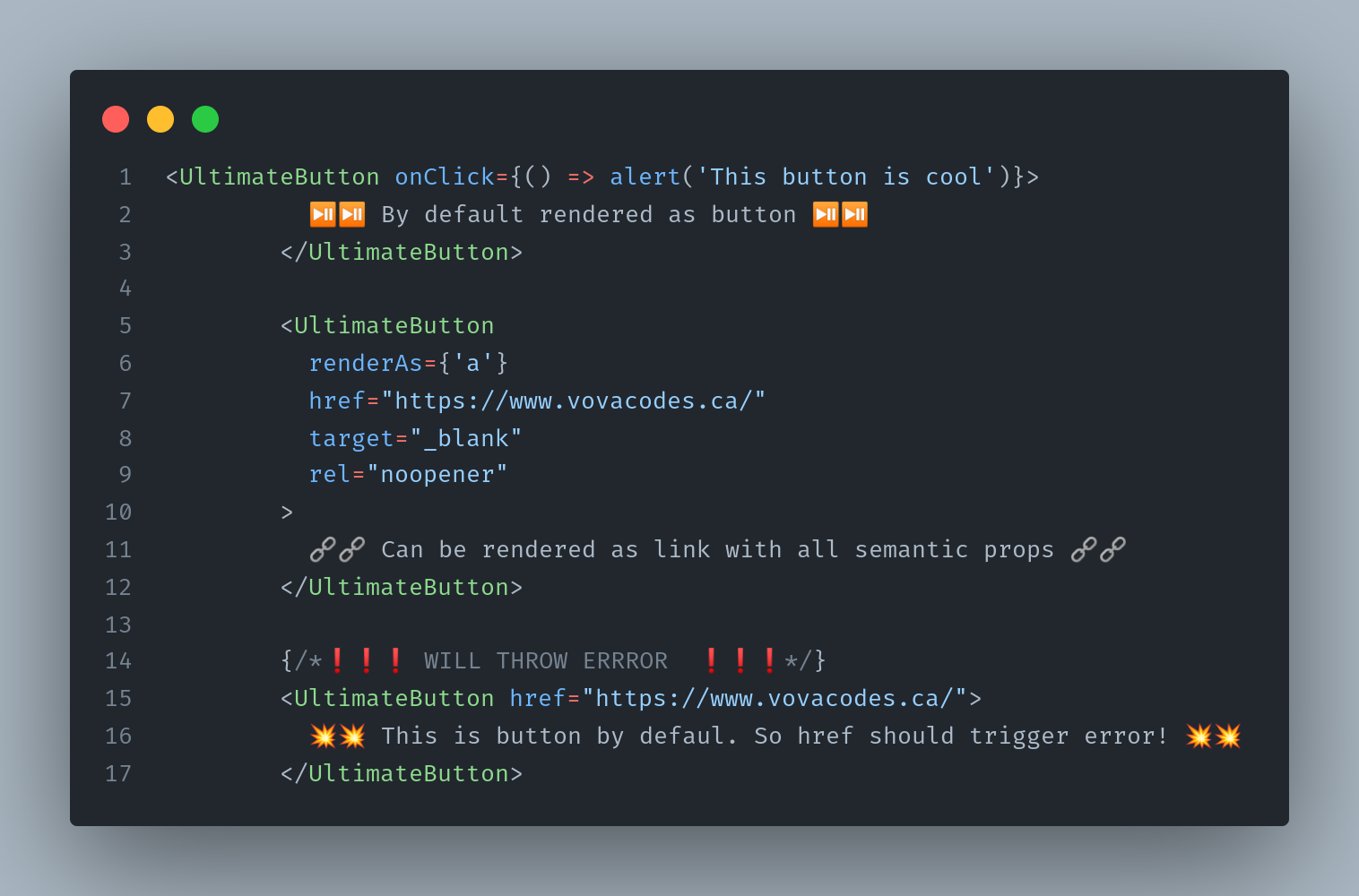
⭐ Please note, in the first case we haven’t specified “renderAs” and the button defaulted to the behavior of the button. It receives native onClick, even though it does not have it in the interface.
⭐ In the second case, we specified “render as a” and now the button is rendered as a link and accepts all the semantic link props without any errors ( we specified href, target and rel).
⭐ Finally, in the third case we render a button, but we use “href” prop and this case will error out. Which is great. Also, errors will be thrown if we will specify some incompatible tags that do not exist.
🖌️ Great! Now we can proceed to styling and making our button - beautiful!
### Styling 🖌️###
As I’ve already mentioned, in this series we will be using styled components.
We want to build a really versatile component with a ton of states. In this case, I do enjoy creating separate styles for each of those states, which will pay-off in readability and maintainability.
In styled-components we can use `css` for this case.
Here’s how the initial styles backbone looks like.
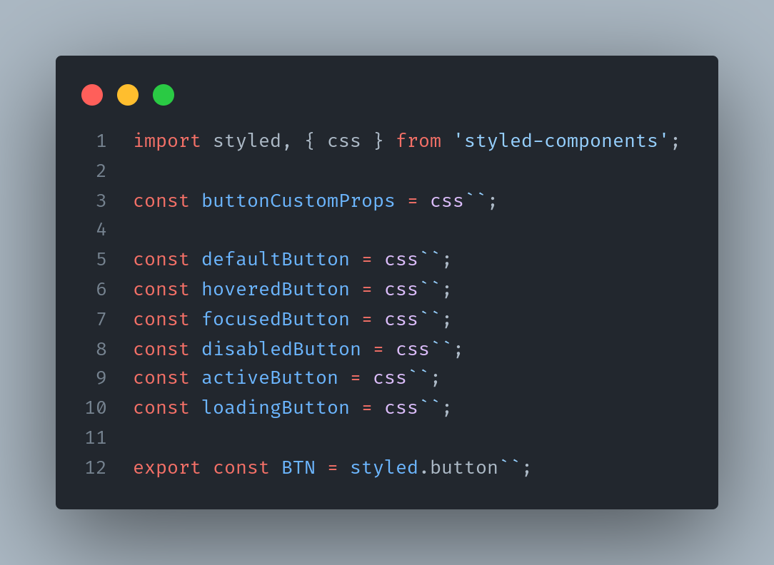
These styles styling states live separate of each other, which will allow us seamlessly add new states without any styling issues.
💡 In `buttonCustomProps` we will initialize our CSS custom props aka CSS variables. This actually addresses one of the biggest styled-component’s weaknesses - re-injection classes and re-rendering in the case when some of the styled props have changed.
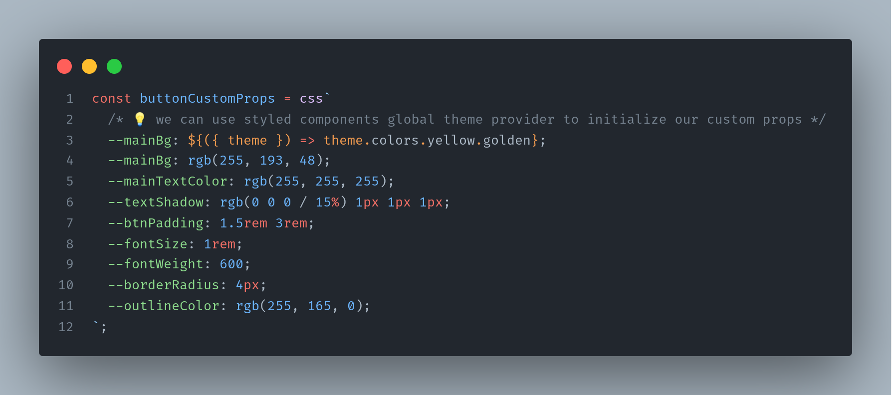
You can read about this in great detail in this [fantastic article](https://www.joshwcomeau.com/css/styled-components/). Thanks Josh!
💡Please note, we set initial custom props to the above hard-coded values, or we can use also use global styled theme provider (if we use one) as we did with --mainBg on the 3rd line. We can also pass these custom props as style object to address the performance limitations of styled components (if we are concerned with them of course).
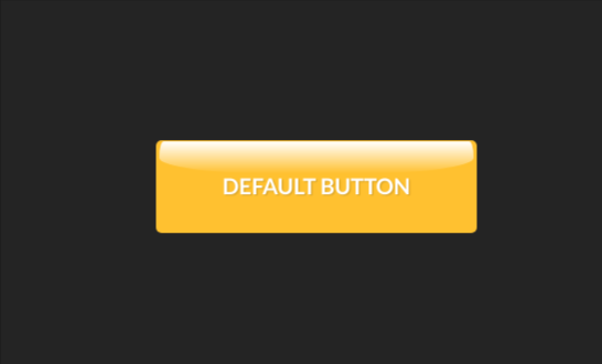
###Default styles###
Let’s consume these variables and add default styles.
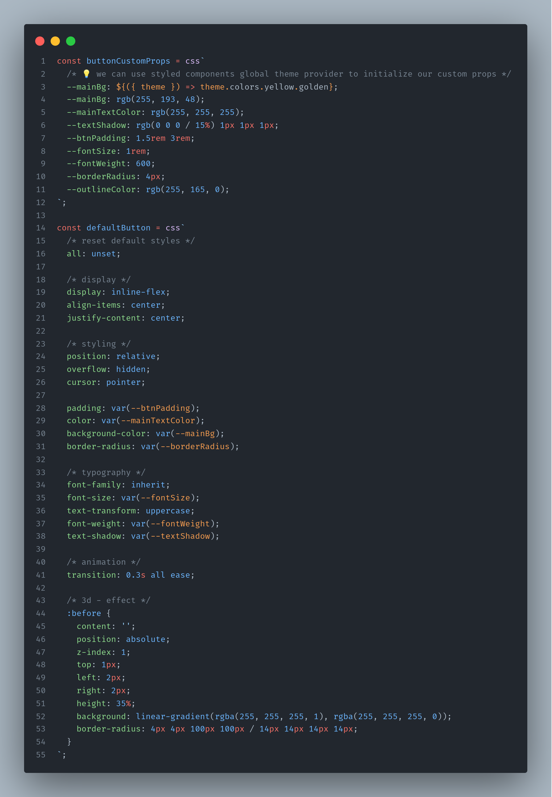
Nothing fancy.
We first reset default button styles with “all:unset” and then gradually construct what we want to be our default button.
🌶️ In order to make our button a little more spicy, I added a small 3d-effect using :before and linear gradient with a sophisticated border radius (will add cool 3d effect).
Then we can add all these good things to our Styled Button.
And here’s the result of our hard word - our default button! Looks kind of cool, isn’t it?
###Button States###
We already have set the foundation! Let’s enhance it with multiple states and looks!
Essentially the button should support the following states : hovered, focused, disabled, loading, active and completed.
Also, it would be great, if it would be easy to add even more custom states (if need be) without and styling problems.
Let's start with introducing a separate interface for styled props that our styled component will receive.
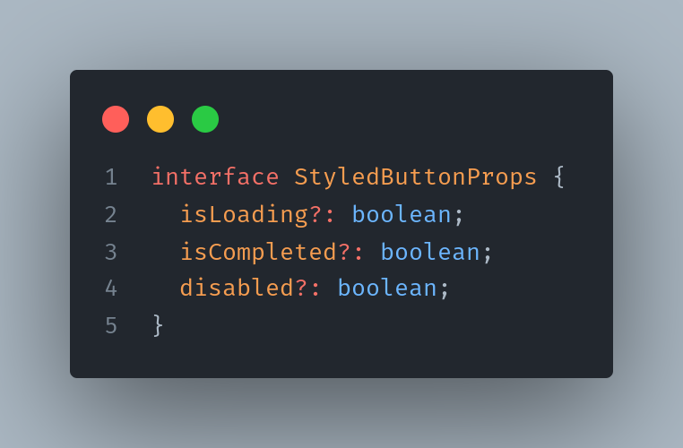
Let’s firstly deal with native button states - focused, active, hovered and disabled.
I think that we must separate these native states from custom one’s. More particularly, when we hover over the button we want to apply hovered styles, but when it is in a loading or disabled state we don’t want to do this.
Since in styled components we can use the full power of Javascript, this can be accomplished in many ways.
I would prefer to manage states like this...
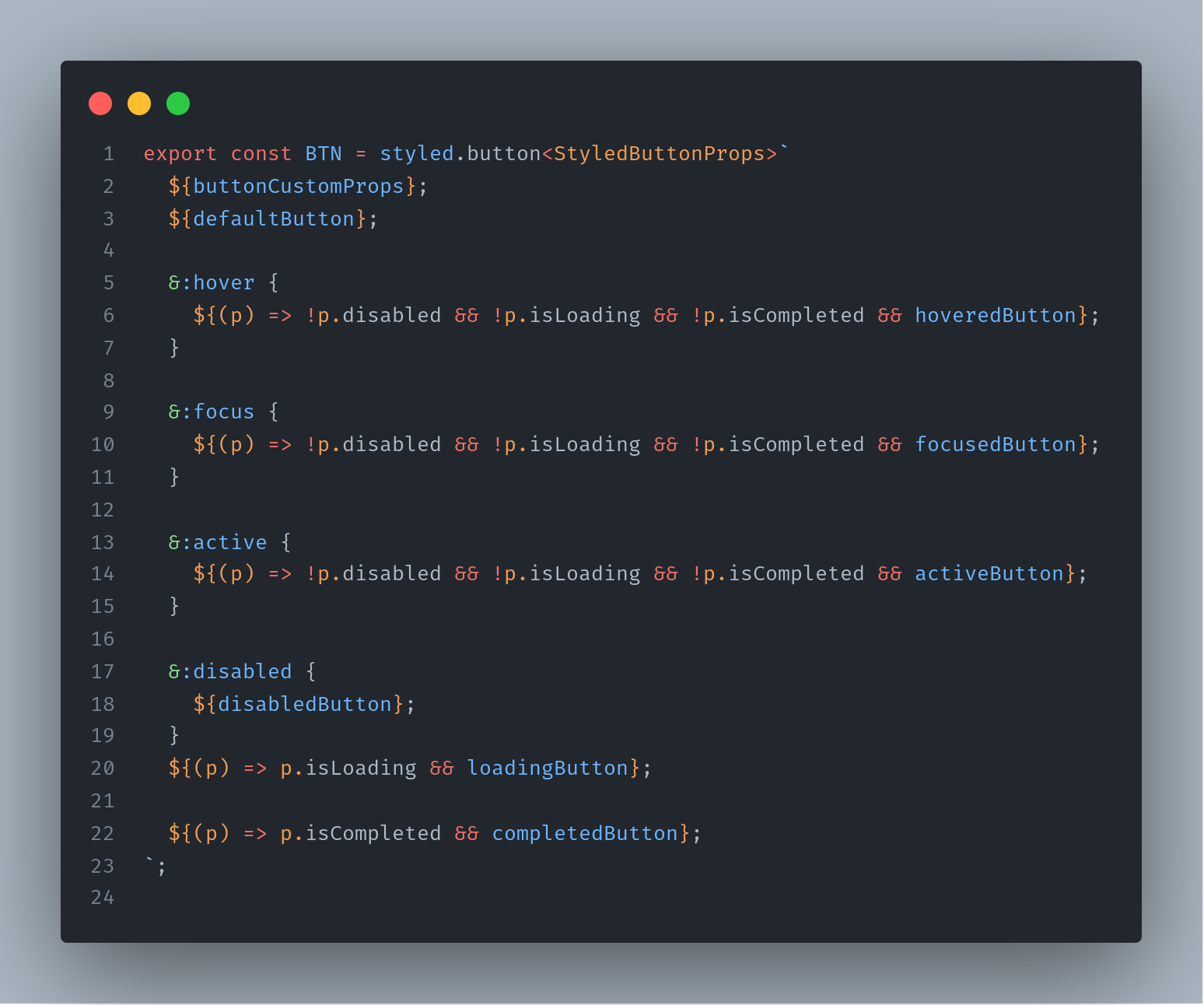
💡 Notice, we receive `isLoading` and `isCompleted` from the passed props and then we also use standard css pseudo-classes `:hover, :focus, :active and :disabled` to apply different styles to different states.
💫 Now we are ready to add some fill the placeholders of states with some styles.
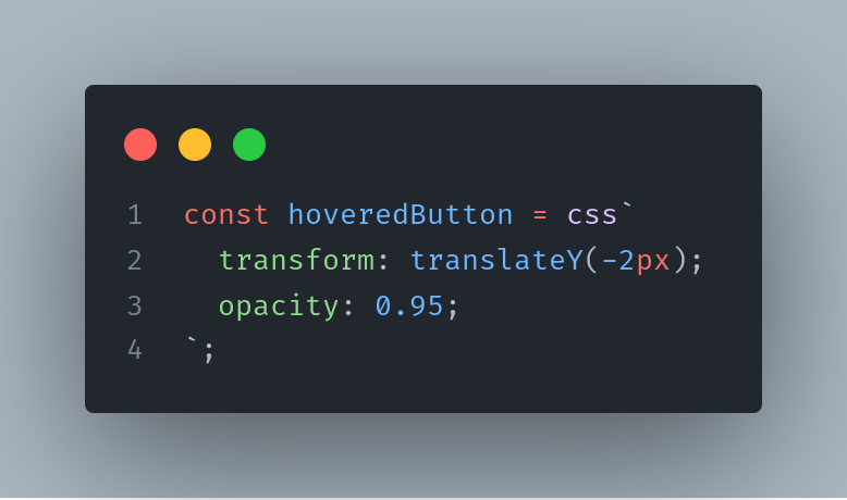
###1️⃣ Hovered button###
Super simple. We will not be using any super sophisticated styles today, but I encourage you to experiment and be as creative as possible.
###2️⃣ Focused button###
We will add more visibility and prominence for those who navigate our website using the keyboard.
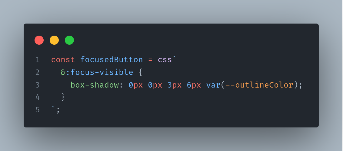
We use nifty `:focus-visible` [pseudo-class](https://css-tricks.com/almanac/selectors/f/focus-visible/) to apply our styles only when the button has focus, but this focus is not triggered by a click. This will greatly enhance the element’s accessibility and will not interfere with the button’s design.
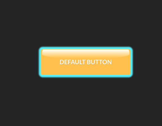
When the button is focused (through TAB) it will look something like this.
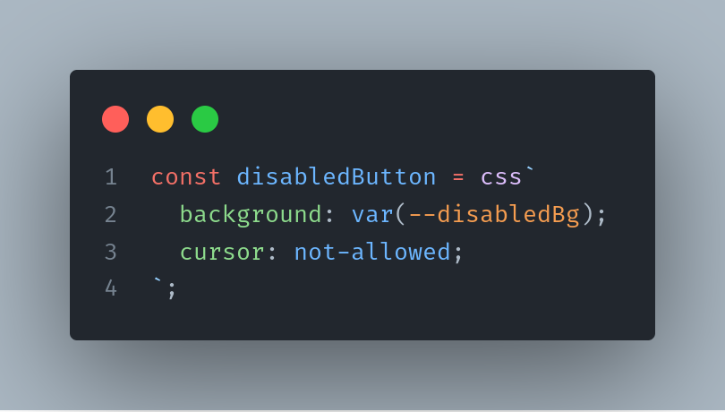
###3️⃣ Disabled button###
###4️⃣ Active button###
By clicking on the button and triggering this state, I want to emphasize its spicy 🌶️ 3D effect.
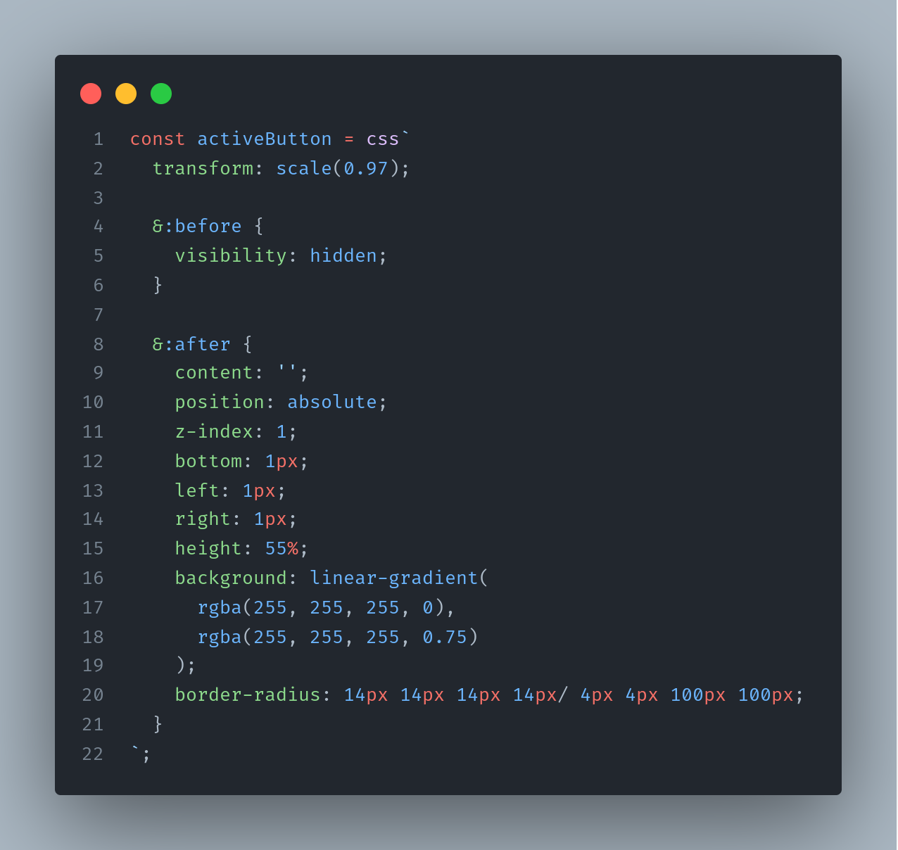
On click, an initial 3D gradient in :before will be hidden, and mirrored gradient will be added to :after.
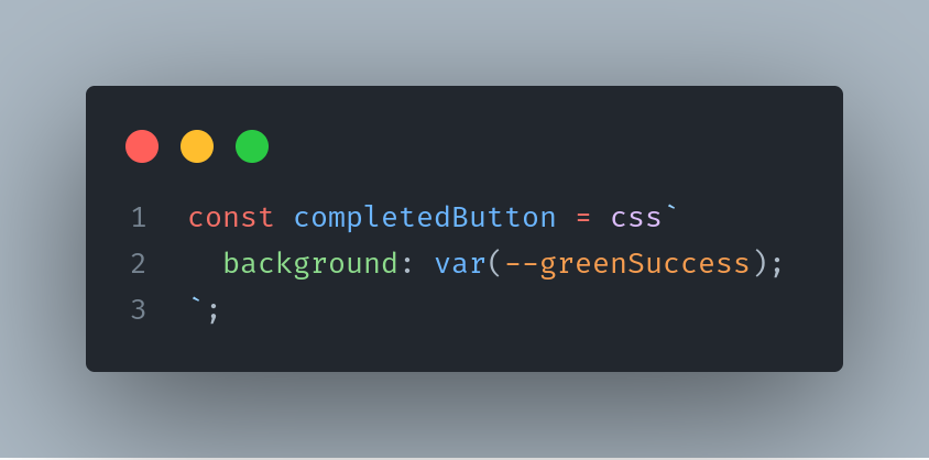
###5️⃣ Completed button###
This state will be used to indicate a successful finish of some operation, which in turn will make user experience far smoother.
In our case we will not go crazy. Just add good old green appealing color (however in your projects, I encourage you to go crazy).
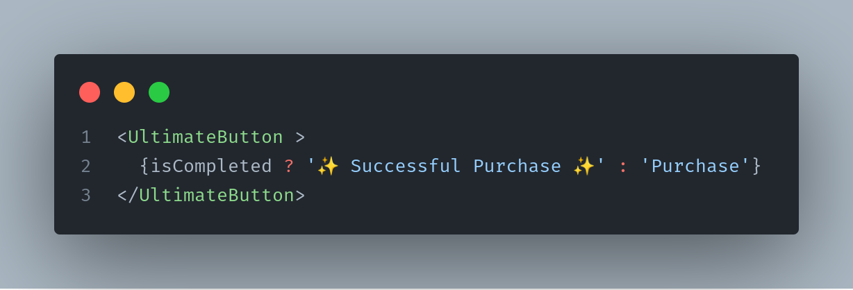
You can also play with the content of the button depending on the state of this flag (isCompleted).
For instance...
###6️⃣ Let’s finally tackle the big beast - loading state###
It would be cool to add some loading animation,and not just a boring spinner that is used in 90% of component libraries.
Let's add a repeating linear gradient and liven it with some animation.
In styled components, for animations we can borrow `keyframes` or write plain old css. Depends on your preference.
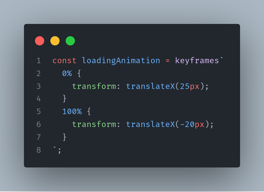
And here’s our loading button styles.
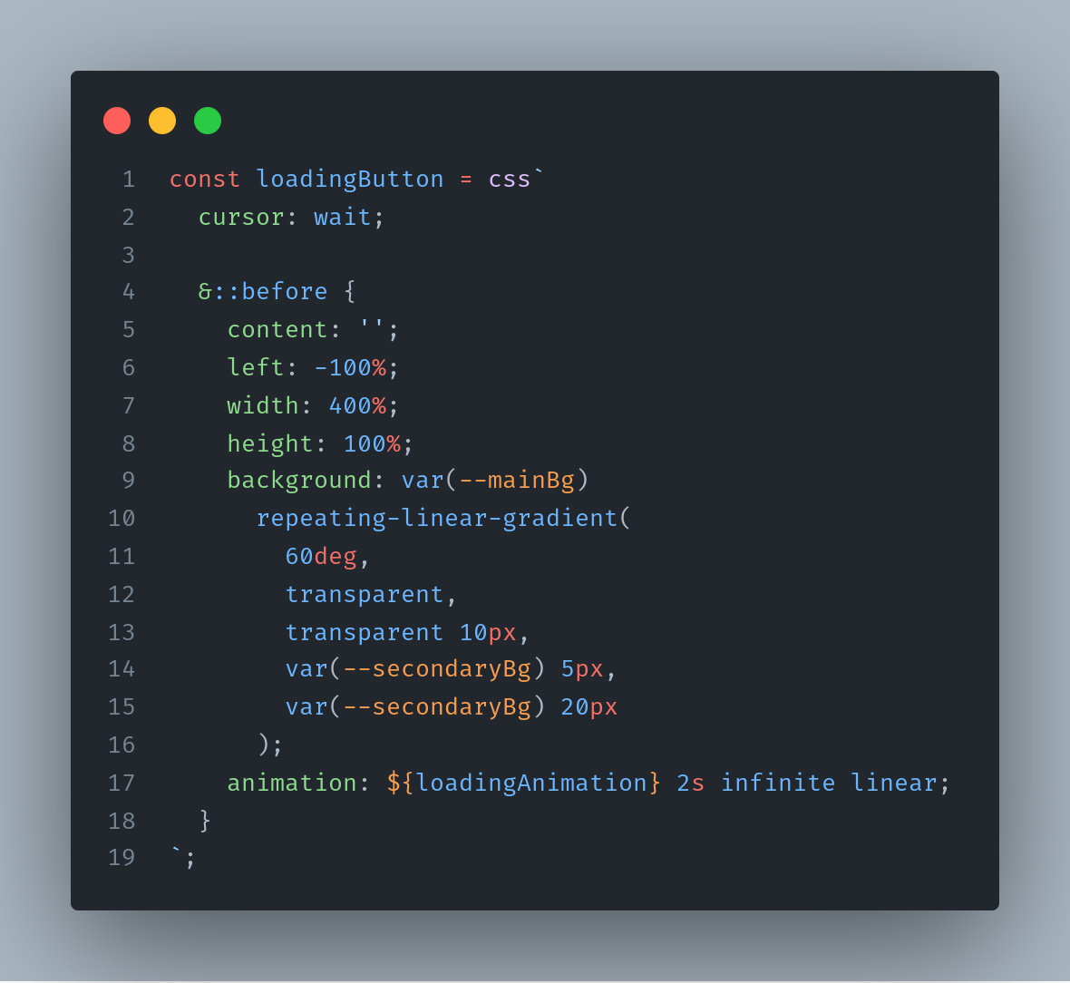
💡 In `:before` we add wide gradient and simply animate its transition on X axis. As simple as that!
###Wrapping up###
Oof! That was a lot of work!
I hope you enjoyed this whole rodeo and learned something useful.
Let’s wrap up.
🏆 We've built a polymorphic component that can be used as a button and link.
🏆 We've nicely separated styles of different component states from each other and now can add even more states without any problems.
🎊 If you enjoyed what we've done, consider giving article a like and subscribing to [my github](https://github.com/vovaushenko) for more updates! 🎊
Cheers!

Top comments (4)
Really exciting concept, but using your code in my simple CRA project gives a quite verbose typescript error at
The (abbreviated) message is: "No overload matches this call. Overload 1 of 2, [ ... ] Types of property 'as' are incompatible. Type 'ElementType | undefined' is not assignable to type 'undefined'. Type '"symbol"' is not assignable to type 'undefined'."
I'm using your code exactly as it exists under the "Scaffold" headline.
Is there any other setup information that may be missing? Specific React, Styled Components or Typescript versions?
Had this same error. Changing renderAs prop to keyof JSX.IntrinsicElements solved it for me.
Could you explaing why did you changed and worked out? Thanks!
Good catch!