Part 1: The Right Image for the Device
Responsive Web Design (RWD) is essential in today's multi-device world. A key challenge in RWD is choosing and loading the right image size based on the device's screen size. This ensures both the quality of the image and the performance of the website.
Using <picture> element example
The Role of the <picture> Element in RWD
Understanding the <picture> Tag
- The
<picture>element in HTML allows for more control over image resources in different scenarios. - It contains one or more
<source>elements and a single<img>element. - The browser evaluates each
<source>to find the best match for the current display and if none matches, or if the browser doesn't support<picture>, it falls back to the<img>element'ssrc.
The Code in Action
Consider this Vue.js code snippet:
<picture>
  <source media="(min-width: 768px)" :srcset="item.largeImage">
  <source media="(max-width: 767px)" :srcset="item.smallImage">
  <img :src="item.defaultImage" :alt="item.altText">
</picture>
- Dynamic Image Selection: Different images are loaded depending on the screen width. Larger images for screens wider than 768 pixels, and smaller ones for narrower screens.
- Efficiency and Speed: This technique optimizes bandwidth usage and improves page load times by loading images best suited to the viewer’s display.
-
Fallback Mechanism: The
<img>element is a backup if no<source>elements match.
Best Practices for Using the <picture> Element
Art Direction: Use
<picture>to modify images for different conditions, like loading a simpler image with fewer details on smaller screens.Format Flexibility: Offer alternative image formats, such as AVIF or WEBP, which may not be supported by all browsers, alongside more universal formats.
Optimized Bandwidth Use: Save bandwidth and improve page load times by loading the most appropriate image for the viewer's display.
High-DPI Displays: Use
srcseton the<img>element for high-DPI displays. This allows browsers to choose lower-density versions in data-saving modes.Positioning and Sizing: Utilize
object-fitandobject-positionproperties on the<img>element to adjust the positioning and sizing of the image within the frame.
The why
In responsive web design, effectively managing images is crucial. The <picture> element is a powerful tool that helps in loading the right image for the right device, enhancing both the user experience and the website’s performance. As we continue to navigate the challenges of RWD, understanding and utilizing these elements will be key to creating versatile and efficient web designs. Stay tuned for more insights in this series on responsive web design.
Considering alternative approaches
Why not just load images based on device detection?
Choosing the right method to load images on a website, especially in a responsive design context, involves considering both efficiency and user experience. While detecting the user's device server-side and then serving appropriate images based on that information is a possible approach, there are several reasons why using HTML's <picture> element or CSS media queries might be more advantageous:
Device Diversity: The range of devices used to access the web is vast and constantly evolving. It's not just about differentiating between a desktop and a mobile device; there are various screen sizes, resolutions, and even connection speeds to consider. Using the
<picture>element or CSS media queries allows the browser to make real-time decisions based on the actual device characteristics.Client-Side Flexibility: By using the
<picture>element or CSS, the decision about which image to load is made client-side, based on the actual conditions at the moment the page is rendered. This includes not only the screen size but also the type of connection (e.g., Wi-Fi or cellular data), which can change even during a single session.Performance and Bandwidth Optimization: Detecting the device server-side and serving different images based on this can lead to unnecessary overhead. The
<picture>element allows for more efficient loading of images, as it can select the most appropriate image based on the current viewport and pixel density, potentially saving bandwidth and improving load times.Scalability and Maintenance: Maintaining a server-side device detection system can be complex and require constant updates as new devices enter the market. In contrast, using the
<picture>element or CSS media queries offloads this responsibility to the browser, which is regularly updated to handle new devices and screen sizes.Future-Proofing: The web is continuously evolving, and so are web standards and browsers. Relying on current standards like the
<picture>element ensures that your website is more likely to remain compatible with future devices and browsers without requiring significant rework.SEO and Accessibility: Search engines prefer websites that use standard, semantic HTML. Using the
<picture>element is in line with HTML standards and can be more easily interpreted by search engines, potentially improving SEO. It's also more straightforward for screen readers and other assistive technologies to interpret, improving accessibility.
While server-side device detection has its uses, for image loading in a responsive design, client-side methods like the <picture> element or CSS media queries generally offer greater flexibility, efficiency, and forward compatibility. These methods align better with the principles of responsive web design, focusing on the actual capabilities and conditions of the user's device at the time of access.
A more complex example
For this example, I'm using a Nuxt 3 project along with my favorite eCommerce UI library, Storefront UI.
The Challenge
What if I need to create something more than just a static image, what about something as complex as a carousel? And to boot, what if we want to load different images into that carousel based on the size of the browser window?
The Solution
The <picture> approach works quite well in this scenario. Let's use a Nuxt 3 App for example. We can create a component that will load the images based on the size of the browser window. There are many edge cases we're ignoring here so we can focus on the topic at hand.
Let's focus on the carousel:
~/components/Carousel.vue
<template>
  <div class="carousel">
    <div class="carousel-track" :style="{ transform: `translateX(-${currentIndex * 100}%)` }">
      <div class="carousel-item" v-for="(item, index) in items" :key="index">
        <picture>
          <source media="(min-width: 768px)" :srcset="item.largeImage">
          <source media="(max-width: 767px)" :srcset="item.smallImage">
          <img class="w-full h-auto md:w-auto" :src="item.defaultImage" :alt="item.altText">
        </picture>
      </div>
    </div>
    <div class="carousel-dots">
      <button class="dot" v-for="(item, index) in items" :key="index" :class="{ 'active': index === currentIndex }"
        @click="goToItem(index)">
      </button>
    </div>
  </div>
</template>

<script setup>
import { ref } from 'vue';

const currentIndex = ref(0);
const items = ref([
  {
    largeImage: '/images/large1.png',
    smallImage: '/images/small1.png',
    defaultImage: '/images/large1.png',
    altText: 'image 1'
  },
  {
    largeImage: '/images/large2.png',
    smallImage: '/images/small2.png',
    defaultImage: '/images/large2.png',
    altText: 'image 2'
  },
  {
    largeImage: '/images/large3.png',
    smallImage: '/images/small3.png',
    defaultImage: '/images/large3.png',
    altText: 'image 3'
  }
]);

let autoSlideInterval = null;

const startAutoSlide = () => {
  stopAutoSlide();
  autoSlideInterval = setInterval(() => {
    nextItem();
  }, 2000);
};

const stopAutoSlide = () => {
  if (autoSlideInterval) {
    clearInterval(autoSlideInterval);
    autoSlideInterval = null;
  }
};

onMounted(() => {
  startAutoSlide();
});

const nextItem = () => {
  currentIndex.value = (currentIndex.value + 1) % items.value.length;
};

const goToItem = (index) => {
  stopAutoSlide();
  currentIndex.value = index;
};

</script>

<style>
.carousel {
  overflow: hidden;
  position: relative;
}

.carousel-track {
  display: flex;
  transition: transform 0.5s ease;
  /* Smooth transition for sliding */
}

.carousel-item {
  flex: 0 0 100%;
  /* Each item takes full width of the carousel */
  /* Other styles for the item */
}

/* Enter and leave transitions */
.slide-enter-active,
.slide-leave-active {
  transition: transform 0.5s ease;
}

.slide-enter,
.slide-leave-to {
  transform: translateX(100%);
  /* Start and end state for sliding */
}

.slide-enter-to,
.slide-leave {
  transform: translateX(0);
  /* End and start state for sliding */
}

.carousel-dots {
  position: absolute;
  bottom: 10px;
  left: 50%;
  transform: translateX(-50%);
  display: flex;
  align-items: center;
  justify-content: center;
}

.dot {
  height: 10px;
  width: 10px;
  border-radius: 50%;
  background-color: #fff;
  margin: 0 5px;
  cursor: pointer;
  border: none;
  opacity: 0.5;
  transition: opacity 0.3s;
}

.dot.active {
  opacity: 1;
}
</style>
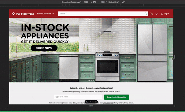
This carousel will fit nicely with the rest of my UI:
~/pages/index.vue
<template>
  <div class="flex-col align-middle">
    <Carousel />
    <NewsLetterForm />
    <div class=" flex justify-center">
      <Banner />
    </div>
  </div>
</template>
You can get your hands on the code here: https://github.com/rohrig/carosel-multisize-image-example
While it might be tempting to create components based on the device, it's more efficient and future-proof to design them responsively, allowing for seamless adaptation to different screen sizes and resolutions. This approach ensures a consistent user experience across all devices and reduces the need for device-specific code maintenance.

Top comments (1)
Nice solution, I saw it from somewhere, usually I use just media queries.