Azure Databricks is a powerful technology that helps unify the analytics process between Data Engineers and Data Scientists by providing a workflow that can be easily understood and utilised by both disciplines of users. Data Engineers can use it to create jobs that helps deliver data to Data Scientists, who can then use Databricks as a workbench to perform advanced analytics.
However, in real life, the need to deliver data in a understandable format that provides actionable insights extends the needs of just Data Engineers and Scientists. With that in mind, how can we expect Marketers, salesman and business executives to understand and utilise comprehensive analytics platforms such as Azure Databricks to perform day-to-day tasks?
Thankfully, we can connect our clusters within Azure Databricks to BI tools such as Power BI. The purpose of this tutorial is to help you understand how you can use both Azure Databricks and Power BI for Data Visualization tasks and how you can connect clusters in Databricks to Power BI
Technologies used in this tutorial:
- Azure Databricks
- Power BI Desktop
For this tutorial, I’m going to assume that you know how to use the Databricks UI to create notebooks. I’m also going to assume that you have a basic understanding of PySpark and how you can create clusters inside Databricks.
Getting our data
For this demo, I’m going to use Python for my scripting work inside Databricks. There’s some really cool data viz libraries that are available in Python and I’ll show you how you can use these inside a Databricks notebook.
Also, I’m going to use one of the pre-loaded datasets that come with Azure Databricks just so I don’t have to waste time explaining how to import data into Databricks, which I covered in this blog post.
Let’s start by creating a Python notebook and load our dataset. Write the following code:
# load our data into Databricks
ourData = "/databricks-datasets/Rdatasets/data-001/csv/ggplot2/diamonds.csv"

# create a dataframe for that data
diamonds = spark.read.format("csv").option("header", "true").option("inferSchema", "true").load(ourData)
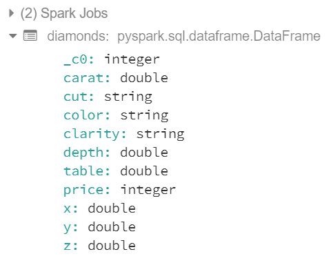
If compilation was successful, we should see the following output:
Let’s play around with our data so we can use different types of visuals. Let’s take a look at our data first just to see what we’re dealing with:
display(diamonds)
We should see the following table in our Databricks notebook:
As you can see, whenever we run a display() function in Databricks, we’ll get a limit of 1000 rows in our dataset.
Visualizing Data in Databricks
Now that we have our different data frames defined in Databricks (say that 5 times as fast), we can start experimenting with different types of data visuals. We know what columns we have, what datatypes they are and what kind of data is inside our diamonds dataframe, so let’s start with some aggregations.
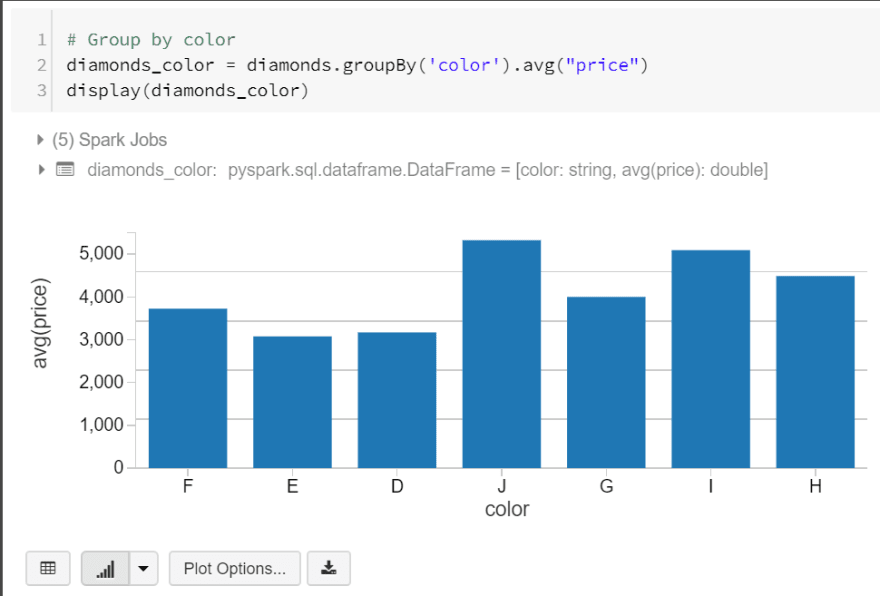
Let’s start off by grouping our diamonds by color and showing their average price. We’ll create a new data frame for this by writing the following code:
# Group by color
diamonds\_color = diamonds.groupBy('color').avg("price")
display(diamonds\_color)
When we executed our code, we got a table but did you see the bar chart button at the bottom of our table? This button allows us to visualise our data. In this example, I’ve used a basic bar chart, but I’ll go through what we can do using this feature.
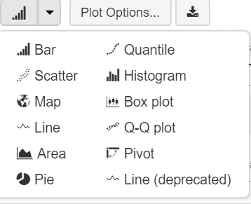
In Azure Databricks, we can create different types of visualisations as seen in the diagram below:
Not everything can be a bar chart right?
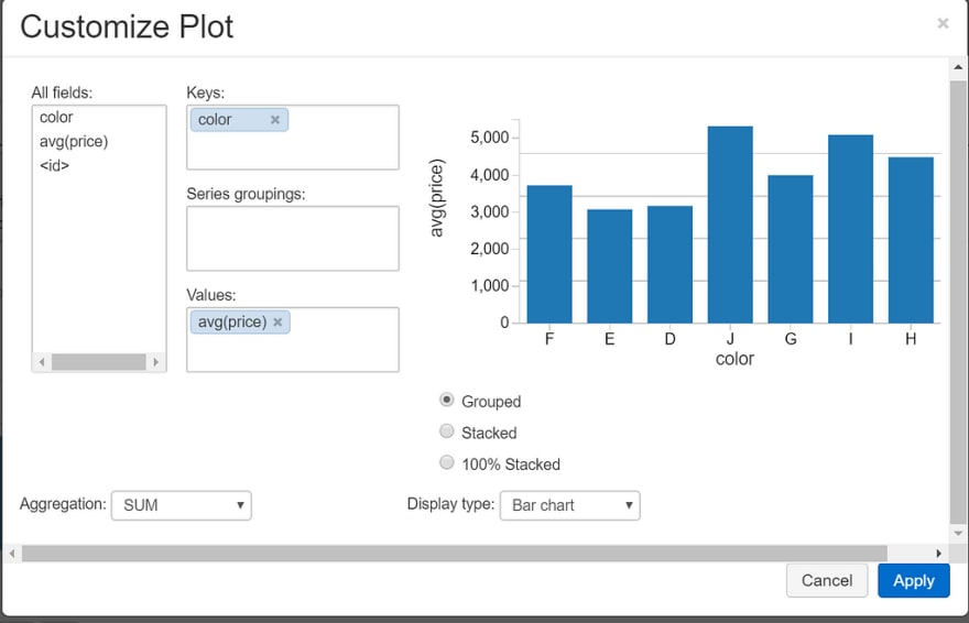
We can also customize our plots using ‘Plot Options..’
This is a pretty basic example, but using this feature, we can customize what fields we want to use in our chart, the keys, values, groups, type of aggregation and how our chart is displayed.
Let’s explore another example. Write the following code in another code block in your databricks notebook:
# depth to carat
depthVcarat = diamonds.select("depth", "carat")
display(depthVcarat)
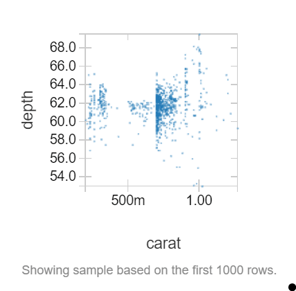
In this data frame, we want to see if there is a relationship between the depth of a diamond and its carat value. Let’s create a scatter plot to see if there is:
Doesn’t look like it.
Now that we’ve got some cool visualizations in our Databricks notebook, we can consolidate these into a pretty neat dashboard.
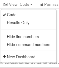
To do this, we can use the drop down menu in our notebook where it says view: Code and click New Dashboard:
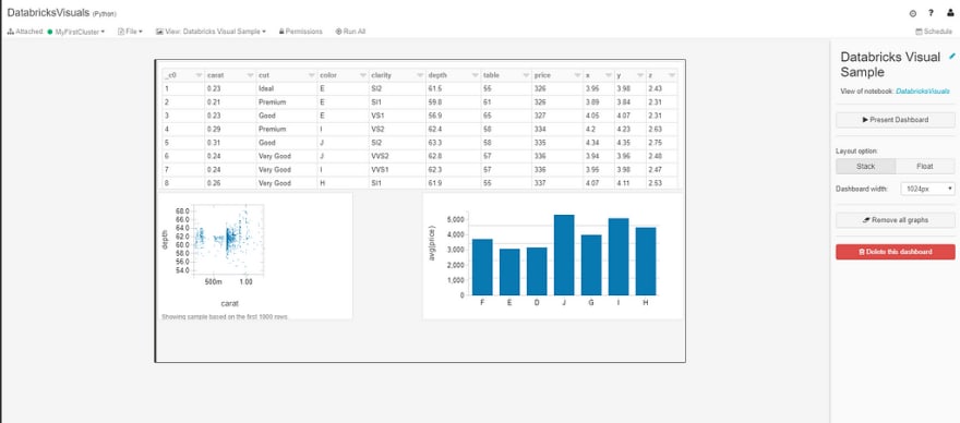
Here we can move our visuals around to create a dashboard like so:
Here we can move our visuals around to fit our dashboard. The controls are pretty simple, we can choose a layout option (either stacked or floated) and a dashboard width.
Dashboards can either be really simple in Databricks. We can do a quick and dirty mock up like the one we’ve just produced or we add some complexity to them by creating a scheduled job to refresh it. For example, if we create a dashboard that provides visuals to a streaming job, we can create a job that updates this every so often.
While the visualization tools in Databricks are good, they aren’t as comprehensive as Power BI. Let’s connect our data to Power BI now.
Connecting Databricks to Power BI Desktop
Power BI provides interative data visualizations that enables users to create reports and dashboards. With Azure Databricks, you can bring in the performance benefits to all business users. Particularly, you can use DirectQuery to offload the processing responsibilities to Azure Databricks which will deal with the vast quantities of data that we don’t necessarily want in Power BI.
Power BI comes with a built in Spark connector which allows us to connect to our clusters in Databricks. In order to connect to your clusters, you will need to generate a personal access token in Databricks.
First, let’s save our diamonds dataframe as a global table inside Databricks. Global tables are available to all clusters.
# save diamonds dataframe as a global table
diamonds.write.saveAsTable("diamonds")
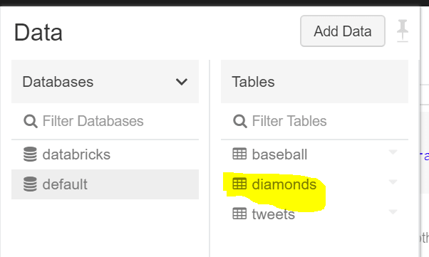
Let’s confirm that our table has been created by checking out our data tab:
Sweet, now that we’ve saved our table, let’s connect it to Power BI. First, we’ll need to get our JDBC (Java Database Connectivity) server address. Go to the clusters UI and select the cluster you want to connect to. On the edit page, scroll down and select the JDBC/ODBC tab.
Here, we see a bunch of values that we’ll need to connect to Power BI. I’m hiding my values on purpose from you, but you’ll need an address in the following format:
https://<server-host>:<port>/sql/protocol/o/<key>/<key>
The two keys at the end will be in your JDBC URL text box, so just copy and paste those values.
Once you have the url, go to Power BI and click Get Data in the toolbar and then click More…
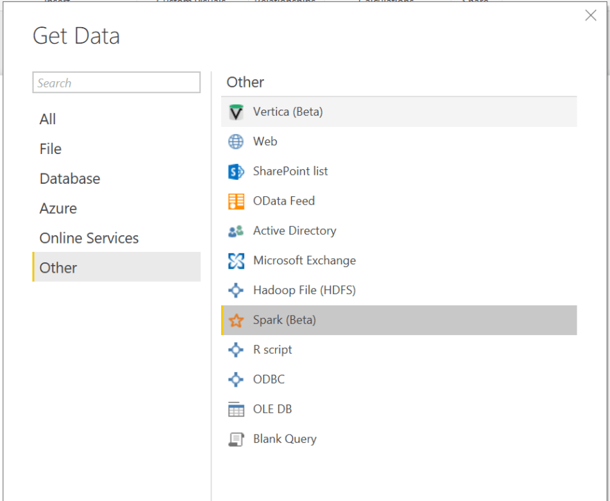
In the Get Data dialog, we’ll need to look for the Spark (beta) connector:
Click Connect. Enter the URL we constructed earlier, use HTTP as the protocol and select DirectQuery as the Data Connectivity Mode. This will allow us to offload processing to Spark (as explained earlier).
Now we’ll need to login into the cluster. Use ‘token’ as the username and use the token for the password (make sure you’ve generated a token before doing this). Click Connect to connect to your cluster.
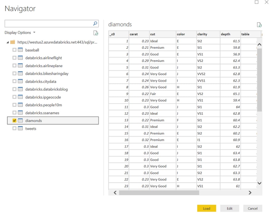
If everything works, you should be able to see all your tables in the Navigator dialog. Select the diamonds table and you’ll see a preview of our data:
We can edit our data import as we would with any data source in Power BI or we can just load it all in. Let’s do the latter! Click Load to get started.
Working with Data inside Power BI
Now that our Databricks table is available to us inside Power BI, we can start creating some awesome visualizations.
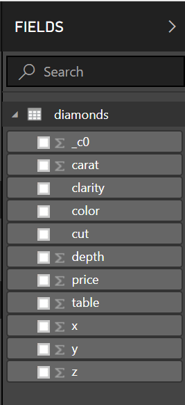
In the fields tab, we can see our table that we imported along with it’s respective columns:
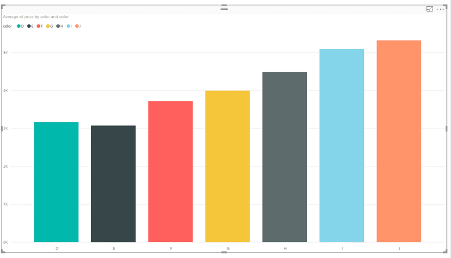
Let’s try and create our bar chart of average prices per color that we did in Databricks. From the fields tab, check the color and price check-boxes to insert those fields into our dashboard.
Now, we want to choose a “Stacked Column Chart” for our visualisation. We’ll need to change a couple of things to make our chart look good. In our visualizations tab, we’ll want to set our axis to color, choose color for our legend and set the value to the average of our price column. It should like this:
Our end result should look something like this:
This is a very simple example that we’ve created here, but hopefully you now know the basics of importing data from Databricks in Power BI
Conclusion
In this blog post, we’ve taken a simple csv file (that’s already loaded in Azure Databricks for us!) and turned it into a Data Frame in Python and applied some cool visualizations on it. We then saved our DataFrame as a table and connected our cluster to Power BI and applied some visualisations on our tables.
You may wonder why we are actually doing visualizations in two separate places. Databricks is a great tool for Data Engineers and Data Scientists to work together in a unified analytics workflow, but not all business users will be able to use a tool like Databricks and will be much more comfortable using a simple tool like Power BI (essentially a drag and drop tool with a jetpack) for their reporting needs.
This example takes data in the cloud and pulls it back down into Power BI Desktop. A more cost efficient strategy would be to use a tool like Power BI Online so the data stays in the cloud, so bear this in mind for production scenarios.
I hope you got some value out of this tutorial. If you have any questions, feel free to ask them in the comments.




Top comments (1)
This is nice!