
Hey Rustacean 👋!
Let's be real for a sec; Nothing kills a great user experience like an app that ignores your light/dark theme preference. One minute you're vibing in a chill dark mode, next minute: BLINDING WHITE SCREEN
We've all been there.
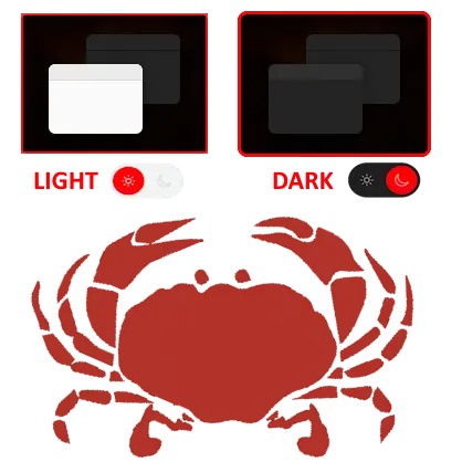
That's why we're excited to introduce Theme, a slick, flexible, no-nonsense theme manager for WASM apps. It handles light, dark, and everything in between (yes, even custom solarized setups, you nerds 🌞🌚).
It's the theming solution your app deserves, easy to drop in, works out of the box, and plays nicely with Tailwind, DaisyUI, and your questionable late-night color choices.
Let's take a look!

🌈 What Is Theme?
Theme is a simple, powerful component for managing theming in your WASM app. It does the hard work, like syncing across tabs, respecting system settings, and storing preferences, so you don't have to.
You just wrap your app with a ThemeProvider, and BOOM: instant style wizardry.
<ThemeProvider default_theme={Theme::System}>
    <App />
</ThemeProvider>
Yes, it even switches automatically between light and dark based on your OS settings. It's basically psychic.
⚡ Quick Setup
1. Add it to your Cargo.toml
cargo add theme --features=yew
2. Import the magic
use theme::yew::ThemeProvider;
use theme::{Theme, StorageType};
3. Wrap your app
<ThemeProvider
    default_theme={Theme::System}
    storage_type={StorageType::LocalStorage}
    storage_name={"theme"}
    custom_themes={my_themes}
>
    <App />
</ThemeProvider>
Congrats, your app is now self-aware and stylish.
🎨 Add Your Own Themes
Wanna roll your own vibes? You can define custom themes like so:
custom_themes.insert(
    "solarized".to_string(),
    Rc::new(CustomTheme {
        name: "solarized".to_string(),
        base: None,
        tokens: ColorTokens {
            primary: "#268bd2".to_string(),
            secondary: "#2aa198".to_string(),
            background: "#fdf6e3".to_string(),
            text: "#657b83".to_string(),
            error: Some("#dc322f".to_string()),
            warning: Some("#cb4b16".to_string()),
            success: Some("#859900".to_string()),
        },
    }),
);
This is not a drill, your brand colors can finally shine in full glory.
🧠 Theme Context Hook? Yes, please!
Need to toggle themes from a button or keyboard shortcut? Use the use_theme() hook:
let ctx = use_theme();

let onclick = {
    let set_theme = ctx.set_theme.clone();
    Callback::from(move |_| set_theme.emit(Theme::Dark))
};
🚨 Pro tip: You can also reset to system default or preview themes temporarily. No reloads. No drama.
🧰 Tailwind, Meet Theme
Working with Tailwind (v3 or below) or using DaisyUI? Theme sets:
data-themeclass-
color-scheme(on the root element)
Automatically. You don't even need to lift a tail... er, finger 🐶.

🧪 Full Control with Props
Locking in a theme? Adding runtime validation? Syncing across windows? There's a prop for all of it.
| Prop | What It Does |
|---|---|
default_theme |
Starts the app in light, dark, or system mode. |
storage_type |
Local or session storage? You pick. |
forced_theme |
Lock to a specific theme (great for demos or trolling coworkers). |
custom_themes |
Bring your own themes!. |
reset_to_system, apply_preview, set_custom_theme
|
Hooks for advanced control & UX magic. |
🧠 Bonus Brainy Features
- ⏱ Time-based fallback: No preference? Default to light during the day, dark at night.
- 🖇 Cross-tab syncing: Share themes across all open windows.
- 🪝 Hooks first: Easy to access and control the current theme in any component.
- 🧪 Custom validation: Every theme goes through a little quality check before being accepted.
🚀 Final Thoughts
Theming shouldn't be a pain. And with Theme, it isn't. From system-based switching to full control, or even total chaos with 10 custom themes, Theme has your back. It's lightweight, declarative, and built for WASM apps.


🎨 Theme


🎬 Demo
| Framework | Live Demo |
|---|---|
| Yew | |
| Dioxus | |
| Leptos | TODO |
📜 Intro
Theme is a flexible, declarative, and type-safe theming system for Rust-based WASM frameworks like Yew, Leptos, and Dioxus. It provides structured and composable themes, including support for dark/light/system themes and custom color palettes with runtime composition and validation.
🤔 Why Use Theme?
-
🌗 Light, Dark, and System Themes: Built-in support for light, dark, and system-preferred themes.
-
🎨 Custom Themes with Composition: Define your own themes with optional inheritance from base themes.
-
🧪 Type-Safe Color Tokens: Validate hex codes at runtime.
-
📦 Persistent Theme Selection: Persist user-selected themes using
LocalStorageorSessionStorage. -
♻️ Runtime Composition with Inheritance: Inherit and override from base themes dynamically at runtime.
-
🎛️ Tailwind & DaisyUI Compatible: Use custom themes to generate CSS variables that integrate smoothly with Tailwind CSS and DaisyUI…
We are Open SASS, babe!.
We're working tirelessly on making Rust web development extremely easy for everyone.
If you made it this far, it would be nice if you could join us on Discord.
Till next time 👋

Top comments (0)