
Designers Beware. I am in no way a designer. I do not claim to be. Choices I make in this post reflect that.
Put away the IDE, open the blinds, get some sun, some coffee, some energy. Today, we’re talking design. More specifically, we’re going to talk about how to work with Material UI in your FERN stack project.
We’ll pick up from where we left off, last time, we made our app fully CRUDdy, implementing edit and delete routes. Today, we’re going to work in the area where I am least comfortable. I am happy to admit that I’m not a designer. I do understand the basics, and I am excited to take you through getting your web app set up with Material UI’s incredibly powerful theming tools.
Like I said from the top, we’re putting away our IDEs to start. Head over to Figma and start up a new canvas. For this, I’m going to work on a Wireframe.

The two big decisions you have to make when getting started are your typography and your colour palette. When getting started, and for maximum compatibility, I like to use Google Fonts to select my typefaces. I usually start with typography, as it gives me the opportunity to select my colours to match my font-faces. Again, I don’t claim to be a designer, that might be terrible advice.
Getting started with our theme
Typography ABC
Anyways, Material UI provides 13 variants by default. They are:
- h1
- h2
- h3
- h4
- h5
- h6
- subtitle1
- subtitle2
- body1
- body2
- button
- caption
- overline
Which, represented visually in the Roboto font, looks like this:

Now, you don’t have to define all of these, I usually do at least: H1-H6, body1, and body2. Now before we get started, it’s also important to remember this note from Material UI:
MUI uses
remunits for the font size. The browser<html>element default font size is16pxbut browsers have an option to change this value, soremunits allow us to accommodate the user's settings, resulting in a better accessibility support. Users change font size settings for all kinds of reasons, from poor eyesight to choosing optimum settings for devices that can be vastly different in size and viewing distance.
I usually like to pick a Display or Serif font for my headers. Something with a lot of different styles so that we can vary our weights. Today I’m going with Roboto Slab for my fancy font, and I’ll use Roboto as my body font. Now, in Figma, I’m going to test this out. Something to remember here is that we’re basing this on rem units, and the browser default is 16px. We’re going to use this as our body1. From there, we will adjust font sizes relative to 16px (relative em).
For my *******body2******* I want a slightly smaller font, something like 90% of the body 1. That can be noted in CSS as .9rem. In Figma, you can multiply sizes, so you can type into the font-size box “16*.9”, and it will provide you with the desired results. If you hate doing math (why are you in this field), you can use Code Beautify’s REM to PX converter tool.
Type some lorem, or get ChatGPT to give you some copy, and give yourself some body text!

Wow, incredible stuff. You can see I’ve thrown some Bolding in there to help us get a feel for how that will look. Now let’s get started with headers! With our headers, we want to be able to add a variety of emphasis types throughout our site. It’s important to make use of your Font Weights to add differentiation.
I’m going to start with my H6 at 1.25rem, or 20pt, and scale upward from there (H5 at 1.5rem, H4 at 1.75rem, etc). With that, our Figma will look like this:

That’s a good start, but with font weight we can add some variety and have some typography that will stand out a bit.
By adjusting our font weights, we’ve create a varying mix of appealing headers, which we can use throughout our project.

🌈 Colour 🟦🟪🟩
Next, let’s talk about color, or as I like to call it, colour. With Material UI, we can theme the following:
primary - used to represent primary interface elements for a user. It's the color displayed most frequently across your app's screens and components. - defaults to #1976d2
secondary - used to represent secondary interface elements for a user. It provides more ways to accent and distinguish your product. Having it is optional. - defaults to #9c27b0
error - used to represent interface elements that the user should be made aware of. - defaults to #d32f2f
warning - used to represent potentially dangerous actions or important messages. - defaults to #ed6c02
info - used to present information to the user that is neutral and not necessarily important. - defaults to #0288d1
success - used to indicate the successful completion of an action that user triggered. - #2e7d32
Within each of those colours, we can specify a Primary, a Dark, a Light, and a Contrast Text. We’re also able to theme our Background colour, with 2 options, one for the primary background colour, and one for “Surfaces” called Paper or Card. To take MUI’s definition:
The background of an application resembles the flat, opaque texture of a sheet of paper, and an application's behavior mimics paper's ability to be re-sized, shuffled, and bound together in multiple sheets.
When it comes to defining a colour palette, it’s great to find colours that are meaningful and speak to you in some way. Or, if you’re struggling to find inspiration, use a generator! I love coolers.co. It’s a great, free way to quickly cycle through complimentary colours, locking in the ones you like. They have some cool pro features like contrast checking and trending palettes. It’s also great for finding the Light and Dark shades of your palette.
Because it’s 2023, I know the vast majority of people are using Dark Mode by default. MUI does offer some strong Dark Mode/Light Mode theming capabilities, but for now, let’s stick with our basic colour scheme. I’m personally going to define: A background colour, a Paper colour, a Primary colour, and a Secondary colour.
Using Cooler, I came up with the following:
Background: default: #1D1A31, paper: #272343
Primary: main: #A12B49, light: #D04E6E, dark: #511524, contrastText: #EBEBEB
Secondary: main: #59C3C3, light: #87D4D4, dark: 1B4B4B, contrastText: #1D1A31
Using their contrast checker, we can tell this is going to be a decently versatile colour scheme:
 colour combinations; Right: All possible combinations](https://res.cloudinary.com/practicaldev/image/fetch/s--cu3zlCZH--/c_limit%2Cf_auto%2Cfl_progressive%2Cq_auto%2Cw_800/https://dev-to-uploads.s3.amazonaws.com/uploads/articles/ojef6771lg2x6fz8ond1.png)
Left: WCAG Contrast Minimum Compliant colour combinations; Right: All possible combinations
Now, let’s apply this to our Figma sheet. Apply your background colour to the document, and create a rectangle of 800px by 800px, centre it and change it to your Paper colour. Centre your text inside your paper, and change it to the contrastText colour. Then, create swatches for each of your primary and secondary colours, and all of their shades, with labelling text. When you’re done, it should look something like this:
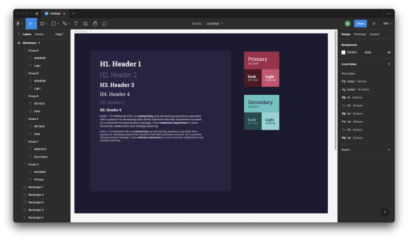
Play around with your colours and find a palette that works for you! You can also use this to see how your text will look on a page, and what your interactive icons might look like. For example, we know that your Button is going to be in your Primary colour. I can see how this might look by placing a 30px tall Rectangle, with 5px corners, and a drop-shadow. You’re of course able to customize your buttons further, but this will give you a general impression of how they’ll look “out of the box”.

Once you’re comfortable with your palette and typography, let’s launch our IDE and get theming!
Implementing our theme 🎨🖌️
Open your project, and start your backend with npm run start , open a new terminal, and throw in an cd client && npm run dev. You can open up your app in a browser window, and you should be greeted with our very basic page:

Now, let’s get started by installing our fonts. If you’re using Google Fonts, you can navigate to the font’s page, and select the variants you want to include in your project, and then getting the import tag for your selected fonts. Mine looks like this:
<link rel="preconnect" href="https://fonts.googleapis.com">
<link rel="preconnect" href="https://fonts.gstatic.com" crossorigin>
<link href="https://fonts.googleapis.com/css2?family=Roboto+Slab:wght@100;200;300;400;500;600;700;800;900&family=Roboto:ital,wght@0,400;0,700;1,400;1,700&display=swap" rel="stylesheet">
Take a look at the MUI Installation Instructions if you’re unsure.
Throw those tags into the head of your index.html, which should look something like this:
<!DOCTYPE html>
<html lang="en">
  <head>
    <meta charset="UTF-8" />
    <meta name="viewport" content="width=device-width, initial-scale=1.0" />
    <title>FERN Stack</title>
    <link rel="preconnect" href="https://fonts.googleapis.com">
    <link rel="preconnect" href="https://fonts.gstatic.com" crossorigin>
    <link
      href="https://fonts.googleapis.com/css2?family=Roboto+Slab:wght@100;200;300;400;500;600;700;800;900&family=Roboto:ital,wght@0,400;0,700;1,400;1,700&display=swap"
      rel="stylesheet">
  </head>
  <body>
    <div id="root"></div>
    <script type="module" src="/src/main.jsx"></script>
  </body>
</html>
Congrats, those fonts are now installed! Let’s put them to use. First, we have to create our theme file. This is where we will define and update all of our theming options moving forward. Create a new file called client/src/theme.js, and let’s build our theme!
import {createTheme} from '@mui/material/styles';
const theme = createTheme ({
  palette: {
    primary: {
      main: '#A12B49',
      dark: '#511524',
      light: '#D04E6E',
      contrastText: '#EBEBEB',
    },
    secondary: {
      main: '#59C3C3',
      dark: '#1B4B4B',
      light: '#87D4D4',
      contrastText: '#272343',
    },
    background: {
      default: '1D1A31',
      paper: '272343',
    },
    text: {
      primary: 'EBEBEB',
      secondary: '1D1A31',
    },
  },
  typography: {
    fontFamily: "'Roboto', sans-serif",
    h1: {fontSize: '2.rem', fontFamily: "'Roboto Slab', serif",},
    h2: {fontSize: '2.25rem', fontFamily: "'Roboto Slab', serif",},
    h3: {fontSize: '2rem', fontFamily: "'Roboto Slab', serif",},
    h4: {fontSize: '1.75rem', fontFamily: "'Roboto Slab', serif",},
    h5: {fontSize: '1.5rem', fontFamily: "'Roboto Slab', serif",},
    h6: {fontSize: '1.25rem', fontFamily: "'Roboto Slab', serif",},
    body1: {fontSize:'1rem', fontFamily: "'Roboto Slab', serif",},
    body2: {fontSize: '.9rem', fontFamily: "'Roboto Slab', serif",},
  },
});
export default theme;
In the above, I’ve defined all of the same colours and theming that we went through earlier in Figma to our MUI theme. This is by no means a comprehensive theme, and there are a lot of options available. I recommend reading MUI’s theming documentation.
Now we have our theme defined. It’s time to implement it. Just as we did previously with our AuthProvider, PageLayout, and PrivatePage, we’re going to create a context to define our theme throughout our project. Because we don’t have many variables to define, we can do so right in our App.jsx file.
// App.jsx
{/* Other imports */}
import { ThemeProvider } from '@mui/material';
import theme from './theme';

const App = () => {
    {/*Hooks, Handlers */}
    return (
    <Router>
      <QueryClientProvider client={queryClient}>
        <AuthProvider>
          <ThemeProvider theme={theme}>
            <PageLayout routes={routes}>
              <Suspense fallback={<div>Loading...</div>}>
                <Routes>
                  {routes.map (
                    (route, index) =>
                      route.isPrivate
                        ? <Route
                            key={index}
                            path={route.path}
                            element={
                              <PrivatePage component={route.component} />
                            }
                          />
                        : <Route
                            key={index}
                            path={route.path}
                            element={<route.component />}
                          />
                  )}
                </Routes>
              </Suspense>
            </PageLayout>
          </ThemeProvider>
        </AuthProvider>
      </QueryClientProvider>
    </Router>
  );
};
export default App;
Now, we can access our theme throughout our project! And if you navigate home, you’ll see that your colours have been impleme-

What the heck? That’s our Primary colour, alright, but nothing has been implemented anywhere else. Earlier, when we create our PageLayout.jsx, we got started with implementing MUI, but stop short of actually providing the app with a global theme.
Let’s do that now. Head over to our PageLayout file, which currently looks like this:
//PageLayout.jsx
import React from 'react';
import Typography from '@mui/material/Typography';
import Grid from '@mui/material/Grid';
import Container from '@mui/material/Container';
import Navbar from '../components/NavBar';

const Footer = () => (
  <Grid item xs={12} sx={{py: 3, mt: 'auto', backgroundColor: '#f8f8f8'}}>
    <Container maxWidth="sm">
      <Typography variant="body2" color="text.secondary" align="center">
        © {new Date ().getFullYear ()} My first FERN App!
      </Typography>
    </Container>
  </Grid>
);

const PageLayout = ({children, routes}) => (
  <Grid container direction="column" minHeight="100vh">
    <Grid item xs={12}>
      <Navbar routes={routes} />
    </Grid>
    <Grid item xs={12} py={4}>
      <Container component="main">
        {children}
      </Container>
    </Grid>
    <Footer />
  </Grid>
);

export default PageLayout;
And update it to implement our new theme! It’s incredibly straightforward to use MUI theming in any component wrapped in the Provider.
//PageLayout.jsx
import React from 'react';
import Typography from '@mui/material/Typography';
import Grid from '@mui/material/Grid';
import Container from '@mui/material/Container';
import Navbar from '../components/NavBar';

const Footer = () => (
  <Grid item xs={12} sx={{py: 3, mt: 'auto', backgroundColor:'background.paper'}}>
    <Container maxWidth="sm">
      <Typography variant="body2" color="text.primary" align="center">
        © {new Date ().getFullYear ()} My first FERN App!
      </Typography>
    </Container>
  </Grid>
);

const PageLayout = ({children, routes}) => {
  return (
    <Grid container direction="column" minHeight="100vh" sx={{backgroundColor:\`background.default\`}}>
      <Grid item xs={12}>
        <Navbar routes={routes} />
      </Grid>
      <Grid item xs={12} py={4}>
        <Container component="main">
          {children}
        </Container>
      </Grid>
      <Footer />
    </Grid>
  );
};

export default PageLayout;
As you can see, we can define our colours with “text.primary”, or “background.paper”, and it will reflect on all of our MUI components:

And we can easily add a pop of colour with some quick adjustments! Let’s make our footer use our Secondary colour:
const Footer = () => (
  <Grid item xs={12} sx={{py: 3, mt: 'auto', backgroundColor:'secondary.main'}}>
    <Container maxWidth="sm">
      <Typography variant="body2" color="secondary.contrastText" align="center">
        © {new Date ().getFullYear ()} My first FERN App!
      </Typography>
    </Container>
  </Grid>
);
You can see there, I’ve defined the background colour with secondary.main, and the text with secondary.contrastText.
Now we have a very bright, colourful screen, matching the palette we defined earlier:

But wait! I hear you calling out, *************the title text doesn’t match!*************
Very observant, audience member. That’s because when we defined our very basic routes in the early stages, we hadn’t yet implemented MUI. Let’s update our Home and About pages.
Before:
//About/Home.jsx

const About/Home = () => {
    return(<h1>About/Home</h1>)
};
export default About/Home;
After:
//About/Home.jsx

import { Typography } from "@mui/material";

const About/Home = () => {
    return(<Typography variant="h1">About/Home</Typography>)
}
export default About/Home;
Ok, so now our font is in place, but our text colour isn’t implemented correctly. We have a couple of ways that we can approach this. We can either apply a color rule in our theme to allVariants, apply it to each of our Headers, and body text objects, or, and this is the path I’m going to go, apply it to the parent component, in this case our Container component in page layout.
const PageLayout = ({children, routes}) => {
  return (
    <Grid container direction="column" minHeight="100vh" sx={{backgroundColor:\`background.default\`}}>
      <Grid item xs={12}>
        <Navbar routes={routes} />
      </Grid>
      <Grid item xs={12} py={4}>
        <Container component="main" sx={{color:'text.primary'}}>
          {children}
        </Container>
      </Grid>
      <Footer />
    </Grid>
  );
};
And just like that, we’ve applied our theme. Let’s throw some text onto our home page, build a sign up button, and then we’ll check out the Theme on our login and dashboard pages! Here’s our updated Home page:
//Home.jsx

import {Button, Grid, Typography} from '@mui/material';
import { useNavigate } from 'react-router-dom';

const Home = () => {
    const navigate = useNavigate()
    const handleSignUpClick = () => {
        navigate('/login');
    }
  return (
    <Grid container maxWidth={'sm'}>
        <Grid item component={Typography} variant="h1" xs={12}>FERNShoppr</Grid>
        <Grid item component={Typography} variant="h5" xs={12} pb={2}>Your Ultimate Grocery Shopping Companion</Grid>
        <Grid item component={Typography} xs={12} variant="body1">Welcome to FERNShoppr, the most user-friendly and efficient app designed to simplify your grocery shopping experience. Say goodbye to the days of forgotten shopping lists and last-minute store runs. With our app, you'll be able to create, organize, and manage your grocery lists with ease.</Grid>
        <Grid item component={Button} onClick={handleSignUpClick} variant='contained' my={4}>Sign up!</Grid>
    </Grid>
    );
};
export default Home;

And our button takes us to our Login page, which will look a little something like this!

I’m not loving how our text field looks, but we’ll revisit that shortly. Log in, and we’ll be greeted with our list, as we left it:

Ok. So we obviously have some issues to address with how we’re applying our theme. Let’s start with our buttons. The primary action with our buttons is to check them off. So let’s apply our theme. Head into GroceryListItem, and update our IconButton component:
//GroceryListItem.jsx

{/* Imports */}

const GroceryListItem = ({
  item,
  handleitemcheck,
  handleRemoveClick,
  onEdit,
}) => {
  {/* States, Handlers, etc. */}

return (
      <Grid container>
        <Grid item component={List} xs={12} sm={8} sx={{margin: '0 auto'}}>
          {Object.values (groceryItems)
            .filter (item => !item.checked)
            .map (item => (
              <GroceryListItem
                item={item}
                handleitemcheck={handleItemCheck}
                key={item.id}
                handleRemoveClick={handleRemoveClick}
                onEdit={handleItemEdit}
              />
            ))}
        </Grid>
        <CheckedItems items={checkedItems} handleItemCheck={handleItemCheck} handleRemoveClick={handleRemoveClick} onEdit={handleItemEdit}/>
        <Grid container justifyContent={'center'} py={2}>
          <Grid
              item
              xs={6}
              sm={2}
              variant={'contained'}
            >
              <Button
                disabled={!checkedItems.length}
                variant={'contained'}
                onClick={() => handleRemoveClick(checkedItems)}
              >
              Complete trip
              </Button>
            </Grid>
        </Grid>
      </Grid>
    );
};
export default GroceryListItem;
Here you can see, we have separated the IconButton from the Grid item, this is to ensure the correct sizing of the button. Then, we apply our background colour. We also got rid of the colours on the buttons, as they don’t work all that well with the new theme colours.
//GroceryListItem.jsx
{/*imports and handlers*/}
  return (
    <Grid container alignItems={'center'}>
      <Grid item xs={2}>
        <Grid container>
          {isEditable &&
            <Grid
              item
              xs={12}
              sm={6}
            >
              <IconButton
              sx={{backgroundColor:'secondary.dark'}}
              onClick={handleEdit} >
              <ClearIcon />
              </IconButton>
            </Grid>}
          <Grid item xs={12} sm={6}>
            <IconButton
              onClick={!isEditable ? handleEdit : handlePublishChanges}
              sx={{backgroundColor: 'secondary.main'}}
            >
              {!isEditable
                ? <EditIcon />
                : <PublishedWithChangesIcon />}
            </IconButton>
          </Grid>
        </Grid>
      </Grid>
      <ListItemForm
        item={item}
        inputValues={inputValues}
        handleChange={handleChange}
        isEditable={isEditable}
      />
      <Grid item xs={2}>
        <IconButton
          onClick={handleClick}
          sx={{backgroundColor: 'primary.main'}}
        >
          {isEditable
            ? <ClearIcon />
            : item.checked ? <AutoRenewIcon /> : <CheckIcon />}
        </IconButton>
      </Grid>
    </Grid>
  );
};
export default GroceryListItem;

Ok, that’s some significant progress. We’re using our secondary colours and depth to signify the importance of our actions. But I’m not sure we’ve resolved the biggest issues with our design here. Let’s take another look at MUI’s Paper component. It’s a great way to differentiate surfaces from one another. We want to make it clear that the header up top isn’t really part of the workspace, and Paper is a great way to accomplish that. Let’s wrap the entire dashboard in a Paper, and give it some padding:
// Dashboard.jsx
import React, {useContext} from 'react';
import {Box, Paper, Typography} from '@mui/material';
import GroceryItemInputForm from '../components/GroceryItemInputForm';
import GroceryList from '../components/GroceryList';
import { useQueryClient } from 'react-query';
import { AuthContext } from '../contexts/AuthProvider';

const Dashboard = () => {
  const {currentUser} = useContext(AuthContext);
  const queryClient = useQueryClient()
  const token = currentUser.accessToken;
  return !currentUser
    ? ''
    : <Box display="flex" flexDirection="column" alignItems="center">
        <Typography variant="h3" mb={3}>
          Welcome to the Dashboard!
        </Typography>
        <Typography variant="h5" mb={2}>
          {currentUser ? \`Logged in as ${currentUser.email}\` : ''}
        </Typography>
        <Paper sx={{padding:6}}>
        <GroceryItemInputForm token={token} queryClient={queryClient}/>
        <GroceryList token={token} />
        </Paper>
      </Box>;
};

export default Dashboard;

Ok, awesome, we have some solid differentiation! Now, before we get to our form issue, we’re going to have to refactor the Dashboard to use the Grid system. From the docs: “The Material Design responsive layout grid adapts to screen size and orientation, ensuring consistency across layouts.” We’ve already used it a bit in this project, and I’ve touched on breakpoints previously. Now, we’ll implement it on the dashboard.
import React, {useContext} from 'react';
import {Box, Grid, Paper, Typography} from '@mui/material';
import GroceryItemInputForm from '../components/GroceryItemInputForm';
import GroceryList from '../components/GroceryList';
import {useQueryClient} from 'react-query';
import {AuthContext} from '../contexts/AuthProvider';

const Dashboard = () => {
  const {currentUser} = useContext (AuthContext);
  const queryClient = useQueryClient ();
  const token = currentUser.accessToken;
  return !currentUser
    ? ''
    : <Grid container justifyContent={'center'}>
        <Grid item xs={12} textAlign={'center'}>
          <Typography variant="h3">
            Welcome to the Dashboard!
          </Typography>
          <Typography variant="h5" mb={2}>
            {currentUser ? \`Logged in as ${currentUser.email}\` : ''}
          </Typography>
        </Grid>
        <Grid sx={{width: '100%'}}>
          <Grid item xs={12} sm={8} sx={{ margin: '0 auto', display: 'flex' }}>
            <Paper sx={{ padding: 6, boxSizing: 'border-box', width: '100%' }}>
              <GroceryItemInputForm token={token} queryClient={queryClient} />
              <GroceryList token={token} />
            </Paper>
          </Grid>
        </Grid>
      </Grid>;
};

export default Dashboard;
Here’ with the xs of 12, we are defining that each of these items should take up their entire row, no matter the screen size. We’re also fixing the width of the paper element, so that it doesn’t change with the contents of the inner components.
And now looks like this:

Looks the way we expect it to, on Desktop or mobile. And we can move things around our grid using our breakpoints. Ok. Let’s get the core issue resolved. We need to fix our colours. Lets start with our Form. We’re going to make use of MUI’s theme style override functionality. Essentially, it works like this:
const theme = createTheme({
// Other theme rules
  components: {
    // Name of the component
    MuiInputLabel: {
      styleOverrides: {
        // Name of the slot
        root: {
          // Some CSS
          color: '#1B4B4B',
        },
      },
    },
  },
});
We can use similar overrides on our other components as well:
MuiListItemText: {
      styleOverrides: {
        secondary: {
          color: '#EBEBEB',
        },
      },
    },
MuiOutlinedInput: {
      styleOverrides: {
        notchedOutline: {
          borderColor: '#1B4B4B',
        },
      },
    },
Note that in this case, we are specifically naming the slot item. In the case of the ListItemText, we don’t need to override the primary, and we only need to change the colour of the outline of our inputs.
Finally, let’s play with the spacing of our list items, and get our buttons a bit more aligned.
//GroceryListItem.jsx

return (
    <Grid container alignItems={'center'}>
      <Grid item xs={1} mx={1}>
        <Grid container>
          {isEditable &&
            <Grid item xs={12} py={1}>
              <IconButton
                sx={{backgroundColor: 'secondary.dark'}}
                onClick={handleEdit}
              >
                <ClearIcon />
              </IconButton>
            </Grid>}
          <Grid item xs={12} py={1}>
            <IconButton
              onClick={!isEditable ? handleEdit : handlePublishChanges}
              sx={{backgroundColor: 'secondary.main'}}
            >
              {!isEditable ? <EditIcon /> : <PublishedWithChangesIcon />}
            </IconButton>
          </Grid>
        </Grid>
      </Grid>
      <ListItemForm
        item={item}
        inputValues={inputValues}
        handleChange={handleChange}
        isEditable={isEditable}
      />
      <Grid item xs={1} mx={1}>
        <IconButton
          onClick={handleClick}
          sx={{backgroundColor: 'primary.main'}}
        >
          {isEditable
            ? <ClearIcon />
            : item.checked ? <AutoRenewIcon /> : <CheckIcon />}
        </IconButton>
      </Grid>
    </Grid>
  );
//ListItemForm.jsx
return (
    <Grid item xs={9} sm={9} component={ListItem} key={item.id}>
      {!isEditable
        ? <ListItemText
            primary={item.name}
            secondary={checked ? '' : \`${item.quantity} ${item.measurement}\`}
            sx={{color: isCheckedColor}}
          />
        : <Grid container spacing={1}>
            <Grid item xs={6}>
              <TextField
                id="name"
                value={inputValues.name}
                onChange={handleChange}
              />
            </Grid>
            <Grid item xs={2}>
              <TextField
                id="quantity"
                value={inputValues.quantity}
                onChange={handleChange}
              />
            </Grid>
            <Grid item xs={2}>
              <TextField
                select
                id="measurement"
                value={inputValues.measurement}
                onChange={handleChange}
              >
                {commonMeasurements.map (unit => (
                  <MenuItem key={unit} value={unit}>
                    {unit}{item.quantity > 1 ? 's' : ''}
                  </MenuItem>
                ))}
              </TextField>
            </Grid>
          </Grid>}
    </Grid>
  );
Now, it should look something like this!

Now we’ve learned how to create and implement a theme using MUI. We’ve learned how to implement our theme, import fonts, and override specific aspects of components.
Now, I also absolutely hate this theme, and I’m going to quickly change it before we move on to the next step.
import {createTheme} from '@mui/material/styles';
const theme = createTheme ({
  palette: {
    primary: {
      main: '#008BF5',
      dark: '#00457A',
      light: '#85CAFF',
      contrastText: '#EBEBEB',
    },
    secondary: {
      main: '#FAB2EA',
      dark: '#AD0B8A',
      light: '#FEECFA',
      contrastText: '#1D1A31',
    },
    background: {
      default: '#1D1A31',
      paper: '#403D57',
    },
    text: {
      primary: '#EBEBEB',
      secondary: '#FAB2EA',
      disabled: 'rgba(235,235,235,.7)',
    },
  },
  typography: {
    allVariants: {fontFamily: "'Roboto', sans-serif"},
    h1: {fontSize: '2.rem', fontFamily: "'Roboto Slab', serif"},
    h2: {fontSize: '2.25rem', fontFamily: "'Roboto Slab', serif"},
    h3: {fontSize: '2rem', fontFamily: "'Roboto Slab', serif"},
    h4: {fontSize: '1.75rem', fontFamily: "'Roboto Slab', serif"},
    h5: {fontSize: '1.5rem', fontFamily: "'Roboto Slab', serif"},
    h6: {fontSize: '1.25rem', fontFamily: "'Roboto Slab', serif"},
    body1: {fontSize: '1rem', fontFamily: "'Roboto', sans-serif"},
    body2: {fontSize: '.9rem', fontFamily: "'Roboto', sans-serif"},
  },
  components: {
    MuiInputLabel: {
      styleOverrides: {
        root: {
          color: '#1D1A31',
          fontSize:'.8rem',
        },
      },
    },
    MuiListItemText: {
      styleOverrides: {
        secondary: {
          color: '#EBEBEB',
        },
      },
    },
    MuiOutlinedInput: {
      styleOverrides: {
        notchedOutline: {
          borderColor: '#1D1A31',
        },
        input:{
            fontSize:'.8rem',
            alignContent:'center',
        }
      },
    },
  },
});
export default theme;
As you can see, it’s incredibly easy and fast to update and change your theme. I’m much happier with it now.

Much better!
While this is still a very raw app, we’ve covered all the basics. With the lessons I’ve covered in this stack, you can create a fully functional app. There’s only one thing left to make this a truly full stack course.
Contain & Deploy
There are many, many ways to deploy web applications. Personally, I use a combination of Docker for containerization, and Google Cloud Platform (specifically Cloud Run and Container Registry) for hosting and deployment.
To get started, install Google Cloud CLI and Docker, open a new Terminal window from your project root, and type in gcloud init. This will take you through logging into your account and creating a new project.
Building and Setting up
Next, open a terminal window and navigate to /client. Then, run npm run build. This will create a static build file of your app, which we can serve through our express server!
Now that we’ve built our Static Site, we can hook it up to the express server. Here’s where we left things with our index.js
// index.js

import express, {json} from 'express';
import * as dotenv from 'dotenv';
import cors from 'cors';

import verifyToken from './middlewares/verifyToken.js';
import userRoutes from './userRoutes.js';
dotenv.config ();
const app = express ();
const port = process.env.PORT || 3000;

app.use (cors ());
app.use (json ());

app.use (verifyToken, userRoutes);

app.use ((error, req, res, next) => {
  res.status (500).json ({error: error.message});
});

app.listen (port, () => console.log (\`Express app listening on ${port}\`));
We need to make a few changes to make this happen. We’ve built the app, but we need to tell the server where to access it. We’re going to use the path and url middlewares to help.
import express, {json} from 'express';
import * as dotenv from 'dotenv';
import cors from 'cors';
import path from 'path';
import { fileURLToPath } from 'url';

import userRoutes from './userRoutes.js';
dotenv.config ();
const app = express ();
const port = process.env.PORT || 3000;
const __filename = fileURLToPath(import.meta.url);
const __dirname = path.dirname(__filename);

app.use (cors ());
app.use (json ());
app.use(express.static(path.join(__dirname, './client/dist')));

app.use((req, res, next) => {
  if (req.url.startsWith('/api')) {
  req.url = req.url.substring(4);
    }
    next();
})

app.use (userRoutes);

app.get('/*', async function (req, res) {
  const homePath = path.join(__dirname,"./client/dist/index.html");
  res.sendFile(homePath);
});

app.use ((error, req, res, next) => {
  res.status (500).json ({error: error.message});
});

app.listen (port, () => console.log (\`Express app listening on ${port}\`));
Here, we’re using the path and fileURLtoPath to define the route to the app. Note that it comes after our userRoutes, that’s to ensure that our API calls aren’t lost and rerouted to the app. You’ll also notice we’re using a middleware to sanitize our /api/* calls. This enables us to continue using the app in either dev or production.
Additionally, we have moved the verifyToken middleware into the userRoutes. This ensures that the home path doesn’t get intercepted by the middleware.
The new userRoutes.js looks like this:
import express from 'express';
const router = express.Router ();
import {db} from './firebase.js';
import {ref, set, get, update, remove} from 'firebase/database';
import verifyToken from './middlewares/verifyToken.js';

router.get ('/data', verifyToken, async (req, res, next) => {
  const {userId} = req.body;
  try {
    get (ref (db, 'users/' + userId )).then (snapshot => {
      if (snapshot.exists ()) {
        res.status (200).json (snapshot.val ());
      } else {
        console.log ('No data available');
        res.status(200).json({});
      }
    });
  } catch (error) {
    next (new Error (error.message));
  }
});

router.post ('/data', verifyToken, async (req, res, next) => {

  const {userId, userData} = req.body;

  try {
    await set (ref (db, 'users/' + userId + '/' + userData.id), userData)
      .then (() => {
        res.status (200).json ({...userData});
      })
      .catch (e => {
        throw e;
      });
  } catch (error) {
    next (new Error (error.message));
  }
});

router.put('/data', verifyToken, async (req, res, next) => {
  const { userId, updatedData } = req.body;

  try {
    await update(ref(db, \`users/${userId}/${updatedData.id}\`), updatedData)
      .then(() => {
        res.status(200).json({...updatedData});
      })
      .catch(e => {
        throw e;
      });
  } catch (error) {
    next(new Error(error.message));
  }
});

router.delete('/data', verifyToken, async (req, res, next) => {
  const { userId, items } = req.body;
  console.log(items)
  try {
    for (const item of items) {
      const itemRef = ref(db, \`users/${userId}/${item.id}\`);
      await remove(itemRef)
    }
    res.status(200).json({ message: 'Items deleted successfully' });
  } catch (error) {
    next(new Error(error.message));
  }
});

export default router;
Once you’ve made those changes, you should be able to navigate to https://localhost:3000 (or whatever port you’re testing on), and see your app running in “production”.

Perfect! Let’s get this thing on the web.
🐳 Dockerization 🐳
Now we’re using Docker to create our container. What does that mean? A container is defined by Docker as:
A Docker container image is a lightweight, standalone, executable package of software that includes everything needed to run an application: code, runtime, system tools, system libraries and settings.
It essentially creates a virtual runtime environment that is incredibly lightweight, and executes only our code in a cloud computing environment. In order to give our container the instructions it needs to build and run, we need to create something called a Dockerfile.
Dockerfiles are a text instruction file that provides a list of commands and arguments a user could call on the command line to assemble an image. Let’s build ours!
Create Dockerfile in your root directory, and enter:
FROM node:alpine
WORKDIR /app
COPY package*.json ./
RUN npm install
COPY . .
RUN cd client && npm install && npm run build
ARG PORT=3000
EXPOSE $PORT
ENV PORT=$PORT
CMD npm start
Alright, so what did we do here? First we’re defining our image environment, we’re using a Node.js environment on top of the Alpine Linux distribution.
Next, we define the working directory as /app, and copy the package.json and package-lock.json files from the root into the /app directory. Next, we run npm install to ensure the necessary dependancies are installed.
Then, we copy the contents of our root directory into the working directory, change into our /client, install the necessary dependancies, and create a new build.
We then accept either a port argument, or define it to the default of 3000, we expose that port and define the environment variable.
Finally, with an npm run start, the app will start up.
Before you build your container, make sure you update your package.json with the correct start command. Mine looks like this:
{
  "name": "fern-stack-walkthrough",
  "version": "3.0.0",
  "description": "",
  "main": "index.js",
  "type": "module",
  "scripts": {
    "start": "node index.js",
    "test": "echo \"Error: no test specified\" && exit 1"
  },
  "keywords": [],
  "author": "",
  "license": "ISC",
  "dependencies": {
    "cors": "^2.8.5",
    "dotenv": "^16.0.3",
    "express": "^4.18.2",
    "firebase": "^9.19.1",
    "firebase-admin": "^11.6.0",
    "path": "^0.12.7",
    "url": "^0.11.0"
  }
}
With that done, we’re ready to build our container!
From your project root, type in docker build -t [gcr.io/yourprojectname/yourappname](http://gcr.io/yourprojectname/yourappname) .
Note: if you’re on an M-Series Mac, you will have to use docker buildx build --platform linux/amd64 -t [gcr.io/yourprojectname/yourappname](http://gcr.io/yourprojectname/yourappname) . or the container will experience startup issues.
Depending on a number of factors, this will take up to a few minutes. Once complete, you can test run your Docker container in Docker desktop, or push to Google Container Registry!
Type in docker push [gcr.io/yourprojectname/yourappname](http://gcr.io/yourprojectname/yourappname) and after it pushes, your container is now ready for deployment! Head to Google Cloud Run and click “Create a Service”
Deployment

Select your container, and provide your service with a name. Next, select a region. If you plan on providing your service with a custom domain, and don’t want to rely on complicated custom mapping, make sure you select a region where domains are supported.

Make sure you allow all traffic, and unauthenticated traffic if you plan on making this publicly available.
Below, you’re able to set your PORT, Arguments, runtime variables, and configure secrets.
If you plan to deploy your app to production, I highly recommend using the Secrets Manager API to protect your sensitive keys.
Once you’re happy with the settings, hit Create, and your service will deploy! You’ll get a URL, and your test app is up and running! Mine’s live at https://fernwalkthrough3-rudpxdpghq-uc.a.run.app
If you have any issues or want to make updates, you can follow the same steps as before, make the changes, containerize, push, and then simply hit edit and deploy your new version!
Wrapping Up
This series was really designed to help you get up and running with a solid framework, and understanding of the FERN stack, Material UI, React Query, React Router, and how to get your App online.
I really hope I was able to help you learn something new.
The full repo is available here: https://github.com/wra-sol/fernstack3
Let’s get in touch. Reach out at nathanielarfin.com or in the comments!

Top comments (0)