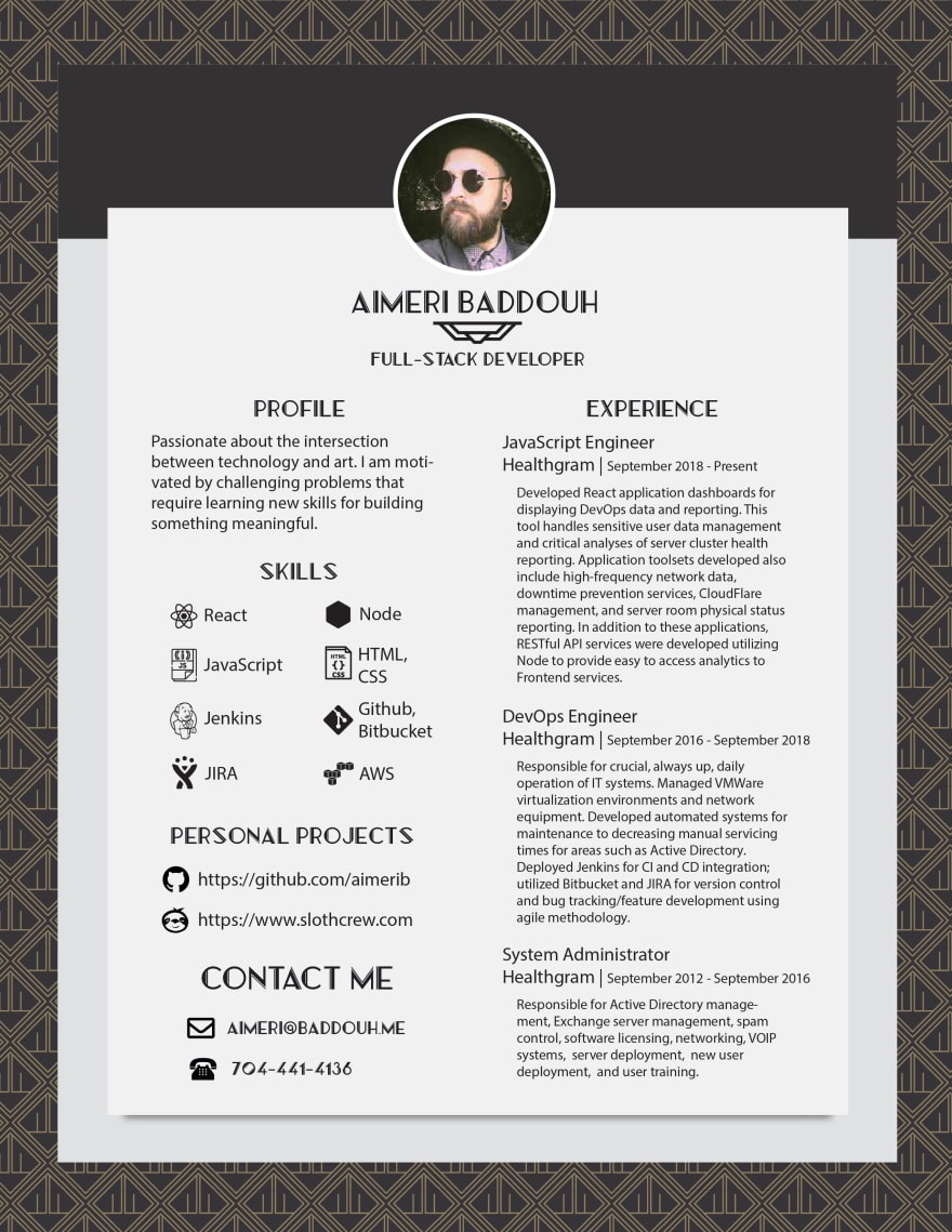
I just saw a post by @ryanmdoyle requesting help with his resume, and I figured I could use some help as well. Some of the advice people gave was really solid, and I have already implemented some of it, but I believe I have a LOT of room for growth.
Please be as nitpicky as possible!
And PDF: https://drive.google.com/open?id=1pQY1SWWVmX9uY3v9BEM7gnv2myYxWkdr
PS: I've seen a lot of comments about pictures in resume. That will probably be the first edit for mine.


Top comments (5)
On the website and on the CV I couldn't find your country anywhere. If you're applying in only one country this doesn't matter so much, though. I'd always keep the phone-number in the standard-format with country-prefix, like "+49 151 555 555".
You mention "intersection between technology and art", yet there's nothing else on the CV to confirm that, or to pick that up. The mentioned projects are tech-only.
I think the headline "PROFILE" is redundant. The whole column is the profile.
It would help the layout to keep the headline-sizes consistent and maybe left-align everything. This could increase readability.
You're giving away lots of room with the darker backdrop-thingie (between background and foreground). Try to ditch that and increase the main space instead. Use the space to add paragraphs to the longish project-descriptions.
The Gatsby-Art-Noveau-Style looks ok, but you have such a unique design going on on Slothcrew.com, especially after "change style". The diagonal look and overall vibrance would definitely stick out more.
Only my personal preferences here :)
Yes, text is very hard to read. I would work on this in first place, because this is the most important part.
So many comments about photos. I've got a flood of comments now so I'll be working on mine today!
I think it’s beautiful. I’ve never seen a resume with such style!