These past few weeks I have been working on a project for fun: a class-less CSS library*.
*I know technically it cannot be considered a library, but for simplicity, I will call it that way, so I don't have to write "a collection of class-less CSS styles" each time :P
The idea is to have a set of styles that can be easily applied to any website to make it look better. Not to make it super-fancy, but definitely better looking than the default display, and as close as possible in every browser.
Differently from other projects like Bootstrap, this is a class-less project: all the styles target the HTML tags so users don't need to add any classes/attributes to them.
The goals of the project were:
- Not using classes or IDs (only tag selectors).
- Cover all HTML5 tags (or as many as possible).
- Making sure it's cross-browser compatible (or as much as possible).
- Make it easily themable (by using HSL colors and CSS variables).
- Ensure responsiveness, accessibility, and usability.
- Have a lightweight build (it is 17KB uncompressed, but 3KB gzipped).
- Keep it simple but elegant (although this is a matter of opinion).
Support-wise, we decided to drop IE11 and focus on Chrome, Edge, Firefox, and Safari (including mobile).
The results
Here is a demo of the results, and some notes about some key parts of it.
Theming
We based the theming on CSS variables and HSL colors. HSL allows defining a color based on three parameters: Hue, Saturation, and Lightness. Provide primary and secondary colors using HSL, and see the demo page change automatically.
The default primary color is a dark pale blue, and the default secondary color is a medium gray.
And there are more parameters that can be changed, not only colors: font size or weight, border-radius, etc. Here are some values that devs can specify:
| Variable | Description | Default Value |
|---|---|---|
--primaryH |
Primary color hue value | 210 |
--primaryS |
Primary color saturation value | 50% |
--primaryL |
Prumary color lightness value | 40% |
--primary-bg |
Primary color background | white |
--secondaryH |
Primary color hue value | 0 |
--secondaryS |
Primary color saturation value | 0% |
--secondaryL |
Prumary color lightness value | 13% |
--secondary-bg |
Primary color background | white |
--font-family |
Set of fonts for the text | Helvetica, Arial, sans-serif |
--font-size-root |
Default font size (root) | 16px |
--font-weight-bolder |
Font weight value (bolder text) | 700 |
--font-weight-bold |
Font weight value (bold text) | 400 |
--font-weight-normal |
Font weight value (normal text) | 200 |
--font-weight-thin |
Font weight value (thin text) | 100 |
--border-radius |
Border radius | 2px |
General typography
For the default font, we opted to go with Helvetica with a fallback on Arial. They are web safe fonts, widely extended, and with many weights to pick from (themable too). Maybe the default weight is actually too thin (especially on mobile).
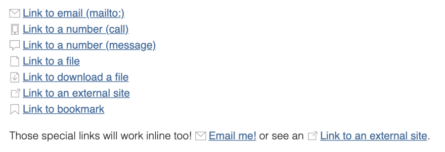
Here how some elements look, plus some special links styled depending on their attributes:
Form elements
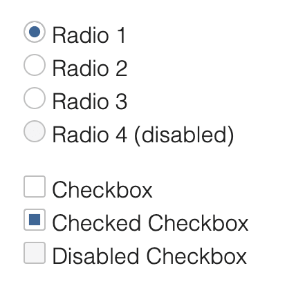
For the form inputs, the decision was styling all the different types of inputs differently by adding an icon that would help identify the fields faster:
Also to use the primary colors for active elements, which would help with the theming later:
You can read about how to create interactive HTML inputs on this other post (the example is related to the time component and animated, but it sets the steps to do something similar to this).
Other elements
There are elements that are common and we had to style to look similar in all the browsers like the table or the buttons:
And then, there are elements that would be a pain to style the same in all browsers (slider, progress bar, input file... to name a few).
For the latter, we opted for at least getting some common ground, like setting the same width/height to similar elements or fording the width to match all browsers.
What's next?
I want to continue developing and extending the library (even if only for fun). Cleaning it up and reorganizing things a little.
For example, right now most of the size of the library is taken by the interactive form inputs and the images. I was thinking about having two variants of the library: one with them and another without them (or maybe an extension to the first one).
While gzipped the difference is not that much; but just minified, the file size jumps to 17KB with images and under 9KB without them.
Also, I wanted to add an extension to add classes that would allow for some fun interactivity and results: different types of tables, "prepackaged" structures...
What do you think? Any feedback? All suggestions are welcome :)


Top comments (4)
Looks great! I really like the idea of keeping it simple. Excuse my ignorance, but I haven't really tried CSS variables yet. Where do you add them and how do you change them?
Also, what do you think about using
margin: { 2rem 0 1rem }for headings and1.8rem lineheightfor paragraphs? I feel it's more readable as a default style for HTML documents.Of course, just my personal opinion :) (also with a small fix on the blockquote)
Here's how it would look:
I like the ideas (especially the line-height on paragraphs). That will be a change that I'll add soon :D
You can add a variable in CSS by defining it like this inside a rule:
--variableName: value;. Then that variable will be available by doingvar(--variableName)within the scope of the rule (e.g. if you define a variable in aul, it will be available in theuland the descendantlis but not outside of it). The cascading applies to them too: if you define them at thehtml,body, or:rootlevel, then they will apply to the whole page; and if you redefine them somewhere in the document, the new redefined value will apply to that scope. (sorry if it's too much, I tried to concentrate the most important info in just a paragraph).The library uses CSS variables at the
:rootlevel, they have some default values, but users can easily overwrite them in their own stylesheet, that will need to be loaded after the almond.css file.I see, started tweaking some variables to see how easy it was to do a mockup dark mode, and it worked well, almost everything looked perfect 💯.
First time I use HSL on CSS, and it's incredibly versatile, never though of it before!
By the way, I added the line-height changes into the library (giving you credit for the suggestion), and made it into a variable too, so users can change it easily (it will apply to paragraphs and lists).
...Looking into the heading margins now :)