
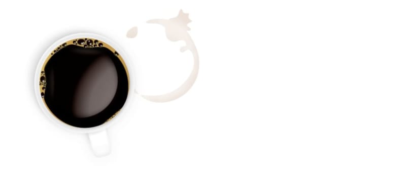
A few weeks ago, I did some CSS Art. This time it was a cup of coffee with a coffee ring stain next to it. All in HTML and CSS –and not as many elements as you'd think... if we don't count the bubbles.
I tried to make it realistic but it was too cartoony/digital. However, I still like how it turned out. Check out the demo and live source code on CodePen:
Now the question is...
How was it done?
I started breaking the drawing into smaller parts (let's apply a "divide-and-conquer" strategy even for illustration): the stain on one side and the coffee mug/cup on the other. Then I repeated the process.
The stain
The stain is also divided into a broken ring and a splash. In this other tutorial, I explain how CSS creates the splash effect. Both ring and splash use the filter needed to get that effect, so I applied it to the parent.
The splash is the same as in the tutorial. For the ring, I applied different box shadows to form a crescent moon shape that then gets blurry with the filter:
filter: blur(1.5vmin) contrast(500);
Finally, to add realism, I made it so the stains weren't the same color everywhere. For example, if you look at pictures of coffee stains, they usually have edges darker than the inside. While I couldn't achieve that, I was able to add different color shades by applying multiple masks:
-webkit-mask:
    radial-gradient(farthest-side at 25% 40%, #000 20%, #0000 45%),
    radial-gradient(#0004, #0000) 10% 25% / 17% 21%,
    radial-gradient(#0006, #0000) 30% 30% / 20% 20%,
    radial-gradient(#000c, #0000),
    radial-gradient(farthest-side, #0000 80%, #000);
We must be careful with the masks because they accumulate, and we may end up with everything in the same color tone. Also, notice how I used the vendor prefix version -webkit-mask because the property mask is still not fully supported, but the prefixed one is.
The mug
The coffee cup is more straightforward than it looks: one element to draw the handle, another to do the cup in itself, and a couple more for the coffee and the foam. Then as many bubbles as you want to add. The more, the merrier.
The cup is a circle (border-radius: 50%) and then I use multiple shadows. While having one shadow and being done with it may be tempting, there are numerous points of light (sunlight from a window, light from a lamp, reflections...). Having a single point of light (and a single shadow) takes realism from the drawing.
.coffee-cup {
  /* three shadows with different opacities and sizes */
  box-shadow:
    -3.5vmin -2vmin 2vmin -1vmin #0001,
    -0.5vmin -0.5vmin 2vmin #0002,
    0 0 5vmin #0001;
}
The handle was tricky because I had to position it in a way that looked natural. I don't think it's 100% right, but it seems close enough. One-degree rotation difference may look fake (or more fake).
I used the same technique for the foam base as with the stain. This allowed for an asymmetric shape resembling a continuous blob on top of the coffee.
Finally, I decorated it with bubbles-many of them. The bubbles are mostly circular, have a coffee color, and have a light border, and I also included a little bit of light reflection to make them look more realistic. I probably should have included more, but as a manual process, it was tedious, and more didn't imply a better result.
Conclusion
I hope you enjoyed this article and learned something new about CSS and its properties (or about drawing, too). If you have any questions, please comment, and I'll happily answer. Also, if you want to check other CSS Art I have done, visit my website or CodePen profile.

Top comments (11)
This is insane.
☕
Amazing!! :)
Nice!
My only (minor) comment is that the cup's a little hard to see. Maybe making it (or the background) a different colour might help it to stand out.
Well done though!
This is so cool, thanks for sharing!
Really incredible 👍
CSS takes about 11 kB, while the final image is only 6 kB. But a nice waste of time :-)
CSS can be minified and zipped, and occupy less than the image. Additionally, it is responsive and scalable (higher quality in different sizes) while allowing for color customization, which the static image can't do. Apart from this, it is also a great way to practice some CSS properties and learn new things. I never said this was practical, but I it's not more of a waste of time than practicing CSS by building a landing page, or painting as a hobby.
I strongly appreciate the work you do to explain all the possibilities of CSS. It´s just unconventional to use CSS as a painting tool. Thank you very much!
What if we draw it as an SVG, would it be still 6KB?
Most likely less, especially after using tools like SVGOMG.
woah this is amazing!