
Yesterday, I made a post about ideas and going after them. Every idea is a learning experience. There are no dumb ideas.

Well, writing that post pushed me to elaborate on a super simple color tool I created for a post about generating Gatsby sites from JSON files. This site shows you whether to use black or white text on a colorful background. All of the colors come from the Material Design color palette.
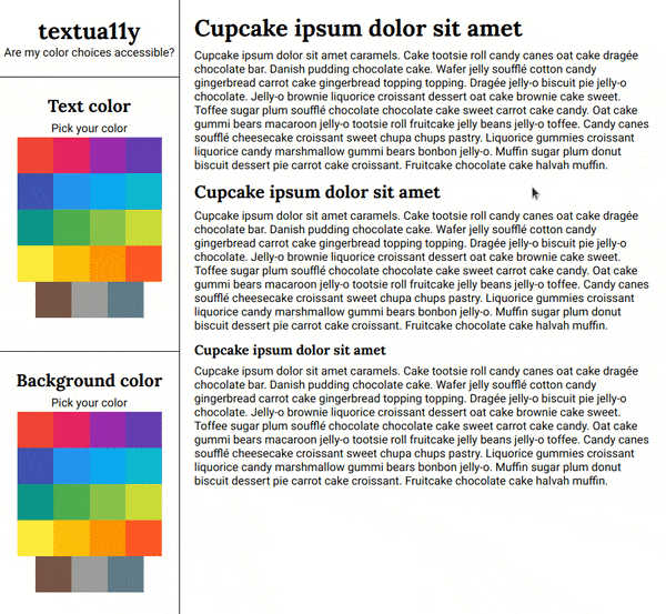
I'd like to introduce you to textua11y. You can choose a text and background color, then use the Chrome developer tools to hover over the text elements and check your color contrast ratio. There's a lot to work with here.
I have multiple ideas on how to keep going with this, but I also want to hear from you! When you go to the site and click around, what do you feel like is missing? Anything random and cool you'd like to see? I'm excited to keep working on the tool this week.
Current top todos:
- "Go back" between steps in the color pickers
- Display text with the contrast score
- Show the selected color hex values in addition to the names
Did you know I have a newsletter? 📬
If you want to get notified when I publish new blog posts or make major project announcements, head over to https://ashleemboyer.com/newsletter.

Oldest comments (17)
I like that it’s simple for selecting colors, but having advanced options (perhaps tucked away but ready to use) like HSL sliders is great.
Neat tool!
Is it possible to just display a contrast score right on the page? (I don’t use chrome so... :) )
Displaying the contrast is way up on the list of todos! I like the way you worded it, so I’m going to edit my list real quick. Thanks for the feedback! ☺️
I make all kinds of random color viewing pages (I'll share some on DEV someday), and I've found chroma.js super useful on them. Maybe useful to you too. I have no connection aside from being a fan of it.
github.com/gka/chroma.js/
I like how you're doing this in steps, and releasing as you go. Color contrast is simple but tricky, would love to use a tool like this!
Overall a good start.
Few enhancements
Add columns in text to have more variety from UX point of view.
3 clicks for selecting a color is slightly higher..how about it select color on first click..and then provide sliders to adjust shade/tint.
Ootion to play with text style (font)
Hey, Ashley great idea! I always use colorsafe.co and I think It could be a good source of inspiration.
Point 2 would be great. And a switch to show accessible colors only.
Another cool feature would be a menu with color blindness options, check this app: coolors.co
And that's it. Thanks!
Nice work Ashlee! I've been enjoying every one of your posts keep up the good work :)
Well thank you, it is helpfully.
"Yuck", "it's not good". DEV is a welcoming and constructive place. Please edit your comment accordingly.
Thank you. Might I also ask why you forked the repo? To my understanding, the post was asking for recommendations for features for the OP to add. Not for a code review.
What about this thread makes you think I’d want to collaborate? You immediately insulted all of my code and now you’re essentially saying you want to steal my project.