Part 1 of "How Do You Make That? - Breaking Down Web Animations".
For this article, we'll be looking at this cool codepen I discovered recently:
It's. So. Cool! So, I have to make it myself.
A quick look at the code reveals some cool things.
- There's only one element - a div!
- The shadow/glowing effect seems to be coming from two pseudo elements.
- It's very complicated...
So, let's start breaking it down!
1 - Pseudoelements Galore
Let's jump about halfway through the code to something I haven't worked with a lot - the pseudoelements :before and :after. The developer of this codepen accomplishes this amazing animation with only one element using these selectors. How?
:after: and :before can add elements to a page without explicitly declaring them with HTML tags. This W3Schools example is a good way to understand them.
These pseudoelements - so named because they exist but aren't true HTML elements (they can't be selected with DOM functions and such) - don't just have to be text - they can also be styles. For example, we can make a pseudoelement that's a little bigger than the original, and put it behind.
IMPORTANT! When using z-index, you have to set position to absolute. So, we get this beauty:
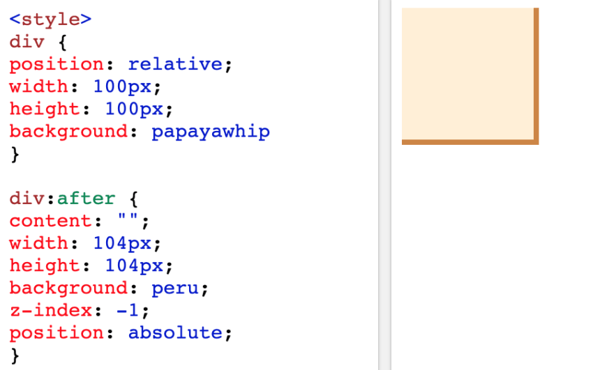
It looks... sorta alright. How do we get that sexy border around it? The answer is in these two lines:
left: -2px;
top: -2px;
Yup. It makes sense if you look at a graphic:

So -2px left makes it like:

and -2px top makes it like:

Awesome! We got the gradient down. Now if we make the pseudoelement a gradient...

Beautiful. But wait, the codepen has both :before and :after, but we only have one. Why is that? On to the next part, where I'll explain...
2 - calc + filter = 🤯
width: calc(100% + 4px);
height: calc(100% + 4px);
🤯🤯🤯
How did I not know about this? It's so cool. Basically what this code does is takes the previous width and height (100% is inherited from the parent element) and then adds 4px. I thought this functionality was only for postprocessors like Sass!
One way we could improve this code is to set the 4px as a variable (like --border-width-gradient) and then calc(--border-width-gradient / 2) for the offset. Pretty cool, huh?
Now, on to blur.
Using our previous square div, I guessed I could just write filter: blur(50px);
WHOA.

It even works for gradients!

Awesome! Now, I'll explain why we need both :before: and :after. If I blur the only pseudoelement we have right now, it becomes like:

Not good. Where's my border? This is easily solved by making both :before and :after the same style, and then blurring one (before or after).

I hardcoded some margins for the main div, just so I could see the entire shadow. And there! We're almost done.
3 - Gradients and Animations
@keyframes steam {
    0% {
        background-position: 0 0;
    }
    50% {
        background-position: 400% 0;
    }
    100% {
        background-position: 0 0;
    }
}
This is the cool part of the code - it's moving around the gradient. If you remember your background-positions:
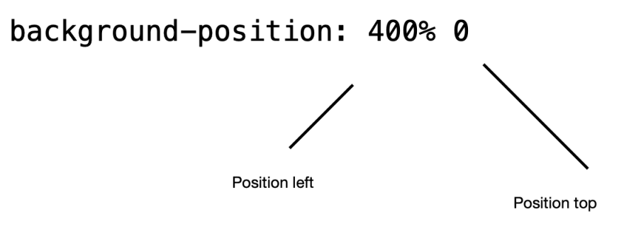
So, it seems like the gradient is being shifted back and forth - because the gradient is like 10 colors, there's plenty of space to move it around with. Because the :after, :before selector has the animation applied to it, the shadow and the gradient will move in sync. Now all we need to do is darken the background (to make it look like its glowing) and put together everything we've learned:
Also note that the original div has a very slight gradient so it looks a little curved outwards - I'll just copy that 😅
And, here's the final result!

Top comments (0)