In a web application, toast notifications are an easy and efficient way to give consumers feedback. They can be utilized to notify users of successful or unsuccessful tasks, mistakes, or just to convey a general message. We'll examine utilizing the react-toastify package to implement toast notifications in a React application. In this article I will show you how to use Tailwind to add some stylish design elements.
Prerequisites
Before getting started with this tutorial, you should have the following:
- Knowledge of React and Tailwind.
-
yarnornpminstalled as a package manager ## Install the Library
You must first install the react-toastify library before you can proceed. Run the following command in your terminal to accomplish this:
npm install react-toastify
or
yarn add react-toastify
Import the Library
Before you can import the library, you must first create a src folder, then a component folder, and finally a file, which I will name FormPage.js. Make a file called App.js in the src folder.
Once the library is installed, you'll need to import it into your FormPage.js . You can do this by adding the following line of code at the top of your component file:
import { toast } from 'react-toastify'
Next, create the handleSumit function in your FormPage.js. This function will be responsible for displaying the toast notification. Inside the function, use the toast function to display the notification.
const handleSubmit = (event) => {
  event.preventDefault();
  toast.success("You have registered");
};
The preventDefault function is typically used to prevent the default behavior of a form submission event.
When a form is submitted, the default behavior is to send a request to the server, which can result in the current page being reloaded.
When the form is submitted, the handleSubmit function is called and the event object is passed as an argument.
The event object is given a call to the preventDefault method, which stops the form from being sent to the server.
The toast.success is a function that is used to display a success message, or "toast," to the user in a web application.
Create your form
Now, you need to bind the handleSumit function to an event in your component. This could be a button click, a form submission, or any other type of event. For example, to display the toast notification when a form is submitted, you could do the following on the FormPage.js:
const FormPage = () => {
  return (
    <div className="flex justify-center items-center h-screen">
      <div className="block p-6 rounded-lg shadow-lg bg-white max-w-sm">
        <form onSubmit={handleSubmit}>
          <div className="form-group mb-6">
            <input
              type="text"
              className="form-control block w-full px-3 py-1.5 text-gray-700
              bg-white bg-clip-padding border border-solid border-gray-300
              rounded transition ease-in-out m-0 focus:text-gray-700
              focus:bg-white focus:border-blue-600 focus:outline-none"
              id="exampleInput90"
              placeholder="Name"
            />
          </div>
          <div className="form-group mb-6">
            <input
              type="email"
              className="form-control block w-full px-3 py-1.5
              text-gray-700 bg-white bg-clip-padding border border-gray-300
              rounded transition ease-in-out
              m-0 focus:text-gray-700 focus:bg-white focus:border-blue-600
              focus:outline-none"
              id="exampleInput91"
              placeholder="Email address"
            />
          </div>
          <div className="form-group form-check text-center mb-6">
            <input
              type="checkbox"
              className="form-check-input appearance-none h-4 w-4 border
              border-gray-300 rounded-sm bg-white checked:bg-blue-600
              checked:border-blue-600 focus:outline-none transition duration-200
              mt-1 align-top bg-no-repeat bg-center bg-contain mr-2 cursor-pointer"
              id="exampleCheck96"
              checked
            />
            <label
              className="form-check-label inline-block text-gray-800"
              for="exampleCheck96"
            >
              I have read and agreed to the terms.
            </label>
          </div>
          <button
            type="submit"
            className="w-full px-6 py-2.5 bg-blue-600 text-white
            font-medium text-xs leading-tight uppercase rounded
            shadow-md hover:bg-blue-700 hover:shadow-lg focus:bg-blue-700
            focus:shadow-lg focus:outline-none focus:ring-0 active:bg-blue-800
            active:shadow-lg transition duration-150 ease-in-out"
          >
            Subscribe
          </button>
        </form>
      </div>
    </div>
  );
};
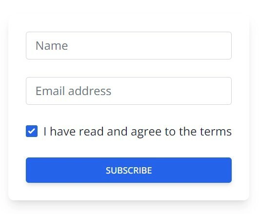
Here is how your form would look on the browser.
Customizing the Toast Notification
You can customize the appearance and behavior of your toast notifications by passing options as arguments to the ToastContainer. The ToastContainer can be used on the App.js. Import the ToastContainer from the react-toastify libary.
import { ToastContainer } from "react-toastify"
Some of the options you can use include:
-
**position**: Specifies the position on the screen where the notification should be displayed (e.g. top-right, bottom-left). -
**autoClose**: Specifies the duration (in milliseconds) for which the notification should be displayed before it is automatically closed, in (autoClose1000 = 1sec). -
**hideProgressBar**: Hides the progress bar that appears at the bottom of the notification. -
**newestOnTop**: Thisbooleanproperty determines the order in which toasts are displayed. -
**closeOnClick**: Closes the notification when the user clicks on it. -
**rtl**: Which stands for "right-to-left, is abooleanproperty that determines the direction in which toasts are displayed within the toast container. -
**draggable**: Makes the notification draggable by the user. -
**pauseOnHover**: Pauses the auto-close timer when the user hovers over the notification.
Here's is how example of how you can use some of these options in the ToastContainer:
      <ToastContainer
        position="top-center"
        autoClose={5000}
        hideProgressBar={false}
        newestOnTop={false}
        closeOnClick
        rtl={false}
        pauseOnFocusLoss
        draggable
        pauseOnHover
      />
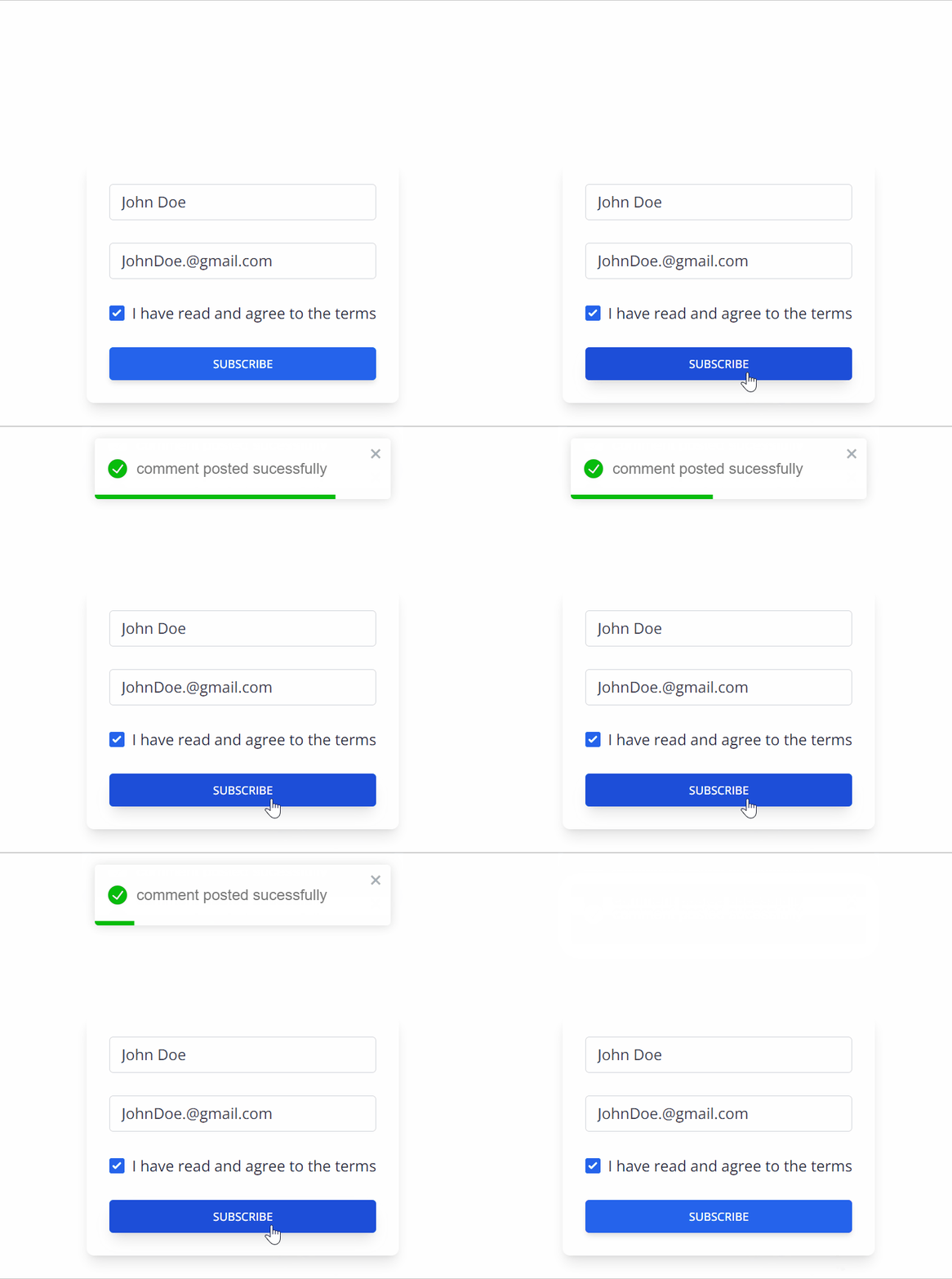
This will display a success notification that will be displayed for 5 seconds, dragged around by the user, closed when clicked, and has a visible progress bar.
Conclusion
Finally, React Toast Notification is a useful tool for displaying temporary messages to the user in a visually appealing and customizable manner. Following the steps outlined in this article, you should now have a solid understanding of how to use React Toast Notification in your own projects. Whether you want to notify the user of a success or error message, or simply alert them to new information, React Toast Notification can help you do so in a professional and user-friendly manner. To access my repository, simply follow this link https://github.com/Uhiene/Form.git.


Top comments (4)
Brilliant article.
To make code snippet colorful you can add the language they are written in at the first line like this:
Use chakra Ui and import useToast.
Excellent article nice work :)
Really nice
Thanks for this