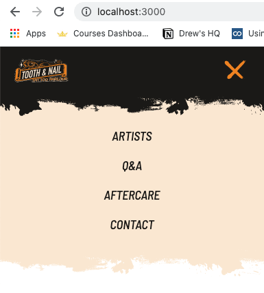
If you haven't yet, check out part 1!
Quick Summary
Some decent progress was made this past week. I was able to get the app setup with Nuxt-- which makes it really easy to get Tailwind CSS in place.
I made it as far as building the responsive header out, and I dropped the base templates for the different pages in as well.
What did I learn?
This was my first time animating an svg based on the state of something in the UI. This may not be the best way to accomplish this, but it worked nonetheless.
A crude definition of an svg is that it's code the generates a shape. Knowing that, I created a vue component and placed the code for the svg in the template.
This allows me to pass it props and do some styling with Tailwind. I'm setting the state of whether mobile menu is open or not in my header component. So, from there I pass that data to the svg component.
<MobileMenuIcon :nav-open="navOpen" />
Now that the svg is aware of when the nav is open, I can do some animating with tailwind.
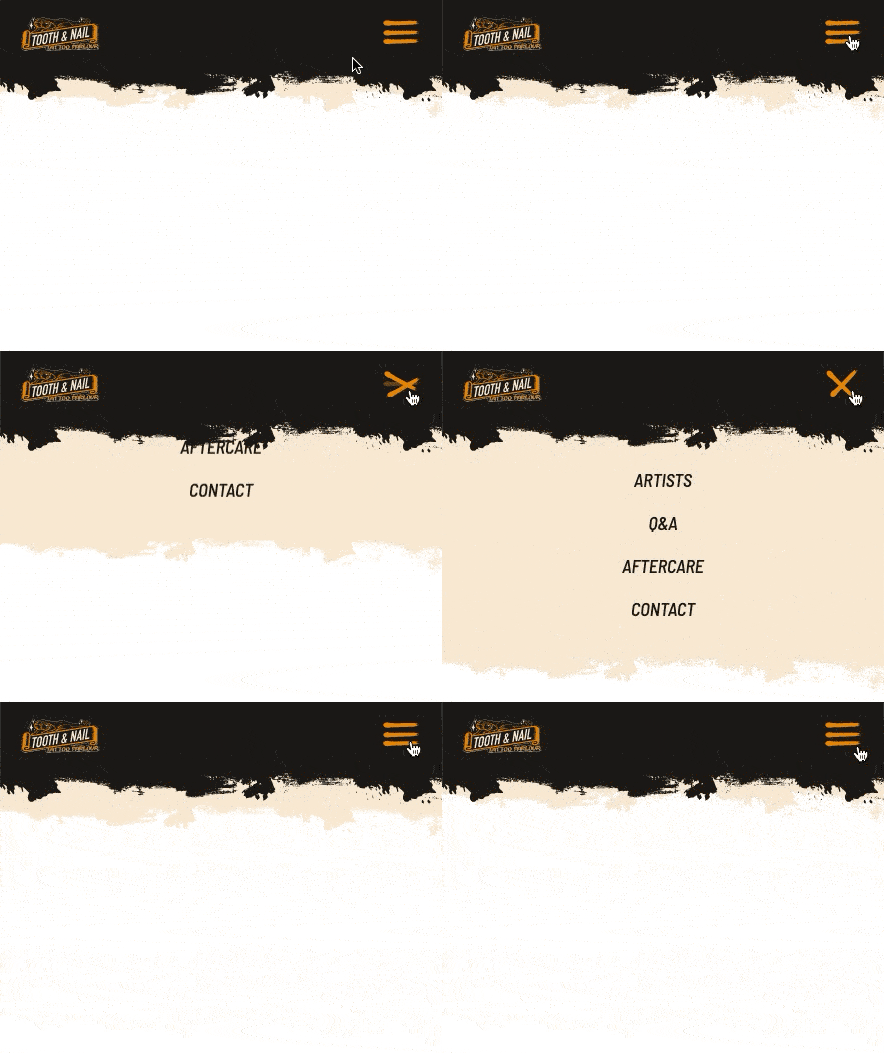
I didn't do much. In this specific icon, there are 3 bars, and I wanted the top and bottom to animate into an 'X' while the middle fades away.
The animation is handled with conditionals and tailwind classes. The top and bottom bar receives a rotate and translate classes to reposition, while the middle bar's opacity gets adjusted.
And these classes were applied directly to the 's in the svg like so:
<path
  class="transition duration-200 ease-in-out transform"
  :class="`${navOpen ? 'rotate-45 scale-105 -translate-y-1 translate-x-2' : ''}`" />

// There's a lot more in the path to generate the shape.
And here's the result!
There's still a long ways to go on this project. Next will be building in some content on the homepage and getting some base components in place!
You can check out the repo here.


Top comments (1)
Love this man. I have yet to explore SVG animation, but this seems like a good starting point.