Prioritizing issues with 👍s, ❤️s and 🎉s
At Pipedream, we use Github Issues to track feature requests, bugs, and new app integrations.

Anytime a user has a new idea, we send them to the roadmap to make sure the idea gets captured.
Anytime someone suggests an idea that’s already been captured, we send them to the roadmap to add a reaction (a 👍, ❤️ or 🎉) to the issue.
We’re diligent about pushing people to the roadmap because we want to prioritize the most requested items. Reactions are the best way to collect that data.
Unfortunately, Github doesn’t provide high-level dashboards on issue reactions. You can sort issues by the total number of reactions in the Issues UI:
is:issue is:open sort:reactions-desc
but you can’t see the reaction count without digging into the issue itself:
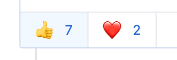
Nor can you compare the count of reactions across issues.
To help us prioritize the right issues, we needed to answer question like:
What are the top issues this week? (What should we be focused on?)
What issues are trending this week? (Even if it’s not in the top 5, is there an issue getting lots of love this week we should be paying attention to?)
Who’s opening the most issues? Who’s reacting to the most issues? (Who are the most engaged users, and how can we prioritize their issues and get more feedback?)
We built a workflow to collect this data, and a Google sheet and Jupyter notebook to drive the analysis. I’ll show you how this works and how to use it for your own repo.
Pulling Issue Reactions, saving to Google Sheets
This Pipedream workflow pulls reactions for all open issues in your repo once a day, saving them to a Google Sheet where can run more analysis:
 This gives us the basic data we need to run analysis on reactions by issue, author, and more.
Follow the instructions in the workflow’s README to connect your Github and Google Sheets accounts, and enter the necessary values in the fields of each step (for example, the Github repo and spreadsheet you’d like to save data to).

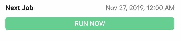
Once that’s done, press the Run Now button to collect your first set of reaction data:
This workflow uses some built-in Pipedream actions to save data to Google Sheets. But when you forked the workflow, you created a copy you can modify however you’d like.
For example, you can swap out the Google Sheets steps if you’d like to save data to a database, Airtable, or any destination (you can use any pre-built actions or run any Node.js code).
How we make requests to the Github API
I use the amazing octokit/rest.js package to facilitate interaction with the Github API. This sets the necessary HTTP headers to enable the reactions API (it’s still in preview), and handles pagination and retries transparently.
When the workflow runs the fetch_issues_reaction_data step, Pipedream provides a fresh OAuth access token in the variable auths.github.oauth_access_token that you can use to authorize requests (read more about connected accounts in the docs).
This all means you can fetch any data from the Github API with just a few lines of code:
const Octokit = require("@octokit/rest").plugin(
  require("@octokit/plugin-retry")
)

const octokit = new Octokit({
  auth: auths.github.oauth_access_token,
  previews: ["squirrel-girl-preview"] // See https://developer.github.com/v3/previews/#reactions
})

# Retrieve owner and repo name from the form params passed by the user
const { owner, repo } = params

let options = octokit.issues.listForRepo.endpoint.merge({
  owner,
  repo,
})

const issues = await octokit.paginate(options)
Exploratory Analysis in Google Sheets
I like to explore my data with a pivot table before ever jumping into a more complex analysis with SQL or a Jupyter notebook.
Pivot tables support grouping, aggregate functions, sorting, and more, all in a friendly GUI.
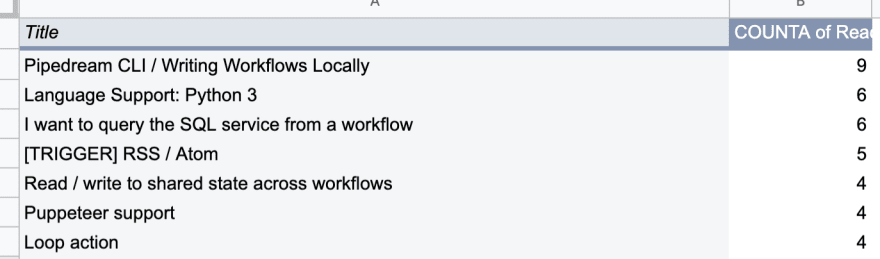
What issues have the most reactions?
It’s nice to have a single, ordered table of the top issues.
What issues have seen the most reactions in the past week?
We need to see what issues are trending. If it’s not a large project and can be tackled quickly, fixing a trending issue proves our responsiveness to users and helps build trust.

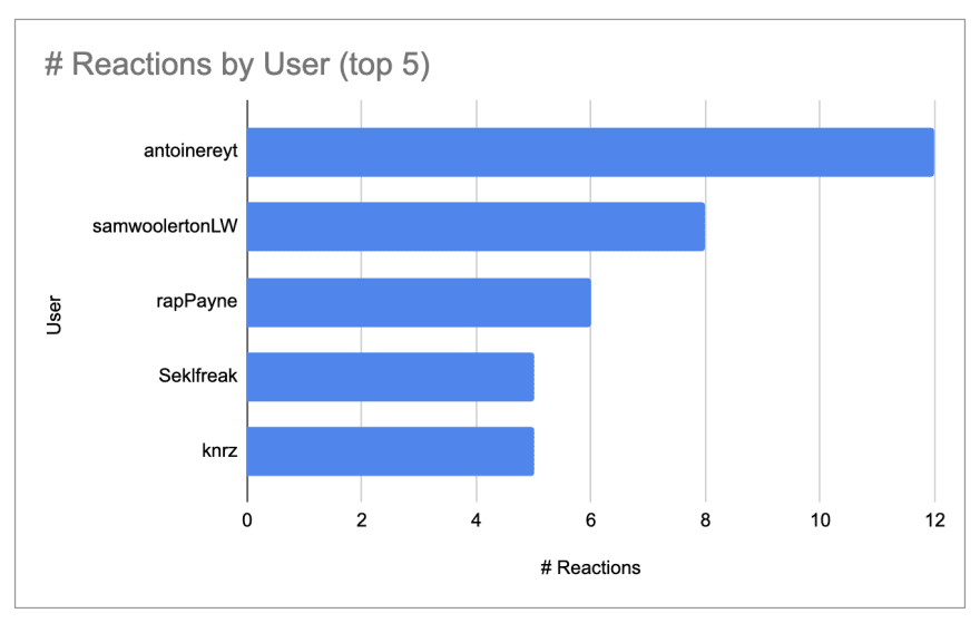
Reactions by User
It’s nice to know who our top “reactors” are, so see if that correlates with engagement in Slack or other channels.
A deeper dive with a Jupyter notebook
I wanted to observe how the cumulative sum of reactions for an issue move over time. This helps us understand whether the top issue recently moved to the top, or whether it’s been the top issue for weeks.
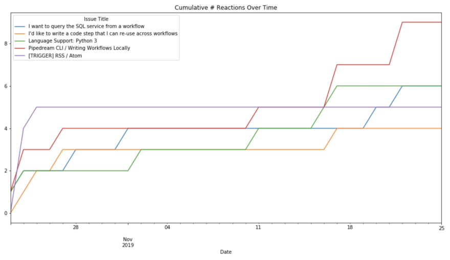
I was also interested to analyze the number of total reactions over time, to see if it’s increasing, on average, or whether it correlates with dates when we’ve promoted our roadmap in our Slack community.
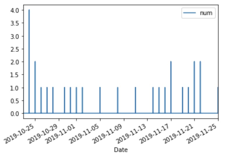
As a new product, the number of reactions per day is small, so this doesn’t tell a rich story yet. You can help us by using Pipedream and 👍 your favorite issues!
I created these charts with pandas and matplotlib, using a a Jupyter notebook. You can see the code in this Github repo.
Extending this analysis
There are a number of other questions that would be interesting to analyze in the future:
Under what conditions are different types of emojis ( 👍, ❤️, 🎉, and more) used? Does the use of a specific emoji correlate with issue closure or activity?
Does an issue get attention on a project after a certain number of reactions?
Do issues with labels (or a specific label) get more reactions than issues with no labels?
Questions like these have been explored in research papers, so there’s a lot of prior art you can read up on to get ideas to apply to your own repo.
Let us know what kind of analyses you end up doing in the comments below!
This article was originally posted on Medium

Top comments (0)