
Implementing a maintainable icon system for a React and React Native project can be a hard task, especially when it comes to achieving the same workflow to add/remove/use an icon in all the platform (Web, Android, and iOS). In this post, I will share how we implemented a consistent icon system inside our component library at Omio.
The problematic 😞
If you come from a web background, it's well known that you can use the <svg> to directly render an SVG image into the DOM. This is perfect because browsers are prepared for that.
Sadly, this is not the same scenario for React Native ... First of all, the platform doesn't support rendering SVG directly and it seems this is going to stay like this for a while. You can follow this feature request for more information.
Therefore the community has created a few workarounds using 3rd party libraries outside React Native to deal with SVG. Some examples are: react-native-svg, react-native-svg-uri, react-native-svg-asset-plugin.
In summary, you can’t use the same renderer in both platforms (web and mobile), and also depending on the React Native library you picked the API of your component will change. This can a problem when working with projects written in React and React Native where the main objective is to share as much code as possible. Therefore you need to look for a way to abstract all these implementation details.
Proposed solution: Auto-generated Icons 👍
Let’s set the context that you start with this kind of folder structure:
assets/
  bus.svg
  train.svg
  flight.svg
  ferry.svg
  …
components
  Icon.js
  Icon.native.js
You have all your in SVG icons inside an /assets folder. The normal workflow will be to create one component for web and another for mobile, using some abstraction for each one like Icon.js and Icon.native.js.
But what if you can automate this process, so the only task you need to do is adding/removing icons from this assets folder. This is when generating icons becomes quite helpful!
assets/
  bus.svg
  train.svg
  flight.svg
  ferry.svg
  …
** cast magic spell **
  # some idea of what the generated folder will look like here
The generation of icon components occurs right before starting and building the application; this is to ensure that they are always up to date. The result will be a file which exports all the icons as React Components, each of which will call the proper implementation in the respective platform.
At the same time, both platforms should implement the same API (propTypes) making the icon system consistent and proving a better development experience.
Demo time 🎉

I created a repository from which I extracted the following snippets. If you want to skip the explanation and jump into the code, you can use this link:
Time to code 👨💻
https://medium.com/media/996390142833111ed20beed80a9a2978/href
So let’s start a clean project using create-react-app and create-react-native-app. After playing around a bit I realized that it’s easier to bootstrap the project using create-react-native-app and then add the missing files to the project.
> create-react-native-app MaintainableIconSystemReact
> create-react-app delete-me-later
Then inside the folder, you need to add the /public folder with the delete-me-later project and also create the assets folder that will hold the icons.
For this demo, I decided to use the collection of Icons from Material Design from Google. We use our own company icons in our applications and internal services. This is just a demo for this article.
Download the icons you want to use in your project (make sure all of them are SVG) and place them inside the /assets folder.
One small reminder in case you want to use another set of icons: double-check that the icons are using the property fill to set the color of it and not stroke. There are some workarounds to convert stroke to fill, but I’m not going to cover those in this post.
Generating Icon Components
This will be the entry point for both platforms. Each SVG icon inside the assets folder will be transformed into a React component which then will call the platform-specific implementation (next two sections).
In summary this step should:
- Read the icons from the
assetsfolder. - For each icon create a React Component with the proper name and send the name of the original icon.
- Export as module the generated icons.
const { readdirSync } = require('fs');

// some helpful functions
const isSVG = file => /.svg$/.test(file);
const removeExtension = file => file.split('.')[0];
const toPascalCase = string =>
  string
    .match(/[a-z]+/gi)
    .map(word => word.charAt(0).toUpperCase() + word.substr(1).toLowerCase())
    .join('');

// getting all the icons
const icons = readdirSync(ICON_SOURCE_FOLDER)
  .filter(isSVG)
  .map(removeExtension);

const indexContent = [
  "import React from 'react';",
  "import Icon from './Icon';",
  '',
  icons
    .map(
      icon =>
        `export const ${toPascalCase(
          icon,
        )} = props => <Icon {...props} name="${icon}" />;`,
    )
    .join('\n'),
].join('\n');

writeFileSync(`src/components/Icon/index.js`, indexContent);
console.log('Icon component file created! ✅');
The result of this script should be an index.js file located inside src/components/Icon which should look similar to:
import React from 'react';
import Icon from './Icon';

export const Louvre = props => <Icon {...props} name="001-louvre" />;
export const LeaningTowerOfPisa = props => (
  <Icon {...props} name="002-leaning tower of pisa" />
);
export const Coliseum = props => <Icon {...props} name="003-coliseum" />;
// and the rest of the icons
Implementing Web Abstraction 🖥
As I said in the introduction, the web is already prepared to render SVG; the only thing you need to solve is how your project will load them. Otherwise, when you try to run your project it will throw an exception because it doesn’t know how to handle this type of file.
As this POC is based on create-react-app it has already integrated an SVG loader inside its hidden Webpack configuration. The way it works is by exporting a ReactComponent in the import of the SVG, which will display the proper icon. For example:
import { ReactComponent } from './my-awesome-icon.svg';

const MyApp = () => (
  <div>
    <p>This is my awesome icon!</p>
    <ReactComponent />
  </div>
);
So for this step, the only task you need to do is to aggregate all the icons inside a map which then can be used in the Icon.js component. This is the corresponding snippet:
const iconMapContent = [
  icons
    .map(
      icon =>
        `import { ReactComponent as ${toPascalCase(
          icon,
        )} } from './${icon}.svg';`,
    )
    .join('\n'),
  '',
  'export default {',
  icons.map(icon => `"${icon}": ${toPascalCase(icon)}, `).join('\n'),
  '};',
].join('\n');

writeFileSync(`src/assets/icons/icon-map.js`, iconMapContent);
console.log('Web Icon Map created! ✅');
The result of it will be a file called icon-map.js inside the assets/icons folder with all the special import to get the React Component from the svg and then exports all of them in a map with key as the name of the originalFile.
import { ReactComponent as AddCircle } from './add_circle.svg';
import { ReactComponent as Alarm } from './alarm.svg';
import { ReactComponent as Assistant } from './assistant.svg';

// and the list continues ...

export default {
  add_circle: AddCircle,
  alarm: Alarm,
  assistant: Assistant,
};
The last thing to do is to create the Icon component for Web. The idea behind this component is to maintain the props between Web and Native. This will make the use of the component platform agnostic, saving a lot of time when developing.
For this example the shared props between platform are:
-
name: the name of the file of the icon. This prop is specified by theIcon/index.jswhen you import a specific icon -
size: how big it will be. Here you can also set the default size -
color: the general colour of the icon; by default will be black
import React from 'react';
import iconMap from 'assets/icons/icon-map';

const Icon = ({ name, size, color, ...rest }) => {
  const Icon = iconMap[name];
  return <Icon color={color} style={{ width: size, height: size }} {...rest} />;
};

Icon.propTypes = {
  name: PropTypes.string.isRequired,
  size: PropTypes.oneOfType([PropTypes.string, PropTypes.number]),
  color: PropTypes.string,
};

Icon.defaultProps = {
  size: '5em',
  color: 'black',
};

export default Icon;
Implementing Native Abstraction 📱
One of the most performant approaches inside the React Native world is treating your icons as a custom font, and then when you need to render an icon it will just be a Text tag with a special character and using this custom font. So the order of steps will be:
- Generate the custom font with the map of characters.
- Load it inside our application.
- Create
Icon.native.js.
In order to group all the icons inside a single font file you should install icon-font-generator which given a path it will generate:
- The
.ttffile with all the fonts included - The
Glyph Map, which has keys as the name of the icon and values equals to the character/position of it inside the font
There is a little fix you need to apply for the generated Glyph Map because the values of each icon are expressed in Hexa and React Native can’t read them. The solution for this is to parse each value to decimal.
execSync(
  `icon-font-generator ./src/assets/icons/*.svg -o ./src/assets/fonts -n custom-font-icon -c false --html false --types ttf --height 500`,
);

const glyphMap = JSON.parse(
  readFileSync(`./src/assets/fonts/custom-font-icon.json`),
);

const customFontContent = [
  '{',
  icons
    .map(value => `"${value}": ${parseInt(glyphMap[value].substr(1), 16)}`)
    .join(',\n'),
  '}',
].join('\n');

writeFileSync(`./src/assets/fonts/custom-font-icon.json`, customFontContent);
console.log('React Native Asset generated! ✅');
The output of this script will generate the already mentioned files inside the folder assets/fonts. The next step is to load it inside your application.
If you are using a project with create-react-native-app, you need to set the folder of assets/fonts as a resource folder for the native projects. To do that, add the following property to your package.json:
{
  "rnpm": {
    "assets": ["./src/assets/fonts/"]
  }
}
And then execute the command "react-native link" inside the root of your project, which will change the configuration of Android and iOS project and load the font when the application starts.
The last step of this implementation is creating the Icon.native.js which has to make use of the generated font and render the proper icon. For that, I suggest using react-native-vector-icons which will do all the magic for us! The two things it needs is:
- The name of the font
- The
Glyph Mapthat has been generated in the first step
Also here you need to maintain the same props as in the web implementation, with the only consideration to change the default value of size because Native applications can’t handle web units (px, em, pt). Therefore the resulting code will be something like this:
import customFontGlyph from '../../assets/fonts/custom-font-icon.json';
import { createIconSet } from 'react-native-vector-icons';

const Icon = createIconSet(
  customFontGlyph,
  'custom-font-icon',
  'custom-font-icon.ttf',
);

Icon.propTypes = {
  name: PropTypes.string.isRequired,
  size: PropTypes.oneOfType([PropTypes.string, PropTypes.number]),
  color: PropTypes.string,
};

Icon.defaultProps = {
  size: 60,
  color: 'black',
};

export default Icon;
Rendering the icons ⚡️
As the components held the same props, the implementation for both platforms is almost identical. The differences are the values for size and the event handlers.
Web implementation
// index.js
import React from 'react';
import ReactDOM from 'react-dom';
import Grid from './components/Grid';
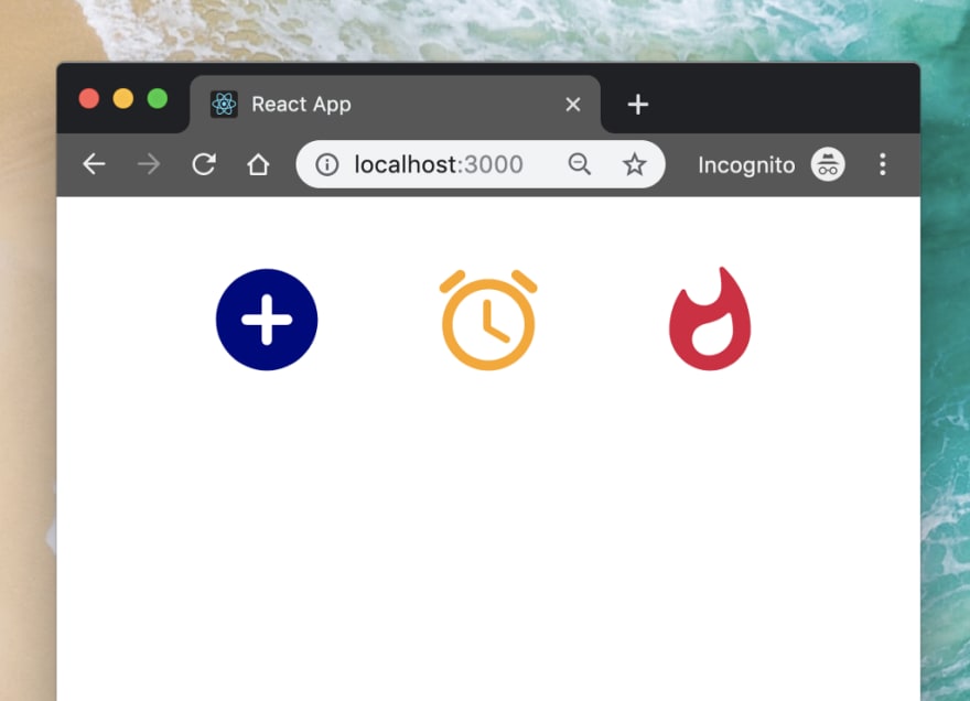
import { AddCircle, Alarm, Whatshot } from './components/Icon';
const App = () => (
<Grid>
<AddCircle color="navy" />
<Alarm color="orange" />
<Whatshot color="crimson" />
</Grid>
);
ReactDOM.render(<App />, document.getElementById('root'));
React Native Implementation
// index.native.js
import React from 'react';
import Grid from './components/Grid';
import { AddCircle, Alarm, Whatshot } from './components/Icon';
const App = () => (
  <Grid>
    <AddCircle color="navy" />
    <Alarm color="orange" />
    <Whatshot color="crimson" />
  </Grid>
);
export default App;

Last words 👋
It may seem like a lot of steps, but once you have it in place, this process provides an automatic setup to easily add/remove/change icons without worrying about how developers need to use them because they will always be React Components.
I really suggest adding to .gitignore the generated files, and run this generation before every start or build process. By doing this you will ensure that all the icons placed inside the assets have the respective React and React Native component.
One more thing before you leave, I decided to start my own Newsletter so in case you want to hear about what I’m posting please consider following it! No SPAM, no hiring, no application marketing, just tech posts 👌 Link to Newsletter

Top comments (0)