
Malaysia is now 62-years old! 🎉 Happy birthday, Malaysia! 🎂
To celebrate this big day, I have decided to create the Malaysia flag using HTML and CSS (only), and without using any JavaScript, SVG, and of course, without using any images.
Um … But technically I can use emoji right? Or maybe I can use this NPM package?
Flag of Malaysia - Jalur Gemilang 🇲🇾
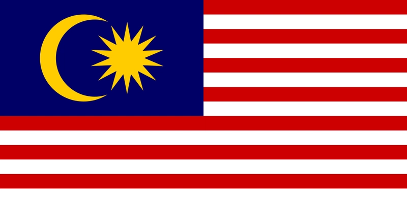
The flag of Malaysia, also known as the Malay: Jalur Gemilang ("Stripes of Glory"), is composed of a field of 14 alternating red and white stripes along the fly and a blue canton bearing a crescent and a 14-point star known as the Bintang Persekutuan (Federal Star).
Here are the components that I need to create using HTML and CSS:
- 14 Alternating Red and White Stripes: Sounds easy 😎
- Crescent: Hmm, a big circle and a small circle inside? 🤔
- 14-Point Star: I have completely no idea how to do this 🤭
Step 1: Create Flag Layout with CSS Grid
Firstly, I am going to create the flag layout with CSS Grid.
It's pretty straight-forward, I will use grid-template-rows and grid-template-columns properties to create the flag layout with 2 rows and 2 columns.
Then, I will use grid-column: span 2 to expand the bottom column into a full row (or 2 columns).

Step 2: 14 Alternating Red and White Stripes
The Jalur Gemilang consists of 7 red stripes and 7 white stripes. 8 of the stripes are located at the upper-right quarter, and the rest of the 6 stripes are located at the bottom part of the flag.
What I need to do now, is to create 14 <div> and use CSS's :nth-child(even) and :nth-child(odd) rules to style the stripes.
But is there any other better method to do this? 🤔
Hmm … how about using repeating-linear-gradient?
The
repeating-linear-gradient()CSS function creates an image consisting of repeating linear gradients. It is similar tolinear-gradient()and takes the same arguments, but it repeats the color stops infinitely in all directions so as to cover its entire container. - MDN Web Docs
With that, I can use repeating-linear-gradient to create the 14 red-white stripes without writing 14 <div>! CSS FTW! 🎉
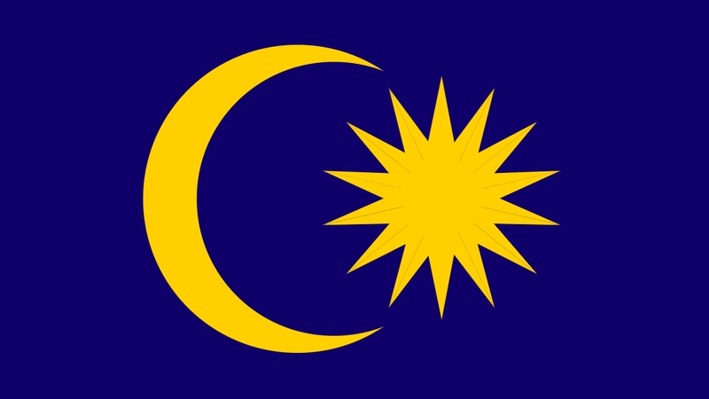
Step 3: Crescent 🌙
The crescent can be created using a circle with an inner shadow, which can be done using the inset value. (Thanks Google!)
Step 4: 14-point star

That's the moment, I realized I have completely no idea how to create a 14-point star using CSS. (And I also forgot how to draw the 14-point star by hand 🤦♀️)

So after some simple research (aka Google Search), I found 3 ways how to draw a 14-point star:
Method 1: Draw 7 lines, then draw a "V" between each tip.
- 😀 Very easy to draw on paper
- 😕 No idea how to recreate it with CSS

Method 2: 14 triangles surrounded by a circle.
- 😀 Easy to draw on paper
- ☹️ Hard to recreate it using CSS

Method 3: 7 long diamond shapes with different rotation values.
- 🤷♀️ I guess no one uses this method to draw on paper?
- 😍 Very easy to recreate it using CSS

Ok, now I have found a way to create the 14-point star using CSS, the next step is to create 14 long diamond shape with different rotation values.

The long diamond shape can be created using 2 isosceles triangles. The code should look something like this:
The next step is to duplicate the long diamond shape for 6 more times, and add the CSS rotate function to it. As a result, the code should look like this:
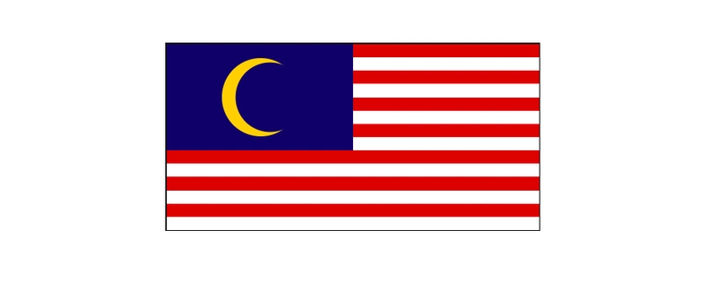
Result 🇲🇾
Here you have it, I have successfully created the Malaysia flag using 30 lines of HTML and ~120 lines of CSS. 🎉
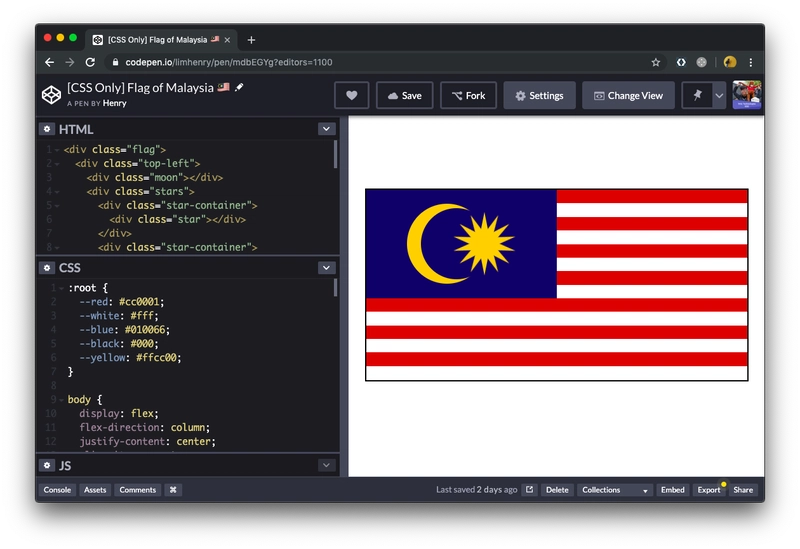
You can look at the full code on CodePen: codepen.io/limhenry/pen/mdbEGYg
What's next?
However, this is not perfect yet. Few more things can be improved:
😤 Issue #1: Sub-pixel Rendering
If you open the CodePen link in Firefox, you might notice the sub-pixel rendering issue (The weird line in the 14-point star).
However, it's actually possible to fix it using transform: translateZ(1px); (Refer to line 111). By doing this, the browser will render it using hardware acceleration or GPU acceleration, instead of the browser's slower software rendering engine.
😅 Issue #2: Flag is Not Responsive
This can be done with a few lines of JavaScript code, but maybe I can write another article just for this? 🤔
Anyway, it's time for me to go eat some Nasi Lemak 😋 Happy Birthday Malaysia! 🎉

Top comments (16)
Really great post!
I love when people create such things just using CSS and not falling back to some JS library. Very clever to use the diamond shapes for the star!
This is a great example of creativity 😊
Thank you! 😁
This is really cool. And reading about the process is even better. Thanks for sharing!
This is soooo cool! I'm amazed! I suddenly miss Malaysia. Haha
Nice & creative, never thought anybody will do this. Happy birthday Malaysia
Cool post. Love it xD
Greetings from Malaysia
Merdekaaaa!
Great post ! Happy Merdeka day !
This is so cool! Malaysia boleh!
This is great and also recreating the flag required some ingenuity due to it's design which makes it even better.
I spent most of my time creating that 14-point star 🤷♀️🤦♀️
❤️
Dude this is awesome! Happy National Day 🎉