
Have you noticed dark mode is pretty standard lately?
Well, that's because it's badass!
Let's achieve this new standard of awesome by utilizing styled-components and React!
It's super easy to implement, so let's get straight to it! 💯
Resources
👉 Demo
👉 Repo
Some things I'm expecting you to know
- Development Environment
- Basics in React
- Basic S(C)ass
1. Fresh React project
Let's clean up the file structure ~ if you want. I deleted all unnecessary files for this project. Removing App.css and all testing related files. Be sure to remove necessary lines of code in index.js. I also cleaned up the boilerplate between the header tags.
2. Install and Import styled-components
With a fresh project, let's now install and import styled-components.
-
yarn add styled-componentsor npm install --save styled-components
Let's now import styled-components like so:
import styled from 'styled-components'{% raw %}`
```
---
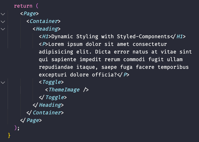
## 3. Let's create a simple landing page with styled-components
In our `App()` let's return a `Page`, `Container`, `Heading`, `H1`, `P`, `Toggle`, and `ThemeImage` component, respectively. It should look like so
---
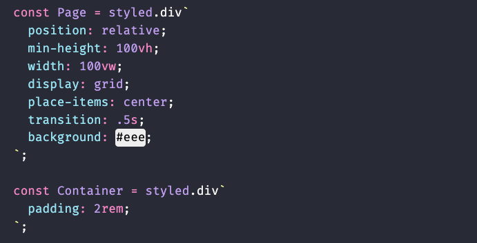
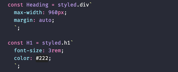
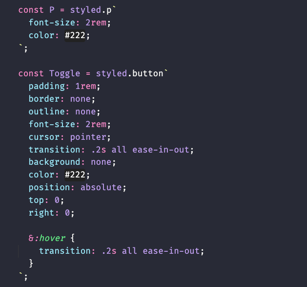
## 4. Now that we have our layout, let's create each of our components
`Page` and `Container`
`Heading` and `H1`
`P` and `Toggle`
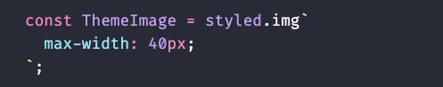
`ThemeImage` is the component that will contain our toggle state images
---
## 5. Let's create state for our toggle component
In order for us to to toggle between light and dark mode, we need to hold state. Let's begin by importing the useState hook. `import {useState} from 'react'`. Then add it to your `App()` component like so:
```javascript
const [isDarkMode, setDarkMode] = useState(false);
```
Next let's add the logic that will toggle between light and dark mode for our button `Toggle` component.
```javascript
const handleToggle = () => {
setDarkMode(!isDarkMode);
// console.log(isDarkMode);
}
```
This functions only responsibility is to toggle the opposite of what the current state is. In other words, if the state is currently `true`, toggling it will become `false`. If `false` it becomes `true`.
---
## 6. Update our `Toggle` component
Now that we have a function that can toggle our light ~ dark state, let's update our `Toggle` component like so:
```javascript
<Toggle onClick={handleToggle}></Toggle>
```
---
## 7. Import images to display the active theme
If we want to show our users the current and next theme, we can do so visually with the use of a Moon and Sun image. Let's import the images at the top of our code like so:
*images are available in the repo*
```javascript
import Moon from './images/moon.png';
import Sun from './images/sun.png';
```
Then lets update our `ThemeImage` component like so:
```javascript
<Toggle onClick={handleToggle}>
<ThemeImage src={ !isDarkMode ? `${Sun}` : `${Moon}` } />
</Toggle>
```
Here we are updating the `ThemeImage` components src attribute as it is an instance of `img`. We are also conditionally setting the image with a simple ternary operator while also utilizing template literals.
I'll explain with some pseudocode. You can read this like `if stateIsNotDarkMode ? render Moon : else render Sun.`
---
## 8. Let's update some style properties in our components
We're almost done! Let's update the `background` and `color` properties in a few of our components
First, Let's change the `Page` components background style to:
```css
background: ${props => props.light ? "#eee" : "#333"};
```
Secondly, let's change the `H1` components color style to:
```css
color: ${props => !props.light ? "papayawhip" : "#000"};
```
Lastly, let's change the `P` components color styles to:
```css
color: ${props => !props.light ? "#eee" : "#333"};
```
Here we are conditionally styling our background or color properties based on the prop that we pass into our components. If the component contains the `light` prop, render this color, else render this color.
---
## 9. Pass in our default Theme to our components with the `light` prop
All we have to do now is update our components in the layout with the default `light` prop. Like so:
```javascript
return (
<Page light={!isDarkMode ? true : false}>
<Container>
<Heading>
<H1 light={!isDarkMode ? true : false}>Dynamic Styling with Styled-Components</H1>
<P light={!isDarkMode ? true : false}>Lorem ipsum dolor sit amet consectetur adipisicing elit. Dicta error natus at vitae sint qui sapiente impedit rerum commodi fugit ullam repudiandae itaque, saepe fuga facere temporibus excepturi dolore officia?</P>
<Toggle light={!isDarkMode ? true : false} onClick={handleToggle}>
<ThemeImage src={ !isDarkMode ? `${Moon}` : `${Sun}` } />
</Toggle>
</Heading>
</Container>
</Page>
);
}
```
Here I am also conditionally rendering the `light` prop to either be true, or false, depending on on our state.
---
## Conclusion! 👏
Congrats! That's a wrap on **No Fuss Dark-Mode Toggle with React & Styled-Components!** Hopefully, if everything went right, you were able to implement a badass dark mode into your project, in 9 simple steps!
Please don't hesitate to hit me up on [Twitter](https://twitter.com/hyggedev) in regards to any questions, concerns or if you just wanna say hello!
---
## Are you a beginner web developer!?


Top comments (23)
Hey, Chris, did you know that u have no need to pass theme prop to each component?
Look for ThemeProvider component from styled-components, it gives you opportunity to wrap you whole JSX component with provider which will pass theme prop to all styleds via context, so u will need to pass your theme only to themeProvider
Absolutely! I wanted to make this as easy as possible! But you are the second person to mention this, so I think I'm just gonna have to continue this, possibly as a series! May have to give that a shot 😅 Thanks for your input, it is good advice 🤘
That's great advice! I actually was planning on storing a userSettings in local storage but I wanted to make it as absolute barbones as possible 👌 And that's really cool. Is that the exact snippet for any OS? In other words that would take my macs theme preference and apply it to the browser? Same for a windows user? How about if my OS preferred theme is set to detect time of day still work!? 🤯
Isn't it a better approach to have a theme provider at the top level component that would take the theme object as a prop based on the value of isDarkMode, instead of having to do the comparison for each of the components. This is not sustainable for a large project that have many components.
Edit:
I wrote this comment not knowing the suggestion has already been made
Well in my honest opinion you are 💯 percent right! My aim was to basically introduce styled components, and to have the least resistance for entry for beginners. Info have a goal of updating this into a series and introducing React context, dark mode hooks, or themeprovider. Thanks for dropping by!
I just came to tell you how badass your caption image looks like. That is really amazing :)
Hahaha! Right on, thanks a lot! I'm super into the cyberpunk genre and it's neon colors, so I guess it worked out. 👌✌️
Something about this caption reminded me on "Stranger Things". And I ABSOLUTELY LOVE that series. :)
Couldn't agree more! The production, cast... top notch. But when the show transitions into the golden age of arcades.. all that eye candy 😎
Thank you
✌️😜✌️
Nice post, Chris!
Hey! Thanks a lot! ✌️
Thank you so much, I will to use in my blog 😄😄
That's awesome! ✌️🤘
Thank you very much for this informative article
Awesome and smooth.
Hey 👋 Glad ya dig it! Thanks for dropping by ✌️
Sorry, but it’s bad approach, just to pass props to each component about selected mode… at least you have to use styled theme context or css variables or whatever, but not like this
This is definitely not the end goal. For beginners who are testing the waters, this is the easiest way imo to get something up and running asap. Context and Local storage would make this much better. But as for styled-components, this totally works!
You want to provide context about dark mode? And get this context state in components and then pass as props again to styled components? ;) just use styled-components theme, and to persist state you can use local storage for sure 😉
Beginners need to learn good patterns - this is the most important thing, imho 🙂
Update coming soon 😉