Hey! I’m finally caught up with Alpha-3! I can finally go outside. I can finally see my friends and family... on second thought, nah. I think I’ll just chill at my computer. Who needs reality when you got an internet connection? Back to the surreal… in a silent way.
Here’s the Gist:
Small Biz Day 1
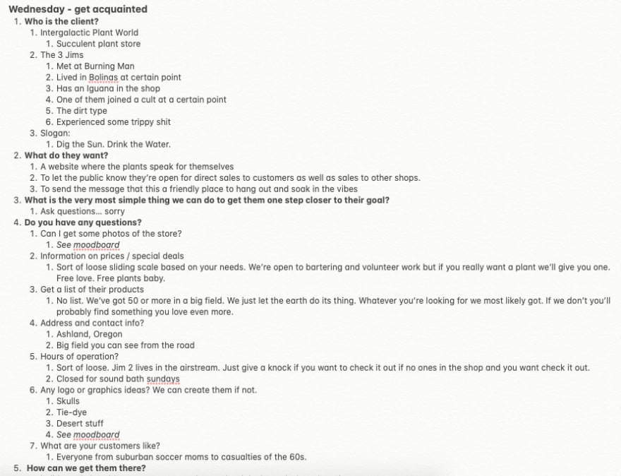
This was really fun. We got a list of mock clients to choose from. The options were really all over the place. You could do one for a gym, dermatologist, etc. Didn’t find anything that really sparked much interest til I scrolled down to Intergalactic Plant World. All the other mock clients at least had some detail and some direction they wanted to go in but IGW was pretty open-ended. This is what I had to work with:
- Succulent Shop
- Three casualties from the 60s named Jim
- They want to let the public know they’re open for business
I kind of let my imagination run wild. Used a bit of elevated life experiences mixed in with a bit of pop culture references to do the research. Ended up making a pretty elaborate backstory. Usually it’s just a matter of asking yourself the right questions and filling in the blanks. That way you don’t get stuck. I absolutely love this kind of stuff. Didn’t have to slog through this at all. Just throw on a good album and start writing.
Small Biz Day 2
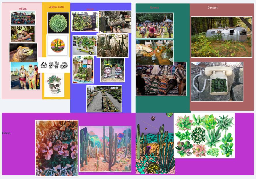
Alright, now I got a lot to work with! Now it’s time to piece together some visual ideas. To do this I first made a mood board. My google search history is pretty funny now — psychedelic succulents, 3 old hippies, old beat-up airstream, succulent phone, trippy colors, etc. This is what I came up with:
Something I always look forward to is choosing the font. I love going on Google Fonts and seeing what’s out there. To do this I typed the company name to see how it looked. I made sure to scroll at a moderate to fast-pace so I can sort of trick myself into seeing what naturally stands out instead of overthinking it. Whenever I came across a good one I would take a screenshot.
I definitely knew I wanted to use that skull with the succulents sticking out. That was sort of the kernel for the whole design. Thinking “I know this fits, now how do I build around this?” I thought the skull was perfect because it reminded me of the skull and roses thing that’s associated with the Grateful Dead. Would look awesome on a t-shirt or as a bumper sticker too. So I took all those fonts and mixed and matched them with the skull til I found something that fit. I ended up choosing Megrim. On top of it looking great with the skull, I like the full-on triangular shape of the A’s and W’s. Reminded me of those triangular planters you often see succulents in. Also the word “intergalactic” seems fitting for it too.
Small Biz Day 3
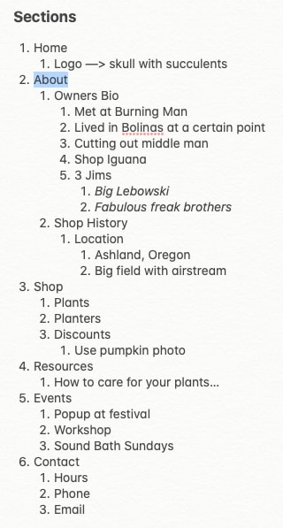
Ok, so now I got some visual ideas and some backstory to work with. How do we start building this site? I cherry-picked the best parts and most crucial information from the research and broke it down into what would be the common sections of a website. While referencing the doc I came up with this:
So I got my navbar/header and the basic structure of the IGW website. Now it’s time to start filling in the blanks with by writing the copy. I went a little overboard. Had to cut out a bunch of stuff but it was a lot of fun.
My first instinct was to go crazy with the design — add a bunch of crazy colors, use the wackiest fonts I could find, etc — but I decided to try and make a site that was the happy medium. Something that would appeal to both the kind of people the 3 Jims hang with as well as the general public.
Small Biz Day 4
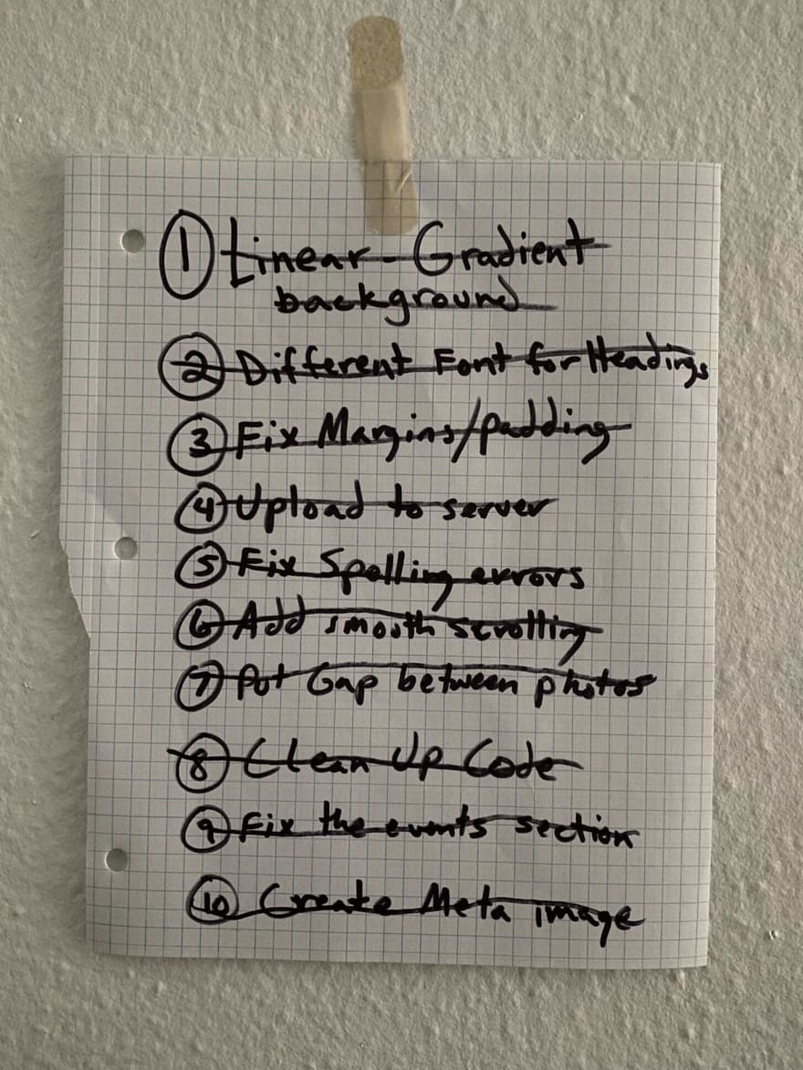
I thought the first round went pretty good. Got some good feedback about the subheadings font from Derek. I decided to hold off on coding the site so I could just look at it, step away and gather my thoughts. Ended up making a list of subtle changes for the 2nd and last version.
After my final submission Derek showed me the work of past students who did the same mock client project. It was super interesting to see how they went about it. Sort of made me second guess my design choices.
Boilerplate
With the mock client project behind me I moved onto building my first boilerplate doc(s). I have always asked myself “why do I keep writing the same code over and over again?” Now I got a great skeleton to work with. All the images will be responsive, all the anchor links have will be styled properly if used in a paragraph or as a block-level element. Also got my meyer reset so I have a blank canvas to work with. Would be fun to build different types of boilerplate for certain purposes.
Version Control
I had a little bit of experience doing this with terminal in a 1-day workshop I took a few months ago. Terminal kinda freaked me out. It felt so fragile, like you could erase everything with one wrong move. Experienced developers always say that it’s a little intimidating at first but you get used to the workflow over time. I haven’t interacted with it enough to get comfortable but let me tell you, using Tower has been a breeze so far. No confusion at all, super user-friendly, easy to navigate. Thank you Tower. Now I got to get all those green squares on my GitHub so the recruiters think I’m legit.
Blend Modes in Affinity Designer
These are great if you want to use an image background but also want to use a lot of text at the same. We had to create a few different designs. Sort of goofed around on this one. This was my favorite of the 3 I made.
SVGs
After this, the next couple lessons were focused on SVGs. How to create them and how to alter them with HTML and CSS. Super fun but damn, SVG code is such an eyesore. I got a little more experience using the pen tool. For the first one I drew a duck. For the second one I drew a cloud monster. I wasn’t able to alter the fill colors for the duck because my dumb ass didn’t close any of the strokes into shapes. Whoops!
Filling In The Gaps
Still on break from coding, our next lesson was about mentally resetting and retain focus. Ask myself questions like “what I want?” and “how do I get there?” — y’know, stuff like that. It’s easy to get carried away and distracted learning all this stuff so it was nice to spend some time decluttering. I actually wrote a pretty epic blog post about it. Check it here!
Planning a Layout
The structure of the lessons changed a bit to a more code-along style (e.g. Derek would give us a prompt, pause the video and do your code, then see how he does it). Pretty standard method but it was good to do this AFTER you have a solid understanding of the code you’re working on. You can better compare and contrast as opposed to straight-up copying. So many teachers do this from the get-go. Feels like your learning but you’re really just copying. The second you work outside of those type of lessons you’re screwed.
Flexbox
We finally get to use this! Makes positioning and organizing so much easier. It looks a little strange at first but once you start using it and messing with different properties it all starts making sense. I’ve been referencing this since day 1. Just keep it open in a window right next to your CodePen and start experimenting. Although I’m still pretty new, flexbox has been a great help so far.
So now that we got flexbox we had to create modules and make them responsive. I thought I did an alright job but then I realized I forgot to factor in things like different amounts of text within the module and wrapping it in it’s own container so I could easily copy/paste it into other docs. Kind of flubbed this one. Whoops.
You live, you learn.
- Alanis Morissette
Typography
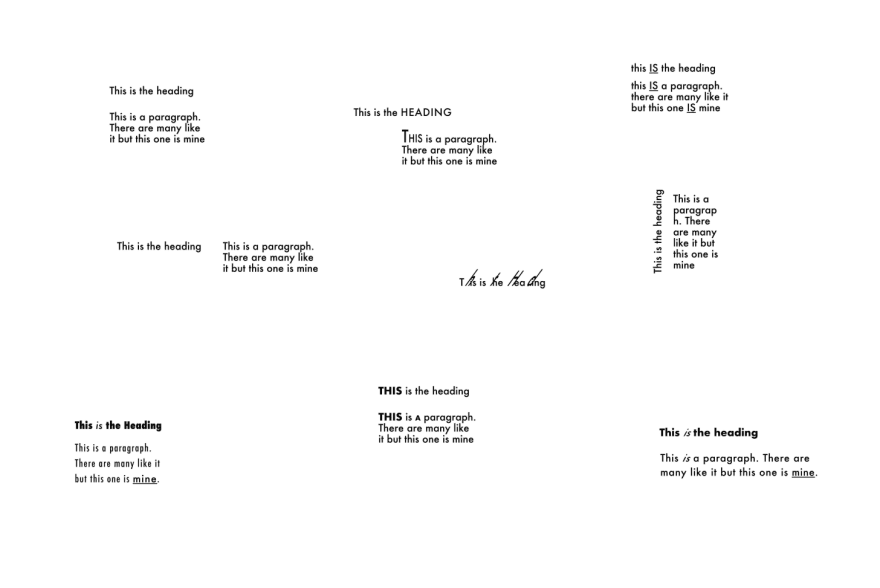
Whoa! Another break from coding. This time we learned about typography. Derek let me do a test run of his new version of the lesson. Pretty cool! I had to work within the limits of using one font and one font size. Even with those limitations there’s a lot you can do and uncover. For this I tried different variations of Futura at 16px.
CSS Positions
Next lesson we learned about the different values of the position property. Some were a little hard to wrap my head around. Just one of those things you have to dive head first into. Through trial and error you’ll eventually get it. Awesome to start making sticky navbars though. Slowly being introduced to this stuff makes you really appreciate it and make the most of it.
Building a Super Responsive Layout
Now that we’ve learned a few new things, we get to put it all together and tackle the next challenge — designing a super responsive layout. At the start of every challenge I usually get a little flustered but this time around I felt pretty confident. As the CSS reached nearly 300 lines I didn’t let it overwhelm me. In the past I’d usually freak out if I don’t fully understand every line of code or if something went wrong and I couldn’t immediately figure it out. This time around I was able to troubleshoot and zero-in on certain parts of the code that needed a little extra TLC. I kind of surprised myself by doing it all in one sitting. Instead of wanting to get it done I became mildly obsessed with making a good working version of it.
This challenge required a few iterations. Again, it was nice to make a good working version the first time around, take a break, take some notes, and get back to it a few hours later. For the 2nd and last version I put flexbox on the whole body for each section (never thought to do that), changed some of the HTML tags, and added this cool wavy underline text-decoration to links for the small and medium screen sizes.
How to Ask or Answer a Question
Moving onto the next lesson we learned about resources for finding answers and how to go about asking a technical question. Every developer I meet tells me this is a huge part of the job and learning process. Looks like I got to get used to using StackOverflow. That’s definitely a problem with me. I get lost trying to figure it out myself when I could’ve saved myself hours by simply asking the right question. On top of that, it’s good to be active by answering other peoples questions. This practice can help you reinforce the things you’ve already learned.
MAMP? PHP? New World Ahead…
Uh-oh, what’s this? A new programming language? Hello PHP. This is something I’m completely unfamiliar with. It’ll be interesting to see how a scripting language will be integrated into everything else we’ve learned so far. We’ve only dipped our toes into PHP by using it to organize, compartmentalize, and stitch together pieces of HTML. I can definitely see how it could be useful. I guess all I can say right now is I’m excited to see what’s next for this course. Especially since I’m caught up now and can finally learn at the same pace as the rest of the class.
Albums listened to while writing this:
- In a Silent Way
- Filles de Kilimanjaro
- Bitches Brew
That’s the gist! Goodbye for now!




Top comments (0)