Disclaimer: This week is a little different because there were no lessons in light of Thanksgiving.
Howdy,
It’s been raining 24/7 in PDX. What else is new though? I’m drinking this tea called Tension Tamer. I doesn’t work. Listening to William Basinski. This in fact — does work.
Looks like I got some new subscribers that aren’t associated with PE so that’s awesome. Welcome! Hope you find this useful and insightful. Don’t hesitate to reach out for further information. I’m an open book.
So anyways, here is the gist…
Consolidation Meeting
Now that I’m 1/3 through through the course, it’s a good time to analyze my progress and build a strategy so that I can achieve my goals. To do this each student has a personal meeting with Derek & Ivy (Divy). Our meeting lasted 2 hours and we went over everything in-depth. So far it’s been hard to choose which route to take (front-end, UI/UX, graphic design, etc) because I find them all fascinating. Maybe I could fulfill this by being a one man shop for small businesses? Honestly I think it’ll be more so about finding a job and holding on for dear life. I could also see the one man shop idea biting me in the ass later. Like most things though, i’m pretty sure theres some harsh realities waiting to crush my soul. Still early in the game.
Turkey Week
We didn’t get any lessons this past week because too many students were busy with Thanksgiving. At first I was a little worried this might slow down my momentum but I kept busy by revisiting a past project, building my own boilerplate template, and doing some PE exercises that had been on the back burner.
Oak Boilerplate
Going forward, I’ll be making a new boilerplate template once a week. This is good practice for everything I’ve learned so far. Just find a responsive layout that’s awesome and try and recreate it using the skills you have. Now that I have this boilerplate I can mix and match things, quickly fill in the blanks with client info, color, image ideas, etc all super fast.
For my first one I chose this page from Oak. I figured why not just look at a site from an awesome design agency (that I’d like to work for) and build a template based around that. The goal of all this is to get a job so I’ll show them my version of how I would do the job. This was a good challenge for a few reasons: 12 modules with different arrangements at every media query while keeping perfect alignment with all the text content. Definitely ran into some issues along the way but I was able to dig myself out of every hole with a quick google search. Something that was very useful was using the toggle device toolbar in Chrome Dev Tools. I set up my page and their page while using keyboard shortcuts to jump between both tabs for comparison throughout the project. Sort of a more robust version of the CodePen interface. Thought I did pretty good. Check it here.
Where do you find inspiration for web design?
These are my go to:
Feedback From the Outside World
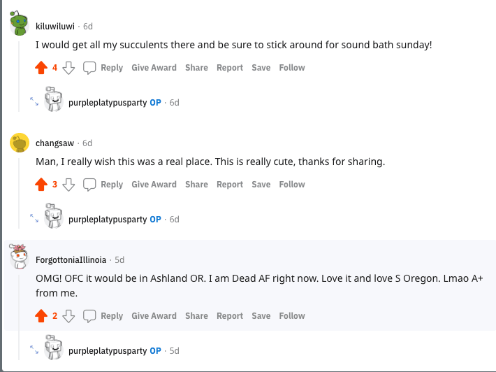
What random peeps said about Intergalactic Plant World:
Jacob Leech’s response to my copycat version of his site:
The response to IGW makes me start thinking that I should ditch this whole web design nonsense and start putting succulents in random objects I find at the junkyard.
Alpha-Net Ideas
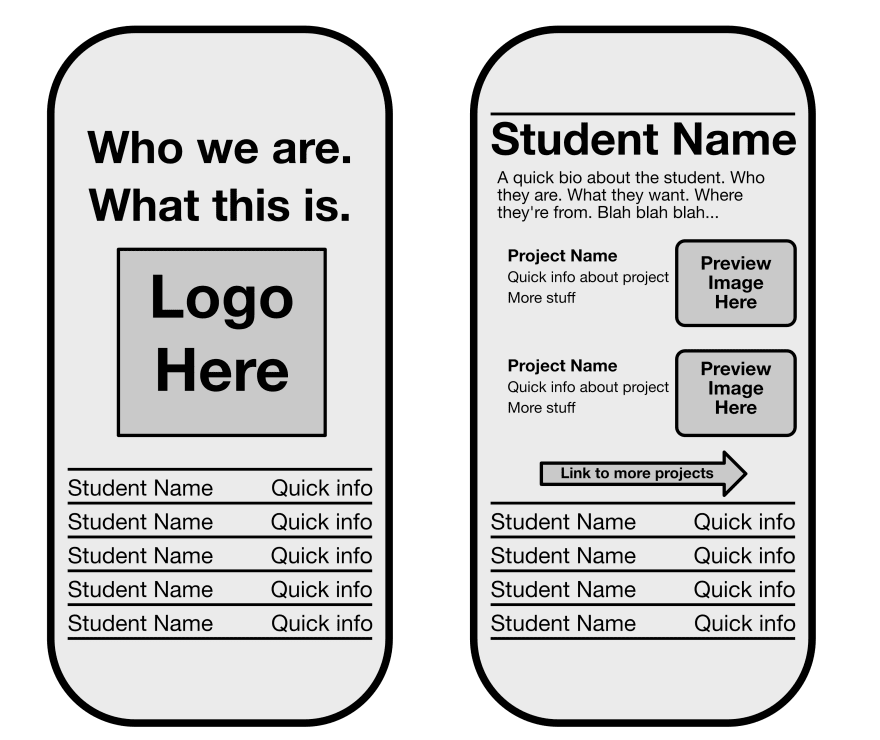
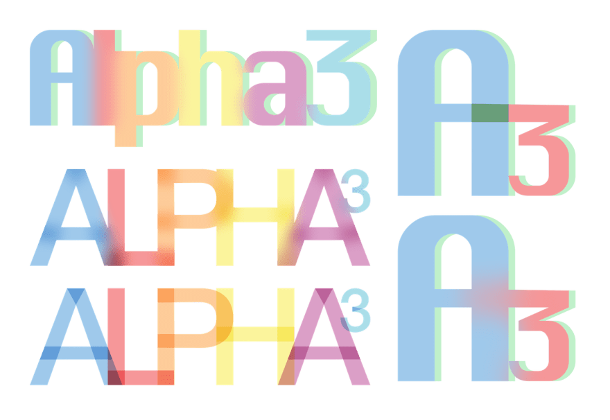
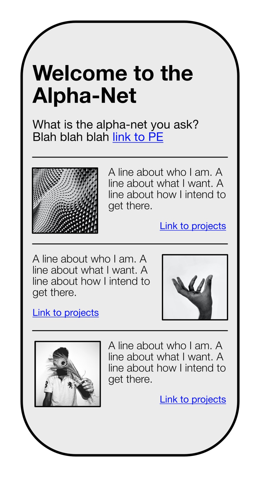
Started generating some ideas for the student directory. Also messed around with blending and blurring colors. Affinity is too much fun.
Some Cool Designer:
-
Marko Cvijetic
- Love his layouts. Will probably try to bring a couple of them to life.
-
Mariano Pascual
- I’ve been noticing the trend of making your website looks like the old school Mac OS. This website is pure insanity though. I love it. Would be fun to make my own version of this.
-
Kristen Kwong
- Similar design to Mariano’s but she’s more like the Athena to his Hades.
Update to Web Portal
Since we had the week off I was able to revisit an old project. For the new version of the web portal I wanted to make the layout somewhat reminiscent of the yellow pages where they have the title then a bunch of periods.
I also wanted to add an arrow at the end to signify that it’s a link. To do this I used the ::after pseudo-element on the link title and within the rule added a bunch of periods to the content property. To ensure the title and the arrow stay at opposite ends I used display: flex and justify-content: space-between. Worked out pretty good.
Next up was figuring out the side navigation bar. I always liked twitters set up with this so I thought’d I’d create my own version. Definitely some issues but I’ll fine tune it later. Check it here.
Welp, that’s all I got for you this week. Take it or leave it. ✌️


Top comments (0)