A few weeks ago I started my journey to become an expert in SwiftUI, you can read about it here.
I am a Javascript developer so many "programming" concepts are quite easy to pick up, however, when I started getting into SwiftUI I felt a feeling of joy and excitement to what concerns building UIs with a completely different approach.
Every day that I spend learning this framework I feel more and more enthusiastic about it.
Today, I am going to list 3 Random Reasons to join me in loving this new fantastic way of building iOS native apps, and I am not even going deep.
1. Goodbye Grid and Flexbox
I don't think Grid and Flexbox are bad, in fact, they are actually an amazing way to layout web and mobile apps. However, as the most performing athletes or the most popular and successful people on the planet remind us every day, we can always do better.
This is what happened, in my opinion with SwiftUI.
VStack (Vertical Stack), HStack (Horizontal Stack), and ZStack (Depth Stack, from Z-Index) are the three containers that speed the development of a layout tremendously. As you can deduct they help you to layout your elements vertically, horizontally, or layered on each other.
Plus, each element in SwiftUI starts positioning itself from the center, which is really handy.
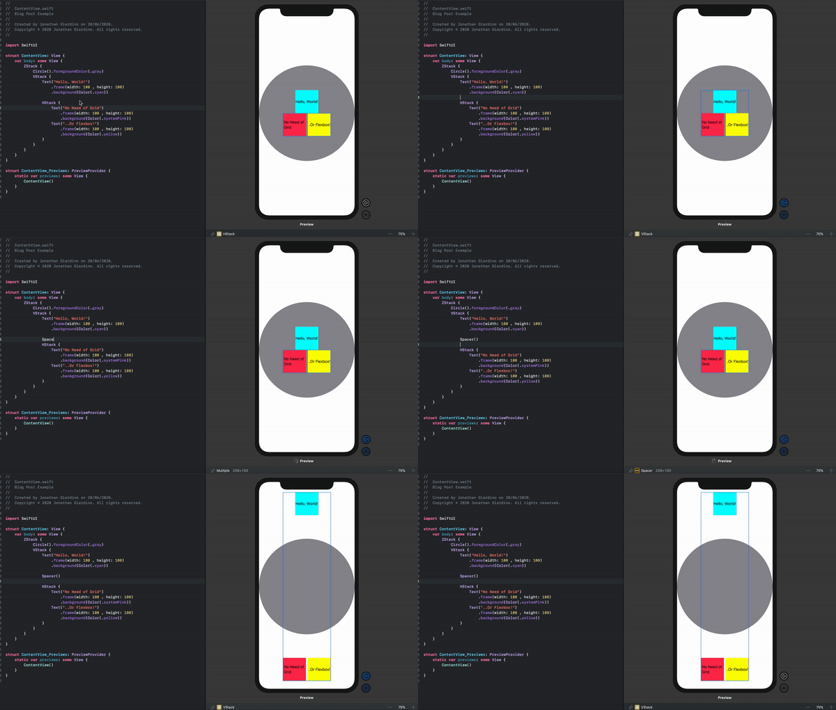
Let's say I want to have three squares with some text, one on top in the middle, the other two below stacked horizontally. All this needs to be on a circled shape that works as a background.
This is how we would do it in SwiftUI:
ZStack {
//The order of the layers goes from top to bottom, the first element will be in the back and accordingly all the following on top of each other.
            Circle().foregroundColor(.gray)
            VStack {
//Here we stack vertically a text element and a HStack that in turn has two text elements but this time they will layout horizontally
                Text("Hello, World!")
                    .frame(width: 100 , height: 100)
                    .background(Color(.cyan))
                HStack {
                    Text("No Need of Grid")
                        .frame(width: 100 , height: 100)
                        .background(Color(.systemPink))
                    Text("..Or Flexbox!")
                        .frame(width: 100 , height: 100)
                        .background(Color(.yellow))
                }
            }
        }
Don't you love it already?
2.Spacers
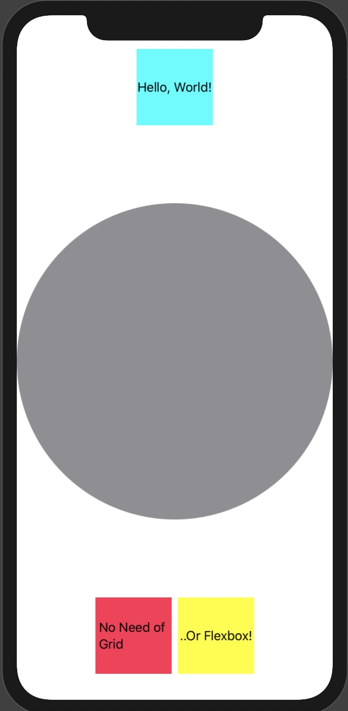
What if we want to move the first square on top of the screen and the other two on the bottom.
Easy peasy, we just insert a Spacer() between them and this will push them all the way to the end of the screen, and the direction will be based on the StackView they belong to, which in this case is a VStack, hence vertically.
ZStack {
            Circle().foregroundColor(.gray)
            VStack {
                Text("Hello, World!")
                    .frame(width: 100 , height: 100)
                    .background(Color(.cyan))

                Spacer()

                HStack {
                    Text("No Need of Grid")
                        .frame(width: 100 , height: 100)
                        .background(Color(.systemPink))
                    Text("..Or Flexbox!")
                        .frame(width: 100 , height: 100)
                        .background(Color(.yellow))
                }
            }
        }
3. Live Canvas
Are you tired like me to rebuild the project every time you edit a corner radius of a button or change the spacing or the font of a paragraph?
Well, SwiftUI has a Live Canvas that show the changes almost to the second. It's really impressive and speeds up UI development amazingly.
Any feedback, comment or advice is super appreciated, in fact it is encouraged.
Let's connect!
Website: jonathangiardino.com
Twitter: @jonathan_gardn
Medium: @jonathangiardino
Photo by Louis Hansel @shotsoflouis on Unsplash


Top comments (2)
I am on my way to learn swiftUI . Do i need to learn storyboard?
Not really, you won’t use them to build your app, SwiftUI provides you with a better way to create the UI. However, the LaunchScreen is still in storyboard so, what I would suggest is just to check out how to create a launch screen with storyboards!