Top Web Trends for 2020 and why they are coming
A look into the latest design and technology advances for web designers and developers
Most web design trends like elements fading-into-view, responsive layouts and parallax scrolling often can be traced back to the available technology at the time. Sometimes it is also an after-effect of a previous design trend or a consequence of a parallel trend in general graphic design. This article will take a look into the upcoming web design trends of 2020 and explore the underlying reasons for the shifts and trends.
Frosted glass effect
› What
The frosted glass effect is the semi-transparent and blurry appeareance of elements behind another. It was first introduced on a big scale for the Windows user interface via Windows Aero. Apple and major app developers started to adopt it later for their OS’ and apps as well.

Frosted glass effect on navigation bar (apple.com)
Up until now it was a rather rare occurrence, however you will see this nifty-looking effect increasingly on the web too. Current common uses are for navigational bars or text backdrops on images.

rgb.wiki using frosted glass on the nav bar
› Why
On the web this effect had to be simulated in an elaborate way, which made it difficult to implement. However with the new stylesheet property *backdrop-filter* it is now supported in most modern browsers. Also it is modern-looking and a graceful fallback is easily possible with half-transparent, solid backgrounds.
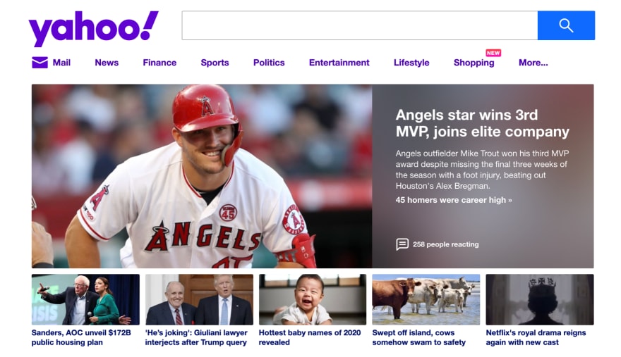
Yahoo using the frosted glass effect as backdrop upon the image (yahoo.com)
Dark Mode
› What
An adaptive color scheme of web apps and websites, aware of your native OS settings and showing you either a light or a dark theme of the site.
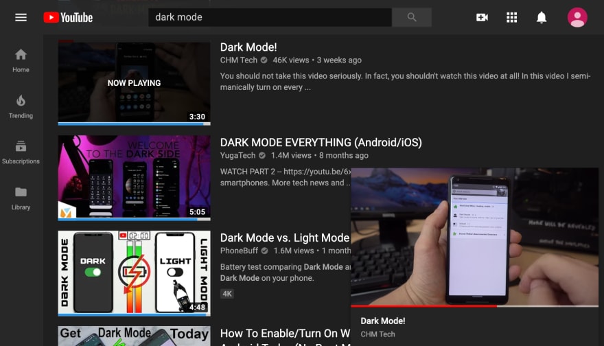
Youtube website in dark mode (youtube.com)
› Why
Some websites started to adopt a manual dark mode years ago. It was a simple control switch in one of the corners of the websites for those night owls who preferred a dark web design. This year major native applications on mobile and desktop have adopted a complementary dark theme (or light one, depending on their default) after the recent addition of dark mode on Android, Windows and Apple devices.
](https://res.cloudinary.com/practicaldev/image/fetch/s--WDeHtBFh--/c_limit%2Cf_auto%2Cfl_progressive%2Cq_66%2Cw_880/https://cdn-images-1.medium.com/max/2000/1%2AniDbWPmaNjVqrlQAsasQeA.gif)
https://dribbble.com/shots/6470322-Admin-Dashboard-light-vs-night-mode
Web browsers are feeding the system preference of enabled dark mode further to web developers with the CSS *prefers-color-scheme *media-query. It’s supported in all modern and admired browser.
Gradients Everywhere
› What
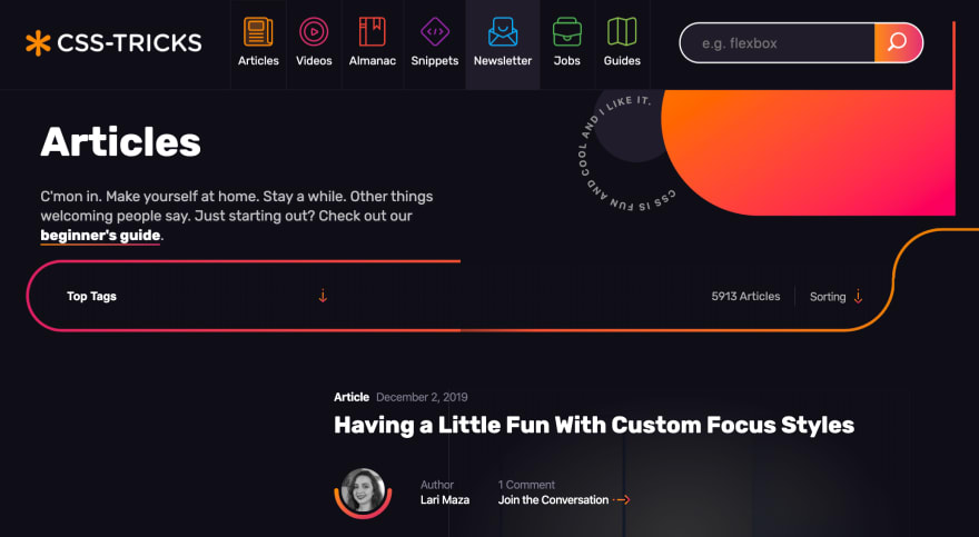
Gradients, the gradual transition from one color to another. Before flat design dominated digital interfaces, gradients were used to create (semi)-realistic surfaces. With the rise of flat design several years ago it seems a transition is happening from pure flatness to gradient-infused designs, displaying some depth again.

Gradient on button border (apple.com)
The trend of gradients furthermore applies to typography, in which the font color is set to a gradient; this also pushes for bolder and bigger typography on the web to make full use of this effect.
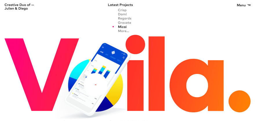
Gradient as text color (studiovoila.com)
› Why
There is no particular web technology that makes gradients more appealing. Gradients as backgrounds, on fonts and on elements were possible before with good support.
Features like *background-clip* & text-fill-color *allow for creating text with a gradient, and *mix-blend-mode allows for planar gradients by blending multiple onto another. These technologies gained good support over the years and are mature for productional use.
However seeing multiple tech companies adopting a gradient-utilizing product identity, it seems to be a naturally occurring design trend and not a technology-driven trend. The better support for *mix-blend-mode *and gradient-colors for text therefore only explains the vivid expression of this respective design choice.

Instagram rebranded its product identity away from pure flat design in 2016. In 2019 multiple companies followed this path.
Sophisticated 3D Graphics
› What
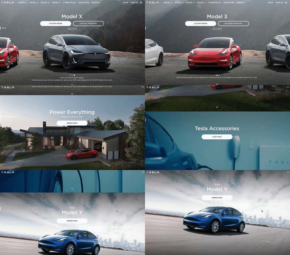
Big, cinema-like graphics and videos. Some are actual 3D renderings and others are videos playing interactively with your scrolling. The common ground lies in the sophistication of web media to capture your attention.
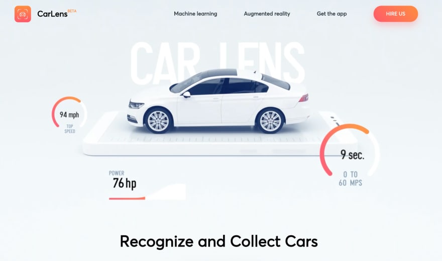
This 3d model is used in an animation. Notice the gradients here as well. (netguru.com/carlens)
› Why
This is technology-wise more of a continuous progression than a trend. With cheap smartphones being able to reproduce high-definition videos and 3d renderings by this time, and with the web becoming more mature, web designers and developers have the possibility to utilize technologies like this without worrying that the playback is failing and having to build fallbacks around it.

Interactive 3D game portfolio, playable on mobile (https://bruno-simon.com)
Support for high-quality video formats like AV6, H.265 and WebM is increasing and shows the need for bigger and better graphical elements on the web. It is likely that this trend will continuously progress with the overall development of the web and popular 3d frameworks like three.js.
Horizontal Scrolling
› What
Horizontal scrolling of elements that otherwise would break to the next line. Especially on mobile, where horizontal space is limited, we are seeing an increase in web designs utilizing non-breaking lists that has to be scrolled horizontally for more content.
)](https://res.cloudinary.com/practicaldev/image/fetch/s--Sj9EKJbf--/c_limit%2Cf_auto%2Cfl_progressive%2Cq_auto%2Cw_880/https://cdn-images-1.medium.com/max/3200/1%2A40fXsQ9JksORsVMHOb06Ew.png)
Two instances of horizontal scrolling (https://dribbble.com/shots/6794395)
› Why
There’s no specific technology advance responsible, this seems to be a shift coming from the need of having plenty of content available on a small screen. Horizontal scrolling allows for teasing the content, without having to scroll down arbitrarily long to get to the next section. This can be considered a shift in UX on the web, especially as gestures like these are already common for native apps.
)](https://res.cloudinary.com/practicaldev/image/fetch/s--qr1S_7AV--/c_limit%2Cf_auto%2Cfl_progressive%2Cq_auto%2Cw_880/https://cdn-images-1.medium.com/max/7680/1%2ALyUF0nnmr_L1zrDbkt9WfQ.jpeg)
Fabian Sebastian writes about the benefits of bidirectional scrolling (https://uxplanet.org/be1afe53206d)
Out-of-box Layouts
› What
Grid-like layouts with transformations, rotations, overlaps and small deviations in general on the grid elements.
](https://res.cloudinary.com/practicaldev/image/fetch/s--IMxqVA3G--/c_limit%2Cf_auto%2Cfl_progressive%2Cq_auto%2Cw_880/https://cdn-images-1.medium.com/max/3200/1%2APA5dVYnbrRPSuHGggykGVg.png)
https://dribbble.com/shots/7748587
› Why
Responsible for grid-like layouts are the grid and flexbox technologies, both are fundamentally supported in all modern browsers. Designers are already experimenting to break out of the obvious grid pattern, with asymmetrical element placing and overlaying sections on top of each other. The support needed for safe productional use isn’t too long ago, in fact both layout methods still have features in active development (like subgrids, flex-gap and space-evenly). We can expect web designers and developers to explore more use cases with experimental variations in the future as this is a recent development in web terms.
](https://res.cloudinary.com/practicaldev/image/fetch/s--KJlRE_zx--/c_limit%2Cf_auto%2Cfl_progressive%2Cq_auto%2Cw_880/https://cdn-images-1.medium.com/max/3200/1%2Aj-zcuj7KRE6g_KuJMN_i_w.jpeg)
https://dribbble.com/shots/6283244
Microinteractions
› What
Small animations and subtle feedback patterns on interaction. Microinteractions themself are already present en masse by default, but clicking a submission button which turns itself to a loading bar to show progress, pull-to-refresh interaction, or clapping a medium post and showing a fitting animation are microinteractions done with more consideration than a conventional color change.
› Why
Web Applications, component-based development (for reusable elements) and adoption of native gestures on the web are steadily increasing. There are enough companies that rely on creating an emotional connection with the user and on the web this is created through media and interaction. Maturing development frameworks and development practices allow for dedicating more attention to those finer details with microinteractions.
](https://res.cloudinary.com/practicaldev/image/fetch/s--nqNBQWBO--/c_limit%2Cf_auto%2Cfl_progressive%2Cq_66%2Cw_880/https://cdn-images-1.medium.com/max/2000/1%2AkJWCQJK24zj0KLmFT8uCQQ.gif)
https://dribbble.com/shots/5346227
Scroll Snap
› What
Scroll snapping allows to automatically fixate the scroll position smoothly on certain elements after the user has scrolled through content. This gives the user a clear focal point, without cut-off content.
› Why
The need to readjust the scrolling position to fit content to the screen came especially with side scrollers, which had until recently, to be implemented manually with Javascript. Especially with mobile having the need and possibility to easily scroll sideways for cycling through containers and images it became a popular technique for content display.
CSS allows for automatic scroll snapping with a few lines of code nowadays with scroll-snap; given the high need we will see an increasing use of it. The specifications have changed since the preliminary introduction of it, however it is now supported (in part) even on IE/Edge.
Tell us what trends you are interested in! What trend are you waiting for to take off? What trends do you see declining?
Originally published at https://rgb.wiki.







Top comments (3)
This is such a great list! I'm definitely going to try to code some of these.
pretty cool post, Jouan, thx!
I'm glad it is of interest to you!