The original article was written by SoftFormance [https://www.softformance.com/blog/product-design-process-guide/]
When you enter a store, what catches your attention first? Probably, products that are appealing, colorful, and with a creative, memorable design.
In fact, 7 out of 10 customers admit that product design directly influences their choice. Of course, it does. It’s in human nature to strive for beauty. We like looking at pretty things, and we like buying them.
That’s why the success of your software product depends on its custom design.
Now it’s more important than ever to invest in the creative and innovative product design cycle. Have you seen how many new products with outstanding UI/UX design there are on the market? Mindblowing.
Yes, it’s a competition. Competition for customers’ attention and loyalty, and if you want to win in it, it’s high time to enhance your design game.
According to the recent statistics, a high-quality UI/UX design enhances conversion rates up to 400%.
How long would you stay on the website that looks like it hasn’t been updated since 1998?
Would you like to work with this business or purchase something from them?
Personally, it would take me 5 seconds to figure everything out and close the tab.
If you’re reading this, you definitely understand that attractive and functional UI/UX design is essential. And now you probably what to know what it takes to create software with an effective and intuitive user interface.
In this article, I’ll share with you our steps in the product design process step-by-step.
If you apply the same principles with your design team, I guarantee your conversion and user retention will skyrocket.
So let’s start!
What is product design?
Product design is how your software looks and works from the user perspective.
It’s not only about nice buttons, colors, and fonts. It’s mainly about how pages and elements are connected and how easy it is to use your app.
Good Product Design presents complex functionality in an easy and intuitive way.
At a minimum, this process involves the following roles:
User Experience (UX) specialist
Graphic Designer
And Business Analyst
Now, let’s dive a bit deeper into the User Experience (UX) term and how it’s different from User Interface (UI).
Difference between UX and UI
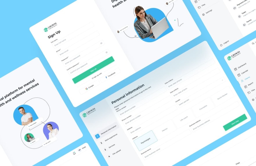
UI design: aesthetic part
In UI design, the visual part is the most important. This design is about how your product looks, whether it catches the eye or interests the user.
UI designers make sure that when users see your product for the first time, they stay and want to learn more about it. UI includes components like font, colors, animation, images, etc.
When we talk about apps and websites, UI covers their interactivity, feel, appearance. It’s also important to make sure that the interface is intuitive. You don’t want the users to look for a guide on how to use your web page.
Thus, the goal of UI design is to visually guide the user through the interface of your product.
UX design: functional part
Your product can be the most appealing and visually pleasing in the world, but it would be worth nothing if it was impossible to use.
Imagine that you have bought a house with an incredible top-notch design. You absolutely love everything about it.
But…
As soon as you enter the house, you notice that there’s a huge hole in the middle of the second floor, some stairs are missing, and there’s no door to the courtyard.
Even though you have the coolest-looking house in the neighborhood, you can’t live in it.
The same applies to design. Your product should not only be good-looking. It should be functional, and that’s where UX comes to the rescue.
Our product design process
When you want to build a house, you don’t start the construction right away. First, you need to research the type of house you want, hire the team, agree on the plan of the house, and only then can you start building.
The constriction process also has multiple steps that go in a specific order. You won’t start building the frame of the house before pouring the foundation and installing the drains, will you?
All this precision to details and strict adherence to the plan may seem a bit too much, but what you get in the end is a perfectly built house and fewer issues in the future.
What’s this all about?
Again, product design.
We don’t create designs for our clients overnight. It takes time, a lot of effort, and adherence to our plan.
But it’s well worth it.
Now, let’s learn about the steps in the product design process in detail, shall we?
- Discovery phase The first of the product design phases is the discovery phase.
Our goal here is to clearly understand the needs of our clients, what their product should achieve, and what problems it is supposed to solve.
To do this, we study the client’s project brief, technical requirements and come up with the questions to the client. These questions are discussed during the kickoff meeting.
During this meeting, we discuss the product’s target audience, goals, and conditions of use. The key here is to come to a mutual agreement and understanding.
The discovery phase is essential because both parties are encouraged to ask questions about the project and make sure that everyone is on the same page.
This stage helps determine the requirements for the future product and its design.
Here, we need to answer these questions:
What is the problem?
Who has this problem?
Why this is the problem?
How can we solve this?
What other goals should we achieve?
When our team clearly understands the client’s requirements and needs, it is time to set a goal for our design.
- Setting a goal What should a project achieve in the long run? What is its main goal?
These are the questions that should be asked at the beginning of this stage. Before getting to work, it is important to understand one thing: what is the big goal here?
The clients that come to us with the requirement to create a custom design or improve on the existing one usually want to improve conversion, fix onboarding, make their products user friendly, or improve on the visual part.
Now, let’s see how we would address each of those requirements.
Improve conversion
The product page is your product’s face. It introduces the product to customers, shows how it saves their problems, and convinces them that they need it.
That is why your product page has to look good and attract people. You need traffic, and you need it to be high.
Conversion rate optimization is a real struggle. Even if you are following all the guides in the universe and doing everything right, you can expect to win the sale only 2.5% of the time.
To increase conversion rates, it is important to focus on what typically makes people stay – the visual part.
High-quality images, videos, and animations are what the majority of the products need the most.
6 out of 10 projects we worked on lacked the visual component, and that is why their conversion rates were suffering.
What we implement depends on what the project needs the most: customer reviews, removing the clutter, improving the site speed, including FAQs, or making mobile conversions a priority. You name it. The end result is always the increase in conversion rates.
Fix onboarding
Frequently, our design projects’ main goal is to fix onboarding and keep users coming back.
Did you know that in 2020, 25% of mobile apps were used only once?
There are different reasons why people are not willing to use the app: it takes too much memory, has technical issues or too many ads, or isn’t easy to navigate.
UI and UX of the apps play a huge role, and the task is to make sure that once users open your app, they don’t want to leave.
How to achieve this?
To make people stay, fix the onboarding UX practice.
For example, explain to the users why they need the notifications, how to use every feature of the app, and what is the main value of the product.
When you buy a car, you want to know how it operates and learn about all of its features, right?
That’s why onboarding is as important as your product itself, and the users agree: 86% of them say that they will be more loyal to a business that invests in onboarding.
Make it more user-friendly.
Have you ever opened a web page and wondered what on earth was making that annoying sound that you couldn’t locate, and the only solution was to close the window?
Maybe you wanted to share an article on your social media, but the social sharing buttons just weren’t there?
Or even worse, you accidentally posted something you didn’t intend to because of the website’s poor design?
We’ve all been there, and the issue will endure, unfortunately.
If you don’t want your product’s page to make people’s eyes twitch, you should ensure that it is user-friendly.
How?
Here’s what we usually do to make clients’ designs more user-friendly:
Make the navigation more intuitive
Check if the website is mobile-friendly
Fix the visual part of the design
Make the website more inclusive
Come up with a unique content strategy.

Improve UI/Design/Visual part
When we talk about product design, looks do matter.
Would you use a website that looks like it had been created before you were born? Would it be enjoyable to read a green text on a red background? Would you buy a product if there were no pictures of it on the web page?
I highly doubt that.
One of the most common requests our clients have is to fix their product’s UI, make it more aesthetically pleasing and attractive.

Look at this website. This is a great example of what you should avoid at all costs when creating a UI design.
Why?
Because not a single soul would stay on a page like this for more than 5 seconds.
What elements in the product’s UI should be fixed depends on our clients’ needs and expectations, but we usually fix the visual part, typography, shadows, animation and make sure that the design is not too cluttered.
- User Experience (UX) The next of the product design process steps is the UX design.
The first step to building a functional interface for your product is to know what the UX really is.
The term was created by Donald Norman, Apple’s VP of the Advanced Technology Group, who said:
“I invented the term because I thought human interface and usability were too narrow. I wanted to cover all aspects of the person’s experience with the system including industrial design, graphics, the interface, the physical interaction, and the manual.”
This stage of design consists of the following steps:
Defining MVP features;
Competitors research;
Storyboarding;
Creating user and app flows;
Wireframing.
Let’s talk about each of them in detail.
Defining MVP features
MVP, or a minimum viable product, is a product with a limited number of features that solves at least one issue of your targeted customer. Its main goal is to collect feedback from the users and see whether they need this product at all.
According to Eric Ries, an MVP is the version of a new product that allows a team to collect the maximum amount of validated learning about customers with the least effort.
That is why an effective MVP strategy is so important in the early stages of UX design. It allows you to see what are the exact expectations and needs of the users in regards to the product’s features.
At this stage, we create a list of MVP features and arrange them according to their priority.
Here, the features are not prioritized yet. It is just a list of everything required for the future product. As you can see, there are four steps that users take to solve the issue using the product: customize an order, manage it, pay, and receive the order.
The next step would be to describe each step in detail and write all of it on cards.
To customize an order, a person should choose their location, type of cuisine, a specific restaurant, a meal, perhaps a drink, and add everything to the cart.
Next, you should describe the next step and so on. After it’s done, you draw a horizontal line to demonstrate user flow.
What’s missing from this image is a priority. The key is to prioritize the features and decide on the value of each of them.
Next, draw a vertical line and place each feature according to its value, like this:

Prioritizing features allows defining the scope of the MVP and its walking skeleton, or the smallest usable version of a product. For example, look at this LinkedIn MVP:

Remember that during this stage, you are not supposed to reinvent the wheel or copy the designs you find during the research.
What you should focus on is users’ problems and unmet expectations that your product can help solve. Competitive analysis should be a tool for making your design more functional, user-friendly, and highly competitive on the market.
Storyboarding
What is a storyboard?
It’s a visual representation of a user’s experience with a product. Usually, it involves creating a comic strip that shows the user’s interaction with a product.
Storyboarding helps UX designers understand the flow of the user’s experience and highlight the most important features of the product.

Here is a great example of storyboarding. It doesn’t need to be as detailed and professionally drawn, but you get the idea. The key is to tell a realistic story. To become the user and experience the product as others will.
The benefits of storyboarding include:
It’s human-centered.
It helps understand the existing scenarios of interaction.
Allows for the “pitch and critique” method.
Allows prioritizing what really matters.
Allows designers to experiment and test multiple concepts and ideas simultaneously.
Creating user and app flows
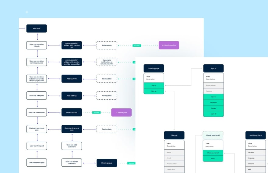
User flow is an intended series of steps that a user should take to get the desired output from the product.
According to the experts at Optimizely, the user flow takes the users from their entry point through a set of steps towards a successful outcome and final action, such as purchasing a product.
Thus, each step of the user’s journey is important and should lead them to their goal.
Creating a user flow allows to prioritize content requirements and create the design in the most efficient way.
This is how it usually looks like:
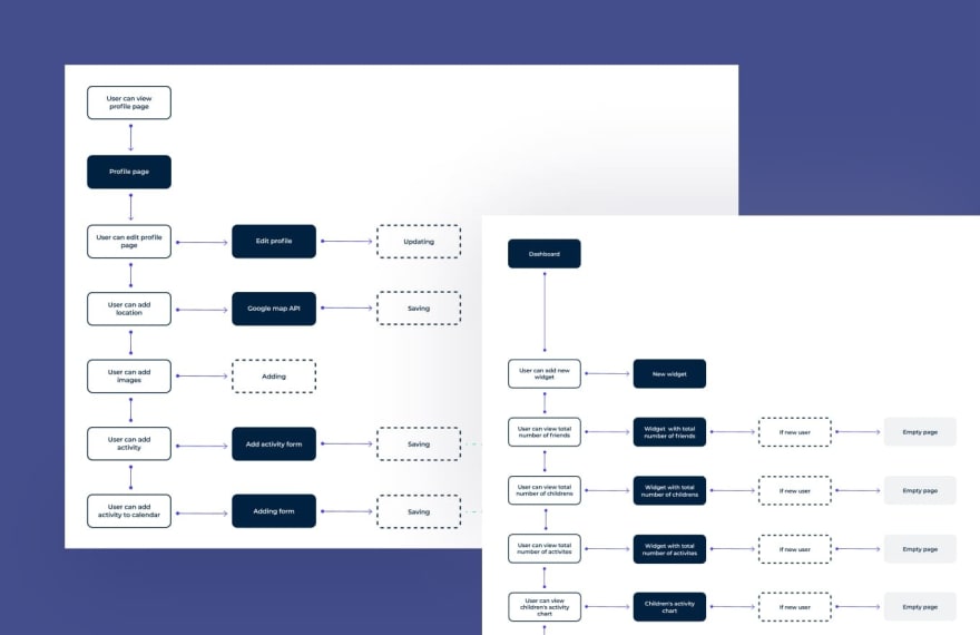
Creating user flows allows you to visualize the process quickly, better learn your audience, eliminate any malfunctions, and improve communication.
Wireframing
Last but not least, we move to the wireframing process.
This process involves drawing overviews of the products and creating sketches that help understand what an app will look like. A wireframe is a very simple sketch that is also called page architecture or a page schematic. It’s what your design will be based on.
It is much faster and easier to review and change the structure of pages when they are presented in a wireframe format.
Here is what a wireframe may look like:

This strategy has a lot of advantages. First and foremost, it helps both the designers and clients see what the product will look like and make alterations easily.
Secondly, wireframes ensure that the content on the page is positioned correctly based on the product’s goals and users’ needs.
At SoftFormance, we never skip this step because it allows our designers to confidently move forward in the design process.
- Branding This next stage is optional, and it depends on your goals and vision of your product. If you want it to become a brand and make people talk about it, there are some branding fundamentals you should take into account.
According to Forbes, the fundamental elements of branding include authenticity, honesty, core values, strong messaging, knowing your target audience, and so on.
Why does branding matter so much?
Well, it helps companies establish their unique place among competitors and demonstrate to customers that a brand has a certain purpose, intention, and awareness.
Branding also helps build brand loyalty. Customers are more likely to return to a company whose brand is memorable and consistent. That’s the reason why people would rather buy products from a company with a well-known, established name rather than from small sellers.
By investing in brand identity, you are more in control of how others will perceive your brand. You can choose the logo, brand color palette, general imagery, and typography. The key is to make all these elements stand out and be memorable.
How to develop your brand identity?
Brand identity consists of memorable elements whose synergy makes your brand recognizable on the market. It’s the core of your brand, what people will remember and talk about, and that’s why you should address this process creatively.

The key elements of your brand identity are:
Brand name
When you meet new people, you always tell them your name first. It’s the most important thing about you that they should remember. The same about your brand. It should represent the core of your brand and what it focuses on.
Color palette
The visual part is essential for effective brand identity, and there’s nothing more eye-catching than a pleasant color palette. The best solution would be to hire a team of professional designers who are knowledgeable in color theory.

Brand voice
Imagine that your brand is a person. How would it talk, and what would it talk about? Perhaps, it would use a formal and restrained tone, or maybe joke around all the time? Brand voice is about the messages you want to spread and what you want people to hear. It’s about your brand’s personality and core values.
Typography
If you want your brand to be recognizable, focus on a limited number of fonts. They need to be consistent, aesthetically pleasing, and easy to read. Imagine reading a book that has 10 fonts of different sizes and styles. You would probably be annoyed, right?

Logo
The face of your brand. It’s the main representative and what people will see most often. When you hear the name Nike, what do you think of it? Correct, it’s a famous swoosh. Your goal is to find your “swoosh.” The logo will represent your brand by being bold, memorable, and unmistakable.
- User Interface (UI) The next step of our design process is user interface design. At this stage, use the UX and branding we have already created and implement them in a working user interface.
UI design focuses on building interfaces that are both interactive and aesthetic. The goal here is to create a design that would attract the user visually and will be easy to use.
Since this is one of the last steps of product design, UI builds upon what the UX process has created and defined. It’s a logical outcome of all previous steps, and it includes design briefing, mood board creation, designing concepts, and developing sketches and wireframes.
Concept
The designconcept is the main idea behind your design. It’s the core idea that can be explained via different visuals: sketches, written statements, or images.
When you come up with a concept for your design, bear in mind that everyone should be able to understand it. It shouldn’t be something philosophical or cryptic. Straightforwardness is the key here.
After defining the concept, the team usually explores several design options to determine the most user-friendly and aesthetic one.
Design concept creation is closely connected to the next stage, mood boarding because both involve drawing inspiration from existing designs, images, and other visual elements.
Moodboard
Moodboardis a visual representation of a concept you have for the project. It looks like a collage of images, objects, animations, and text that inspires the future design and conveys the general idea.
With moodboards, you don’t have to produce new work because you collect all images online. The key is to evoke the feeling you want people to experience when they use your product.

Remember, though, that inspiration should not equal plagiarism. It is totally fine to take images from all over the Internet and use them to get inspired and create your own product.
What’s not okay is to use someone else’s work. Let’s say yes to defining your own path and no to plagiarism.
Mood boarding opens your eyes to new possibilities, allows you to be more creative, and positively influences your future work.
At SoftFormance, we use mood boards to provide clients with ideas, demonstrate where our design team is headed towards, and what will the final feeling evoked by the product be like.
By putting all ideas and concepts in one place, we can quickly access them and see whether the entire composition makes sense and is harmonious.
Prototypes and final design
After all that effort and time spent on the previous stages, you can finally start creating your high-fidelity prototypes and moving to the final design.

The difference between a wireframe and a high-fidelity prototype is that the latter one is interactive. It’s almost like your final design but without the final changes.
It’s what you create to present to your clients and test the functionality of the product. You can also use high-fidelity prototypes in user testing to collect feedback and invest in further design if needed.
What are the pros of hi-fi prototyping?
It allows collect meaningful feedback during the testing phase;
Testability of UI elements and interactivity;
Great for demonstrating to stakeholders.
Once the hi-fi prototype is finished, feedback is collected, and final changes are made, it’s time to present the final product.

The final design is a fully-functioning product that includes all changes made in the previous stage, including users’ and stakeholders’ feedback. It should solve the problems mentioned at the first stages of design, meet the core concept, and serve the needs of both the clients and the customers.
Imagine that you have been building the house, and it’s finally time to see the final results. Of course, you expect everything to be perfect and all your remarks to be taken into account.
Sometimes, though, it can happen that you are not fully satisfied with the results. Some walls may need repainting or a sink being fixed.
The same applies to the final design. It happens that clients have some remarks and want to change some elements of the design, and that is why the team can return to previous stages to implement those changes.
The final product is almost never really final. It all depends on the collaboration with the team during every stage of the design.
Essential tips and avoiding mistakes
Don’t expect your design process to be smooth and flawless. Mistakes will happen, be it due to miscommunication or technical issues.
But some mistakes can be easily avoided if you follow these tips:
Collaborate with the team.
You’re in this together. When you delegate your product design to a team of designers, you are responsible for clearly stating your goals, needs, expectations, and your craziest ideas.
The outcome does not only depend on the team. It also depends on the communication between you and the designers. You need to collaborate and stay in touch.
Learn from the top companies
Some companies are called the best for a reason. When working on a design, feel free to draw inspiration from the companies that set design standards, no matter in what industry they are working.
The simpler – the better
All the best designs are simple. The users should easily navigate your website or app, not find it complicated and impossible to use. That’s why you should follow a simple thinking approach.
Take your time
There’s no need to rush when you’re designing your product. Take as much time as you need to perfect every detail and solve all issues. Invest time in research, communication with the team, and testing.
Understand your customer
Every design should be customer-oriented. Your main task is to create a real customer journey and understand how people will use your app. You should understand your customers’ issues, needs, preferences and help them have the best experience possible with your product.
SoftFormance product design
Having launched more than 200 successful projects over the years, we can make one definite conclusion – custom design is essential if your product is customer-oriented.
When we just started, we were only programmers, and we were just applying theme templates to most of our software products. But over the last five years, we realized that great software is both great on the logic layer (code) as well as on the design level (user interface). That’s when we introduced a design department within our agency.
So, if you want your product to be recognizable, memorable, and competitive, it’s high time to invest in custom design and branding.
Our design team can help you with that.
At SoftFormance, we make sure that our client’s designs are unique, creative, and highly functional. We’re not afraid of implementing your craziest ideas and making sure that your products stand out on the market.
If you want to see the portfolio of our finished products, you can check it out here.
Case study
One of the recent projects that we have finished is KidiBoard. It’s an application for parents that contains both a marketplace and a social network.
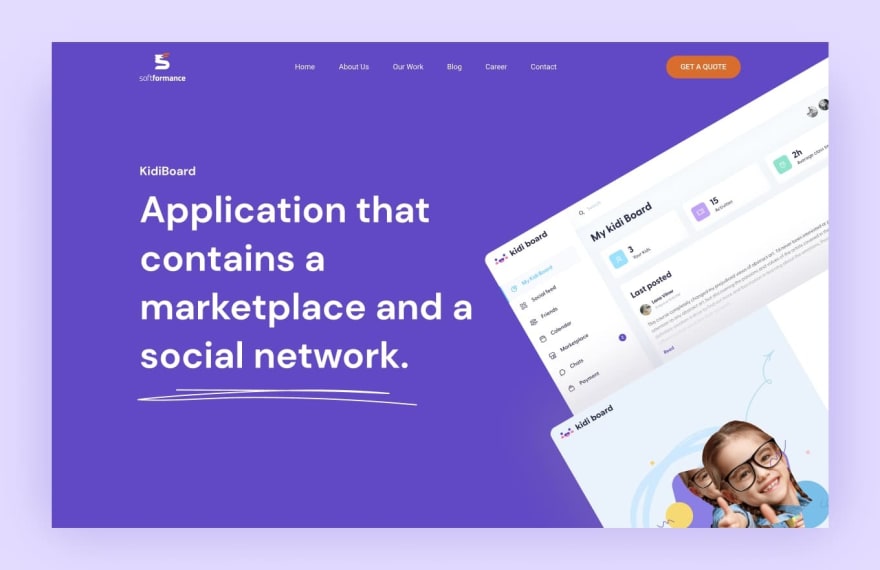
Parents who use KidiBoard can connect with each other, find clubs, seminars, and activities for their kids, and even look for personal tutors there. Users can look for art classes for their kids, yoga, photography courses, and other activities in their location. They can also chat with other users and make posts on their feed.
Thus, our goal was to understand the key needs of parents and make a user-friendly interface with a lot of useful features.
Let’s take a look at the KidiBoard design process:
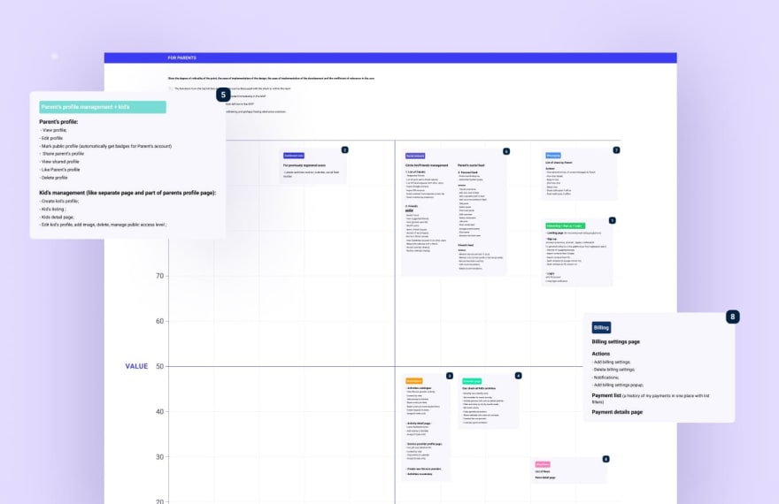
First, we identified the key MVP features.

Then, we created user and app flows.

The next step was to design login & onboarding steps.

Next, we created the MVP version mockups for the app.
During the branding UI design part, our team worked on the app’s color palette, typography, buttons, and states. We also created moodboards and prototypes for the client.
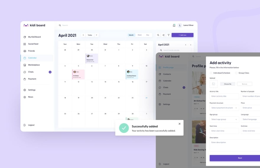
Here is how the page with kids’ activities looks like.

Parents can also communicate with each other in their personal chat.

KidiBoard is a social platform, so parents can make posts on their social feed and follow other users’ updates.
If you want to have a very nice design and UX done like we did for Kidiboard, then we’re ready to help.
Summary
According to research by Study Council, the companies that put an emphasis on design do way better than the ones that don’t care about it. In fact, they outperform the FTSE 100 index by 200%.
That’s why custom design is so important. Your product’s design is the face of your company. It demonstrates how dedicated you are to the success of the business, your main goals, values, and principles.
You should never underestimate the influence of UI/UX on the competitiveness of your product on the market and the importance of investing in the design process during product development.
The success of any digital product depends on how customer-oriented it is, whether it takes into account users’ needs and expectations and whether it offers creative solutions to their problems.
Your custom design should be user-friendly, simple yet functional, and represent your product’s concept and goal. If you need help with creating an aesthetic and efficient design, our design team can assist you with that.
When we start working on a project, we consider all client’s ideas, remarks, and wishes. Our core principles are transparency, flexibility, creativity, efficiency, and standardization.
Since 2011, we have finished 200+ projects and will happily consider your great digital product idea too!
Therefore, if you’re interested in working with us on your custom design and company branding, contact us.



Top comments (1)
Great post, it contains a lot of information useful to me.
Of the useful posts, I can also mention the post what is product design, it is perfect for learning product design for beginners.