I’ll be real: I didn’t set out to make yet another dark theme. I just wanted to stop rubbing my eyes like a sleepy toddler by 10 PM.
Here’s the story:
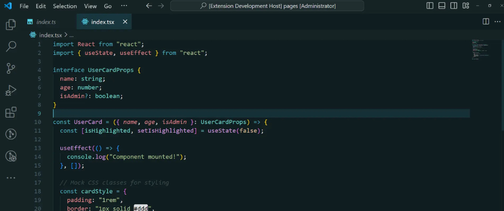
After burning out my retinas with neon-colored brackets one too many times, I started experimenting with darker, warmer tones. The goal? A theme that felt like sipping herbal tea — soothing, not stimulating.
The “Aha!” Moment:
I showed an early version to a friend who said, “Wait… why does this feel easier to read?” Turns out, the subtle teal-and-charcoal palette (#101E21 and #17363D) reduced visual noise without sacrificing clarity.
What I Learned:
- Good themes aren’t about looking “cool” — they’re about disappearing so you can focus.
- Tiny details matter (like making JSON keys just slightly lighter than the background).
Try it yourself: Ocean Mist
And if you hate it? Tell me why! I’m just a dev with a color picker, not a designer. 😅

Top comments (4)
I'm a sucker for themes. I'll most certainly try it out.
I'm sure you'll like it.
Glad to know that! Thank you
You're welcome @landingcat