
For the last few days(9 to be precise) I have been collecting some public data with the help of Dev API. My motive behind this was to see some natural behaviors of posts and the authors at Dev.
For that, I wrote a simple Python script that would collect the data of the top 50 dev posts each day and send it to my email at a specific time each day for 7 days a week. I deployed the script at Heroku and started receiving the data from the very moment I deployed it. After collecting data of 9 days, I took the data of the latest 7 days and made some quick analysis.
And now, I am happy to share the data with you guys today.
SPOILER ALERT: Probably the most useful piece information is in the bottom
Relation between reactions and comments
| Reactions | Comments | |
|---|---|---|
| Maximum | 243 | 45 |
| Average | 20 | 1 |
| Minimum | 6 | 0 |
Point to be noted: It's not necessary that the post with 243 reactions will have 45 comments and vice versa.
Let's see some graphs for better visualization.

As the table informs, the maximum post-reaction is 243, the average is about 20 and quite a small amount of posts have reactions near to 5.
Now the graph for comments.
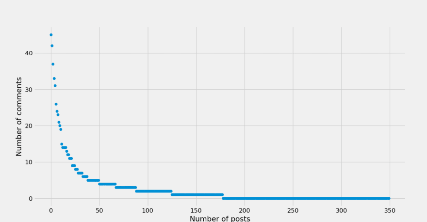
Not a significant difference in comparison to the graph of the total number of reactions.
But the scenario changes as we combine the scatter plot for the number of reactions and number of comments together.
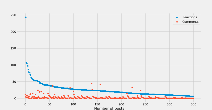
As you can see, the post with the highest number of reactions doesn't need to have the highest number of comments. Even, in some cases, the number of comments is more than the number of reactions.
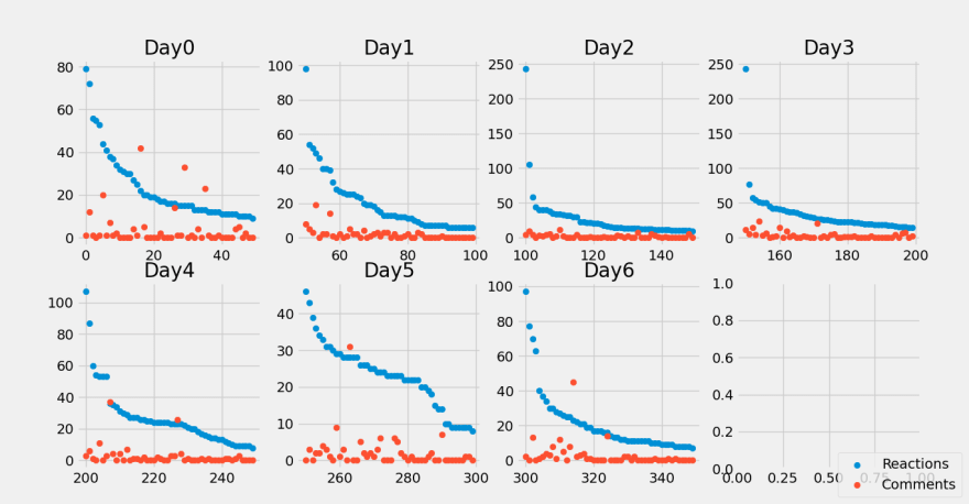
Here is a more detailed graph chart split into days for a more comprehensive comparison.
Some neat peaky details about the post
Let's see the details in 6 different categories to answer the following 6 questions.
- Was the post cross-posted?
- Was the post edited?
- Is it a part of a series?
- Was is posted under an organization?
- Was it posted the same day it was created?
- Does it have a cover image? 😅
1. Was the post cross-posted?
Crossposted means, the post was published on a different website and its main origin is not from Dev.

Wow! Almost all the posts of Dev aren't crossposted. That means people prefer to write posts at Dev rather than just copying and pasting it. Isn't that good news?
2. Was the post edited?

So, about half of the authors make some changes to their post once they are made public to read. That's interesting. Do you know what's more interesting? The pie chart looks like the logo of Pepsi. 🤣

3. Is it a part of a series?

I have noticed that if you are making a series of posts, your first post will get a nice amount of views(reactions) and the number will keep decreasing as the series advances. It's also true for other platforms such as Youtube.
4. Was it posted under an organization?

5. Was it posted the same day it was created?

So, about 79% of the authors publish the post the same day they created it. On the other hand, 21% of them took several days to complete finishing it.
6. Does it have a cover image? 😅
This has to be the most informative chart in this whole post !!! 😂

Comparing the size of the post
For this part, I have divided the post into three categories.
- Small: Takes about 5 minutes to read
- Medium: Takes about 10 minutes to read
- Big: Takes more than 10 minutes to read
To figure out the reading time, I counted the words in the post(actually my script did) then divided it by the average reading speed of an adult person(225 words per minute).
Here is what I have discovered.

It's quite clear like daylight, people like to read the small post as they don't take much time to finish. Though the number of big posts is less, some people like to read super informative posts.
Here is a detailed scatter plot of the same pie chart stated above.

Even a few posts crossed the limit of 20 minutes and there is one that will take almost 30 minutes to read. SALUTE!😉
Publishing time
The Dev is a global community. So, activities are going on 24 hours and 7 days each week. So, it doesn't matter which timezone you are, you will still receive fresh and latest posts every hour of the day. However, not all hours are the same. So, here is a chart that indicates the number of posts being published each hour (+ GMT).

And here is another one.

As both of the charts suggests, the most active time in Dev is between 13.00 (+ GMT) to 18.00 (+ GMT).
For me, it's at midnight. 😑
Analysis of the authors
Unfortunately, for this category, there wasn't that much useful data. I still managed to answer the following question(not that useful at all)
- Does the author have Twitter?
- Does the author have Github?
- Does the author have a website?
Here are the answers.


Analysis of top 5 tags
Now my favorite part of the whole report. The usage of tags. This can be visualized in 5 perspectives.
- Total number of reaction
- Total number of comments
- Total number of average reactions
- Total number of average comments
- How many times it was used
1. According to the total number of reactions

As always, Javascript leads. After all, Javascript is the most famous language.
2. According to total number of comments

You know the reason why discuss is the top tag! 😁
3. According to average number of reactions

We can clearly see the effect of current event, web monetization(I love it!)
4. According to average number of comments

I was expecting discuss to take the lead.
5. According to total number of appearance
So, wanna go viral? Write a post using the javascript tag! 😆
JUST KIDDING! It's not the tags you use but the quality of your content which matters the most.
You can access(contribute if possible) all the raw data from this Github repo.
 Muhimen123
/
Dev-Data
Muhimen123
/
Dev-Data
Some public data collected from the Dev API for simple analysis
We have come to the end. This was all I have to offer to you guys this week. I hope the information was somewhat useful if not helpful to you. Let me know in the comment section what you think about the report and whether you want to see this kind of report each week or not.
Until next time, happy coding. 😀

Latest comments (3)
This is a super interesting write-up! Thanks for sharing.
Amazing article!
Thank you 😀