Originally posted on scenelab.io - try our online editor for branding and mockup graphics.
Building websites or apps requires a range of different skills. Independent of what toolset you choose you'll have to know the basics of HTML, CSS, JavaScript to some extent. Nowdays you might also have frameworks like React, Angular or Vue.js on top. Even if you're doing plain server-side rendering with something like WordPress with a bit of jQuery sprinkled on top, you'd still have two more things to get familiar with.
Managing these technologies well is respectable in and of itself. It's perfectly natural not to excel at everything and therefore you shouldn't feel bad for some lack of designing skills - I'll give you some tips on how to end up with decent user interfaces anyway.
Web Developer Without Design Skills
You definitely can work as a professional web developer without having design skills. In my opinion this shouldn't even be an actual part of the job description. Once you've done some work in the industry though, you might disagree. Especially in enterprise software development there's a notion for giving user experience and design a lower priority. This can lead to some unpleasant surprises as developers are guessing what's best.
In terms of design and usability, consumer-grade websites and apps have long surpassed enterprise software. Nowadays, enterprise users expect the kind of user experience they know from the tools they use everyday - mostly on their phones.
But you might also be missing a designated designer when working in small ventures or when building something just by yourself. In all those environments it pays of to have some basic design skills and a couple tricks up your sleeve. You'll be inevitably more valuable to the project and also increase communication skills with designers because you know where they're coming from.
Design Principles
Principles are a solid foundation for any craft. They provide you with concepts which are applicable to many different domains. You can use them to reflect and validate your creations. This way you have proper arguments when discussing and refining designs rather than just arguing about what "looks better".
You could start by looking at the works of some influential figures. Alan Dix wrote a book called Human Computer Interaction where he structured several principles into the categories Learnability, Flexibility and Robustness. Don Norman wrote The Design of Everyday Things laying down seven principles of usability design.
Although these principles are often highly praised, they're pretty abstract. Instead of trusting what one person came up with when writing a book about design, I like looking at what worked for people designing real user interfaces. That's why I urge you to take a look at design case studies from other companies and the principles they derived from experience and iteration. Here are a couple studies I found interesting:
- Airbnb: The Way We Build
- Relay: Designing for open source software
- Did Snapchat succeed because of its controversial UI?
Another useful set of principles for evaluating your user interface designs are the Gestalt Principles. These psychological principles describe how humans recognize groups and patterns. They'll prevent you from becoming blind to certain errors you might incorporate in your design by helping you understand how new users will approach your interfaces.
Developer Tools For Design
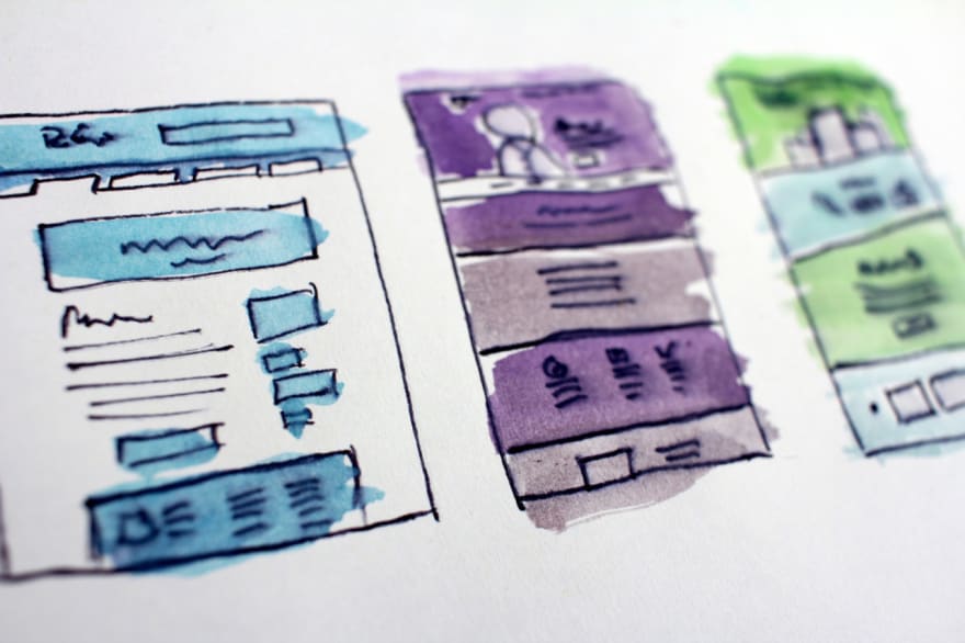
Designing interfaces might seem to call for extensive tool support allowing you to build sophisticated mockups of your website, however, I'd propose the opposite: just use pen & paper or a whiteboard. In my opinion these are the best tools in most of the cases. Their simplicity offers several advantages:
- you don't have to learn complex tools
- you won't loose yourself in the pointless bits and peaces of complex tools
- iteration is fast and without hurt feelings - turn the page or wipe the board and start over
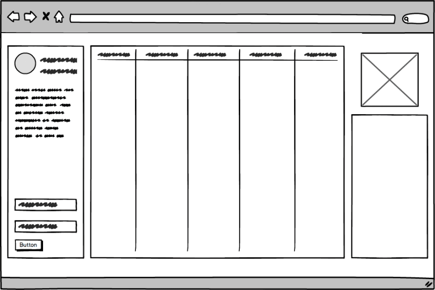
Designing user interfaces with simple measures gives you what's called a low-fidelity prototype. If you're insisting on a digital tool for that, try Wireframe.cc, draw.io or Sketchpad.
If you'd like to have a more refined look you can still transfer your scribbles into more advanced tools, giving you high-fidelity prototypes.
Sometimes though you're design has to be more polished. For those cases I've had some good experiences with balsamiq. It's somewhere between low and high-fidelity - depending on how intensively you'd use it.
When you want to go all out and create a high-fidelity prototype, you can refer to tools like Sketch, Figma or Adobe XD. Maybe also Photoshop or Gimp will work for you as they'll enable you to create pixel-perfect designs.
Again, these tools can be challenging to get into. Making them part of your workflow might therefore be harder than starting out with simpler ones.
While you'll definitely get closer to the actual implementation of your website or app, you can also run into problems with high-fidelity prototypes. It's easy to get stuck up on details when discussing such prototypes. Also people might refrain from criticizing fundamental aspects of your design, because they don't want to devalue the effort you put up. Less tech-savvy people also might get the impression that the final product is almost done when you present fully-fledged and possibly interactive prototypes.
When you're looking for a color palette to apply to your design, try the Adobe Color Wheel or Material Color Tool. Personally I really like Coolors because you can get inspired by existing palettes or play around until you've got something good.
Design Frameworks
By design frameworks (or design systems) I don't mean just mean some CSS theme or a bunch of components you'd use when building your website or app. Although the latter are often based on the former - such as React Material UI is implementing the Google Material Design Framework - a design framework offers principles, styles and best practices for designing interfaces or rather whole user experiences. Some examples include:
You can also find a nice collection of design systems created by different companies in this Design Systems Gallery.
Design systems have several advantages over going at it on a per-interface basis. First, you get a solid set of pre-existing components you can use. This way you don't have to reinvent the wheel for common interactions. Next, you get a set of rules for creating components and interfaces that work well with the existing ones. Moreover your interfaces will be consistent allowing users to navigate seamlessly through your websites.
You might feel restricted by a design framework, yet, that's exactly what it's supposed to do: give your creativity a solid frame to streamline your work and provide coherent results.
If you don't like using someone else's design framework, you can also create your own. Tools like Storybook or Bit come in handy here.
Get Inspired And Iterate
Have a look at the tools you like using and figure out what exactly you like about them. Learning from others is a totally valid approach - as long as you don't straight up copy them. Also, if you need some smaller design cues tailored to developers, have a look at Refactoring UI.
It's important to setup a system that has a solid foundation whilst being rigid enough to adapt to your use-cases. Making errors quickly allows you to iterate faster eventually reducing the risk of fundamental mistakes and allowing you to grow.


Top comments (6)
This is an awesome article regarding design systems Invision's Inside-Design & Topal Design Blog has very good articles on designs which is used to reference on articles that are useful for me
Thanks a lot. The article is really interesting.
Glad you like it, more coming up!
Very good article and references, thanks
Appreciate it! I love sharing the references I pick up along the way :)
love this! Bookmarking for later reference :)