
Over the past few years, Responsive design has become quite a hot topic in the web design community. There are various frameworks which help to build responsive design faster. One of the ways is using Viewport percentage units or “Viewport Units” for short, a CSS3 property which helps you to automate some aspects of your responsive design.
Using viewport units, the size of specific elements can adapt to the varying size of a browser.
Instead of pixel, em or percentage values, you can use these settings:
- vw: the percentage of the browser’s width
- vh: the percentage of the browser’s height
- vmin: the minimum percentage of browser’s height or width, the smallest value of both
- vmax: the maximum percentage of the browser’s height or width, the smallest value of both
You may use these units in any CSS property that accepts values in px such as width, height, margin, font-size, etc. They will be recalculated by the browser on window resize or device rotation.
Let’s take an overview of its advantages:
Full Height of the page
Traditionally, we have been using height:100% to get the full height of the container to fit on the screen. We can obtain the same result with less code by using vh. This helps to scale an image to the height of the user’s screen. View demo in codepen. To see a difference, replace 100vh with 100% in the Codepen demo.
.image-container {
  height: 100vh;
  width: auto;
}
Keeping an element shorter than the screen
This technique can be useful if you want to explicitly control the height of an element relative to the viewport size so that it will always remain in view. View demo in codepen
Scaling Text (Responsive text)
Using this technique it gives developers great flexibility when adjusting font sizes and they help to scale dynamically with the viewport size. For easy practice place a base font size in the root element, and then use a viewport unit on the root element’s font size, and scale with that.
Media queries combine nicely with vw units to ensure readability across various screen sizes. View demo in codepen. Try changing a base font size (html) value.
html {
  font-size: 20px;
}

h1 {
  font-size: calc(100% + 5vw);
}
Breaking out of the container
Viewport units make it possible to break outside of a containing element or elements. In scenarios where the CMS makes it difficult or impossible to alter our markup in an HTML template, using viewport units can achieve the desired result regardless of the markup. This technique won’t work in every scenario, but it’s a nice trick in some instances.
View demo in codepen
.container {
  max-width: 1024px;
  margin: 0 auto;
}

.breakout {
  position: relative;
  left: 50%;
  transform: translate(-50%, 0);
  width: 100vw;
}
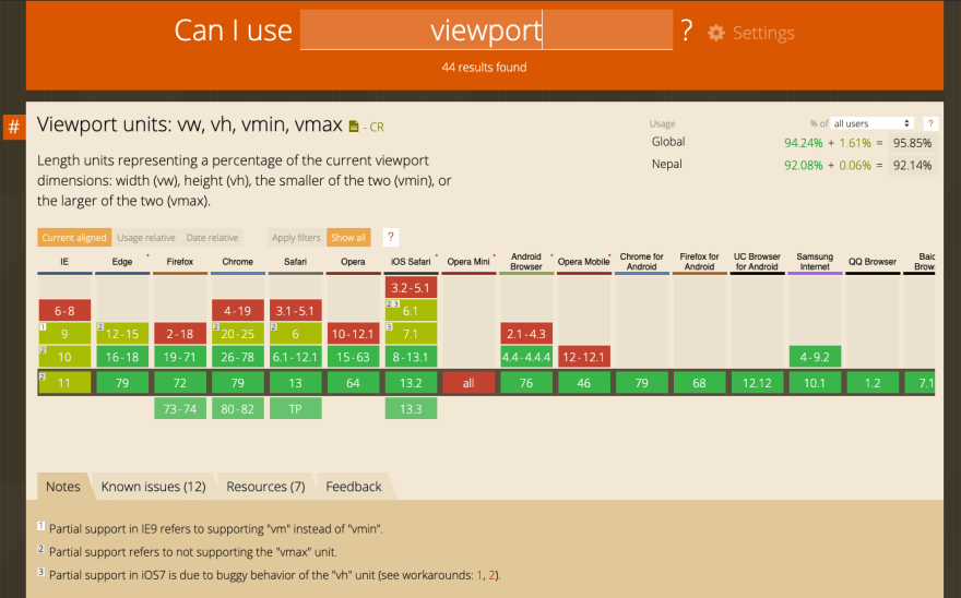
As you can see, there are solid supports for viewport units across all major web browsers. You may run across a few bugs though. It is always a good practice to check caniuse before implementing a newer technique in your design.
Conclusion
By coming this far I hope you are already loving Viewport Units. And personally, I can say viewport units are the perfect fit for a wide range of devices. I suggest you give it a try in your project, explore and enjoy!
I hope you’ve found this blog very helpful. Feel free to share your thoughts and opinions and leave me a comment if you have any problems or questions.
Keep on Hacking !! Cheers

Top comments (2)
Great article thanks for the writeup.
When we talk about viewport units one should be aware that the support is problematic on mobile devices as can be seen here css-tricks.com/the-trick-to-viewpo...
Because of that I would just be very careful for what things I would use them.
Thanks 😊