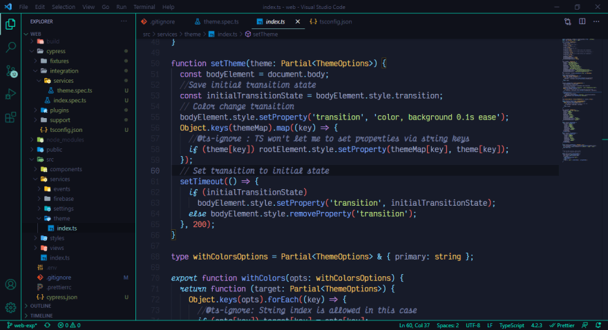
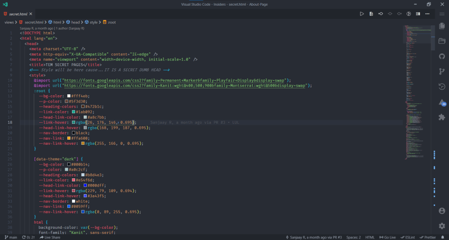
After the last edition, which I loved a lot btw let's do it again this month too.
𝗧𝗵𝗲𝗺𝗲: Deepdark Material Theme
𝗙𝗼𝗻𝘁: Dank Mono
𝗣𝗲𝗮𝗸𝗰𝗼𝗮𝗸 𝘁𝗵𝗲𝗺𝗲: #f22e60 colour code
So tell me what's your current VSCode theme and font look like? I'm Curious. Also, share your 3 personal favourite VSCode plugins.


Top comments (75)
Learn how I did this here
How did you set up this background? Can you provide a small tutorial?
I'll put up a tutorial
dev.to/anubra266/transparent-backg...
right-sidebar team.
dope
Theme: Gruvbox Dark Hard
Font Family: Input Mono, 12
Icons: material-icon-theme
Product Icons: fluent-icons
thanks for this, I am going to use this from now, looks really nice
You're welcome. That's great, let me know if you can make it even better.
Nah, I'm not into customizing that much, I just use pre-made templates most often 😅
I dont like designing that much lol, I suck at css and stuff like that
Screenshot?
Always forget that comment uses markdown
updated it
My favorite theme of them all
xD
🤔
I don't use VS Code. It's slow and a resource hog
Most of the electron products are slow. Atom is based on electron too and it much much slower than any other editor. My personal favorite in simple text editors is Sublime Text - written in C++ and extremely fast
Sublime Text is my editor of choice too
Material Theme: Palenight - HC 🧛🧛
Is file broweser on right better than left ?
It's more of a personal preference I suppose. There's no better way😇😅
It actually is. Reason is toggling menu from left while working shifts your editor.
And that is distraction. But when it's toggled from right. You won't lose focus on where you where last.
What's theme name?
What's the theme name?
Here's mine:

So clean ✨✨
Theme: Remedy (dark - tilted)
Product icon theme: Carbon Icons
Font: JetBrains Mono
I don't really go crazy with plugins other than autocompletes, Live Server and a minifier. The one exception to that is Better Comments, a must-have to me.
Sweet 💯🚀
Don't mind the code:

Theme: One Dark Pro
Font-Family: Fira Code
Icons: Material Icon Theme - Philipp Kief
Product Icon: Material Product Icons - Philipp Kief
Recommended MUST HAVE extensions:
Code Spell Checker
Error Lens
Project Manager
P.S. Philipp Kief is AWESOME with icons!
P.S.P.S. The blue marking on the scroll bar is blue because it is a spell check error and it is shown brightly because of the Error Lens extension.
theme: deepdark material theme
fav plugins:
Same pinch dude.
+1 for a light theme. We are a rare breed.
no offence to people use dark, but dark theme are overrated.
ones u start using light there is no going back..
FORCE is way stronger on the light side...
Relax folks 😅
I love them too.
Theme: Gruvbox Dark Medium
Font Family: Fira Code, 14
icons: material-icon-theme
I really like to hide and show parts of the UI with shortcuts, I think it's very clean.