
Demo is here. Source code is here.
Use <button>
Please don't use <a> for buttons. They have different meaning and behaviour. Link responses to Enter key (will trigger onClick action), <button> responses to Space. If user focuses on <a>, which is styled as button and uses Space page will be scrolled instead of action. <a> used for navigation, user can Ctrl/Cmd click it, to open in new tab. <a> is not focusable in Firefox. What I try to say <a> and <button> has quite big difference in behaviour and semantics.
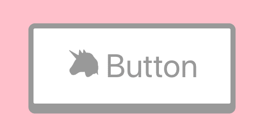
<button type="button">
  <span role="img" aria-label="unicorn">
    🦄
  </span>{" "}
  Button
</button>
You should be able to use <button> everywhere, but if you want something else you can use <div role="button" tabindex=0> as well. There is <input type="button" /> if you want something old-school.
If using
role="button"instead of the semantic<button>or<input type="button">elements, you will need to make the element focusable and have to define event handlers for click and keydown events, including the Enter and Space keys, in order to process the user's input. See the official WAI-ARIA example code.
-- MDN
Reset styles
<button> comes with predefined styles, but if we want to customize it we can start with resetting styles
/* reset button styles https://css-tricks.com/overriding-default-button-styles/ */
button {
  border: none;
  padding: 0;
  margin: 0;
  /* not needed in modern browsers */
  -webkit-appearance: none;
  -moz-appearance: none;
}
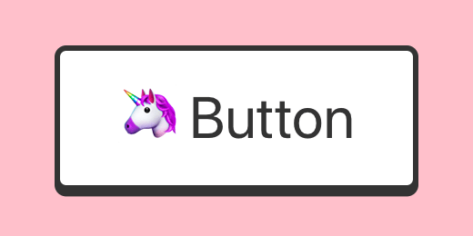
Initial style
Let's make our button look like a button
<button type="button" className="button">
/* inspired by https://codepen.io/liamj/pen/vvdRdR */
.button {
  --color-dark: #333;
  --color-light: #fff;
  display: block;
  position: relative;
  font-size: 2rem;
  padding: 1rem 2rem;
  border-radius: 0.4rem;
  background: var(--color-light);
  color: var(--color-dark);
  border: 0.2rem solid var(--color-dark);
  box-shadow: 0 0.2rem 0 0 var(--color-dark);
}
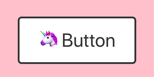
Active state
The button should provide active state, so a user would know that the button responds to click.
.button:active {
  top: 0.2rem;
  box-shadow: none;
}
Disabled state
The button should provide disabled state, so a user would know that button is not clickable.
<button type="button" className="button" disabled>
.button:disabled {
  --color-dark: #999;
  cursor: not-allowed;
}
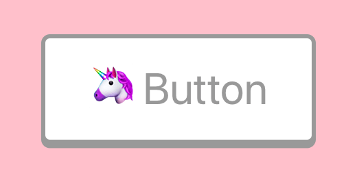
Almost there, but Emoji doesn't change color.
.button:disabled {
  --color-dark: #999;
  cursor: not-allowed;
  /* see https://www.bram.us/2016/10/06/emoji-silhouettes-and-emoji-outlines-with-css/ */
  color: transparent;
  text-shadow: 0 0 0 var(--color-dark);
}
Firefox will, unlike other browsers, by default, persist the dynamic disabled state of a
<button>across page loads. Setting the value of the autocomplete attribute to off disables this feature. See bug 654072.
-- MDN about button
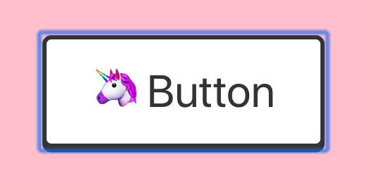
Focus state
The button should provide a focused state, so a user would know where is the focus, otherwise, the user would need to guess or tab to closest element which provides focus. There is a focus state out of the box provided by the browser:
Chrome:
Firefox:

Safari:
In Safari buttons are not "tapable" 🤦
Customize focus state
Let's remove default focus state:
/* https://fvsch.com/styling-buttons/ */
.button:focus {
  outline: none;
}
.button::-moz-focus-inner {
  border: none;
}
Don't remove the outline unless you provide alternative
Let's add custom outline:
.button:focus {
  outline: none;
  box-shadow: 0 0.2rem 0 0 var(--color-dark), 0 2px 5px 3px #f0f;
}
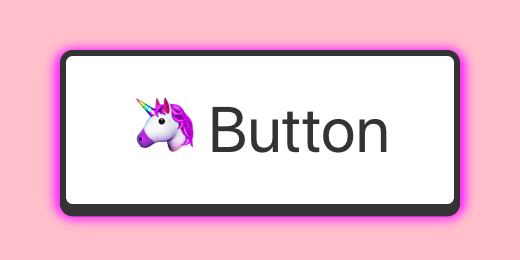
Focus state + active
Because we use box-shadow for both :active and :focus they can conflict and we need to take care of special case:
.button:active:focus {
  top: 0.2rem;
  box-shadow: 0 0px 6px 4px #f0f;
}

Focus state for keyboard users only
There is no need to show focus for mouse users, it is only useful for keyboard users. So there is a proposal to add :focus-visible state to do that. Meantime we can use a polyfill or implement this functionality ourselves.
import "focus-visible";
.js-focus-visible :focus:not(.focus-visible) {
  box-shadow: 0 0.2rem 0 0 var(--color-dark);
}
.js-focus-visible :active:not(.focus-visible) {
  top: 0.2rem;
  box-shadow: none;
}
Touchscreen
The touchscreen has special requirements for buttons as well
Minimum size
According to many sources (1, 2, 3) size of button on touch devices should be about 1cm.
button {
  min-width: 1cm;
  min-height: 1cm;
}
As well there should be enough space around adjacent buttons to prevent wrong button clicks.
Active state for touchscreen
When the user taps the button on touch device they cover the button with the finger, so they can't see the active state of the button. So they need a special active state which will be visible sometime after they take off the finger. For example, the Material design uses a ripple effect for this.
button {
  user-select: none;
  /* we need to remove the built-in effect */
  -webkit-tap-highlight-color: rgba(0, 0, 0, 0);
}
Let's create our own after tap effect
/* https://css-tricks.com/touch-devices-not-judged-size/ */
@media (hover: none) {
  /* inspired by https://codepen.io/numerical/pen/XJKeop */
  .button ::after {
    content: "";
    display: block;
    height: 100px;
    position: absolute;
    transform: translate3d(-150%, -50px, 0) rotate3d(0, 0, 1, 45deg);
    width: 200px;
  }

  .button.active ::after {
    background-image: linear-gradient(
      to top,
      rgba(255, 0, 255, 0.1),
      rgba(255, 0, 255, 0.9)
    );
    transition: all 2.2s cubic-bezier(0.19, 1, 0.22, 1);
    transform: translate3d(120%, -100px, 0) rotate3d(0, 0, 1, 90deg);
  }
}
And a bit of JS to toggle class after mouse up
const Button = ({ children }) => {
  const [activated, setActivated] = React.useState(false);
  return (
    <button
      className={"button" + (activated ? " active" : "")}
      onMouseDown={() => setActivated(false)}
      onMouseUp={() => setActivated(true)}
    >
      {children}
    </button>
  );
};
PS
I made it with React, but it can be achieved with plain HTML and CSS as well. I hope your main take away will be UX of a button, not the code itself.

Top comments (28)
You forgot the most important point about buttons from an accessibility viewpoint. Using
type="button"when you aren't using it to submit data!If you forget this type, some browsers default back to
type="submit". By also using proper type you don't neede.PreventDefaulteither.If you want to get better at #a11y development I would focus more on HTML symantics and what changes when you add aria elements because it can change the behaviour of elements and their intended meanings to users.
To learn more I would highly recommend readying Hedyon Pickering's Accessible Components. It's mandatory reading for all our frontend Devs at our shop because we're a charity that needs to build accessibility into everything we do.
TIL
developer.mozilla.org/en-US/docs/W...
I don't remember where I've read it, but once one guy asked on the internet if he should fire his font-end developer.
The guy said that it took 2 days for the font-end dev to create a button!
This guy should probably see this guide :P, I am pretty sure we could add even more to it, like aria props, buttons with menus, buttons that control state of other elements, etc...
Then test it all on multiple browsers and screen readers.
Honestly though, it entirely depends on what the task was.
If it's just "add a button that does x when clicked", I don't want a developer to go nearly as far as what's presented here and waste two days on a button. I wouldn't fire anyone over this, but I would definitely explain that they have a job to do and that it's not OK to start doing R&D when asked to add a button.
Now if the task was "add a button that looks exactly like this, is responsive, has a specific look when disabled, a focus state that looks identical on all browsers" and so on... I'd expect a developer to at least tell the Product Owner "OK, but this is not a simple button and it's going to take me at least a day of work"
The question on Quora got viral and there are one answer with 13k upvote. I only got 1k upvotes though :D
qr.ae/TWG0sV
I've linked back to this post.
So, what if I want that as a clickable link and don't want to hook up JS to that button to do so?
This result you have there would only make you as the initiator of the idea feel better. Client wouldn't give 2 shits about how is that working, it just works, so why do extra work for that? It's just a trend, even W3C Validator doesn't give a crap about as a button. Therefore, why not style to look like a button, even better - create few concise utilities for that? This is just getting nit-picky.
I mean if your main concern is "Client wouldn't give 2 shits about how is that working", I guess this advice is not for you.
I'm not saint myself, but from time to time I think about people who have special needs, for whom internet (the biggest source of information, free education, online banking, social, media etc...) is not accessible. There are people who can't use internet, because somebody "didn't give 2 shits", and other person didn't bother either, because he is not get paid for it.
W3C Validator? Seriously? Did you travel here from 1999?UPD: W3C Validator is ok, it is not for a11y testing though. You can try axe for a11y testing. a11y testing tools doesn't guarantee absence of a11y issues, they just help find some obvious ones. You still need to test it manually
As I am not exclusively a front-end dev, yet I was back in the day, W3C Validator was my go to.
For accessibility - that would be some additional planning, time consuming one. Either I hire someone for front-end or learn that stuff myself, either money or time consuming. Not my top priority, since that's quite low percentage of users.
That is discrimination based on abilities which has legal implications under some laws. Here is the list of laws
Not only are there legal implications to your attitude about accessibility, but your assumptions about users who benefit from accessible designs is really limited. Microsoft has an Inclusive 101 guide that is a great resource, and I highly recommend reviewing it and challenging yourself a bit on this, Davis.
Oh, we are even going there with this.
I am not interested in answering everyone getting upset by that - I won't prioritize accessibility concerns over what the hell my button really is and what it does.
This viewpoint is exhausting and is exactly why accessibility gets pushed to the back burner. "It doesn't effect me personally, so it MUST be a low percentage of users."
That is an awful attitude. And you never know when you or someone you know will suddenly belong to that group of users. A disability can happen in an instant.
You do realize that "not my top priority" !== "not gonna do that"?
But, I guess, it's appealing to push views for leverage of community that will get backed up since I am the "bad guy" here.
Sheesh, so many butthurt people. ;)
i got you ;)
One might be interested reading this as well, “Buttons shouldn’t have a hand cursor” by Adam Silver link.medium.com/E09nLN8KmX.
Fair point. I kind of agree with it
thanks, always interesting to look into the accessibility best practices!
and i find the button looking good
This is comprehensive, simple, and in-depth on the topic of button styling! Really nice work.
It seems like such a simple thing, but I love to see all its important and interesting facets.
I guess you would enjoy reading about The Image as well
ye, nice.
I know you can add articles to a series on dev.to. Are these two articles in a series?
edit: never mind, clicked on the link and realized it's a github link :| I am just curious what a series of articles looks like on dev.to
Yeah, it was published before I joined dev.to. Maybe I will update component to use React hooks and republish article to dev.to.
At least you made a button
I know, right?
I’m lost. Where do I put the href for that button? It’s missing from your examples.
You can style links to appear as buttons (it can be bad UX, it depends on the situation), but you should not use links as buttons e.g. when they don't have correct href param. Examples of bad buttons:
instead, you can write
Does this help?
Some comments may only be visible to logged-in visitors. Sign in to view all comments.