Recently, for our final project my group and I have been working on a flash card. Its main purpose is to further learning and education. This was what we modeled it after: flashcard. The way that I initially thought of it was a smaller and similar version of Quizlet. I always like to compare and map out similar implementations.

This was the model that was in the back of our minds. It is very simple. Some of the notable points was the correct and incorrect indication as well as the question it pertains to with the image. In order to obtain the image and document it the same way, we used a keyword for the question. The check answer will then indicate the reset and restart.
Aspects
Visual Documentation of Your Card:

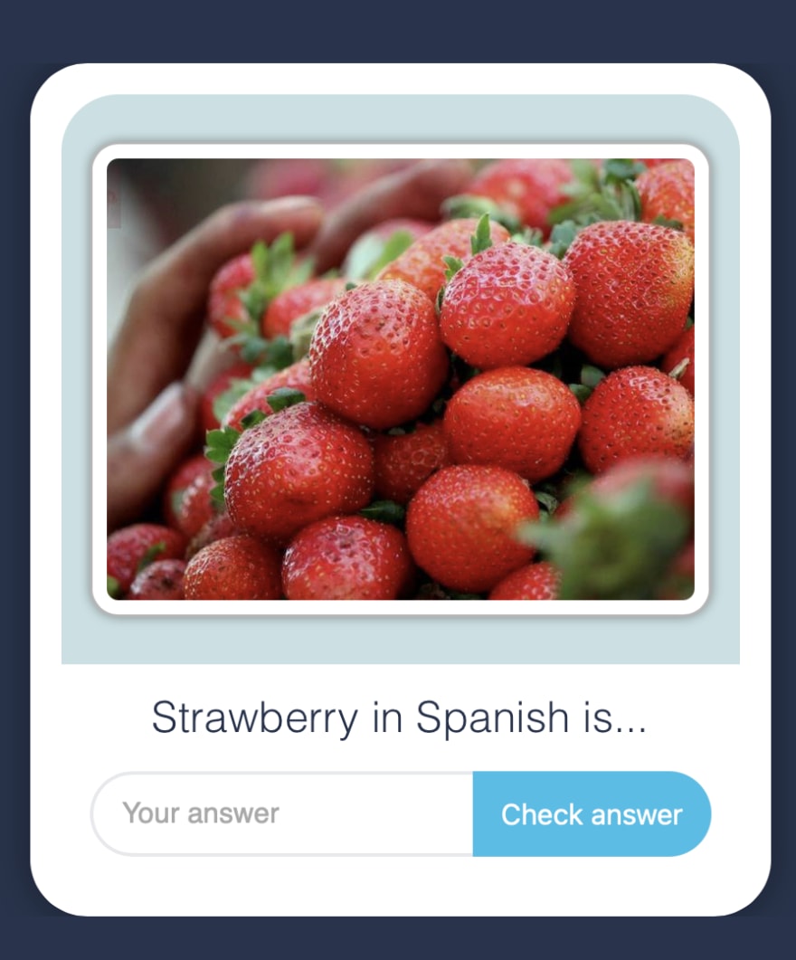
This image shows the simple flash card as well as the translated answer and check answer to Spanish by means of the locales. Some more notable stylistic changes is the white border surrounding the pulled image with a changeable card that has a shadow to produce depth.

This is what it would look like if the answer was correct before the restart of the flash card back into its general form. As seen, once someone submits an answer it blocks out another submission. It has the same consistent styles throughout.

This is what it would look like if the answer was incorrect before the restart of the flash card back into its general form. As previously mentioned, it blocks out another submission, so that the only task is to retry by using the restart.
Explanations
Tutorial and Approaches
In order to make this element that we are proud of was that we had to separate it into three major part and their own documentation for each. It appears very simple but it has also a lot of working and moving parts. First, the image and that support which uses the keyword to produce an image to the question, the question and the answer box (as a whole), and the whole card itself including the locales and translations.
We used slots which can be shown below in order to produce the card itself. sideToShow represents what should be seen at first versus hidden from the user in order to check but not give the answer away. The purpose is to test knowledge and not give it away.
render() {
    return html`
      <krusty-image img-src="${this.keyword}"></krusty-image>
      <flash-card-body sideToShow='${this.sideToShow}'>
      <slot slot="front" name="front"><div slot="front">${this.front}</div></slot>
      <slot slot="back" name="back"><div slot="back">${this.back}</div></slot>
      </flash-card-body>
    `;
  }
We used files in the locales folder in order to name the translation of the different languages such as the one shown below in Spanish. That comes from flash-card-body-es.json.
{
    "yourAnswer": "Tu Respuesta",
    "checkAnswer": "Respuesta",
    "restartActivity": "Reiniciar la actividad"
}
One issue that took a while to figure out is how to get the answer and check answer on the same line. The solution to this issue is using divs such as the code shows below.
<div>
        <p id="question">
          <slot name="front"></slot>
          <slot name="back"></slot>
        </p>
        <input
          id="answer"
          type="text"
          .placeholder="${this.t.yourAnswer}"
          @input="${this.inputChanged}"
          .value="${this.userAnswer}"
        />
        <button
          id="check"
          ?disabled="${this.userAnswer === ''}"
          @click="${this.checkUserAnswer}"
        >
          ${this.t.checkAnswer}
        </button>
      </div>
Relevant Links
Github Link:
https://github.com/TheKodingKrab/flash-card
NPM link:Stay Tuned!
Final Thoughts
I really enjoyed furthering my knowledge and learning all about web components through this class and beyond. Stay tuned for new posts in the next semester as I continue my knowledge and add more tools under my toolbelt!


Top comments (0)