
Let me take you through my personal experience of exploring, cleansing, and finally unearthing valuable insights from raw data. This marks my second visualization project; the first involved analyzing UK Road Safety data for 2015, utilizing Matplotlib and Seaborn to create visuals.
As a starter, I wanted to experience the feeling of working on real-life data for my Tableau project, and I wanted a dataset that I understood. After scouring the internet, I decided that this was the right dataset.
The Encounter with Raw Data
I downloaded the large dataset from Our World in Data and opened it in Excel to have a preview of what I would be working with. The data needed to be divided into two subsets: CovidTests.csv, holding raw COVID-19 test data, and CovidDeaths.csv, containing raw COVID-19 death data. But because of some inconsistencies, I later dropped the CovidTests.csv file and did not use it in my analysis.
Staring at a screen filled with rows upon rows of numbers and labels. That's precisely where my journey began. My systematic approach to making sense of data usually involves cleaning with the Pandas library in Python, analysis with PostgreSQL, and visualizing the data, using Tableau this time.
Understanding the Data
The first step was understanding the problem with the data. The CovidDeaths.csv file had some features that were irrelevant to the scope of my analysis. I started by reducing my data to include only the significant columns, which are:
- iso_code: This stands for "International Organization for Standardization" code. It's a three-letter code that uniquely identifies a country or territory.
- continent: This indicates the continent to which the country or territory belongs.
- location: This refers to the name of the country being reported in the dataset.
- date: This column represents the date on which the COVID-19 data is recorded.
- population: This value indicates the total population of the country or territory.
- total_cases: This represents the cumulative number of confirmed COVID-19 cases up to the given date for the specific location.
- new_cases: This shows the number of newly confirmed COVID-19 cases reported for the given date.
- total_deaths: This indicates the total number of confirmed COVID-19-related deaths up to the given date for the specific location.
- new_deaths: This represents the number of newly reported COVID-19-related deaths on the given date.
The dataset is ordered alphabetically using the country column.
The Art of Data Cleaning
Inconsistencies, missing values, and outliers are rampant in datasets, hence the reason for data cleaning. After performing data exploration to understand the underlying structure and features of a dataset, I replaced the null values in the numeric columns with zero and changed the data type to integer.
There were also missing values in the continent column, so I performed some validation using Google, and it was necessary to drop those rows, which I carried out. These were the two major steps I took in cleaning the data before exporting it to a CSV file (CovidDeaths.csv).
Unveiling the Data's Secrets
It was time to piece together the underlying patterns. I created a coviddeaths table in PostgreSQL with columns the same as those in the CSV file, and then I copied the data from the file to the SQL table. The first thing I did was to create an index on the 81,060-row table, enabling faster aggregations, calculations, and viewing data subsets.
For visualization, I needed a table to view things on a continent scale. A table that shows the population per continent, total COVID-19 cases per continent, and total COVID-19 deaths per continent. I created the table using common table expressions.
Visualizing the Unseen
The power of visualization cannot be overstated. I would choose adjusting buttons in an interactive dashboard myself rather than having to read pages trying to find patterns in data. I worked with bar charts, pie charts, heatmaps, etc. As I created these visuals, the data began to reveal its insights to me. A spike in COVID-19 cases in certain countries, a correlation between population and total cases - these were the messages the visuals brought to life.
The "Aha!" Moment
It was after my first attempt at creating the dashboard that this "Aha!" moment arrived. At this point, I knew how I wanted the worksheets to be arranged, what filters to use. I had just unlocked a treasure trove of valuable information.
Key Observations
Here are a few findings that I came across:
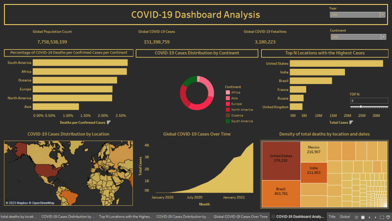
The data represents the global situation of the COVID-19 pandemic up to April 30, 2021.
- The global number of COVID-19 cases is 151,398,759, and the number of deaths is 3,180,223.
- The United States has the highest number of cases (32,346,970) and deaths (576,232).
- India is the second-highest in terms of cases (19,164,969) and the third-highest in terms of deaths (211,853).
- Brazil is the third-highest in terms of cases (14,659,011) and the second-highest in terms of deaths (403,781).
- The highest number of new COVID-19 cases reported in a single day was 401,993 cases in India on April 30th, 2021.
- South Africa has the highest death rate per confirmed cases, at 2.70%.
Accessing the Code and Files
If you're interested in exploring the code and files used in this project, you can find everything on my GitHub repository. The repository contains the Python scripts, SQL queries, and dataset files that were utilized during the analysis.
Conclusion
Every data exploration is a unique journey, filled with highs and lows, frustrations, and revelations. With the right tools and mindset, any complex data is worth exploring. This expedition taught me more than just data analysis skills. It taught me to approach problems step by step, patience, perseverance, and the extent to which we can utilize data. So, the next time you're faced with a dataset that appears daunting, remember – it's not just data, it's a story waiting to be told.


Top comments (0)