
This post was originally published at thedevspace.io. Everything you need to master web development, all in one place.
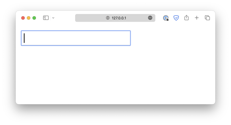
Forms are an essential component when creating your website, as they allow the user to communicate with the website. An HTML form is created with the <form> element, which acts as a container for different input fields.
<form>
  <input type="text" />
</form>
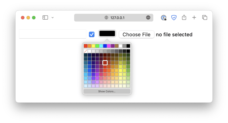
The <input> element has a type attribute, which allows the element to be displayed in different types, such as a checkbox, a color picker, a file upload field, and so on.
<form>
  <input type="text" />
  <input type="checkbox" />
  <input type="color" />
  <input type="file" />
</form>
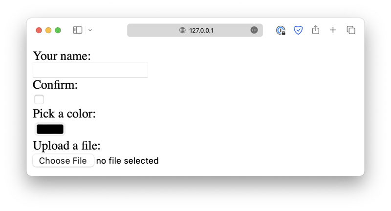
You should also use the <label> element to provide a clear and descriptive label for each field. This helps the users understand what information is being requested and ensures that your form is accessible to all users.
<form>
  <label for="text_input">Your name:</label><br />
  <input type="text" id="text_input" /><br />

  <label for="checkbox_input">Confirm:</label><br />
  <input type="checkbox" id="checkbox_input" /><br />

  <label for="color_input">Pick a color:</label><br />
  <input type="color" id="color_input" /><br />

  <label for="file_input">Upload a file:</label><br />
  <input type="file" id="file_input" /><br />
</form>
Make sure that the for attribute of the <label> element matches the id attribute of the corresponding <input> element.
Also, keep in mind that the id attribute must be unique throughout the entire HTML document. There should not be two elements with the same id.
The <label> elements help the user understand the purpose of the form fields and are particularly useful for screen reader users. When the user focuses on a field, the screen reader will read the corresponding label out loud.
The input also requires a name attribute. When the form submits data to the backend, the user input of each field will be tied to its name, allowing you to retrieve the corresponding information in the backend.
The form attributes
This leads to two other very important attributes for the <form> element, action and method, as well as the <input type="submit"> element. These three components are what make the form function properly.
<form action="/some-program.py" method="POST">
  <label for="first_name">First Name:</label><br />
  <input type="text" id="first_name" name="firstName" /><br />

  <label for="last_name">Last Name:</label><br />
  <input type="text" id="last_name" name="lastName" /><br />

  <input type="submit" value="Submit" />
</form>
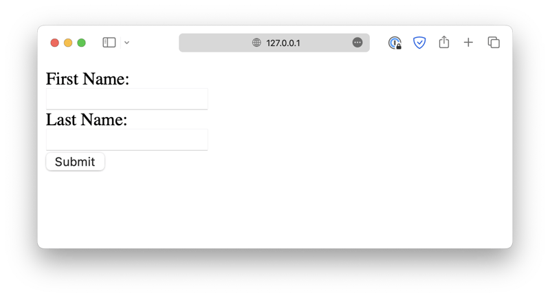
When the Submit button is clicked, that tells the browser to wrap up the user inputs and send them to the backend. However, the browser needs to know where to send the data and how to send them.
This information is specified by the action and method attributes. action points to a backend program that will process the data, and method specifies an HTTP method that will be used to transmit the information.
Text inputs
So far, we've only been working with text inputs, but in practice, you might need to collect all kinds of data, such as numbers, files, images, and so on. So, let's take a look at some of the most commonly used input types.
Besides the text input we just demonstrated, which accepts a single line input from the user, there are other input fields designed for more specific purposes. For example, the email input:
<input type="email" />
It will automatically check if the user input is a properly formatted email address. Of course, that doesn't necessarily mean the email address exists, but it should at least have the correct format.
Similar text input fields include tel (phone number) and url.
<input type="password" />
The password field also accepts a single-line text input, but the input will be obscured so that it cannot be recognized.
<input type="hidden" value="xxxxx" />
The hidden field is a special case, it will be hidden to the user, so obviously it cannot collect user input. Instead, it is often used to pass security tokens, such as the CSRF (Cross-Site Request Forgery) tokens or user information used for tracking purposes.
<textarea rows="5" cols="33">
. . .
</textarea>
The textarea field is used to collect multi-line text inputs. You can use the rows and cols attributes to define its initial size.
In addition, the input fields also accept the following attributes:
-
read-onlyanddisabled
<input type="text" placeholder="Read Only Field" readonly />
<input type="text" placeholder="Disabled Field" disabled />
Both options prevent the user from editing the field, except readonly still allows the field to be selected, while disabled disables the field completely.
-
placeholder
<input type="text" placeholder="Placeholder Text" />
Defines the placeholder texts that will be displayed when the field is empty.
-
minlengthandmaxlength
<input type="text" maxlength="20" minlength="10" />
Specifies the minimum and maximum number of characters that the field will accept.
-
spellcheck
<input type="text" spellcheck="true" />
Defines whether or not the browser's built-in spell check functionality will be enabled for the field.
Radio and checkbox
Radios are used in radio groups. The group is determined by the name attribute. Radios with the same name is considered to be in the same group.
<input type="radio" id="opt1" name="options" value="1" checked />
<label for="opt1">Option #1</label>

<input type="radio" id="opt2" name="options" value="2" />
<label for="opt2">Option #2</label>

<input type="radio" id="opt3" name="options" value="3" />
<label for="opt3">Option #3</label>

<input type="radio" id="opt4" name="options" value="4" />
<label for="opt4">Option #4</label>
Only one option in the radio group can be checked. You can set the default option using the checked attribute.
The checkboxes, on the other hand, allow you to check multiple options in one group.
<input type="checkbox" name="multi-options" id="opt5" />
<label for="opt5">Option #5</label>

<input type="checkbox" name="multi-options" id="opt6" />
<label for="opt6">Option #6</label>

<input type="checkbox" name="multi-options" id="opt7" />
<label for="opt7">Option #7</label>

<input type="checkbox" name="multi-options" id="opt8" />
<label for="opt8">Option #8</label>
Selections
<select name="options">
  <option value="">--Please choose an option--</option>
  <option value="opt1">Option #1</option>
  <option value="opt2">Option #2</option>
  <option value="opt3">Option #3</option>
  <option value="opt4">Option #4</option>
  <option value="opt5">Option #5</option>
</select>
The <select> element creates a selection menu. Each option is defined with the <option> element.
By default, only one option can be selected, but you can enable multi-select using the multiple attribute.
<select name="options" multiple>
  <option value="">--Please choose an option--</option>
  <option value="opt1">Option #1</option>
  <option value="opt2">Option #2</option>
  <option value="opt3">Option #3</option>
  <option value="opt4">Option #4</option>
  <option value="opt5">Option #5</option>
</select>
Buttons
Buttons are also a crucial part of a form. There are 3 types of buttons available, submit, reset, and button.
<input type="submit" value="Submit this form" />
<input type="reset" value="Reset this form" />
<input type="button" value="Do Nothing without JavaScript" />
- The
submitbutton will wrap up the user input, and submit the data to the backend. - The
resetbutton clears all the existing user input. - The
buttonbutton does not do anything on its own, but can be customized using JavaScript.
Besides the <input> buttons, there is also a <button> element, which works exactly the same, except it is easier to style. We will discuss more about this later.
<button type="submit">Submit this form</button>
<button type="reset">Reset this form</button>
<button type="button">Do Nothing without JavaScript</button>
File picker
Besides the text-based input fields, sometimes you also need to allow users to submit files.
<input type="file" />
Later, we are going to discuss exactly how to upload files.
Date selector
<input type="date" />
The date selector allows the user to pick a date.
Read more
- How to Build Interactive Forms Using HTML and CSS
- How to Send HTTP Requests Using JavaScript
- How to Change Colors in CSS
If you found this guide helpful, follow us on social media for more tips, tutorials, and updates on web development:
🔹 TheDevSpace | LinkedIn
🔹 TheDevSpace | X
🔹 TheDevSpace | Threads
Let's stay connected! 🚀

Top comments (0)