
This post was originally published at thedevspace.io. Everything you need to master web development, all in one place.
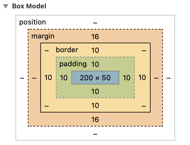
When the browser renders an element, that element will be treated as a box, which is defined by a border, with margin and padding. Margin is the space surrounding the border, and padding is the space between the border and content.
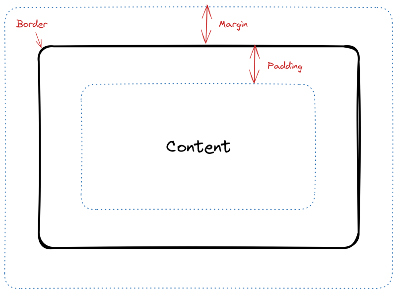
Borders
The border is not visible by default, but that can be changed by setting a border-style property.
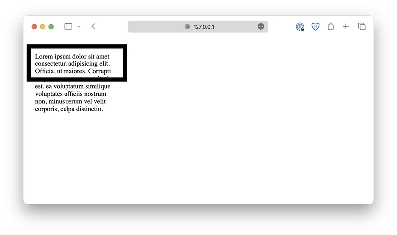
<p>Lorem, ipsum dolor sit amet consectetur adipisicing elit. Quia, rerum.</p>
p {
  border-style: solid;
}
Other possible values for border-style include: dotted, dashed, solid, double, groove, ridge, inset, outset, none (default), and hidden.
From the examples, it seems that none and hidden have the same effect, but you should be careful not to misuse them. none indicates the element has no border at all, and hidden indicates that the element has a border but is not visible.
This small difference is crucial because the border itself has thickness, and if not calculated correctly, it might lead to problems when resizing elements.
Border width, color, and radius
You can further customize the border by setting its width, color, and radius:
p {
  border-style: solid;
  border-width: 4px;
  border-color: red;
  border-radius: 10px;
}
The border-width property accepts either numeric values such as 2px, 1rem, and 0.25em, or keyword values such as thin, medium, and thick.
The border-color property defines the border color using the same methods we discussed in the CSS colors lesson.
And finally, the border-radius property defines the radius to create a rounded border. It accepts either length values or percentage values. To make the border completely rounded, you can set the border-radius to larger than or equal to 50%.
Border sides
Besides the properties discussed above, there are also properties that allow you to customize individual sides of the border. For example:
p {
  border-top-style: solid;
  border-right-style: dotted;
  border-bottom-style: double;
  border-left-style: dashed;
}
Similar variants also exist for border-width, border-color, and border-radius.
If you want something simpler when customizing individual sides of the border, you can use the same properties border-style, border-width, border-color, and border-radius, which are mentioned above, but pass multiple values to them. The syntax is as follows:
border-style: <top> <right> <bottom> <left>;
border-style: <top> <left_and_right> <bottom>;
border-style: <top_and_bottom> <left_and_right>;
border-style: <all>;
The same pattern holds for border-width, border-color, and border-radius.
The shorthand
Lastly, CSS offers an ultimate shorthand property, border, which allows you to customize width, style, and color together. However, you cannot customize individual sides with this property.
p {
  border: 2px dashed red;
}
Padding
Inside the box, you can add space between the border and the content. This space is called padding, defined by the padding property.
padding: <top> <right> <bottom> <left>;
padding: <top> <left_and_right> <bottom>;
padding: <top_and_bottom> <left_and_right>;
padding: <all>;
Hint: Use the Developer Tools to inspect the element. It will help you see the actual padding.
Alternatively, you can always set individual paddings using properties padding-top, padding-right, padding-bottom, and padding-left.
Margin
Similarly, you can add space outside the border so that two neighboring elements do not touch each other. This space is called margin, defined by the margin property. For instance, here we have two <span> elements:
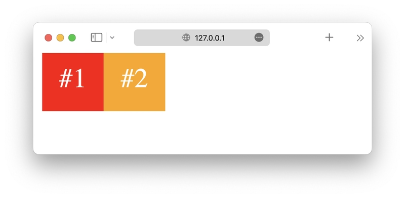
The margin property works similarly to the padding property.
margin: <top> <right> <bottom> <left>;
margin: <top> <left_and_right> <bottom>;
margin: <top_and_bottom> <left_and_right>;
margin: <all>;
Hint: Use the Developer Tools to inspect the element, it will help you see the actual margin.
Resizing elements
After understanding the box model, let's discuss how to change the size of the box using width and height properties.
<p>Lorem ipsum dolor . . .</p>
p {
  border: 2px solid black;
  width: 200px;
  height: 50px;
}
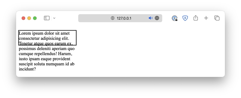
Deal with content overflow
Notice that the content is too big to fit inside the 200 x 50px box. By setting an overflow property, you can customize how the overflow is handled.
When set to hidden, the overflow will be cropped off.
When set to scroll, the overflow will be cropped off, but a scrollbar will be added, allowing you to scroll down to see the full content.
Or you can simply set it to auto, which adds a scrollbar only when necessary.
Box sizing
There is one more issue with this box. Consider this example:
<p>Lorem ipsum dolor . . .</p>
p {
  border: 2px solid black;
  width: 200px;
  height: 50px;
}
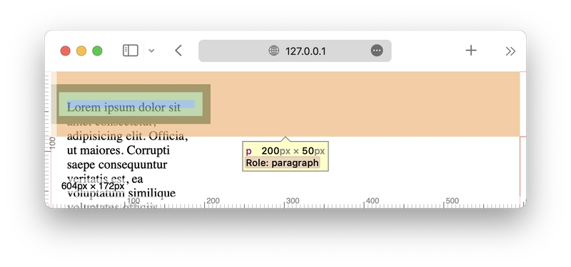
Try to do this on your own machine and inspect this paragraph element using the Developer Tools, and you will see that even though we defined this element to be 200px wide and 50px tall, it is, in fact, 204 x 54px.
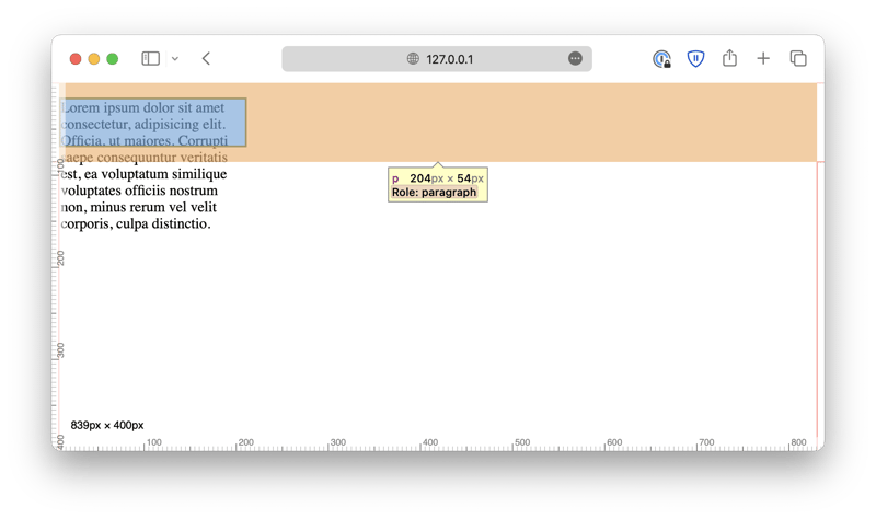
This is because when you define the box size, the browser assumes you refer to the size of the content, meaning it ignores the padding and the border itself. For example, let's make the border thicker and add a padding. Notice that the size of the content box remains the same.
p {
  border: 10px solid black;
  padding: 10px;

  width: 200px;
  height: 50px;
}
This can be counterintuitive sometimes because when we define the box size, we usually mean the size of the border, not just the content. To fix this issue, you can overwrite the browser's default actions by setting the box-sizing property to border-box.
p {
  box-sizing: border-box;

  border: 10px solid black;
  padding: 10px;

  width: 200px;
  height: 50px;
}
By default, this property is set to content-box, so the browser will count the content size as the box size. When you set it to border-box, the browser will take padding and border into account when calculating the box size.
Minimum and maximum sizes
Besides setting a fixed dimension for the elements, you can also be more flexible by specifying the maximum or minimum sizes or both. For example, you can define the maximum width of the <p> element as 400px.
Open this demo in a new browser tab, and resize your browser window. Make sure its width is less than 400px. Slowly make the window wider, and notice that the <p> element grows with it until it reaches 400px and stops growing.
The minimum value works the same way, just in the opposite direction.
p {
  border: solid 2px;
  min-width: 400px;
}
You can specify both maximum and minimum values to ensure the element size is always within the defined limit.
This is crucial for a design concept called responsive design, which we will discuss later.
Units in CSS
Finally, when it comes to resizing elements, we can't overlook the importance of CSS units. We've already covered some commonly used ones, such as px, em, and rem. Now, let's take this opportunity to summarize all the units available in CSS.
Units in CSS can be divided into two groups, absolute units and relative units.
First of all, we have the absolute units:
-
cm: Centimeters. -
mm: Millimeters. -
in: Inches. -
px: Pixels. -
pt: Points,1ptequals1/72in. -
pc: Picas,1pcequals12pt.
These units define a fixed value, and they will not be affected by other elements ot the screen size. They are useful when you need precise control over the size of an element.
Besides the absolute units, there are also relative units, whose values are relative to some other elements or the screen size.
-
em: Relative to the font size of the parent element. If not set, the default font size will be16px.2emis two times the current font size, which is32px. -
ex: Relative to the x-height of the current font. This is rarely used. -
ch: Relative to the width of the character0. The value may be different for different fonts. -
rem: Relative to the font size of the root element,<html>. This provides a consistent base size across the entire document, and as a result, this is the most commonly used unit for fonts. -
vw: Relative to 1% of the width of the viewport. Viewport is the visible area of the webpage, such as the browser window. -
vh: Relative to 1% of the height of the viewport. -
vmin: Relative to 1% of the smaller dimension (width or height) of the viewport. This ensures the element is at least visible on the screen. -
vmax: Relative to 1% of the larger dimension (width or height) of the viewport. -
%: Relative to the parent element.
These units adapt based on the context, and are more flexible and useful for responsive design.
Among these options, there are only 6 units that are most commonly used: px, em, rem, %, vw, and vh.
-
pxis often used for fine-grained, pixel-level control when you need to specify the exact size of an element. -
emandremare often used for font size and text spacing.emis relative to the font size of its closest parent element, andremis relative to the document's root element. -
%,vw, andvhare the three most popular relative units used for defining dimensions and creating layouts that adapts to either the parent element (%), or the view port (vw, andvh).
Each of these units plays a unique role in web design, providing different levels of flexibility and control depending on the layout and responsiveness requirements.
To summarize, when you need responsive and flexible dimensions and layouts, use %, vw, and vh; when you are working with texts, use em and rem; when you need to define the exact size of an element, use px.
Read More
If you found this guide helpful, follow us on social media for more tips, tutorials, and updates on web development:
🔹 TheDevSpace | LinkedIn
🔹 TheDevSpace | X
🔹 TheDevSpace | Threads
Let's stay connected! 🚀

Top comments (0)