
Well well well, no catch here. As I have said already, learning CSS and using some of its properties carefully, is no joke.
The concept of CSS art is usually to practice our CSS skills. How to add this property, how to add such values, when to use this unit for precise craft or how to even choose one property over the other.
If you're into these type of questions or just want to know why you should dive into making art with CSS, then I would recommend you all to check the following article written by @Suzanne on her learnings after she completed 50 Days of CSS:

Okay, so everyone uses some sort of HTML markup to have a basic structure of CSS art but what if you're feeling super cool with your CSS skills and just want to skip the markup? How about we just don't use any HTML code and make CSS art possible?
Of course, most of you might already know the 'trick' we will be using but if you're a beginner in CSS or in making art with CSS, read on because we are about to make an emoji which is a blend of 🤯 and 🤪...
What is CSS art? 🌚
Hehe, I forgot to even introduce you to this term in case you're unaware...
It's the act of using only HTML and (of course) CSS to create any art form.
Now that's a made-up sentence above to convey the meaning briefly. The art form can include anything you can imagine from a cartoon character to illustrations, basically anything that comes under the category of 'art'.
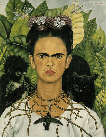
So you can go from this glass of water...
...to this ridiculously detailed Mona Lisa painting:
Yes, that 'painting' you just saw is not just a <img> tag with an image attached to it, every element you see there is made from scratch!
What we will make? 👀
Of course, not another Mona Lisa but yes, we can make a simple (yet different) emoji like this:

...and not this:
Dang dang! How is it? Of course, not beautiful but yes, might have some taste of humor in it?
Breaking down the layout 🖼
Before writing any code, we must understand:
- How many elements we will need?
- What properties we are aware of?
- How can we use those CSS properties?
- Is there any new properties or a CSS feature we need to learn?
- What units should be used for measurement?
em,rem, or just%?
Let's visually enhance the output we need (dev mode on!):

We can clearly see (thanks to the dotted borders):
- There is an overall container to hold our emoji (represented in blue background).
- Then we have the main body of the emoji which is a circle filled with yellow color.
- Inside this, we have the two eyes (super light brown) and then the vague wide mouth (dark brown).
Three quick elements and we got three quick minutes, ready? (I randomly added the 'three minutes' thing, please take as much time you need to fully understand the concept).
Start making CSS art with zero HTML characters 🤪
The markup 🤒
Oops, nothing much here but make sure to either link your CSS file externally or internally, whatever you feel is good.
The real deal 😎
Open up your stylesheet. Everything we need can be encapsulated inside the <body> of the DOM. So we first start by using the body selector. Here's a cool CSS Tricks article on HTML vs Body if you're into that.
Whatever property you write inside the body selector will target the DOM's <body> element. It consists of basically all of the HTML content you can see. But using just body and adding some colors will simply apply the entire color to the full page. We don't want that.
What we need is the 'trick'! And that is to use a pseudo-element on the body! 🥳
A pseudo-element is a keyword that is attached to any selector that lets us style a specific part of that selected element.
With this, we can make an infinite amount of shapes, vectors, and yes, CSS art by simply using a single element. In this case, we will just need to work on the body part and nothing else.
There is a range of pseudo-elements available, one of the most important among those is the ::before pseudo-element. This one selects the first child of the selected element and is generally used to add a special element by using the mandatory content property which generated the value.
For our emoji art, we don't need any special content inside so we can leave this property's value as blank "".
Position the emoji 📐
Next, we need to position the emoji. To make something visible you can add a background-color of orangered because the plain red value is almost like coding at night with a light theme and maximum screen brightness...

We need to make positioning absolute to the original body element. Now we need to set where on the viewport we need to show the emoji. For this we use:
.
.
.
top: 0; left: 0; right: 0; bottom: 0;
margin: auto;
.
.
.
This ensures the CSS art is centered throughout the webpage. Next just give a decent amount of width and height say, 15rem units. And yes, as the body of the emoji perfect round, just add border-radius: 50%; to make that happen.
By now you should have the emoji centered and with fixed dimensions.
Working with the background! 🟡
Everyone changes from here! We need to make those facial features like eyes and the mouth.
The background (specifically the background-color) property of CSS accepts something cool along with the usual color value i.e. gradients!
For our demo, we need to only use the radial-gradient(), a CSS function which creates a gradient that radiates (like a circle) from the center. It has the following syntax:
radial-gradient(circle at center, red 0, blue, green 100%)
We first provide from where the circle needs to be drawn and then what colors are needed (with the amount).
As you saw in the layout breakdown, we have 3 circles for 2 eyes and 1 mouth. So, for each of those, we will need to use the radial-gradient. As for the background of the emoji body, you can change that later. Here how our circles would go:
1️⃣ The first eye is a big one. First, we need to position it. For that, after circle at we use a rough estimate of both horizontal and vertical placements in terms of percentages. Here I have chosen 30% and 40% respectively.
Next, we give it a color of #b58c1b (light brown) and a 20% scale from its original scale. The more you increase this percent, the bigger the circle would be.
The third parameter is simply making it transparent so that it doesn't affect the color of the emoji body.
.
.
.
radial-gradient(circle at 30% 40%, #b58c1b 0%,
#b58c1b 20%, transparent 0%),
.
.
.
2️⃣ The second eye is the same but here we need a small size so just change the scale to 13%:
.
.
.
/* Big eye */
radial-gradient(circle at 30% 40%, #b58c1b 0%,
#b58c1b 20%, transparent 0%),

/* Small eye */
radial-gradient(circle at 70% 45%, #b58c1b 0%,
#b58c1b 13%, transparent 0%),
.
.
.
3️⃣ The wide mouth is also made up of the same radial gradient but here apart from a different position and color, we need to define the wideness or the length of the mouth. That slight wide mouth feel can be done by giving external width and height of 80rem and 5rem respectively.
And make sure to add no-repeat towards the end else, this mouth would go crazy all over the face!
.
.
.
/* Big eye */
radial-gradient(circle at 30% 40%, #b58c1b 0%,
#b58c1b 20%, transparent 0%),

/* Small eye */
radial-gradient(circle at 70% 45%, #b58c1b 0%,
#b58c1b 13%, transparent 0%),

/* Wide mouth */
radial-gradient(circle at 50%, #672e00 10%,
transparent 10%) 50% 100% / 80rem 5rem no-repeat
.
.
.
Finally, the emoji background color hex value can be added towards the end as:
.
.
.
background:
    radial-gradient(circle at 30% 40%, #b58c1b 0%,
    #b58c1b 20%, transparent 0%),

    radial-gradient(circle at 70% 45%, #b58c1b 0%,
    #b58c1b 13%, transparent 0%),

    radial-gradient(circle at 50%, #672e00 10%,
    transparent 10%) 50% 100% / 80rem 5rem no-repeat

    #ffcf34;
So now the entire code of the CSS emoji looks like this:
body::before {
    content: "";
    position: absolute;
    top: 0;
    left: 0;
    right: 0;
    bottom: 0;
    margin: auto;
    width: 15rem;
    height: 15rem;
    border-radius: 50%;
    background:
        radial-gradient(circle at 30% 40%, #b58c1b 0%,
    #b58c1b 20%, transparent 0%),
        radial-gradient(circle at 70% 45%,
    #b58c1b 0%, #b58c1b 13%, transparent 0%),
        radial-gradient(circle at 50%,
     #672e00 10%, transparent 10%) 50% 100% / 80rem 5rem no-repeat
        #ffcf34;
}
That's it! You just made CSS art without a single line of HTML but most importantly you learned what is a pseudo-element, how it works, how to make good use of gradients to make art forms, and more!
Here's the CodePen embed of the above code:
More resources 🤩
Go ahead with your new CSS art skills and get more knowledge from these resources:
- Pure CSS Art: A Beginner’s Tale by Alison Quaglia
- PURE CSS ART GALLERY
- CSS Art Crash Course - By Example! by DesignCourse
Thanks for reading, I appreciate it! Have a good day. (✿◕‿◕✿)
Always remember to leave yourself useful comments! 👇#DevHumour #Developer pic.twitter.com/VJsR6YYVSs
— Microsoft Developer UK (@msdevUK) November 13, 2020

Top comments (7)
Very nice! Small correction. In the second to last paragraph, it should say:
"You just made CSS art without a single line of HTML."
Great job :)
Yes! Thanks a lot for reading. 😁
a.singlediv.com/
Yes, that's a wonderful resource...but WITH HTML 😏
Thanks for sharing! :)
Each image created using only ONE DIV as in the examples in this post.
Incredible article! Also thanks for the info about the Mona Lisa in CSS, that literally blew my mind O_O
Yes, it's so awesome to think about what we can make with CSS!!!
Here's a website which I also mentioned in the resources to look at some of the top CSS art: css-art.com/
Thanks for reading :)