If you can, then imagine a world where there is no styling in websites. It's close to impossible, right?
Being in the frontend industry for quite some time, it's very hard to not use CSS in a project. I mean, one of the foundations of a website you create is CSS! Having no CSS is like living a faded life. No excitement, no moods, no emotions, just a straight-up structure with some content in it.
Some backstory (if you like...) /_ \
This is completely a different article of what I usually write on a weekly basis. I stumbled upon this topic a week ago when I was browsing some resources for my upcoming newsletter. Due to some reason a link opened after quite a long time.
Turns out, the server was really slow to respond. I thought maybe it's a browser issue, so I switched from Chrome to Firefox. The same happened. I opened dev tools to see if there are some errors which I can take a look on. There was nothing I could possibly do as some of the errors were out of my head.
Then I started experimenting (you can blame my curious mind for this). I opened up the Settings and tried to fiddle with things like:
- Turning off some extensions.
- Enabling service workers.
- Recording a performance analysis in the Network tab.
- Disabling JavaScript. 👀
And more such things.
That sudden idea! (ノへ ̄、)
Out of (I don't know what) curiosity, I started searching for "Disable CSS in Firefox". Well, I think that it was because of that last point stated above. I tried to disable JS, the page reloads, and still, the website wasn't opening (please don't ask what website that was, it was a pain to remember the name as it was in a foreign language).
I got to know that you can do this in Firefox by hitting the alt key, then v -> y -> and finally n. Basically this...
This activates the "No Style" mode in Firefox so the page you're currently on has no CSS style sheet rules in it. Of course, that horrible website even now couldn't load properly. So I gave up on that and did something weird next...
Turning OFF CSS on top websites (#_<-)
Yes, I did this. I visited some of the most popular websites on Earth to just explore how they would look. Of course, I knew they would look bad, but how bad?
This bad 🙂
⚠ WARNING! DISGUSTING AND UGLY WEBSITES AHEAD. SCROLL AT YOUR OWN RISK. ALTHOUGH I KNOW 99% OF YOU'RE GONNA SCROLL SO JUST GET STARLIGHT INTO IT! 😈
1️⃣ Wikipedia
Eheheh, funny but here are some of the things I got to know about it.
- The use of
font-family: sans-serifis heavy throughout the body as it's usually a text-based content website. - The
line-height: 1.6plays an important role to have a clear read of its content. - They use quite a LOT of borders.
2️⃣ Amazon
Key takeaways:
- The immediate thing you notice is the extensive use of the carousels they use to showcase some products. So here, properties like
width,transform, andheightplay a great role. - For the categories section, they're using the grid display.
3️⃣ Yelp
Key takeaways:
- Apart from good use of SVGs, the
background-imageproperty makes the difference here. - The form uses some pseudo-classes,
position: relativeandabsolute. - Centre-aligned text is important!
4️⃣ IMDb
Key takeaways:
- In the navigation, there is a good use of
padding. - Surprisingly, the entire IMDb logo is made up of SVG elements which obviously used
width,heigh,transformproperties. - Again, for the anchor tags, there is padding everywhere.
5️⃣ Fandom
Key takeaway:
Can't tell much due to the integrated use of some CSS framework or library of whatever...but, yes, the buttons having an SVG do have transform: rotate(0) properties.
But why? ╰(‵□′)╯
Before you start thinking, "Why the hell he turned off CSS?" I want to tell you that I did this 'experiment' kind of thing to clear out two things:
First, a CSS framework or not, PLEASE DO NOT UNDERESTIMATE THE SHEER POWER OF CASCADING STYLE SHEETS! Make it a habit for using pure CSS in your learning, you have no idea how many CSS properties you are not using!
Second, well, if you take a look at some of the CSS properties discussed above, you get to know that THESE CSS PROPERTIES ARE HEAVILY USED AND MAKE SURE YOU KNOW HOW AND WHERE TO USE THEM.
Where to next? 🤔
I turned off CSS, you might have turned off JS way before but how about you turn off HTML now? Well, of course, if you take this seriously, then there will be nothing to critique...or to learn.
But yes, as I said, learn CSS with your heart, give it the same importance as you give to JavaScript. I love it, that's why I wrote this article. Look how bad the internet looks without CSS. It's just unusable...
Thanks for reading, I appreciate it! Have a good day. (✿◕‿◕✿)
Why was she disappointed? 😂
— Coding Interview Coach (@CoachCoding) August 5, 2020
.
#coding #developer #webdevelopment #iosdevelopment #javadevelopment #java #python #ruby #php #html #javascript #codingmeme #codingjoke #developerhumor #devhumor #devhumour #programmerhumor #programmingmeme #programmingjoke pic.twitter.com/rfbrh4KBgG


Top comments (25)
Funny thing is that if you had run the same experiment in sites from the 90s/early 2000s, in many cases there wouldn't have been much difference between the with- and without-CSS versions.
Ahah, yes!
CSS is bloat, it should be deprecated
What's the alternative?
No CSS
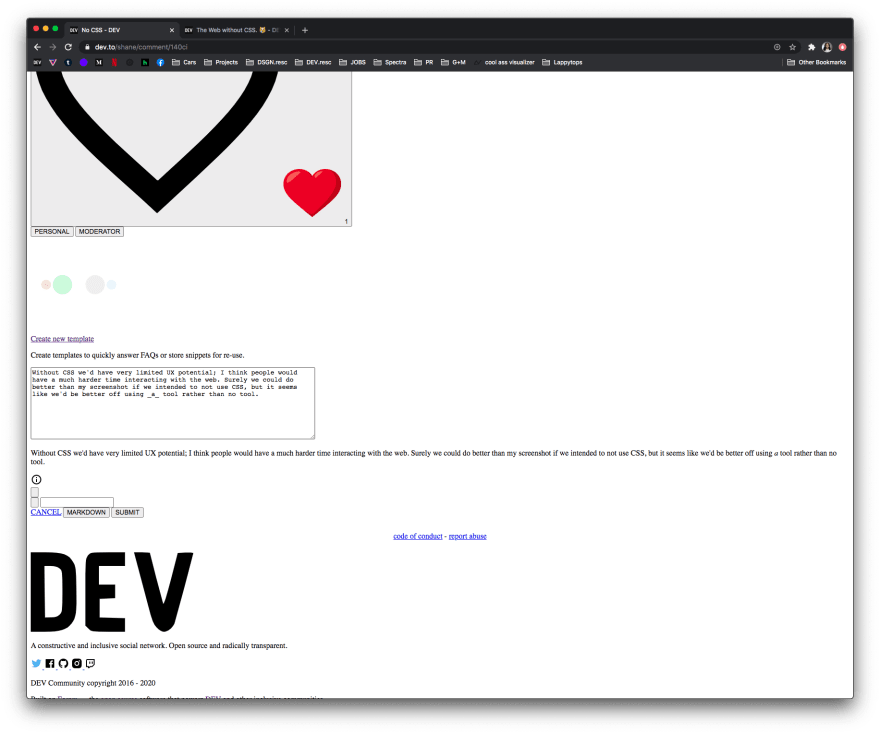
Without CSS we'd have very limited UX potential; I think people would have a much harder time interacting with the web. Surely we could do better than my screenshot if we intended to not use CSS, but it seems like we'd be better off using a tool rather than no tool.
I actually couldn't find the attachment button without CSS lmao.

I not sure how good it works but Firefox has a add-on call Remove CSS from websites
Combine that with disable JavaScript and our page load speeds will be world class!
Interesting! I feel like you also should have discussed how this affects accessibility issues. Terminal browsers and other disability software don't always recognize CSS very well, so I feel like knowing how your site looks without any styling and pure structure could be valuable. This also shows the importance of using the proper HTML tag for each section of your content.
Absolutely! Accessibility is really important. But I think this it's rightly addressed in this MDN article:
CSS and JavaScript accessibility best practices.
One big problem with me is the stupid scrollbars. I hate the newer scrollbars.
CSSis like soul to a website. It's impossible imagine a modern site without It.Absolutely!
The wikipedia looks more informative without css.
someone should make a site (or an extension) where you can enter the URL, press no-CSS and the stripped-down version appears.. could also include some site recommendations from Alexa500, so we do not need to remember all the most popular sites... could be a fun tool to play around 👌
Looks like a really solid project to work on! Thanks for the recommendation!
Super interesting! I think it's also nice to see how the content is laid out and the pure skeleton framework before all the CSS gets added.
Yes, it's so good to see CSS in action!
Wait! What just happened? I'm still processing😬🙄
Everything but nothing!
A web without CSS, also mean I never existed.
Wikipedia doesn't use CSS. IMDB, Yelp, the new Facebook, the new Twitter, and Outlook does use CSS. You can use Fandom with and without CSS. I can live without CSS.
Some people can live without markup, and it's okie. I dare you to take it away though, half of the world may want to kill you lol.
Accessibility is great, but people also love beautiful things, the world would be so boring otherwise.
no it look ugly.