


Salut 👋!
If there's one thing that unites frontend developers across every language, framework, and decade of web history, it's a deep, personal, somewhat traumatic relationship with HTML forms.
You know the drill. You write a <form>. You add an <input>. You add a <label>. You write the JavaScript to validate it on blur. You add a <p> for the error message. You wire up aria-describedby so screen readers can find the error. You set aria-invalid on the input. You set aria-required. You check event.preventDefault(). You realize you've been writing a custom form library for the last four hours. You consider leaving the industry.
That stops today. We're shipping Form RS.

What Is Form RS?
Form RS is a fully composable, WCAG 2.2 AA compliant, production-ready form component library for Yew, Dioxus, and Leptos. It wraps Input RS for the actual <input> rendering, provides a complete context-driven architecture for validation state propagation, and ships seven discrete components that you can mix freely.
Think of it as the form library you would build yourself if you had time, patience, and hadn't already burned both writing <div class="form-group"> for the 8000th time.
The Seven Components
Form RS ships a composable hierarchy, not a monolith.
Form
The outermost container. Wraps <form> with configurable method, action, enctype, autocomplete, ARIA labels, and submit/reset/invalid callbacks. There are two validation modes:
ValidationBehavior::Native   // HTML5 + browser popups (default)
ValidationBehavior::Aria     // Real-time ARIA errors, no popups, submit never blocked
Control
The context provider. Wraps a single field, distributes disabled, error, focused, required, variant, color, and size state to every child that reads FormControlContext. Your labels and helper text automatically inherit this state without prop drilling.
Label
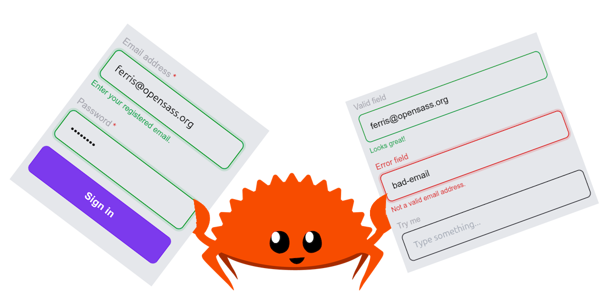
Renders a <label> that visually and semantically tracks the control's state. It goes red when there's an error. It glows when focused. It shows the required asterisk automatically. You don't have to think about any of this.
// In Yew:
<Label html_for="email" error={true} focused={false}>
    {"Email address"}
</Label>
Helper
A <p> element below the input. Changes color based on validation state:
<Helper error={true}>{"Not a valid email."}</Helper>
<Helper valid={true}>{"Looks great!"}</Helper>
Three states, zero class strings.
Group
Groups related checkboxes or radio buttons in a <fieldset>-adjacent <div>. The row prop flips the layout from column to horizontal. The aria_label wires up a role="group" for screen readers.
ControlLabel
Wraps a form control (checkbox, radio, switch) with its associated label text. Controls label placement (End, Start, Top, Bottom), required asterisks, and disabled styling.
<ControlLabel
    control={html! { <input type="checkbox" /> }}
    label={html! { <span>{"Email notifications"}</span> }}
    label_placement={LabelPlacement::End}
/>
Field
This is the one you'll use most. A drop-in composition of Control + Label + Input + Helper with reactive focus rings, error/valid ring states, ARIA attributes, and helper text management.
<Field
    id="email"
    label="Email address"
    r#type="email"
    placeholder="ferris@opensass.org"
    helper_text="Enter a valid email."
    required=true
    full_width=true
    handle={email.clone()}
    valid_handle={email_valid.clone()}
    validate_function={Callback::from(validate_email)}
/>
One component. Fully wired. WCAG compliant. You're done.

Validation Architecture
Form RS supports two distinct validation paradigms:
Native HTML5 Validation
Uses browser-native required, pattern, minlength, maxlength, and type="email" constraints. The browser handles error messages. Form submission is blocked on invalid fields. This is the ValidationBehavior::Native default.
External/ARIA Validation
Pass a ValidationState explicitly, from a server response, a complex cross-field rule, or your own logic:
ValidationState::None        // No judgment, untouched
ValidationState::Valid       // Green ring, success helper text
ValidationState::Invalid(msg)// Red ring, error helper text, aria-invalid="true"
Server errors? Set validation_state={ValidationState::Invalid("Email already in use.".into())} on the field. The error surfaces immediately. The ARIA is correct. Done.
Accessibility Built In
This isn't "we added aria-label" accessibility. This is the real thing.
- Every
Fieldgenerates a unique{id}-helperelement ID and passes it asaria-describedbyon the underlying<input>. -
aria-requiredandaria-invalidare set precisely based on prop + validation state, not just "always true". -
Helperrenders withrole="alert"when in error state, so screen reader users hear errors without tabbing to them. -
Labelis always linked to its input viafor/html_for. No floating labels that break semantics. -
Grouppropagatesrole="group"witharia-labelfor checkbox/radio clusters.
Audit-passing HTML forms. In Rust. Across three WASM frameworks.
The ValidationState Pattern
This is the piece that makes server-side validation ergonomic:
pub enum ValidationState {
    None,
    Valid,
    Invalid(String),
}
Pass None on a fresh field. Pass Valid once you've confirmed on the backend. Pass Invalid with your error message string when the server rejects it. The component does the rest.
Variant, Color, and Size System
Form RS exposes a full semantic token system for the input appearance:
// Visual input style
Variant::Outlined  // Default, bordered input box
Variant::Filled    // Solid filled background
Variant::Standard  // Bottom-border only

// Accent color (rings, labels, helper text)
Color::Primary | Color::Secondary | Color::Error | Color::Info | Color::Success | Color::Warning

// Input density
Size::Small | Size::Medium
Building a dense admin data-entry form? Size::Small. Consumer onboarding flow? Size::Medium. Dark theme with error highlights? Color::Error. The system handles the visual output; you just name the intent.
Quick Setup
Stop writing raw HTML form boilerplate. Do this:
# Yew
cargo add form-rs --features=yew

# Dioxus
cargo add form-rs --features=dio

# Leptos
cargo add form-rs --features=lep
Final Thoughts
Forms are foundational. Every user interaction that matters, login, registration, checkout, profile editing, contact, search, flows through a form. Getting them right means getting ARIA right, validation right, focus state right, and error surfacing right. Every time. On every field.
Form RS is the answer to "who has time for all of that." We did. You don't have to.


 opensass
/
form-rs
opensass
/
form-rs
📋 A highly customizable Form component for WASM frameworks (Powered by Input RS).
📋 Form RS






🎬 Demo
| Framework | Live Demo |
|---|---|
| Yew | |
| Dioxus | |
| Leptos |
📜 Intro
A highly customizable, accessible form component library for WASM frameworks: Yew, Dioxus, and Leptos.
Supports HTML5 and ARIA validation, composable sub-components (Form, Control, FormLabel,
Helper, Group, ControlLabel, Field), and full WCAG 2.2 AA compliance.
🤔 Why Form RS?
- 🎨 Fully Customizable: Control variant, color, size, class, style, ARIA labels, and every sub-component attribute.
-
🧩 Composable API: Mix
Form,Control,FormLabel,Helper,Group,ControlLabel, andFieldindependently or together. - ✅ Dual Validation: Supports native HTML5 validation and real-time ARIA error messaging.
-
♿ Accessible by Default:
aria-describedby,aria-required,aria-invalid, androle="alert"wired up automatically. - 🔧 Framework Agnostic: Same API semantics across Yew, Dioxus, and Leptos.
Y Yew Usage
Refer to our guide to integrate this component into…
We are Open SASS, babe!
We're working tirelessly on making Rust web development extremely easy for everyone.
If you made it this far, it would be nice if you could join us on Discord.
Till next time 👋!


Top comments (0)