


Salut tout le monde 👋!
If there is one layout component that has been re-implemented more times than the <button>, it's the Card. Think about it. Every widget, every dashboard panel, every pricing tier, every shiny glowing glassmorphism element you've ever seen is, deep down, a card.
Instead of writing div class="p-6 border rounded-xl shadow-lg bg-white" for the 5000th time, we decided to solve cards natively for WASM.
Today, we're shipping Card RS.
What Is Card RS?
Card RS is an extremely customizable, production-ready, accessible Card component for Yew, Dioxus, and Leptos. We've extracted all the tedious BEM boilerplate, flexbox wrangling, and ARIA attributes out of your templates, giving you a clean, composable API for building solid UI surfaces.

Cards shouldn't be monoliths. If you just need a surface, <Card> works perfectly alone. If you need standard anatomical parts, stick <Header>, <Title>, <Content>, and <Footer> in there.
The Composable Anatomy
The problem with most UI library cards is that they force you into a specific layout. Card RS doesn't mandate structure; it provides logical boundaries.
The Shell: Card
The parent wrapper. It renders a clean HTML5 <article> (or whatever ARIA role you need) with our default elevated styling.
use card_rs::yew::Card;
use card_rs::Variant;
use yew::prelude::*;

#[function_component(MyWidget)]
pub fn widget() -> Html {
    html! {
        <Card variant={Variant::Default} aria_labelledby="widget-title">
            // the world is yours in here
        </Card>
    }
}
The Skeleton: Headers, Content, & Footers
Don't want to write inline styles for gaps and flex-columns? Neither do we.
<Card aria_labelledby="c-title">
    <Header>
        <Title id="c-title">{"Card Title"}</Title>
        <Description>{"The description lives here."}</Description>
    </Header>
    <Content>
        <p>{"Any content fits neatly in the main body area."}</p>
    </Content>
    <Footer>
        <button aria-label="Confirm">{"Confirm"}</button>
    </Footer>
</Card>
The header stacks title and description with precise spacing. The footer handles your action bars. Everything just snaps into place like LEGOs.

Variants and Prominence
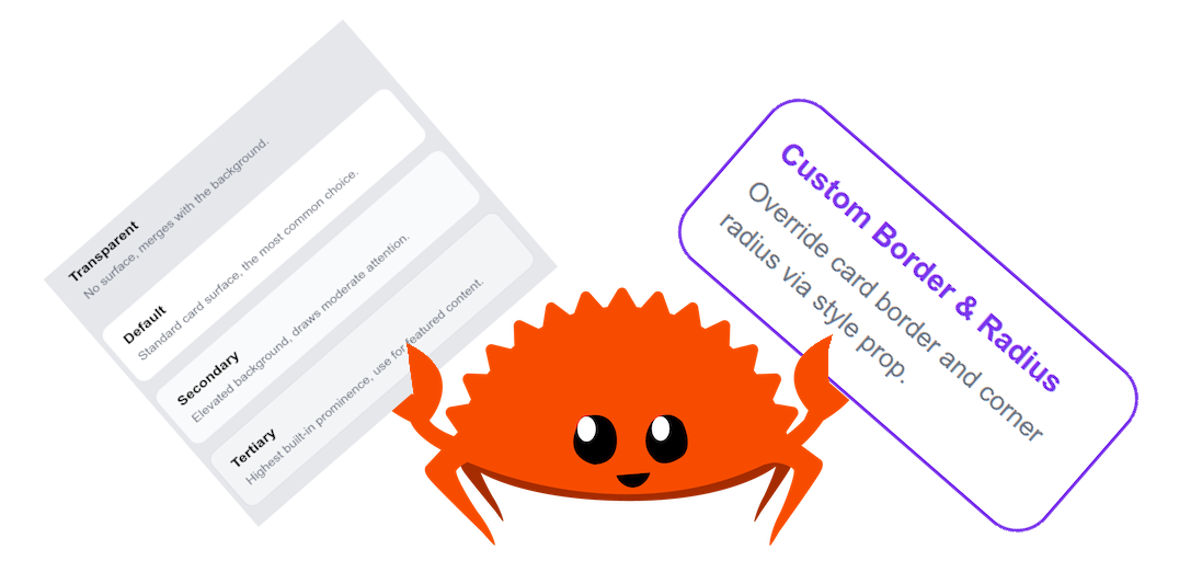
Not all cards are created equal. You need visual hierarchy. We provide a Variant matrix that affects the surface depth and contrast without rewriting class strings.
pub enum Variant {
    Transparent,  // No background, merges with the canvas
    Default,      // Standard surface layer
    Secondary,    // Elevated and highlighted
    Tertiary,     // Premium prominence (perfect for selected items)
}
Building an interactive pricing selector? Wrap your iterations in a <Card variant={if selected { Variant::Secondary } else { Variant::Default }}> and your hierarchy logic is done.
Framework Parity
Like everything we build, Card RS provides identical API surfaces and behavioral guarantees across all three rusty frontends:
| Feature | Yew | Dioxus | Leptos |
|---|---|---|---|
Card |
✅ | ✅ | ✅ |
Header |
✅ | ✅ | ✅ |
Title & Description
|
✅ | ✅ | ✅ |
Content & Footer
|
✅ | ✅ | ✅ |
| Variant Matrix | ✅ | ✅ | ✅ |
| Accessible ARIA bindings | ✅ | ✅ | ✅ |
| Role overrides | ✅ | ✅ | ✅ |
If you know how to build a card in Leptos, you can build a card in Dioxus. The props are the same. The BEM classes are the same. The logic is identical.
Accessibility Built-In
Accessible surfaces are often completely ignored by developers until an audit fails. Card RS is designed strictly around WCAG guidelines.
-
Cardrenders withrole="article"by default. - We enforce
aria_labelledbyto tie structural landmarks to theTitleID. - If you want a non-interactive surface, just override it with
role="note"orrole="region".
// Accessible structural linking:
<Card aria_labelledby="promo-heading" role="region">
    <Header>
        <Title id="promo-heading">{"Special Offer!"}</Title>
    </Header>
</Card>
With one prop, screen readers will now announce "Region: Special Offer!" properly.
Customization
We aren't trapping you in our aesthetic. Want a weird horizontally-aligned flex-row card with a gradient background? Just use the style prop. Card RS accepts your CSS strings eagerly.
Quick Setup
Stop copying and pasting giant Tailwind HTML blobs. Do this instead:
# Yew
cargo add card-rs --features=yew

# Dioxus
cargo add card-rs --features=dio

# Leptos
cargo add card-rs --features=lep
Final Thoughts
The web is made of cards. Taking the time to unify how we create, structure, and render them across Wasm frameworks means we can stop fighting with padding and flexbox alignment, and get back to building real features.



🃏 Card RS






🎬 Demo
| Framework | Live Demo |
|---|---|
| Yew | |
| Dioxus | |
| Leptos |
📜 Intro
A highly customizable, accessible card component for WASM frameworks: Yew, Dioxus, and Leptos. Supports semantic prominence variants, composable sub-components (header, title, description, content, footer), and full WCAG compliance.
🤔 Why Card RS?
- 🎨 Fully Customizable: Control variant, class, style, ARIA labels, and every sub-component attribute.
-
🧩 Composable API: Use
Card,Header,Title,Description,Content, andFooterindependently or together. -
🏷️ Semantic Variants:
transparent,default,secondary,tertiary, themes interpret prominence without hard-coded colors. -
♿ Accessible by Default:
role="article",aria-labelledby, andaria-labelwired up automatically. - 🔧 Framework Agnostic: Same API semantics across Yew, Dioxus, and Leptos.
Y Yew Usage
Refer to our guide to integrate this component into your Yew app.
🧬 Dioxus Usage
Refer to our guide to integrate this component into…
We are Open SASS, babe!
We're working tirelessly on making Rust web development extremely easy for everyone.
If you made it this far, it would be nice if you could join us on Discord.
Till next time 👋!


Top comments (0)