


Je vous salue 👋!
Every WASM app eventually needs a badge. The little red circle on your notification bell. The green dot on the corner of an avatar. The "99+" that taunts you every morning from the inbox icon. They're everywhere, and somehow everyone is still hand-rolling them.
That stops today. We're shipping Badge RS.
What Is Badge RS?
Badge RS is a production-ready badge component for Yew, Dioxus, and Leptos. Notification counters, status dots, overflow labels, the whole catalogue. It handles positioning, sizing, color theming, dot mode, accessible markup, and even knows the difference between a circle and a rectangle.

If you've ever opened your browser devtools at 11pm trying to figure out why a badge is floating 4px off the corner of an avatar instead of sitting flush on the arc, Badge RS is the component you wish had existed.
The Core Components
Anchor
The positioning wrapper. Drop it around any element and it becomes a badge target. Uses position: relative; display: inline-flex; so it doesn't break your layout, doesn't eat your accessibility tree, and doesn't require you to memorize any CSS tricks.
use badges_rs::yew::{Badge, Anchor};
use badges_rs::{Color, Shape};
use yew::prelude::*;

#[function_component(NotificationBell)]
pub fn notification_bell() -> Html {
    html! {
        <Anchor>
            <span aria-label="Inbox, 5 unread messages">{"📬"}</span>
            <Badge
                color={Color::Danger}
                shape={Shape::Circle}
                aria_label="5 unread messages"
            >
                {"5"}
            </Badge>
        </Anchor>
    }
}
That's it. The badge positions itself. You decide where.
Badge
The actual indicator. Pass children and you get a labeled badge with text inside. Skip children and you get a compact do, no extra prop needed, just don't put anything inside.
// A labeled count badge
<Badge color={Color::Danger} size={Size::Sm} aria_label="5 unread">{"5"}</Badge>

// A status dot, no children, no extra prop
<Badge color={Color::Success} placement={Placement::BottomRight} aria_label="Online" />
Same component, two modes. The dot is not a separate component.
BadgeLabel
A thin <span class="badge__label"> wrapper. Used automatically when you pass plain text to Badge. Expose it directly when you need extra CSS classes or styling on the label slot.
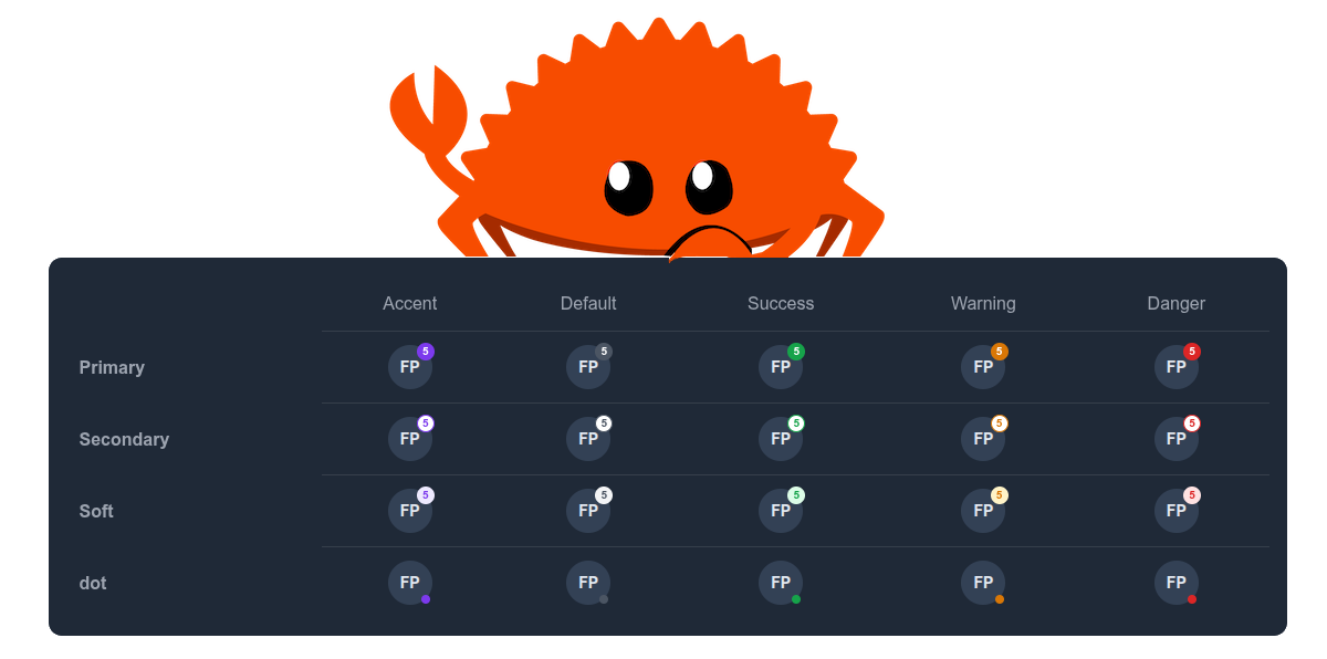
Colors, Variants, Sizes
The full set of knobs is available:
// Colors
Color::Default | Color::Accent | Color::Success | Color::Warning | Color::Danger

// Variants (three visual styles)
Variant::Primary    // solid fill
Variant::Secondary  // outlined
Variant::Soft       // muted, lower-contrast

// Sizes
Size::Sm | Size::Md | Size::Lg

// Placement
Placement::TopRight | Placement::TopLeft | Placement::BottomRight | Placement::BottomLeft
All combinations work. TopLeft is there for RTL layouts and anyone who likes to be contrarian about badge placement.
The Positioning Bug Nobody Talks About
Here's the subtle one. top: 0; right: 0 with transform: translate(50%, -50%) centers a badge perfectly on the corner of a rectangle. That's fine for icon buttons, list items, or anything with a square bounding box.
For a circle, which is what every avatar in existence is, the story is different. A circle's actual edge at 45° sits inward from the bounding box corner. The geometric offset is exactly 1 - sin(45°), which works out to roughly 14.64% of the element's width and height.

Most badge implementations ignore this. The badge floats slightly off the arc, nobody files a bug, and the designer quietly seethes.
Badge RS exposes a Shape enum to handle this explicitly:
pub enum Shape {
    Rectangle,  // top: 0; right: 0, standard bounding box corner
    Circle,     // top: 14.64%; right: 14.64%, sits on the arc
}
// On a circular avatar, badge sits flush on the arc:
<Badge color={Color::Danger} shape={Shape::Circle} aria_label="3">{"3"}</Badge>

// On a square icon button, badge sits on the bounding box corner:
<Badge color={Color::Accent} shape={Shape::Rectangle} aria_label="New">{"New"}</Badge>
The math is not magic. It's just trigonometry that nobody wanted to look up at 11pm. We looked it up for you.
Framework Parity
All three frameworks ship the same API surface:
| Feature | Yew | Dioxus | Leptos |
|---|---|---|---|
Anchor |
✅ | ✅ | ✅ |
Badge |
✅ | ✅ | ✅ |
BadgeLabel |
✅ | ✅ | ✅ |
Shape::Circle offset |
✅ | ✅ | ✅ |
| Dot mode (no children) | ✅ | ✅ | ✅ |
| All placements | ✅ | ✅ | ✅ |
| All variants | ✅ | ✅ | ✅ |
| ARIA attributes | ✅ | ✅ | ✅ |
If you've used it in Yew, you already know how to use it in Dioxus and Leptos. The prop names don't even change.
Accessibility
Accessible badges are an afterthought in most libraries. In Badge RS they're mandatory.
-
Badgerenders withrole="status"and a requiredaria_label. Screen readers announce the content without the user having to navigate to it. -
aria-atomic="true"ensures the full label is re-read when the count updates. A badge that goes from "3" to "4" reads "4 unread messages", not just "4". -
Anchorrenders as a<span>with no ARIA role, because it's structural glue and should be invisible to assistive technology. - The WCAG guidance on badges is straightforward: label the element that owns the badge, not just the badge itself. We mention this in the docs and the examples follow it throughout.
// The accessible way, the host element's label includes the count
<span aria-label="Inbox, 5 unread messages">{"📬"}</span>
<Badge aria_label="5 unread messages">{"5"}</Badge>
The badge label and the host's aria-label should tell the same story from different angles.
Quick Setup
# Yew
cargo add badges-rs --features=yew

# Dioxus
cargo add badges-rs --features=dio

# Leptos
cargo add badges-rs --features=lep
No CSS framework required. Styles are computed inline from the prop values.
Dot Mode vs Count Mode
One component, two modes, no separate component for each. This matters because it keeps your import surface small and your mental model consistent.
// Count mode, children present
<Badge color={Color::Danger} aria_label="5 messages">{"5"}</Badge>

// Dot mode, no children, badge renders as a small filled circle
<Badge color={Color::Success} placement={Placement::BottomRight} aria_label="Online" />
The dot is a first-class mode with its own size calculations. Size::Sm in dot mode renders a 6×6px dot. In count mode, it renders a 16×16px pill. The size label refers to the visual weight, not a fixed pixel value.
Status Indicators
The placement prop combined with dot mode covers the most common avatar status pattern:
use badges_rs::leptos::{Badge, Anchor};
use badges_rs::{Color, Placement, Shape};
use leptos::prelude::*;

#[component]
pub fn UserAvatar() -> impl IntoView {
    view! {
        <Anchor>
            <span
                style="/* your avatar CSS */"
                aria-label="Jane Doe, online"
            >
                "JD"
            </span>
            <Badge
                color=Color::Success
                shape=Shape::Circle
                placement=Placement::BottomRight
                aria_label="Online"
            />
        </Anchor>
    }
}
Green dot, bottom-right, perfectly on the arc. That's the whole pattern.

What We Didn't Do
No magic threshold that auto-truncates to "99+". That's application logic, not component logic. We show whatever you pass in. If you want count.min(99).to_string() or "99+", that's two lines in your own code.
No auto-detection of the parent element's shape. That would require measuring the DOM at runtime, which is expensive. Instead: explicit shape prop. You know your own design system. Tell us.
No CSS injection. No global stylesheet to import. No BEM class naming conventions to memorize. The styles live on the element.
Final Thoughts
Badge RS is compact by design. Three components, one enum, one positioning decision that most libraries get wrong.
The Shape prop is the detail worth remembering. If you're putting badges on circular avatars and they look slightly off, that's the fix. Try Shape::Circle and stop adjusting pixel offsets in your component stylesheets.



🏷️ Badges RS






🎬 Demo
| Framework | Live Demo |
|---|---|
| Yew | |
| Dioxus | |
| Leptos |
📜 Intro
A highly customizable, accessible badge component for WASM frameworks: Yew, Dioxus, and Leptos. Supports notification counts, status dots, labels, multiple colors, variants, sizes, and placements with full WCAG compliance.
🤔 Why Badges RS?
- 🎨 Fully Customizable: Control color, variant, size, placement, class, style, and ARIA labels.
- 🔴 Dot Mode: When no children are provided the badge renders as a compact status dot.
-
📍 Smart Placement: Four corner placements (
top-right,top-left,bottom-right,bottom-left) via CSStransformfor pixel-perfect positioning. -
♿ Accessible by Default:
role="status",aria-label, andaria-atomicwired up automatically. - 🧩 Framework Agnostic: Same API semantics across Yew, Dioxus, and Leptos.
Y Yew Usage
Refer to our guide to integrate this component into your Yew app.
🧬 Dioxus Usage
Refer to our guide to integrate this…
We are Open SASS, babe!
We're working tirelessly on making Rust web development extremely easy for everyone.
If you made it this far, it would be nice if you could join us on Discord.
Till next time 👋!


Top comments (0)