There are a plethora of plugins to use and JS to write to achieve dark mode on your website. A straightforward and single-layered way of doing this is by adding the CSS rule filter:(invert). An example is below.
<section> This is some text. </section>

<a href = "#'> a Link </a>
html {
       background: black;
       filter: invert(1); /* This will flip the contents on the page, from black to its inverted color*/
}

a {
    color: green; /* This will render as a light pink or purple*/
}
To have the link render as green, add the hue-rotate()function to the filter property.
html {
       background: black;
       filter: invert(1) hue-rotate(180deg); /* This will flip the color back to its original value.*/
}
Inspiration for this post is by Dev Ed on YT https://www.youtube.com/watch?v=CxC925yUxSI&feature=youtu.be
Timestamp: 17:29
Happy Coding! 😊


Top comments (14)
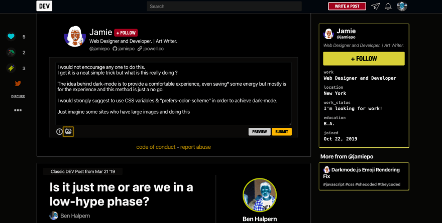
I would not encourage any one to do this specially at this level, on component level maybe.
I get it is a neat simple trick but what is this really doing ?
The idea behind dark-mode is to provide a comfortable experience, even saving* some energy but mostly is for the experience and this method is just a no go.
I would strongly suggest to use CSS variables & prefers-color-scheme in order to achieve dark-mode.
Just imagine some sites who have images and doing this.

The beginning of the post states that it’s a straightforward or quick and single-layered way to achieve dark mode. It’s meant to be built upon.
Honestly, No! Inverting colors using filter isn't a good base to build upon under any circumstances.
When am I to put the lime in the coconut?
😂😩
When I get bored, I like to open up the dev tools and use this:
developer.mozilla.org/en-US/docs/W...
We all should feel free to fiddle and let the browser be our canvas. ☺
Exactly, some people don’t see that right away. I think my next post will be about creative coding 😊
That would be cool! There's so many options now to create digital art using JavaScript and CSS. I say title it as: HTML6 Boilerplate; so everyone knows it's now the new standard way of doing things.
I think I’ll do that. I know all the head honchos at the W3C, so I’ll breeze past recommendations in no time. You’ve inspired me and evolved the future of the web in one day. Wow. a hero...
I'm waiting for the comment: A practical example use case for
filter: invert(1) hue-rotate(180deg);is...This is cool as a party trick or a little experiment, but has some drawbacks. Some of which can be improved, but also some of which are by design.
You invert all the colors including, images, videos, etc. In order to preserve critical elements, you could expand your invert-selector like
Also, while you hue-rotate your accents, brand colors, etc. back to their original hue, their lightness is reduced. This may be a good thing for most elements, but can get you into trouble with your marketing department. I'd include brand colors into
.all-color-critical-elements.What can't be fixed easily though is the hierarchy of lightness on elements. As an example, look at the DEV header. In its default light theme, it's slightly lighter than the content, but has a search field that's darker than its own background. It creates a hierarchy in which it is less important than the main content and below the search field. By simply inverting this, you'd put jank that hierarchy up.
This is why most dark modes use a set of variables that are simply being changed to new values.
That function doesn’t just have to have the intention to change a site to dark mode in the way we see it being used today. Its potential goes beyond a party trick especially in design or creating digital art.
i was looking for a few line solution to flip the color scheme on pinboard.in . This was exactly what I was looking for. Fun times !
Thanks a lot, you really helped me out!