A few months ago I asked myself this question for my website buildfaster.co.
I wanted to update it simply because I heard many people telling it looked ugly, the color palette was off, and it wasn't very user-friendly. 😬
Yep it hurt.
But I wasn’t just going to keep BuildFaster the way it was. I was going to fix it.
So I took the time to gather more feedback and make improvements on the landing page. It took over a month to complete the new landing page. Looking back on it, I wish I had a faster solution.
So how can I get a “fresh look“, faster? 🤔
Do you feel the same way right now? If you do, then your problems have now been solved. 😲
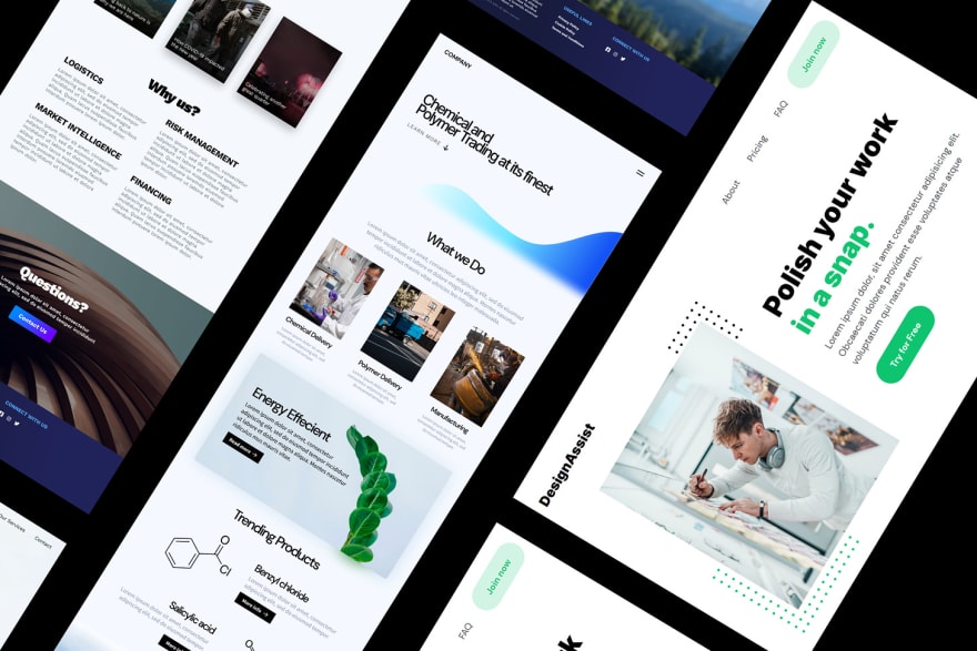
I've been working on a few simple website themes for startups for the past week.
Here's a sneak peak of some of them:
What do you think? Could you use a boost right now?
I'm open to any feedback and if you want early access, feel free to reach out to me.
Have a great rest of your day. 👋


Top comments (3)
Mobile version needs a revision.
About page header isn't responsive, and the navbar on mobile is slow as hell (maybe too much JS? you can achieve the same using plain CSS).
Also being able to choose another category when inside one without needing to go back to the main themes page could be fine for usability.
Apart from that it's a good work for me, check your webpage (view by view) using Lighthouse and match the requirements for performance, seo and best practices, it could be a nice exercise. Start lazy-loading this chat that is a third party plugin for sure and then seek the details to see more ways to improve your site :)
Thanks so much for this feedback @joelbonetr ! Appreciate it :)
you're welcome! :)