
Hope you all had a good holiday last week for those who celebrated! This edition will be covering November 20 to November 27.
Features
-
@rhymes added the option to export your dev.to posts! It comes as a JSON file via email. Check out the changelog post for more details:
-
@glebec, @bennypowers and I worked on this PR together and added anchor links to headers in posts! Check out the changelog post for more details:
-
@philnash added the HTML attribute
rel='me'to profile links. If you're not sure what this is, check out the PR for more details. Thanks, Phil!


Bug Fixes / Other Contributions
-
@moriczgergo updated our documentation with how to add series to your front matter. Thanks @moriczgergo!
-
@lightalloy removed database.yml and added it to our .gitignore. If you've previously contributed, you might need to copy over the new
config/database.yml.sampleinto a newconfig/database.yml. Thanks Anna! -
@ben added some beginnings of pagination functionality to the notifications page. This pattern will let us add true pagination later on.
-
@lightalloy refactored how our comments rendered, and there are now less SQL queries being called. Thanks again, Anna!
-
@jess refactored one of the ways we handle spam accounts. The PR has a great service object name 👌
-
@mariocsee updated some documentation regarding our API keys. You no longer need to set up Stream API keys for basic development. Thanks, Mario!
New Issues / Discussions
-
We have a small bug where the left end of the navbar is shortened a bit. Thanks @tristan957!
 The navbar width becomes messed up upon clicking on my profile picture
#1160
tristan957 posted on
The navbar width becomes messed up upon clicking on my profile picture
#1160
tristan957 posted onDescribe the bug The overlay seems to be cutting into the navbar.

To Reproduce Steps to reproduce the behavior:
- Click profile picture
Expected behavior Navbar to be above overlay.
Desktop (please complete the following information):
- OS: Solus (Linux)
- Browser Firefox
- Version 63.0.1
</div>
<div class="gh-btn-container"><a class="gh-btn" href="https://github.com/thepracticaldev/dev.to/issues/1160">View on GitHub</a></div>
The Runkit tag has a bug where it doesn't render in the comment preview. Thanks @antogarand!
Runkit tag in comments - Broken
#1163
AntonyGarand posted onDescribe the bug Runkit tags are not working in comments. Instead of a normal tag, they simply put the raw content into a code tag, which has bad formatting and no execution.
To Reproduce Create a comment with a runkit tag Preview or publish it
Actual behavior We get content in a code tag, without the formatting or execution runkit should provide us.
Expected behavior We get a correct runkit tag
Screenshots If applicable, add screenshots to help explain your problem.


Additional context Add any other context about the problem or helpful links here.
We have service workers that show a cool offline page, but we could brush up on caching pages.
Feature request - cached content for offline use
#1171
gurpritsingh posted onIs your feature request related to a problem? Please describe. I love using dev.to whenever I am travelling but because I am in India and internet connection is not reliable I end up seeing the offline page with the drawing canvas which is cool but not helpful.
Describe the solution you'd like Having a caching strategy so that user can see some of the articles when offline would be great.
Additional context Dev.to is all about the community and knowledge sharing and I think if we can have access to some subset of that knowledge even when offline would be amazing
Sometimes duplicate posts are made. Perhaps we could add a buffer to prevent that? More details in the issue. Thanks, @rdumais!
Feature Request - Duplicate Posts
#1170
RDumais posted onIs your feature request related to a problem? Please describe. I have seen authors accidentally double post a topic on multiple occasions. I am not sure where the problem is stemming from.
Describe the solution you'd like I believe the Dev.to team should implement some kind of buffer where authors are unable to post a second topic until x amount of minutes have passed since the first post (1-2 minutes).
Describe alternatives you've considered I cannot really think of any alternatives. Maybe make it so topics cannot have identical names within x amount of minutes of posting?
Additional context Here is an example I've seen with two different links:
https://dev.to/jeremyksutter/ultimate-guide-to-selling-your-product-online-25me https://dev.to/jeremyksutter/ultimate-guide-to-selling-your-product-online-212d
It'd be great to have a history on dev.to of all the posts you've read on dev.to. Feel free to add the discussion in the issue. Thanks, @yafkari!
add a history of read articles
#1173
zechtyounes posted onIs your feature request related to a problem? Please describe.
I'm always frustrated when I read an article the morning and I can't find it again the evening..
Describe the solution you'd like
I thought it would be cool, if there is a history of read articles
Additional context
That's all ^^
PS: Sorry for my bad english and this short issue !
It would also be cool to be able to subscribe to a series of posts and receive notifications when a new post of that series is released. Thanks, @sturzl!
Publish/follow a series of articles
#1172
sturzl posted onMany authors are posting series of articles. I would like to see notifications for articles in a series without having to follow everything from that author or the related tags.
E.g. https://dev.to/shikaan/design-patterns-in-web-development---2-memento-253j
We have a bit of an edge case where we show text in a post's sidebar that probably doesn't make much sense. More details in the issue. Thanks, @david_j_eddy!
Replace 'More from @...'
#1202
davidjeddy posted onIs your feature request related to a problem? Please describe. No problem , verbiage update when viewing an article when user is the author.
Describe the solution you'd like Either remove the 'More from @...' when user is the author or rephrase to something in the vein of 'Other posts by you.'
Describe alternatives you've considered Not a critical issue, more a readability / consistency update.
Additional context

Thank you; keep up the amazing effort!
Andrew wrote up a great issue on how the save buttons could have better contrast. Check it out below. Thanks @link2twenty!
Save button's contrast
#1204
Link2Twenty posted onDescribe the bug Currently, the article
savebuttons are calculated at #4a68ff and their text is #ffffff this leads to a contrast of 4.45 generally anything below contrast 7 is frowned upon.This is calculated in the scss file here https://github.com/thepracticaldev/dev.to/blob/master/app/assets/stylesheets/articles.scss
background: darken($purple, 26%);Side note: if you're going to use darken and lighten it's generally best to avoid absolutes (ff/00) as they're not really affected.
Expected behavior Ideally if we could boost the contrast to above 7 that would be good for accessability. I've done some tests and changing the darken to 38% (#0d35ff) would have a contrast of 7.07 and changing the hover to 50% (#0022cf) would allow the affect to remain about the same.
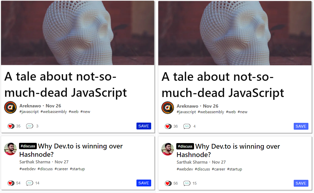
Screenshots
 Left is with the change, right is without
Both top articles have the hover attribute.
Left is with the change, right is without
Both top articles have the hover attribute.Additional context I would have just gone ahead and submitted a pull request but I thought this would be a better way to do it. Also, if the change is accepted, it would make a good first pull request.
That's it for this edition. Feel free to share your thoughts on any of the issues.


Top comments (3)
Thank you to @rhymes @glebec @bennypowers @philnash @moriczgergo @lightalloy @ben @jess @mariocsee @tristan957 @antogarand @rdumais @yafkari @sturzl @david_j_eddy @link2twenty for your contributions!
W00t! Glad to get my first contribution to the platform done, even if it's only a small one. This will hopefully be the first of many!
No problem. I am loving the dev.to team, community, and interaction. If for no other reason, dev.to might be why I pick up Ruby. :)