
In many apps it's common to have a short tutorial that guides the user through the basic functions of the app. There you often find a semi-transparent overlay that covers everything except the part of the app that is being explained and which you are supposed to interact with.
There are several approaches to achieve this. Let's look at them.
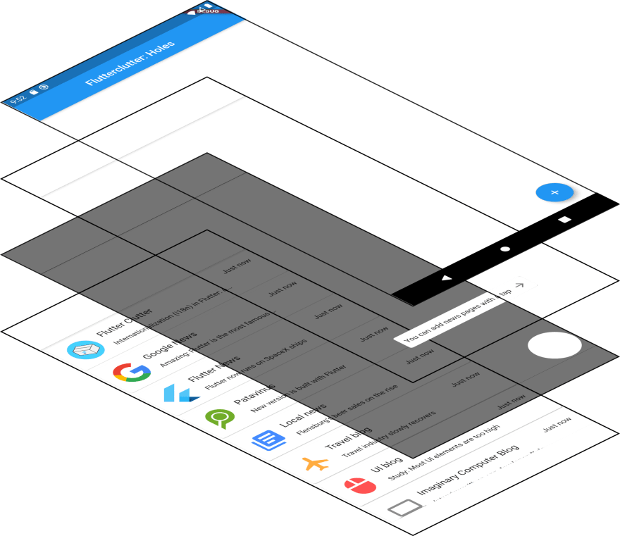
Our goal

Let that be our goal: an app with a screen in the background (in this case a ListView) and a FloatingActionButton on top that is enclosed by a half-transparent overlay and has an explanation text next to it.
The concept
To approach the solution, let's think of the concept behind this:
We want to have different layers stacked on top of each other:
- At the bottom we have the screen that is to be explained
- On top of that there is the overlay that defocusses most of the UI elements
- The second-hightest level is occupied by an explanation text
- The uppermost layer contains everything that is out of our control (for now) like the FAB, the app bar, the status bar and the OS controls
Note that this is only the case for FABs. If we were to explain a FlatButton or a TextInput in our tutorial, we'd have this element on the lowest layer as well. FABs are drawn onto an overlay that is not part of the usual canvas.
For now, that's irrelevant because that's where we put our hole anyways. So from a top-down perspective it's impossible to say where the button is positioned on the z-axis.
Implementation
Flutter provides a horizontal stack (called Row), a vertical Stack (called Column) and a stack in z-direction called Stack.
Let's use it to bring the above mentioned concept to life.
Stack(children: <Widget>[
  _getContent(),
  _getOverlay(),
  _getHint()
]);
That's the main widget.
-
_getContent()is supposed to return whatever content we want to cover (in the above mentioned example it's theListView) -
_getOverlay()returns the half-transparent overlay that has a hole in the bottom right corner -
_getHint()is responsible for returning the hint that labels the button
The FAB is part of the parent Scaffold, that's why it's not inside the Stack widget.
The overlay
The trickiest part is the _getOverlay() method. There are multiple possibilites I want to introduce.
ClipPath
The docs say:
Calls a callback on a delegate whenever the widget is to be painted. The callback returns a path and the widget prevents the child from painting outside the path.
So basically we have a shape that is to be painted and then a ClipPath that definies where to draw. There is only one problem: we want the opposite. We want to declare an area in which the overlay is not drawn.
But before we handle that problem, let's see what the ClipPath should generally look like.
In order to create a custom clipper, we need to extend from the class CustomClipper<T> and in our case set the type to Path because we want a more complex shape (inverted oval inside a rectangle). There are predefined basic shapes as well. These can be used when the clipping is simple (e. g. oval or rectangle with rounded corners) because it's less code to write and the performance is a little bit better.
class InvertedClipper extends CustomClipper<Path> {
  @override
  Path getClip(Size size) {
    return new Path();
  }

  @override
  bool shouldReclip(CustomClipper<Path> oldClipper) => true;
}
We are required to override the following two methods:
-
getClip: the input is the size of theRenderBoxand the required output is aPathrepresenting the space inside the givenRenderBoxthat is to be drawn -
shouldReclip: this method is called when there is new instance of thePathobject. Input is the old version of the clipper. By the boolean output you decide whether the clipping is performed again. Actually, for development purpose we return true because we want hot reload to work. In release version I recommend to return false because of performance reasons and the clipper is static
Let's fill the getClip method with an actual path.
return Path()
  ..addRect(Rect.fromLTWH(0, 0, size.width, size.height))
  ..addOval(Rect.fromCircle(center: Offset(size.width -44, size.height - 44), radius: 40))
  ..fillType = PathFillType.evenOdd;
Depending on your level of understanding, there might be a bit to be explained.
First, something about the syntax: I used the two dots, which is called cascade notation in Dart. This is just syntactic sugar in case you have a sequence of method calls on the same class instance.
We add two shapes to our path: a Rect and an Oval. The rectangle has the size of the whole RenderBox as it represents the whole overlay. The oval has the size of the FAB (plus a little padding) since it's meant to be the "hole" in the overlay.
The last line is actually crucial. If we omitted it, we would see the overlay but not the hole. But why is that? Remember, everything inside the path is drawn, everything outside the path is not. So we must create a path in which the oval is considered outside whereas the surrounding rectangle is considered inside.
The PathFillType determines exactly that. Per default the fillType is set to PathFillType.nonZero. In that case, a given point is considered inside the path if:
a line drawn from the point to infinity crosses lines going clockwise around the point a different number of times than it crosses lines going counter-clockwise around that point
evenOdd sees it as inside when:
a line drawn from the point to infinity crosses an odd number of lines
Since our oval does not cross any lines and zero is considered an even number, the oval is seen as outside.
If you want to go deeper, you can find out more about the algorithms on Wikipedia: here and here.
This is not so easy to understand so I have a simpler apporach for you: instead of working with subpaths and manipulating the PathFillType we just draw the surrounding rectangle and then substract the oval:
Path.combine(
  PathOperation.difference,
  Path()..addRect(
      Rect.fromLTWH(0, 0, size.width, size.height)
  ),
  Path()
    ..addOval(Rect.fromCircle(center: Offset(size.width -44, size.height - 44), radius: 40))
    ..close(),
);
I don't know about performance, but in terms of readability and clarity, I would say that the latter approach is better, but that might be only my personal view.
The only thing left to do is to decide which widget to clip. In this case we want a screen-filling container that is half-transparent.
Widget _getOverlay() {
  return ClipPath(
    clipper: InvertedClipper(),
      child: Container(
        color: Colors.black54,
      ),
  );
}
CustomPainter
Using a ClipPath we take a semi-transparent overlay and decide to draw everything except for a hole. How about the alternative of using a CustomPainter to only draw what we want?
The good thing: we can reuse almost every part of the above code so I will instantly show the result.
class OverlayWithHolePainter extends CustomPainter {
  @override
  void paint(Canvas canvas, Size size) {
    final paint = Paint()
      ..color = Colors.black54;

    canvas.drawPath(
      Path.combine(
        PathOperation.difference,
        Path()..addRect(
          Rect.fromLTWH(0, 0, size.width, size.height)
        ),
        Path()
          ..addOval(Rect.fromCircle(center: Offset(size.width -44, size.height - 44), radius: 40))
          ..close(),
      ),
      paint
    );
  }

  @override
  bool shouldRepaint(CustomPainter oldDelegate) {
    return false;
  }
}
But wait, if we compile that, don't see an overlay. Why is that?
Well, if a CustomPaint's child property (which defines everything being drawn underneath) is not set, the size defaults to zero. In this case we have to set the size property manually like this: size: MediaQuery.of(context).size.
Comparing the two approaches
ClipPath
Widget _getOverlay() {
  return ClipPath(
    clipper: InvertedClipper(),
      child: Container(
        color: Colors.black54,
      ),
  );
}

class InvertedClipper extends CustomClipper<Path> {
  @override
  Path getClip(Size size) {
    …
  }

  @override
  bool shouldReclip(CustomClipper<Path> oldClipper) => true;
}
CustomPainter
Widget _getOverlay(BuildContext context) {
  return CustomPaint(
    size: MediaQuery.of(context).size,
    painter: HolePainter()
  );
}

class OverlayWithHolePainter extends CustomPainter {
  @override
  void paint(Canvas canvas, Size size) {
    final paint = Paint()
      ..color = Colors.black54;

    canvas.drawPath(
      …,
      paint
    );
  }

  @override
  bool shouldRepaint(CustomPainter oldDelegate) {
    return false;
  }
}
In terms of LOC the clipper approach is ahead. Regarding readability I prefer the CustomPainter way. Anyways, both ways produce the exact same result:
Note that if you still want underlying widgets to receive gesture events of the user, you need to wrap everything inside an IgnorePointer.
ColorFiltered
There is a third approach I want to introduce. The interesting thing about it is that you don't have to interact with Paint at all. You can just stay in the widget tree. Sounds promosing doesn't it?
What we're going to use is the ColorFiltered widget. Like the name implies, this widget applies a ColorFilter to its child.
A color filter is a function that takes two colors, and outputs one color
The two colors are firstly the one you specify (the ColorFilter.mode constructor has a color property) and secondly the color of the respective pixel of the child that is specified. As BlendMode we use BlendMode.srcOut. It has the following effect:
Show the source image, but only where the two images do not overlap. The destination image is not rendered, it is treated merely as a mask. The color channels of the destination are ignored, only the opacity has an effect
Source image in our case is the color Colors.black54 and destination is whatever we provide as the child argument. So basically a half-transparent overlay is drawn and every pixel with opacity greater than zero in the child widget produces a hole because the source image is not drawn where they overlap. Essentially we have an alpha mask now.
Widget _getOverlay() {
  return ColorFiltered(
    colorFilter: ColorFilter.mode(
      Colors.black54,
      BlendMode.srcOut
    ),
    child: Stack(
      children: [
        Container(
          decoration: BoxDecoration(
            color: Colors.transparent,
          ),
          child: Align(
            alignment: Alignment.bottomRight,
            child: Container(
              margin: const EdgeInsets.only(right: 4, bottom: 4),
              height: 80,
              width: 80,
              decoration: BoxDecoration(
                color: Colors.black, // Color does not matter but should not be transparent
                borderRadius: BorderRadius.circular(40),
              ),
            ),
          ),
        ),
      ],
    ),
  );
}
We let the overlay be drawn by using a Container with a transparent background color. There is no overlapping pixel so Colors.black54 is drawn on the whole screen. We create the hole by putting a oval-shaped Container into the other Container. It's important that this widget has a non-transparent background color as this produces an overlap which then causes the mask not to draw the shape of it.
A effect is that we can put whatever widget into that Container which will lead to a hole. This can be text, images or anything else.

The text hint
Now what's left is to show a hint that describes the purpose of the FAB. We do that by implementing the _getHint method as follows:
Positioned _getHint() {
  return Positioned(
    bottom: 26,
    right: 96,
    child: Container(
      padding: EdgeInsets.all(8),
      decoration: BoxDecoration(
        color: Colors.white,
        borderRadius: BorderRadius.all(
          Radius.circular(4)
        )
      ),
      child: Row(
        children: [
          Text("You can add news pages with a tap"),
          Padding(
            padding: EdgeInsets.only(left: 8),
            child: Icon(Icons.arrow_forward, color: Colors.black54,)
          )
        ]
      ),
    )
  );
}
What we have learned in this tutorial: there are numerous ways to prevent Flutter from displaying parts of a widget. I have introduced ways involving ClipPath, CustomPainter and ColorFiltered. Depending on the personal preferences and the use case one or another widget might.
The complete code can be viewed in my gist.

Top comments (5)
This is really neat
Thank you :)
I love this way of thinking in layers!
A great article, but
links to Wikipedia are not links. :)
Well spotted, thank you! I inserted the links now.