WHY REACT NATIVE?
With React Native, we can build native mobile applications for multiple platforms using JavaScript and React. Importantly, the interfaces we build are translated into native views. We’ll be able to share a lot of the code we write between iOS and Android devices, and React Native makes it easy to write code specific to each platform when the need arises. We get to use one language (JavaScript), one framework (React), one styling engine, and one toolchain to write apps for both platforms. Learn once, write anywhere.
Today, we’ll use the most common React Native components to build an app that resembles Instagram. We’ll build the main image feed with the components View, Text, Image and FlatList. We’ll also build a comments screen using TextInput and ScrollView.
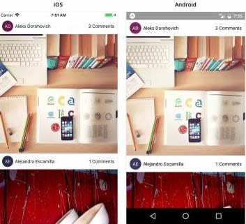
This is what we will be building:
The second screen opens when we tap “comments” to display comments for that image: 
If you are not familiar with creating a react native app with expo, see here.
We have to break down the UI of our app into components; we will create these components then link them all. Let’s start by breaking down the image feed page.

When we are done, we will have to create four components:
- Avatar - The profile photo or initials of the author of the image
- AuthorRow - The horizontal row containing info about the author: their avatar and their name
- Card - The item in the image feed containing the image and info about its author
- CardList - The list of cards in the feed
Avatar:
Here’s what the Avatar should look like, when rendered in isolation:
For simple apps, it’s easiest to keep all of our components together in a components directory, Let’s create a new directory called components and create a new file within that called Avatar.js
Our Avatar component is going to render the components View and Text. It’s going to use StyleSheet, and it’s going to validate strings, numbers, and color props with PropTypes. Add the code below to Avatar.js
import { ColorPropType, StyleSheet, Text, View } from 'react-native';
import PropTypes from 'prop-types';
import React from 'react';

export default function Avatar({ size, backgroundColor, initials }) {
  const style = {
    width: size,
    height: size,
    borderRadius: size / 2,
    backgroundColor,
  };

  return (
    <View style={[styles.container, style]}>
      <Text style={styles.text}>{initials}</Text>
    </View>
  );
}

Avatar.propTypes = {
  initials: PropTypes.string.isRequired,
  size: PropTypes.number.isRequired,
  backgroundColor: ColorPropType.isRequired,
};

const styles = StyleSheet.create({
  container: {
    alignItems: 'center',
    justifyContent: 'center',
  },
  text: {
    color: 'white',
  },
});
AuthorRow:
In the same “Components” folder, create another file, AuthorRow.js. This is a horizontal row component containing our Avatar and the full name of the photo author. In this file, we’ll import mostly things we’ve seen already: StyleSheet, View, Text, PropTypes, and React. We’ll also import a TouchableOpacity so that we can handle taps on the “Comments” text to take us to the comments screen. We’ll also need to import the Avatar component we just made, and a few of the utility functions we copied into this project at the start of the chapter. Add the following block of code to AuthorRow.js
import { StyleSheet, Text, TouchableOpacity, View } from 'react-native';
import PropTypes from 'prop-types';
import React from 'react';


import Avatar from './Avatar';
import getAvatarColor from '../utils/getAvatarColor';
import getInitials from '../utils/getInitials';


export default function AutoRow ({ fullname, linkText, onPressLinkText }) {
    return (
        <View style = {styles.container}>
            <Avatar
                size={35}
                initials={getInitials(fullname)}
                backgroundColor =  {getAvatarColor(fullname)}
                />
                <Text style = {styles.text} numberofLines={1}>
                    {fullname}
                </Text>
                {!!linkText && (
                    <TouchableOpacity onPress={onPressLinkText} >
                        <Text numberOfLines={1}>{linkText}</Text>
                    </TouchableOpacity>
)}
        </View>
    )
}

const styles =StyleSheet.create({
    container: {
        height: 50,
        flexDirection: 'row',
        alignItems: 'center',
        paddingHorizontal: 10,
    },
    text: {
        flex: 1,
        marginHorizontal: 6,
    },
});
Card:
Next up, we’ll make the card containing AuthorRow and the Image component, we will download images from a URI. Create a new file Card.js in the components directory. Add the following to this file:
import { ActivityIndicator, Image, StyleSheet, View } from 'react-native';
import PropTypes from 'prop-types';
import React from 'react';

import AuthorRow from './AuthorRow';

export default class Card extends React.Component {
  static propTypes = {
    fullname: PropTypes.string.isRequired,
    image: Image.propTypes.source.isRequired,
    linkText: PropTypes.string.isRequired,
    onPressLinkText: PropTypes.func.isRequired,
  };

  state = {
    loading: true,
  };

  handleLoad = () => {
    this.setState({ loading: false });
  };

  render() {
    const { fullname, image, linkText, onPressLinkText } = this.props;
    const { loading } = this.state;

    return (
      <View>
        <AuthorRow
          fullname={fullname}
          linkText={linkText}
          onPressLinkText={onPressLinkText}
        />
        <View style={styles.image}>
          {loading && (
            <ActivityIndicator style={StyleSheet.absoluteFill} size={'large'} />
          )}
          <Image
            style={StyleSheet.absoluteFill}
            source={image}
            onLoad={this.handleLoad}
          />
        </View>
      </View>
    );
  }
}

const styles = StyleSheet.create({
  image: {
    aspectRatio: 1,
    backgroundColor: 'rgba(0,0,0,0.02)',
  },
});
We used the Image component to render images on the screen. we also passed an object to the source prop of the Image component. The Image component will automatically download the data from the URI and display it once loaded. Since large images take a while to download, we showed a loading indicator before the download has finished. The order we render components in our code matters here: within the inner View, we render the ActivityIndicator before the Image. The component rendered last in the code will render on top of its siblings visually.
CardList:
The CardList component will render the infinitely scrolling list of authors and images, We’ll render this list of cards using the FlatList component. Let’s create a new file, CardList.js, in our components directory. We’ll import the FlatList, our Card, a utility for building an image url from an id, and a few other things at the top of the file. Ultimately we’ll use unsplash to fetch the data for our feed.
import { FlatList } from 'react-native';
import PropTypes from 'prop-types';
import React from 'react';

import { getImageFromId } from '../utils/api';
import Card from './Card';

const keyExtractor = ({ id }) => id.toString();

export default class CardList extends React.Component {
  static propTypes = {
    items: PropTypes.arrayOf(
      PropTypes.shape({
        id: PropTypes.number.isRequired,
        author: PropTypes.string.isRequired,
      }),
    ).isRequired,
    commentsForItem: PropTypes.objectOf(PropTypes.arrayOf(PropTypes.string))
      .isRequired,
    onPressComments: PropTypes.func.isRequired,
  };

  renderItem = ({ item: { id, author } }) => {
    const { commentsForItem, onPressComments } = this.props;
    const comments = commentsForItem[id];

    return (
      <Card
        fullname={author}
        image={{
          uri: getImageFromId(id),
        }}
        linkText={`${comments ? comments.length : 0} Comments`}
        onPressLinkText={() => onPressComments(id)}
      />
    );
  };

  render() {
    const { items, commentsForItem } = this.props;

    return (
      <FlatList
        data={items}
        extraData={commentsForItem}
        renderItem={this.renderItem}
        keyExtractor={keyExtractor}
      />
    );
  }
}
Adding Screens:
Our app will have two screens:
• Feed: The image feed
• Comments: The list of comments for a specific image
Create a new directory called screens within our top level image-feed directory, and create a new file within screens called Feed.js which will fetch live data from unsplash and pass the data into our CardList. Also, we need to consider loading and error states. This screen will show a simple loading indicator and error status.
import {
  ActivityIndicator,
  Text,
  ViewPropTypes,
  SafeAreaView,
} from 'react-native';
import PropTypes from 'prop-types';
import React from 'react';

import { fetchImages } from '../utils/api';
import CardList from '../components/CardList';

export default class Feed extends React.Component {
  static propTypes = {
    style: ViewPropTypes.style,
    commentsForItem: PropTypes.objectOf(PropTypes.arrayOf(PropTypes.string))
      .isRequired,
    onPressComments: PropTypes.func.isRequired,

  };

  static defaultProps = {
    style: null,
  };

  state = {
    loading: true,
    error: false,
    items: [],
  };

  async componentDidMount() {
    try {
      const items = await fetchImages();

      this.setState({
        loading: false,
        items,
      });
    } catch (e) {
      this.setState({
        loading: false,
        error: true,
      });
    }
  }

  render() {
    const { commentsForItem, onPressComments, style } = this.props;
    const { loading, error, items } = this.state;

    if (loading) {
      return <ActivityIndicator size="large" />;
    }

    if (error) {
      return <Text>Error...</Text>;
    }

    return (
      <SafeAreaView style={style}>
        <CardList
            items={items}
            commentsForItem={commentsForItem}
            onPressComments={onPressComments}
            />
      </SafeAreaView>
    );
  }
}
ADD FEED TO APP
Let’s update App.js to render our new screen. First we’ll need to update the imports at the top of the file, then we can render our Feed within a wrapper View:
import { Platform, StyleSheet, View } from 'react-native';
import { Constants } from 'expo';
import React from 'react';
import Feed from './screens/Feed';

export default class App extends React.Component {
  render() {
   return (
    <View style={styles.container}>
     <Feed style={styles.feed} />
    </View>
   );
  }
}

const platformVersion =
  Platform.OS === 'ios' ? parseInt(Platform.Version, 10) : Platform.Version;

const styles = StyleSheet.create({
  container: {
    flex: 1,
    backgroundColor: '#fff',
   },
  feed: {
    flex: 1,
    marginTop:
      Platform.OS === 'android' || platformVersion < 11
        ? Constants.statusBarHeight
        : 0,
   },
});
Since our Feed uses a SafeAreaView at the top level, we’ll also updated our styles. We only want to add a marginTop on Android, or on iOS versions less than 11, since the top margin is added automatically by the SafeAreaView on iOS 11+ now.
Next, we’re going to add a new screen to the same app for commenting on images. Here’s what the comments screen will look like:
To build this portion of the app, we’ll to use the TextInput, ScrollView, and Modal components. We’ll also use AsyncStorage to persist comments locally on our device. 
• NavigationBar - A simple navigation bar for the top of the screen with a title and a “close” button
• CommentInput - The input field for adding new comments
• CommentList - The scrollable list of comments
The App component will be responsible for handling comment data in our app, since both the Feed screen and Comments screen need to render this data. We’ll render the Comments screen component from App, passing the comment data for the selected card as a prop. We’ll render the built-in Modal component to open and close this new screen based on the state of App.
commentInput:
Create another file , CommentInput.js, in our components folder. We want this component to have two props:
• onSubmit - we’ll call this with the comment text when the user presses the “return” key.
• placeholder - a passthrough to the placeholder prop of the TextInput. Add the following to CommentInput.js:
import { StyleSheet, TextInput, View } from 'react-native';
import PropTypes from 'prop-types';
import React from 'react';

export default class CommentInput extends React.Component {
  static propTypes = {
    onSubmit: PropTypes.func.isRequired,
    placeholder: PropTypes.string,
  };

  static defaultProps = {
    placeholder: '',
  };

  state = {
    text: '',
  };

  handleChangeText = text => {
    this.setState({ text });
  };

  handleSubmitEditing = () => {
    const { onSubmit } = this.props;
    const { text } = this.state;

    if (!text) return;

    onSubmit(text);
    this.setState({ text: '' });
  };

  render() {
    const { placeholder } = this.props;
    const { text } = this.state;

    return (
      <View style={styles.container}>
        <TextInput
          style={styles.input}
          value={text}
          placeholder={placeholder}
          underlineColorAndroid="transparent"
          onChangeText={this.handleChangeText}
          onSubmitEditing={this.handleSubmitEditing}
        />
      </View>
    );
  }
}

const styles = StyleSheet.create({
  container: {
    borderBottomWidth: StyleSheet.hairlineWidth,
    borderBottomColor: 'rgba(0,0,0,0.1)',
    paddingHorizontal: 20,
    height: 60,
  },
  input: {
    flex: 1,
  },
});
CommentList:
Next, we’ll render a list of comments for each image:
We’ll render these comments in a ScrollView. Nornally, we would have made use of a FlatList, but because of the app’s simplicity we will make use of ScrollView. For large quantities of items, or cases where many children of the ScrollView are offscreen, you will likely want to use a FlatList component for better performance.
import { ScrollView, StyleSheet, Text, View } from 'react-native';
import PropTypes from 'prop-types';
import React from 'react';


export default class CommentList extends React.Component {
    static propTypes = {
        items: PropTypes.arrayOf(PropTypes.string).isRequired,
    };

    renderItem = (item, index) => (
        <View key={index} style={styles.comment}>
            <Text>{item}</Text>
        </View>
        );
        render() {
            const { items } = this.props;

            return <ScrollView>{items.map(this.renderItem)}</ScrollView>;
        }
}

const styles = StyleSheet.create({
    comment: {
        marginLeft: 20,
        paddingVertical: 20,
        paddingRight: 20,
        borderBottomWidth: StyleSheet.hairlineWidth,
        borderBottomColor: 'rgba(0,0,0,0.05)',
    },
});
NavigationBar:
In a real app, we would likely use a navigation library for this, but for simplicity, let’s write something small of our own. Create NavigationBar.js in the components directory and add the following:
import { StyleSheet, Text, TouchableOpacity, View } from 'react-native';
import PropTypes from 'prop-types';
import React from 'react';

export default function NavigationBar({ title, leftText, onPressLeftText }) {
    return (
        <View style={styles.container}>
            <TouchableOpacity style={styles.leftText} onPress={onPressLeftText}>
                <Text>{leftText}</Text>
            </TouchableOpacity>
            <Text style={styles.title}>{title}</Text>
        </View>
        );
}
NavigationBar.propTypes = {
    title: PropTypes.string,
    leftText: PropTypes.string,
    onPressLeftText: PropTypes.func,
};
NavigationBar.defaultProps = {
    title: '',
    leftText: '',
    onPressLeftText: () => {},
};


const styles = StyleSheet.create({
    container: {
        height: 40,
        borderBottomWidth: StyleSheet.hairlineWidth,
        borderBottomColor: 'rgba(0,0,0,0.1)',
        alignItems: 'center',
        justifyContent: 'center',
    },
    title: {
        fontWeight: '500',
    },
    leftText: {
        position: 'absolute',
        left: 20,
        top: 0,
        bottom: 0,
        justifyContent: 'center',
    },
    });
Commentscreen:
Create a new file Comments.js within the screens directory. Within our new screen, we’ll want to render first the NavigationBar, then the CommentInput, and finally the CommentList. We want this screen to take 4 props:
• comments - The array of comments to display.
• onClose - A function prop to call when the user presses the close button.
• onSubmitComment - A function prop to call when the user adds a new comment.
• style - The style to apply to the top-level View of this screen (just like we did with Feed) Add the following to Comments.js:
import { SafeAreaView, ViewPropTypes } from 'react-native';
import PropTypes from 'prop-types';
import React from 'react';

import NavigationBar from '../components/NavigationBar';
import CommentList from '../components/CommentList';
import CommentInput from '../components/CommentInput';

export default function Comments({
    style,
    onSubmitComment,
    onClose,
    comments,
}) {
    return (
        <SafeAreaView style = {style}>
            <NavigationBar
                title="Comments"
                leftText= 'Close'
                onPressLeftText= {onClose}
                />

                <CommentInput placeholder = "Leave a Comment" onSubmit={onSubmitComment} />
                <CommentList items ={comments} />
        </SafeAreaView>
    );
}

Comments.propTypes = {
    style: ViewPropTypes.style,
    comments: PropTypes.arrayOf(PropTypes.string).isRequired,
    onClose: PropTypes.func.isRequired,
    onSubmitComment: PropTypes.func.isRequired,
 };

 Comments.defaultProps = {
    style: null,
 };
The code for our screen is fairly simple, since we already built the different parts of the UI as individual components.
Wrap It Up:
In bigger apps we would probably use be using a navigation library to navigate our screens, rather here we used the built-in Modal component. This helps us navigate from the Feed screen we made earlier to the new Comments
screen. We maintain the state of the Modal in the state of our App component.We also created a function property onSubmitComment on our App component for saving a new comment into the commentsForItem object in our state. Update our App.js to the following:
import { AsyncStorage, Modal, Platform, StyleSheet, View } from 'react-native';
import { Constants } from 'expo';
import React from 'react';

import Comments from './screens/Comments';
import Feed from './screens/Feed';

const ASYNC_STORAGE_COMMENTS_KEY = 'ASYNC_STORAGE_COMMENTS_KEY';

export default class App extends React.Component {
  state = {
    commentsForItem: {},
    showModal: false,
    selectedItemId: null,
  };

  async componentDidMount() {
    try {
      const commentsForItem = await AsyncStorage.getItem(
        ASYNC_STORAGE_COMMENTS_KEY,
      );

      this.setState({
        commentsForItem: commentsForItem ? JSON.parse(commentsForItem) : {},
      });
    } catch (e) {
      console.log('Failed to load comments');
    }
  }

  onSubmitComment = text => {
    const { selectedItemId, commentsForItem } = this.state;
    const comments = commentsForItem[selectedItemId] || [];

    const updated = {
      ...commentsForItem,
      [selectedItemId]: [...comments, text],
    };

    this.setState({ commentsForItem: updated });

    try {
      AsyncStorage.setItem(ASYNC_STORAGE_COMMENTS_KEY, JSON.stringify(updated));
    } catch (e) {
      console.log('Failed to save comment', text, 'for', selectedItemId);
    }
  };

  openCommentScreen = id => {
    this.setState({
      showModal: true,
      selectedItemId: id,
    });
  };

  closeCommentScreen = () => {
    this.setState({
      showModal: false,
      selectedItemId: null,
    });
  };

  render() {
    const { commentsForItem, showModal, selectedItemId } = this.state;

    return (
      <View style={styles.container}>
        <Feed
          style={styles.feed}
          commentsForItem={commentsForItem}
          onPressComments={this.openCommentScreen}
        />
        <Modal
          visible={showModal}
          animationType="slide"
          onRequestClose={this.closeCommentScreen}
        >
          <Comments
            style={styles.comments}
            comments={commentsForItem[selectedItemId] || []}
            onClose={this.closeCommentScreen}
            onSubmitComment={this.onSubmitComment}
          />
        </Modal>
      </View>
    );
  }
}

const platformVersion =
  Platform.OS === 'ios' ? parseInt(Platform.Version, 10) : Platform.Version;

const styles = StyleSheet.create({
  container: {
    flex: 1,
    backgroundColor: '#fff',
  },
  feed: {
    flex: 1,
    marginTop:
      Platform.OS === 'android' || platformVersion < 11
        ? Constants.statusBarHeight
        : 0,
  },
  comments: {
    flex: 1,
    marginTop:
      Platform.OS === 'ios' && platformVersion < 11
        ? Constants.statusBarHeight
        : 0,
  },
});
As an optional final step, we persist the comments we write to the device via the AsyncStorage API.
To run our app, go here
Reference
Fullstack React Native by Devin Abbott

Top comments (5)
Great article, thanks for sharing! You should try to integrate Firebase for a super straightforward way to do this a fully fledged app (we use the approach in our Social Network React Native app)
Thank you for your contribution, I should do that. Thanks
The way this tutorial article is structured into different UI implementation headings with code snippets is simply gold. One can learn a great deal about react native with the expo ecosystem and react native packages with its use case following this article. The article is beginner friendly and anyone can easily implement their own version of instagram clone while briefly going through this article. For someone who wants simplicity in a development environment, they can always choose from popular, highly customizable and feature full React Native Instagram clone templates out there.
Great article. But I never found an example with Video feeds, I think they are much more complex than this.
You are right, this is just a general overview, to handle the intricate parts a video or series of posts in parts will be required. I should be doing that also.