
Have you ever noticed that the materials in RealityKit appear dull and lackluster? Even when using UnlitMaterials, the colors tend to look muted and unimpressive. In this article, we'll explore why this is the case and provide a solution to achieve more vibrant colors in your RealityKit scenes.
The Current Issue
By default, the materials in RealityKit are designed to mimic real-world lighting conditions. This means that even unlit materials will have some degree of shading and shadowing, resulting in colors that appear less saturated than they would in a perfectly lit environment.
While this approach may be appropriate for many use cases, such as architectural visualizations or product renderings, it can be frustrating when you're trying to create a more stylized or vibrant scene, or when just want some objects to stand out amongst the other objects that should blend into the scene.
Take a look at this example, showing a simple sphere in a 3d scene. It looks okay, but in on way does that white colour stand out as a true white:
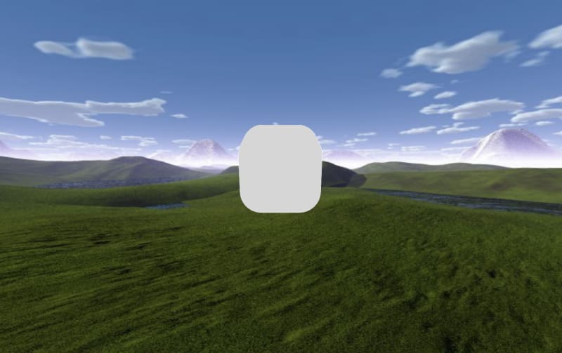
The actual pixel value of the cube shows it's only 214 out of a maximum of 255 for true white.
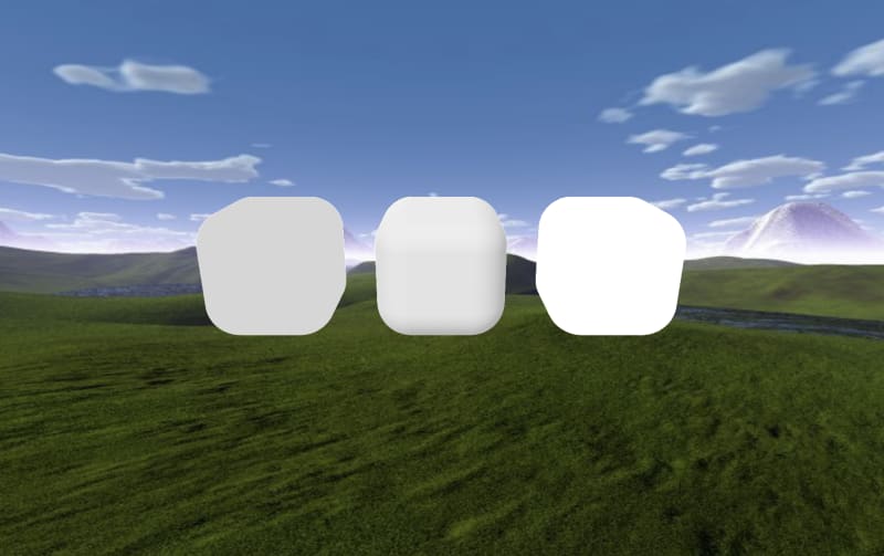
The same can be said when applying a texture.
The colours are much more dull than they're intended to be, which is frustrating when wanting to make objects in your AR scene that really pop.
The Solution
Fortunately, there's a simple solution to this problem that doesn't involve custom shaders, using the new(ish) material class PhysicallyBasedMaterial.
This material type is actually made for simulating the appearance of real-world objects, but there's a trick to making it appear just like you would expect an UnlitMaterial to act, which is to set its baseColor and sheen to black, which then means the object will not respond to lighting, then apply your colour or texture to the emissiveColor, and bump up the emissiveIntensity to a value greater than its default of 1.
Here's an example of what that might look like:
var mat = PhysicallyBasedMaterial()
mat.baseColor = .init(tint: .black)
mat.sheen = .init(tint: .black)
mat.emissiveColor = .init(color: .white)
mat.emissiveIntensity = 2

The new material is on the right.
Here's what the pixel values are in the screenshot:

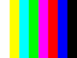
Similarly, instead of setting the color in the emissiveColor, you can set a texture as such:
mat.emissiveColor = .init(texture: MaterialParameters.Texture(try! .load(named: "rgb_test")))
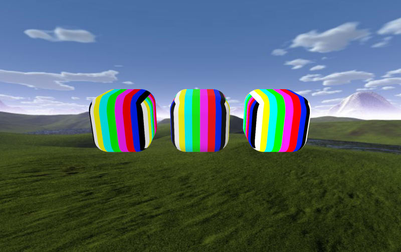
The above image shows an UnlitMaterial on the left, a SimpleMaterial in the middle, and a BoldMaterial on the right, using this image:
By making this small change, you'll be able to achieve more vibrant and true-to-life colors in your RealityKit scenes, without sacrificing the benefits of an unlit material.
The type of BoldMaterial is included in RealityToolkit, which is a lightweight set of tools to make RealityKit more powerful, with remote image and USDZ file loading, and now BoldMaterial too.
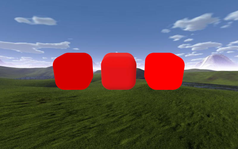
Here's a few examples with other colours, with the unlit material on the left, simple material in the middle, then the adaptation of the physically based material on the right:

But What About Lighting?
This technique works best for materials that have no response to lighting, giving them an appearance that really stands out. However, if you do what your materials to respond to lighting, a few small tweaks could help. These tweaks include keeping the sheen as .white, and increasing the baseColor to instead a dark gray.
Play around with PhysicallyBasedMaterial to find the exact appearance you're looking for in your RealityKit app.
Conclusion
While RealityKit is a powerful tool for creating immersive AR and VR experiences, but things like this can sometimes make it more challenging than necesary to achieve the desired look and feel for your scenes. By using alternative type of material types, you can create more vibrant and engaging scenes that capture your user's attention.
As mentioned above, check out the RealityToolkit Swift Package to make adding bold materials to your project easy.
I hope that this simple guide has helped you achieve the vibrant colors you're looking for in your RealityKit projects!

Top comments (1)
Thank you so much. Great small tip to improve the look of 3d objects