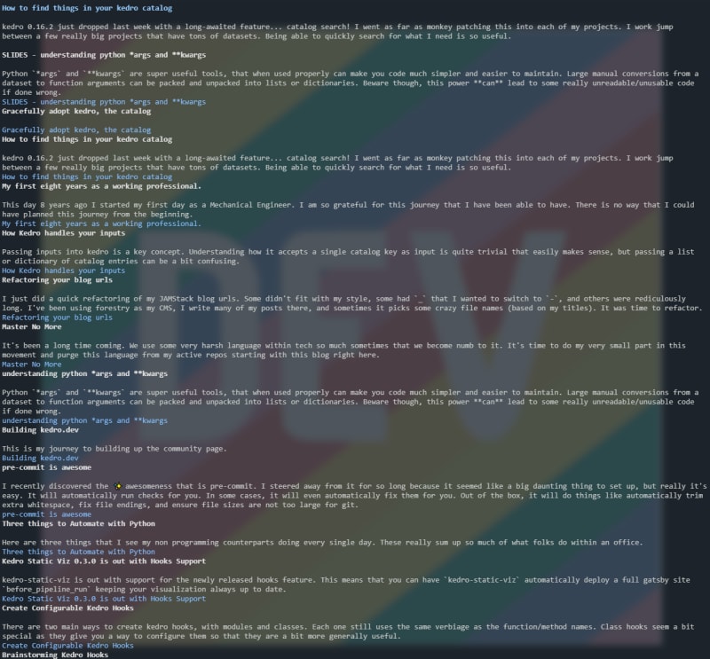
I was recently logged into a remote server and needed to look up one of my blog posts. Feeling a bit lazy I just w3m https://waylonwalker.com. And to my surprise the homepage didn't look half bad, but the posts themself, actually look great. I love the terminal but am far from doing everything from the terminal. This may be a new way for me to peruse my own blogs.

For further actions, you may consider blocking this person and/or reporting abuse


Top comments (7)
Phew 😌
I was worried mine was gonna be worse, but its functional and doesn't look half bad! Tried
lynxandw3mto compare results!lynx
Lynx Notes: The colors seem to at least partially be coming from my CSS and the contrast is pretty bad on some of the text. I worked on that for in a browser before but might need to take a look into why this is happening here.
w3m
w3m Notes: I like the layout of the
lynxhome page better. This didn't line break as well as lynx did but its still workable, just not as easy to quickly parse down. But I think due to the contrast I find the actual blog post MUCH easier to read inw3mI looked around and it turns out those colors
lynxshows are from a "theme", the default color scheme. I have been playing around with the config file for the theme and made slightly better: here is the link.Also, because I had nothing better to do I made myself a few function for my
.zshrcTo make it more convenient you can make an alias (or two).
Gatsby for the win! Text-based browsers work surprisingly well with static generated sites.
Ya it's been a while since I messed with Gatsby stuff and I didn't remember how good the no-js story was, so was more than happily surprised!
Been thinking of making sure the no-js experience wasn't awful so thanks for the kick in the right direction!
TIL about
w3m. 🤯An
<hr>tag will generate horizontal rule lines in w3m.It seems to be OK. My intention was to maximize accessibility in the first place as well.
The only may-be-problematic part, is that it asks for several cookies...