
This is more of a just-for-laughs tongue-in-cheek post, do not take the content of it as advice for anything, it was just an entertaining way to practice with JavaScript and CSS.
It all started with a tweet:
 Jack Butcher@jackbutcher
 A tiny goal that will change your life:
Make $1 on the internet.15:48 PM - 21 Apr 2020


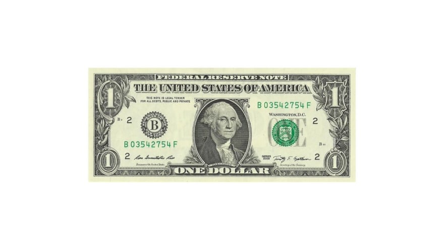
Then someone joked about drawing a one-dollar bill with a single HTML element and some CSS... so, just for fun, I decided to give it a try. And here is the result:
I didn't draw it manually. Drawing the dollar bill manually was out of the question since the beginning, it would take too much time and look awful. Automatizing the process was a must, and that's where an initial use of JavaScript was needed.
But first, we have to find an image of a dollar bill. The Wikipedia page for the US one-dollar bill has a nice image of one of it, and I used it as a base.
The size of that image is 1216x519 pixels. That would require a maximum of 631,104 individual shadows... which is nuts and most browsers won't support, also it would require a HUGE *SS file –the * stands for Cascading 😉–. Taking into account an average of 20 characters per shadow (
ABCpx DEFpx #RRGGBB,), just the box-shadow size would be 12.6MB! I never said this was going to be efficient or performant.But reducing that number is easy though as we'll see later. Still, and as a friendly reminder, this post is about something that probably should never be done. Just for fun.
Now that the image is picked, we have to extract the colors. This is possible by using a canvas and some JavaScript. Let's see how this is done step-by-step:
First, set up the canvas with a particular width and height (I found that using 1216x519 crashed my browser, then opted for a slightly smaller size of 912x389):
// Create a canvas to set and read the image from
const canvas = document.createElement("canvas");
canvas.width = 912;
canvas.height = 389;
const context = canvas.getContext('2d');
Now that we have the canvas, we place the image in it:
base_image = new Image();
base_image.crossOrigin = "Anonymous";
base_image.src = 'https://s3-us-west-2.amazonaws.com/s.cdpn.io/1506195/US_one_dollar_bill%2C_obverse%2C_series_2009.jpg';
The
base_image.crossOrigin = "Anonymous"part was required because the image was not in the same origin as the web page, and it blocked me from reading the canvas content due to security restrictions.
Once we have defined the image, we have to wait for it to load, place it into the canvas, and we can proceed to read all the pixels. The algorithm for this would be something like this:
- Draw the image into the canvas
- Traverse the image pixel by pixel and:
- Read the color for that particular pixel
- Calculate the difference between that color and the background green (for this I used this delta function from StackOverflow).
- If the difference is larger than the specified value:
- Convert the color to HEX version (to cut the size a little)
- Save the position and color in an array of shadows
- Once we have all the shadows, concatenate them into a
box-shadowstring - Place the string as a style into the page
This last step is used in the demo page (see below), but for our purposes, we really want to save, so we don't need to do the calculation every single time (and so we get rid of JS, and keep it as a single HTML element and CSS).
Here is the actual JavaScript code for the algorithm above:
// When the image is loaded
base_image.onload = function(){

  // target size
  const width = 912;
  const height = 389;

  // draw it into the canvas
  context.drawImage(base_image, 0, 0, 1216, 519, 0, 0 , width, height);

  // High values = less colors/quality and smaller size; low values = more colors/quality and higher sizes
  const minDiff = 20;
  let shadows = [];
  let count = 0;

  // traverse the whole image pixel by pixel
  for (let x = 0; x < width; x++) {
    for (let y = 0; y < height; y++) {
      // get the color of that particular pixel and compare to the background green
      const color = context.getImageData(x, y, 1, 1).data;
      const delta = deltaE(color, [235, 238, 199]);

      // if the difference is big enough, then include it to the box-shadow
      if (delta > minDiff) {
        // convert the color to a shortened HEX (lose quality, but smaller size)
        const newColor = simplifiedRGBToHex(color);
        // in a previous iteration I found that #998 is the most common color, so used it as the main color to cut the size a little
        shadows.push(`${x}px ${y}px${newColor === "#998" ? "" : newColor}`);
        count++;
      }
    }
  }

  // create the actual styles and place them on the page
  const styles = document.createElement("style");
  styles.innerHTML = `#bank-note::before { box-shadow: ${shadows.join(",")}; }`;
  document.querySelector("body").appendChild(styles);
}
There you can already see some of the tricks used to reduce the size of the generated CSS:
Make the image smaller: it is 3/4 of its original size (which prevents some browsers from crashing)
Use a shortened version of HEX:
#RGBinstead of#RRGGBB. This change will make the generated image lose quality but the size of the generated CSS will be reduced by ~16%.Use a higher delta: smaller deltas will mean more color differences will be found, more box-shadows, more size... using a higher value reduces the size proportionally (a delta of 3 will generate 8.5MB of CSS, while a delta of 20 will be 4.1MB).
Remove the most common color: in CSS, the box-shadow color can be omitted, and the default value will be the text color. In this case,
#988was the most common color, setting it as text-color and removing it saved 6% of the CSS size.
Note: while the image in this code is 912x389, the image in the demo above is just 456x194 (half the size), and that means a considerable difference in size. Actually, the generated CSS is 75% smaller (from 4MB to 1MB). Although some quality is lost.
That small JavaScript (barely 100 lines including the delta and conversion functions) is all we need to read the image and generate the CSS. Now we need to set up the rest of the code.
The HTML is simple, as it is a single element:
<div id="bank-note"></div>
And the CSS is not that complicated either, we have an element with the green background, and its ::before pseudoelement will be used to put the shadows in place:
#bank-note {
  width: 912px;
  height: 389px;
  background: #ebeec7; /* dollar bill green */
  position: absolute;
  top: 50%;
  left: 50%;
  transform: translate(-50%, -50%);
}

#bank-note::before {
  content: "";
  display: block;
  position: absolute;
  width: 1px;
  height: 1px;
  color: #998; /* most common color */
}
Here you can see a CodePen with the whole code:
And that way, we recreated a dollar bill in HTML and CSS... with a lot of help from JavaScript, but the end product is just HTML and CSS (once we generate the shadows, we can copy them into their own file and remove the JS as I did in the example at the top of the post).
Again. Something to do just for fun 😊

Top comments (12)
This post could literally be titled as "Making Money using JS and CSS"
I had one job 😓
Is it too late to change it?
Not a single element and invalid HTML, but the closest I could do in a couple of minutes: codepen.io/alvaromontoro/pen/xxwdKbz
Well, congratulations on building an image just by using box-shadows, but need I point out that you get a much better gif at full size with only about 90k and an amazing one at 4-500k, vs. I think 1mb of text encoded box-shadow values for a glitchy smaller one?
Kinda like saying I figured out how to not get my can opener dirty while opening a can of tuna, using my teeth, and I only sliced off half my nose.
I'm sure I'm missing something.
Some people practice web technologies by building grandiose projects aimed at making millions of dollars, and some other people practice web technologies by building goofy projects aimed at learning and having fun... just making a single fake dollar. I guess I'm part of the latter ¯_(ツ)_/¯
Understood, and good going! You're right about learning, of course!
Loved the delta trick in order to reduce the box-shadow, really smart 👏👏👏
Love it!
Awesome
Haha very smart : )