
Hello everybody. In this post I'd like to write about a little side project I've been working on for a few days. It's an online device simulator for mobile phones that have edge to edge screens and/or notches (like basically any new phone these days):
https://byteteilchen.de/edge-2-edge/
Why?
If you like to design websites or mobile apps like me then you probably use the device preview integrated in your favorite browser a lot (F12 -> CTRL + SHIFT + M). In many cases it does a pretty good job, especially because it modifies the browser's user-agent to make sure web-servers will serve the mobile version of a page (and it emulates touch controls ... kind of).
What I never understood was ... WHY does it only support simple square screens while basically all new phones since the iPhone X have some sort of edge-to-edge design with camera cut-out (aka notch) and round edges?
One day when I was working on one of my apps and wanted to try out new colors for the status and navigation bar I got so annoyed (again) because there was no easy way to do it :-/. I didn't want to start one of those heavy-weight device emulators from Xcode or Android Studio etc. and I had no real device available for testing ... so I tried a web-search ... and failed. Maybe I haven't been looking in the right places, maybe I missed something (please comment if you know any good online tools) but I was stuck and so I decided it was time to build my own tool!
What does it do?
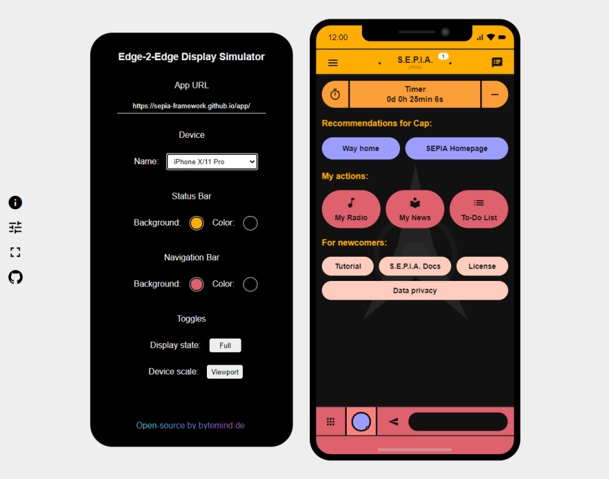
Basically its a website that can open your own app (e.g. http://localhost:9000/index.html or any local/public URL) in an iframe, draws the screen shape of a specific device around it and puts a notch and some icons like wifi or battery on top of it.
You can select a few popular devices from a list (Samsung S10, iPhone X/XR/11/6, Google Pixel etc.) and the simulator will set the correct size according to the available pixels of the screen (= viewport not "real" resolution). It's not pixel perfect but I think I got pretty close to the real looks 😎.
What else?
There are additional controls to change the display format, rescale the device to it's physical size (including some factor to adjust it to your monitor) and change the status and navigation bar colors via a color picker. I invite you to play around with it, its pretty fun! 😊. Here is an example where I edit one of my apps:
Something I learned
Did you know that the Samsung S10 and S10e actually have the exact same viewport while having pretty different looks? The interplay of viewport, resolution and actual device size can be very surprising sometimes!
Also: It can be pretty hard to find out the correct values for viewports (some online data is actually simply wrong oO).
And now?
Feel free to use it, share it, copy it, modify it, whatever, everything is open-source and available on GitHub. I'll probably not write any tutorials about how to add new devices to the code but it shouldn't be to hard to figure out. If you do please send a pull request! 😉
Have fun!
Florian

Top comments (2)
Good job Florian.🤓 I was desperately searching for something like this online but I was disappointed. I knew about the mobile preview functionality of browsers, but I wasn't getting the hang of it. I'll make sure I give this a try when next I'm coding.
Thanks! Hope you like it 😃