From:
DailyUXWriting
--
UX Writing Challenge: Day 3
Scenario: The user entered the wrong email address to sign in to their account.
Challenge: Tell the user to enter the right email.
40 characters max
--
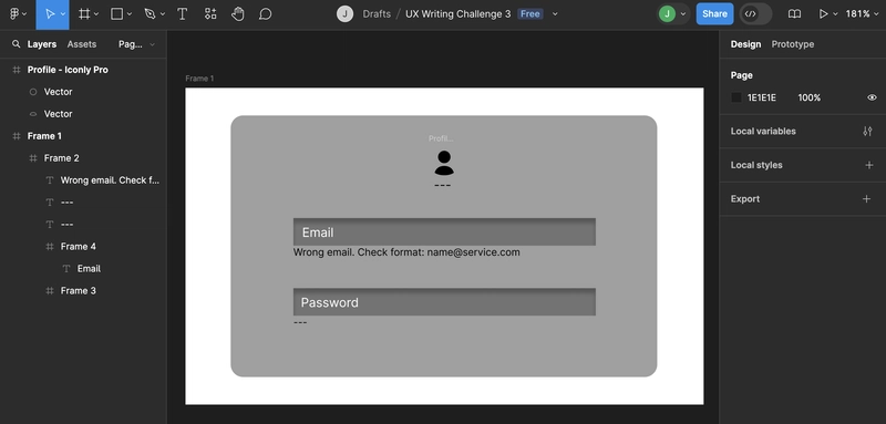
"Wrong email. Check format: name@service.com"
Why I chose this:
- Within 40 characters
- Clear
- Concise
- Quickly guiding
- Immediately inform
Here is the possible design using the prompt in Figma

Conclusion:
The message effectively addresses the user's error by being brief and direct. It stays within the 40-character limit, clearly communicates the issue, and provides an immediate example of the correct format. This approach minimizes user frustration and helps them quickly resolve the problem without confusion.


Top comments (0)